
Without a fuel gauge in your car, you'd have to rely on gut feeling to know when to fill up, and that's risky. You might end up stranded on an empty road without gas.
The same principle applies to software we use every day. Embedding analytics (charts, graphs, reports and dashboards) into your app means your users can base their decisions on fast, powerful visualizations of real-time data.
Take Booking.com as an example. Their use of visualizations gives property owners information about when potential guests plan to visit their city, how long they plan on staying, and how traveler demand compares to their own bookings. Owners can also see, at a glance, which countries guests are booking from and get a better understanding of their reasons for traveling.
The best apps provide contextual analytics that combine internal data with broader market insights. Together, we can try building something like that in a future blog post, but to cover the basics first, let’s stick to an internal dashboard only.
Let’s imagine we are working on a food delivery app and we want to embed a dashboard for restaurant owners to use to glean insights. We will be using InterBase for super-fast, secure, robust database management and Yellowfin for its powerful analytics.
Step 1: Generating a dataset
The first thing we need is data, and since we are only learning here, lets create a dataset synthetically using ChatGPT AI.
The AI prompt we are using is: “Create a database for a food delivery app. Format it in a way that lists orders in rows, with columns including variables such as feedback (1–10), returning customer (0/1), order value, order type (what food it was), time of the order, and preparation time. Give me 10,000 rows in a CSV format, something that could actually be pulled from the app.”
Step 2: Setting up a live database and creating a View
We could upload that CSV file to Yellowfin as is, but to simulate real-time changes to data and show how that reflects in our analytics, we will be using InterBase, a small footprint database that will handle new orders.
Inside Yellowfin, we go to the Admin Console and add a new database connection using the InterBase JDBC driver, pointing it to the local InterBase server and database file. Once the connection is validated, Yellowfin can query the database directly, just like any application would.
With the connection established, we can create a View in Yellowfin on top of our database – this will act as the foundation for our analysis.
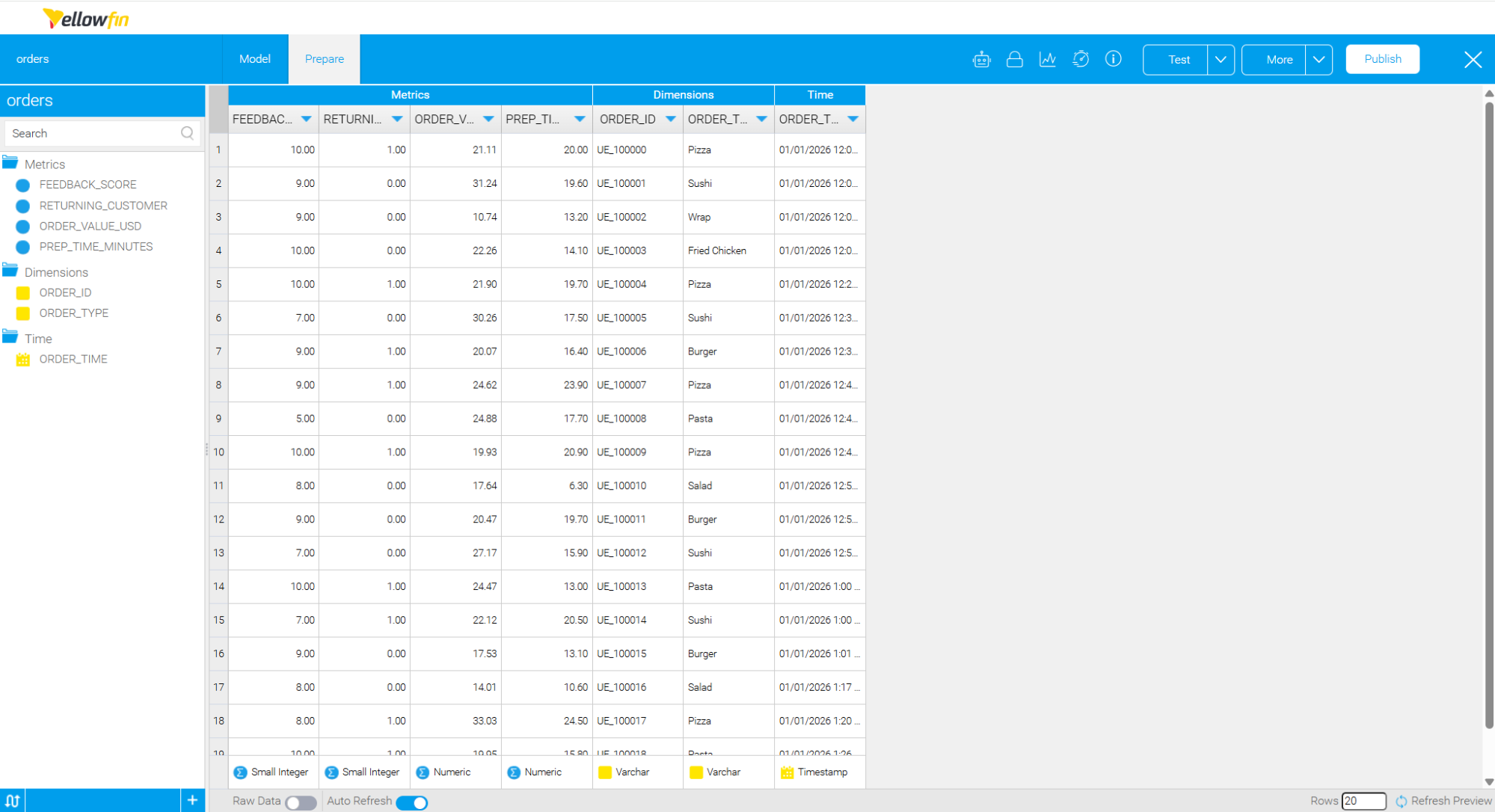
A View in Yellowfin is where you can preview your source data, change metrics and dimensions, add calculated fields and other things you might need to do in preparation for analysis.
Step 3 The fun part of data analysis: Asking Yellowfin questions
Once you have an active View, you can start running analysis on it. This is the most interesting part as you are actively thinking about what sort of information would matter most to the person who is going to view it; in this case, the restaurant owner.
Traditionally, this is where users would need to understand charts, filters, and dimensions before they could get answers. Yellowfin offers another option: Natural Language Query (NLQ).
NLQ allows users to ask questions about their data in plain language and get immediate answers. Instead of building a report first, a restaurant owner can simply type questions like “How many orders today?” or “Average prep time by order type”. Yellowfin translates these questions into database queries behind the scenes and returns the result as a table or chart.
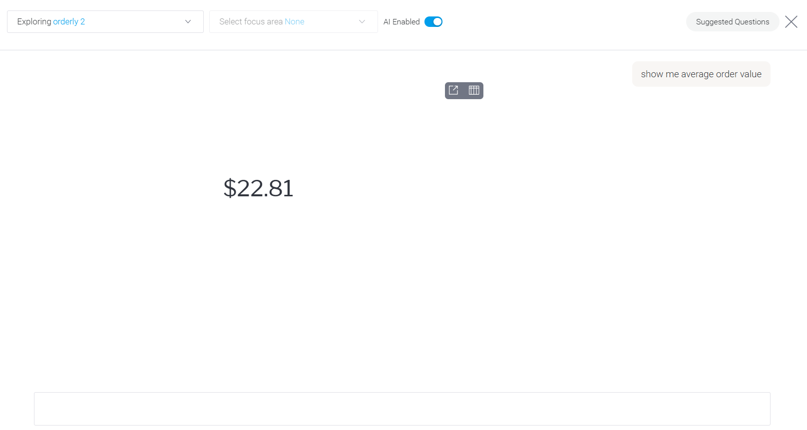
That was easy. Let's now ask a couple more questions:
How many orders today?
Net sales today
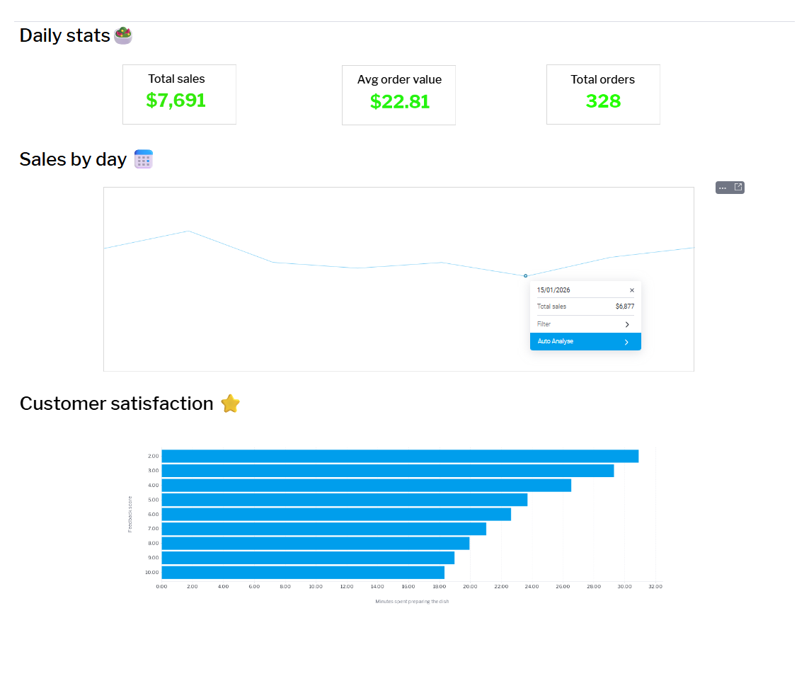
The same way, we get results that we can group into the “hero” section of our dashboard.
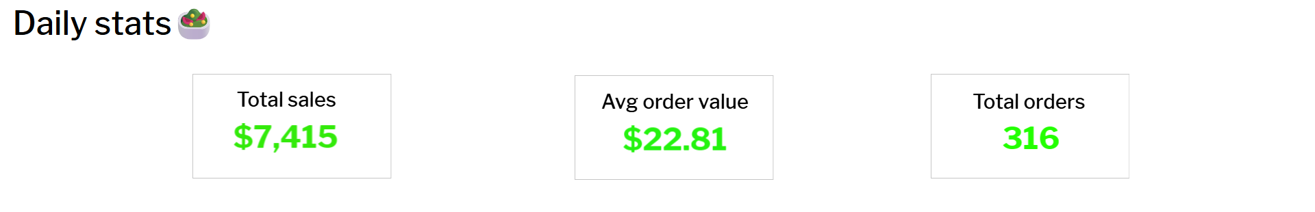
Now, the restaurant owner has a real-time view of how the business is doing, showing specific, meaningful values that she finds the most useful. We used InterBase on the backend and all changes sync in real time.
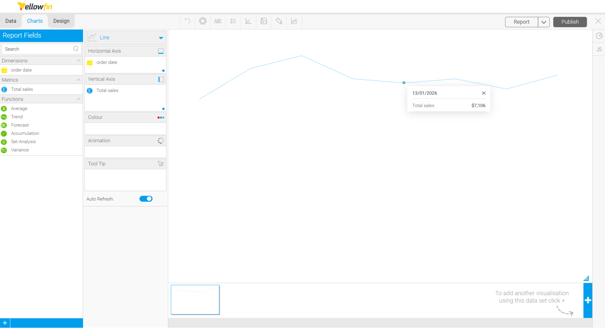
The next thing that the restaurant owner would find helpful is a breakdown of net sales by day. In Yellowfin, we can ask “Show me net sales by day” and we get a chart that looks like this:
We could also look at something like customer feedback vs prep time to see how much time a customer spends waiting might hurt our review ratings. And maybe after that, we could compare average preparation time by order type to see which items might benefit from prep optimization.
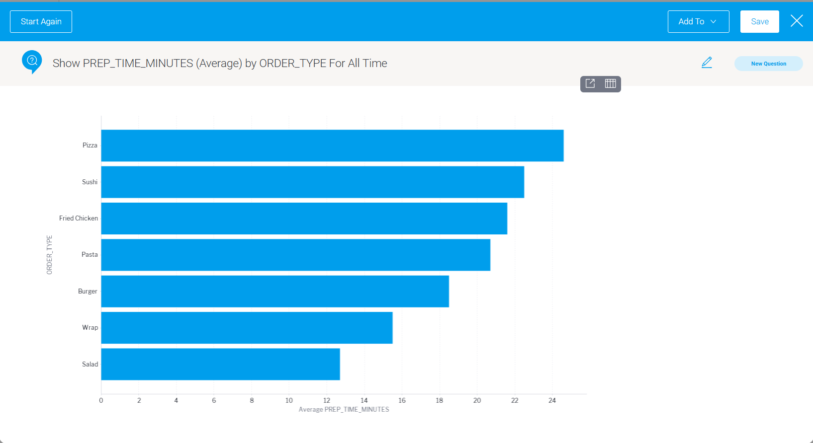
From this visualization we can see that pizza takes the longest time to prepare and we already know that the longer the prep time the more unhappy the customer. Now might be the time to invest in a better pizza oven!
Final thoughts
At this point, we have a few charts a restaurant owner might actually need:
- a live view of orders
- an understanding of how the kitchen is performing
- and a breakdown of revenue per day.
Yellowfin made it easy to move between asking questions in plain language and refining those answers into dashboard-ready visuals, all on top of a live database.
Whether you’re building a food delivery app, a booking platform, or any other product, the pattern is the same: think about your users’ burning questions and deliver the answers right where they work. Or, even better, let them ask the questions themselves.
If we do it correctly, analytics can become something your users rely on every day, adding value to your products and services.
Want to do your own analysis? Start here and we will set you up with a trial license.