Last Thursday we quit. (Pause for sharp inhalation)
*gasp*
We quit our complaining about the chronic state of Business Intelligence (BI) dashboards, and offered up some best practice recommendations aimed at eradicating the persistently poor usage of this BI communications mechanism.
Now, let’s continue the extermination of mediocrity and reinforce best practice dashboard design and delivery principles, capable of producing actionable insights and underpinning better organizational decision-making.
13. Easy to use
Whilst the importance of usability might have been implied in several of the best practice recommendations made in part one of this post, for the avoidance of all doubt, we’re explicitly stating it here: Ease-of-use is a non-negotiable must. Gartner’s 2012 BI platform Magic Quadrant survey revealed that “ease-of-use” carried over from 2011 as the new number one priority of business users when selecting a BI product. And how do business users receive their BI information and primarily interact with their chosen BI solution? Via a dashboard; that’s how.

So what constitutes an intuitive and highly navigable dashboard? Think about design layout and practicalities: Can you easily identify a problem and then drill to detail to identify the underlying cause? Can you drill down and through your data? Can you filter the high level reports to understand the associated particularities quickly and easily? Aside from the report interactivity, is the dashboard layout and interface arranged in a logical order that facilitates fast navigation whilst not distracting and detracting from the ability to absorb and interpret the information presented?
Stick to expected design practices as denoted by the globe’s most prominent Web pages, sites and services, and as outlined in part one of this blogs series via Person and Schaik’s research study, The effect of spatial layout of and link colour in web pages on performance in a visual search task and an interactive search task.
14. Only present at-a-glance and actionable information
While enabling users to quickly access and understand the detailed information underpinning high-level Key Performance Indicator (KPI) reports is essential (via filter and drill capabilities), all data within a dashboard should provide at-a-glance insight into organizational performance. If you have to explore and interact with the dashboad to discover its business implications, the design has failed to communicate the significance of the data effectively.

The whole point of a dashboard is to enable time-poor executives to understand the health of key business facets without having to wade through information. KPIs should also be contextualized with predefined threshold indictors – green for good, red for bad, etc – that help executives understand business performance based on agreed organizational standards.
15. Visualizing your data (revisited)
Selecting appropriate visualizations was initially explored in point ten of this post, Select the best, not the best looking, visualizations.
But, other than avoiding the temptation to be consumed by visual puffery, there are a number of other vital visualization best practices to abide by.

It’s imperative that you understand the difference between categorical and quantitative information, how they interrelate to produce meaning, and how this impacts the associated methods of data visualization:
- Quantitative information (measures and metrics) is countable and measurable
- Categorical information (dimensions) represent different sub-sets of data
For example, you might count the number of orders that leave a warehouse, whilst dividing those total orders into different categories based on a predetermined value or benchmark – small, medium or large.
Ensure your graphs are proportional and accurately represent the raw data. For example, If utilizing a bar chart to communicate the fact that there are twice as many large orders leaving the warehouse compared to small orders, the bar representing large orders must be exactly twice the length of the bar representing small orders.
It may sound obvious, but failure to accurately reflect the value of comparable data types can lead to complete misunderstanding of performance and total confusion. Oh, and of course subsequently poor decision-making.
16. Can pull from multiple data sources to deliver optimum business insight
Inevitably, your organization captures numerous types of data, storing it in a multitude of different systems.

For reporting and analytics to generate a complete, insightful and valuable view of your business, it’s imperative that your dashboard solution is capable of integrating data from various sources – your sales, finance, marketing, CRM, HR and ERP data – to produce discerning reports capable of exposing the inner workings or your business.
17. Heed the advice of Tufte and Few: Embrace sparklines and bullet graphs
Most dashboard designs are confronted with limited space in which to convey required messages. Employing chart types that utilize minute amounts of screen real estate are an effective answer to this common problem. Data visualization expert, Stephen Few, backs the use of bullet graphs because they provide an effective “answer to the problems exhibited by most of the gauges and meters that have become synonymous with dashboards”, as they are “designed to display a key measure, along with a comparative measure and qualitative ranges to instantly declare if the measure is good, bad, or in some other state.”
Fellow analytical visualization professional, Edward Tufte advocates the sparkline – a chart type that he is credited with creating – for similar spatial reasons: “Sparklines are data words,” writes Tufte, “small, high-resolution graphics usually embedded in a full context of words, numbers, images” which are effective because they are “data-intense and design simple”.

18. Text is like color: Use sparingly and appropriately for maximum impact
Like the appropriate and effective usage of colors (as outlined in best practice number nine), deploying frugal utilization of text – both in terms of style and quantity – is important.
Fancy fonts are often difficult to read, while simultaneously demanding attention. An overly elaborate text choice has the power to both detract and distract from the data.
In terms of quantity, too much text results in clutter and reduces the readability of a dashboard, whereas too little may provide inadequate contextualization and explanation of the data presented.
Remember: Use basic font styles, in combination with succinct and sparse prose.
Other prominent textual pointers include:
- Avoiding repetition at all costs
- Avoiding text-based clutter – does a chart require rollovers, a title, legend and x and y labels?
- Avoiding slanted or vertical titles or labels wherever possible (they’re hard to read)

18.1 Develop an appropriate hierarchy for text where possible and when appropriate
You’re designing a dashboard that requires a relatively significant amount of associated text. It’s essential that you develop an appropriate hierarchy of emphasis by which readers can intuitively distinguish levels of importance: Headings, chart titles, body copy, side notes and so on.
Additionally, cognitive research indicates that we read words as whole shapes, rather than as a conglomerate of individual letters. This same research also indicates that capitalization actually hinders our ability to read text because capitalized letters have less distinct shapes. Therefore, emphasizing text via color, bold or italics is preferable.
19. Ensure the consistency and quality of the data feeding dashboard deployments
While dashboards are one of the most effective means for quickly sharing the fruits of your BI initiative with end-users, no amount of fancy design work can hide, or compensate for, poor quality data.

Dashboards that produce inaccurate and inconsistent information can quickly derail your reporting and analytics project by distilling a sense of distrust amongst your user groups, who will then inevitably revert to isolated and traditional methods of intelligence gathering (Excel anyone?).
20. Consider the unique informational requirements of each defined user group
Think about how dashboards support each of your defined user groups to more easily perform their job role and make decisions. What information are they already aware of? What information would enable them to make more efficient and effective decisions?

Perhaps most importantly, consider the frequency with which they’ll be accessing their dashboards, and therefore the type and freshness of information needed. The informational necessities of a best practice operational and strategic dashboard are often vastly different. For example, a floor manager of a manufacturer might require up-to-the-minute data to track stock produced, purchased and delivered. An operational dashboard would enable the near-real-time management of manufacturing and supply chain processes, allowing the manager to address issues and opportunities as they arose. Conversely, strategic dashboards may track the progression of several KPIs towards predetermined goals over a number of weeks, months or even years. In these circumstances, not only is a less granular level of information required, there’s little advantage in delivering the data to that dashboard in real or near-real-time.
Remember, the timeliness of the data required for your dashboards will directly impact and dictate your data warehousing strategies and technological requirements – which dashboards, if any, require connection to live data sources?
Also consider:
- How long each user or user group can spend analyzing information – this will impact:
- The scope of information displayed
- The level of detail displayed within the selected scope (reports chosen to populate the dashboard)
- The level of customization required
- The technical proficiencies of each user group – this will also impact:
- The level of contextualization and information explanation required
- The level of detail displayed in each report and / or dashboard
21. The environment and device used to access dashboard information
The environment or context within which each user group regularly accesses their dashboards will have direct implications on:
- The type of information necessary
- The style in which the information is displayed
- The type of device most appropriate to consume that information (will dashboard users primarily be consuming data on-the-go or at their desk?)

22. Link dashboards directly to business objectives
Each dashboard or group of dashboards should be designed and delivered to designated user groups with the specific aim of assisting recipients to achieve specific business objectives and strategies, as well as meeting predefined industry or company benchmarks and targets.

Only including information that is directly linked to supporting specified business processes and goals – relevant to the job function(s) of the receiving user(s) – also implies that that information needs to be directly actionable.
It is vital, that in each of these instances, you are able to identify and separate the interesting and inessential information, from the productivity enhancing and imminently usable / useful content.
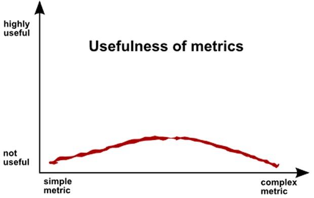
23. Select the right metrics
It’s not enough just to decide on what aspects of your business a dashboard should monitor. You need to decide how you’re going to track and measure those chosen aspects. That means selecting the best metrics with which to track and monitor designated elements of your business.

In order to select the best metrics possible, consider:
- Focusing on absolute measures
- Including only directly actionable information linked to specific goals
- Including the best metrics that your data set supports, rather than pursuing the “ideal” metric that is not adequately supported by the underpinning data set
- Using commonplace and easily understood metrics with agreed definitions
24. Layout and flow of information
Dashboard layout – the way information is positioned – is a simple, yet highly effective method for assisting information absorption. Best practice layout helps guide users through the presented information in the most logical order, whilst helping them understand the implications and importance of the dashboard as a whole piece of communication.

When planning the layout of a dashboard, consider:
- The relationships between different measures and charts within a dashboard and position them in a way to most effectively highlights those connections
- The order in which information appears – creating logical information flows, from left to right and from the beginning of a process to its conclusion
Few outlines the importance of dashboard structure in a 2007 article, Pervasive Hurdles to Effective Dashboard Design: "Dashboard content must be organized in a way that reflects the nature of the information and that supports efficient and meaningful monitoring. Information cannot be placed just anywhere on the dashboard, nor can sections of the display be sized simply to fit the available space. Items that relate to one another should usually be positioned close to one another. Important items should often appear larger, thus more visually prominent, than less important items. Items that ought to be scanned in a particular order ought to be arranged in a manner that supports that sequence of visual attention.”
Point five of this blog post, Ensure natural alignment and logical order of charts, also touches on the layout and flow of information presented on a BI dashboard. The same research report referenced there – The effect of spatial layout of and link colour in web pages on performance in a visual search task and an interactive search task – also mentions several other findings and factors that support the creation of effective Web-based communication via the optimal layout of Web-based information. These findings and recommendations include:
- The fact that people scan information from left to right and top to bottom, suggesting that the most prominent information should be situated in the top left hand corner of your dashboard
- That division of information by a grid system can add order and readability to Web-based information
- Leaving sufficient white space reduces clutter and makes information-rich areas standout more obviously, stimulating faster and deeper comprehension (for more on the effective use of color in BI dashboard design, see point nine – Use color appropriately and sparingly to achieve maximum contrast)
Where to next?
Sign up for Yellowfin’s BI dashboard best practices pronto >