Running a vacation rental is a laborious task.
Communicating with guests, managing cleaning staff, developing a pricing strategy… It's all time-consuming work.
What makes it harder is that many decisions are made with partial information: a sense that “this month felt busy,” a hunch that prices might be too low, or a vague feeling that one booking channel is starting to dominate. That’s how intuition quietly replaces evidence.
This is where vacation rental analytics earns its keep
Analytics gives us an objective view of what’s actually happening in the business, so we can spend less time guessing and more time acting. More importantly, it helps us deliver a consistently high-quality experience that keeps guests coming back.
The challenge is that the truth is usually scattered across booking platforms, spreadsheets, and gut feel. A good dashboard pulls it into one place and gives users a quick, honest read on performance, with the ability to drill deeper the moment something looks off or unexpectedly good. With that said, here is what we will be building:

Step-by-step: how we built the vacation rental dashboard
When you are building an app, the goal is not just to give users charts. The goal is to give them confidence inside the workflow they already live in. That is what embedded analytics is for. The dashboard sits inside your app, speaks your product language, and answers the questions users already ask, without sending them to a spreadsheet or another platform.
In this blog post, we will build the same kind of foundation you would use in a real embedded scenario:
- a bookings dataset stored in PostgreSQL
- a clean data source connection in Yellowfin
- A View designed for dashboards and NLQ
- and a dashboard that can be extended as your product grows
Step 1: How to create the PostgreSQL database
We start by storing bookings in PostgreSQL, with one row per booking and variables such as booking date, nights booked, nightly rate, etc. From PowerShell, open psql and create a database for the demo:
CREATE DATABASE hotel_demo;
\c hotel_demo
Create the bookings table
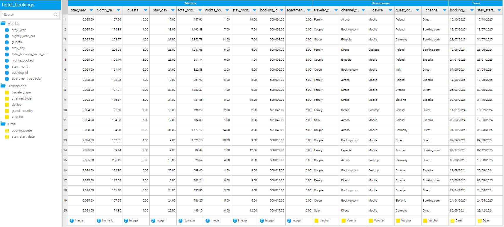
Next, we create a flat bookings table designed to support the kinds of questions property owners naturally ask.
DROP TABLE IF EXISTS bookings_flat;

CREATE TABLE bookings_flat (

  booking_id               INTEGER PRIMARY KEY,

  booking_date             DATE,

  nights_booked            INTEGER,

  guests                   INTEGER,

  apartment_capacity       INTEGER,

  guest_country            TEXT,

  channel_type             TEXT,

  device                   TEXT,

  nightly_rate_eur         NUMERIC(10,2),

  total_booking_value_eur  NUMERIC(12,2)

);
This structure is intentionally simple – it reflects how booking systems work, keeps the grain obvious, and it makes downstream analytics easier to explain and extend
Load the data from a CSV file into our PostgreSQL table
With the table in place, we load the CSV:
\copy bookings_flat
FROM 'C:\Users\YourUser\Desktop\bookings_flat.csv'
DELIMITER ','
CSV HEADER;
A quick check confirms everything is in:
SELECT COUNT(*) FROM bookings_flat;
At this point, we have a clean, booking-level dataset that is ready to be exposed to an analytics layer.
In the next step, we will connect this database to Yellowfin, build our first Views, and start shaping the data into something your end users can explore directly inside your product.
Step 2: Connect PostgreSQL to Yellowfin and expose the data safely
The next job is to make the database available to the analytics layer in a controlled way.
This is where Yellowfin comes in.
For product teams, this step is critical. You are not just connecting a database. You are deciding what your end users will be allowed to see, ask questions about, and build insights from inside your application.
Create a PostgreSQL data source in Yellowfin
From the Yellowfin admin interface, we create a new data source and point it to our PostgreSQL instance.
You will need:
- host
- port
- database name
- username and password
Once connected, Yellowfin can see the database schema, but nothing is exposed to users yet. That separation matters. Tables are not automatically reportable.
Create a View on the bookings table
We now create a View based on the bookings_flat table.
In Yellowfin:
- create a new View
- select bookings_flat as the base table
Inside the View, we change fields to metrics, dimensions and time where necessary.
This step may look administrative, but it has a direct impact on the user experience. A well-defined View makes dashboards easier to build and NLQ questions far more reliable.
What this enables immediately
With a single View in place, we unlock several things at once:
- dashboards can be built without touching SQL
- NLQ understands what can be counted, averaged, or grouped
- product teams can evolve analytics without changing the database
Most importantly, we have created a clean boundary. PostgreSQL remains the source of truth. Yellowfin becomes the storytelling layer.
In the next step, we will use this View to build the first charts from the dashboard and show how NLQ fits naturally into the experience.
Step 3: Build the first charts and let NLQ do what it’s good at

With the bookings View in place, we can finally answer the question that matters to product teams:
What does a useful analytics experience look like for an end user?
The goal here is not to build every possible chart. It is to surface the right ones. Charts that give immediate clarity, and that naturally invite follow-up questions.
This is where Yellowfin starts to shine.
Start with outcome, not exploration
We begin by building charts that answer outcome-level questions first. These are the questions property owners ask without needing prompts.
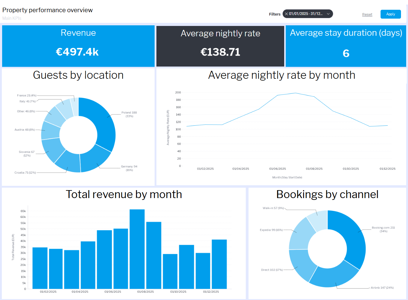
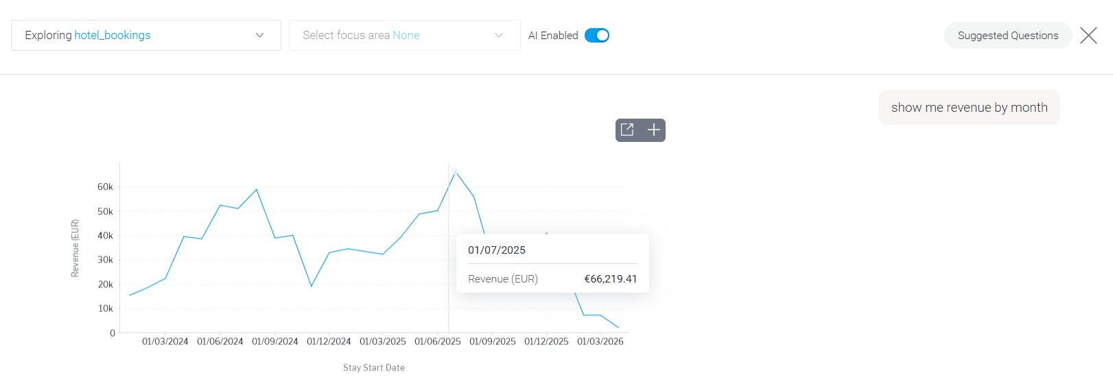
Revenue over time
This is the anchor. It tells users whether the business is trending in the right direction and provides context for everything else on the dashboard. On its own, it does not explain why revenue moved, but it tells us where to look next.
Average nightly rate by month
This chart gives meaning to revenue changes. It shows whether performance is driven by pricing or volume. When revenue rises alongside stable rates, demand is likely increasing. When rates fall without a lift in bookings, pricing strategy becomes a question.
These two charts together already reduce guesswork. They turn vague impressions into something measurable.
Add behavioral context
Once outcomes are visible, we layer in behavior.
Number of bookings
Bookings show demand independently of price. A rise in bookings paired with flat revenue suggests pressure on pricing. Fewer bookings with stable revenue often means longer stays or higher-value guests.
Average length of stay
This is where operational reality enters the picture. Longer stays usually mean fewer turnovers and more predictable operations. Shorter stays increase workload and can hide weaker demand behind higher booking counts.
These charts help users understand not just what happened, but how it happened.
Make strategy visible
Finally, we surface the charts that influence long-term decisions.
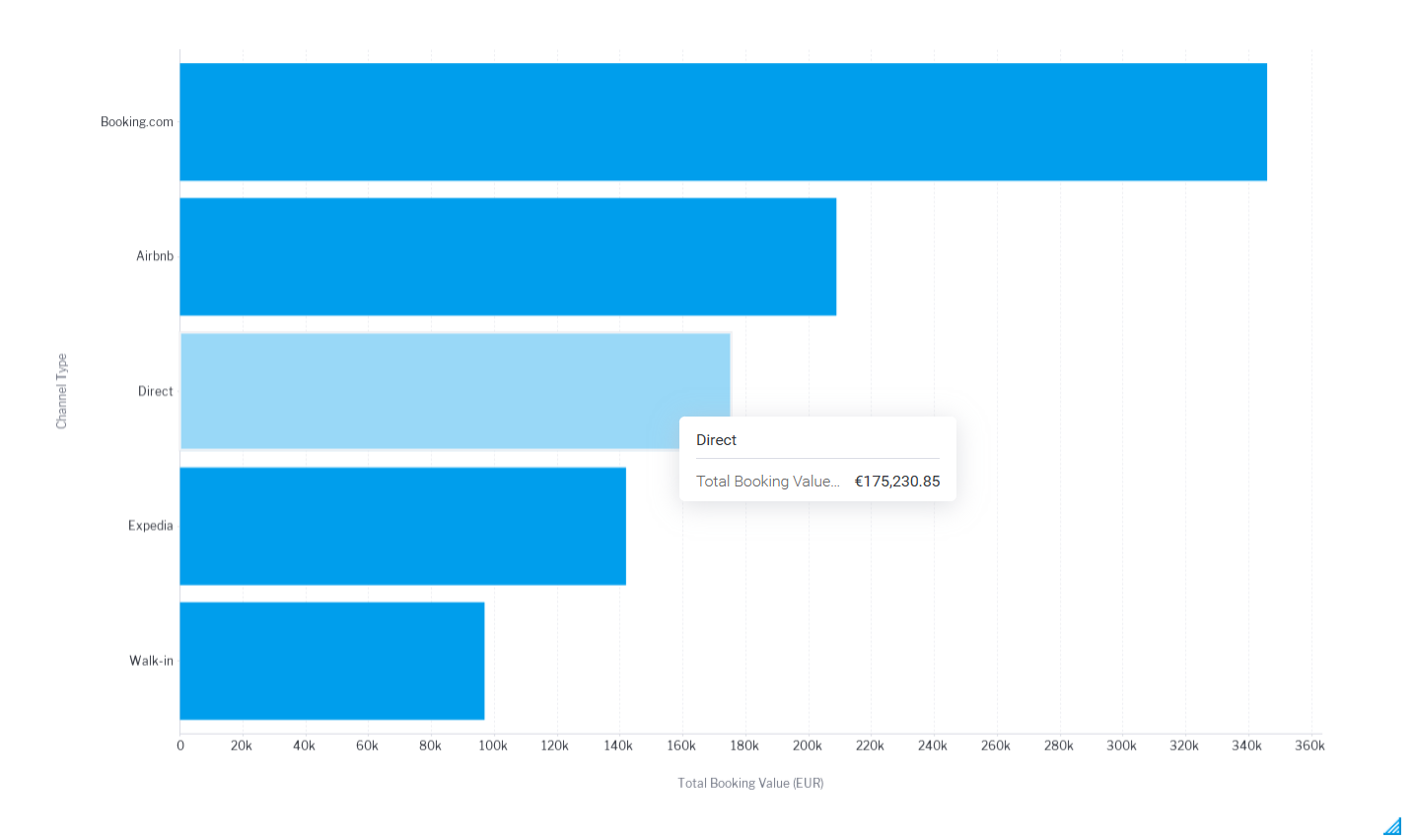
Revenue by channel
This shows how dependent the business is on Booking.com, Airbnb, Expedia, direct bookings, or walk-ins. Heavy reliance on OTAs may drive volume, but it impacts margins. Growth in direct bookings often signals healthier demand and stronger brand recognition.
Guest origin
Guest country adds context that numbers alone cannot. Over time, this chart can inform marketing focus and seasonal pricing decisions.
Where NLQ fits in naturally
Once these charts are in place, NLQ stops being a novelty and starts behaving like a natural extension of the dashboard.
Users can ask follow-up questions like:
- bookings by channel last month
- average nightly rate for direct bookings
- revenue from guests in Germany
- length of stay by device
Because the View was designed carefully, these questions return sensible answers without needing explanation. NLQ works best when the data model already reflects how users think.
Why this matters for product teams
You are no longer showing users static reports. You are giving them:
- a shared view of performance
- the ability to ask their own questions
- confidence that insights come from the same source of truth
And the best part? As data comes into your database, the charts in Yellowfin update automatically. This means your users have a real-time view of how the business is performing.
Think you’re ready to start building your own dashboard? Sign up for a private playground where you can experience the full power of Yellowfin. Bonus: you will find code samples that make it easy to embed analytics into your app.