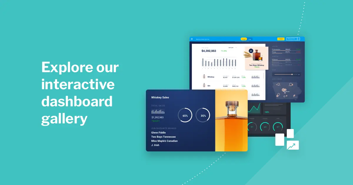
TL;DR
Great BI dashboards are focused, visually clear, interactive, and aligned to strategic objectives. They should balance detail with accessibility, enabling both executives and frontline users to act fast. Yellowfin provides dashboard tools designed around these principles, so you can deliver analytics that actually get used.
Ever feel like your company's data is an untapped resource? We understand the frustration when your data isn't translating into clear, actionable insights for your team.
A truly effective business intelligence (BI) dashboard should be a guide, not a barrier. It helps users understand what's happening and what they can do next, transforming a chaotic data landscape into a single, intuitive source of truth. That requires some work.
This guide explores 7 key elements of effective dashboards, giving you a clear roadmap to choose the right business intelligence dashboard software software and create a tool your team will find genuinely useful.
Key takeaways
- Clarity is king: The most effective BI dashboards combine a simple, intuitive layout with clear data visualizations and real-time insights to support faster decision-making.
- Great dashboards are user-centric: Understanding your target users and their decision-making needs is crucial to designing dashboards that deliver value.
- Empower with interactivity: Dashboard features like customizable views, global filters, and collaboration tools help users explore data and align with their teams.
- Keep it clean: Avoid clutter, outdated data, and non-responsive designs to ensure dashboard components remain actionable and user-friendly.
What makes a good business intelligence dashboard?
Before we dive into the key elements of a dashboard, let's quickly refresh what a great BI dashboard actually is.
A business intelligence dashboard is a dynamic, visual command center that transforms raw data into a clear, high-level overview. Unlike a static spreadsheet or a basic operational report, a BI dashboard is built to be interactive. This allows users to not only see key business metrics at a glance, but also click to explore their data, drill down into details, and find answers to their own questions.
BI dashboards are created using specialized analytics solutions, such as Yellowfin or Power BI, that provide their own editors for designing and customizing a dashboard for specific requirements. A well-designed dashboard ideally helps present trends, tracks performance in real-time, and supports smarter, more confident decisions without getting lost in a sea of numbers.
Here are some of the fundamental features that make a dashboard effective:
- Clear and concise data visualizations
- Easy-to-use navigation
- Effective communication and collaboration tools
- Data discovery and drill-down features
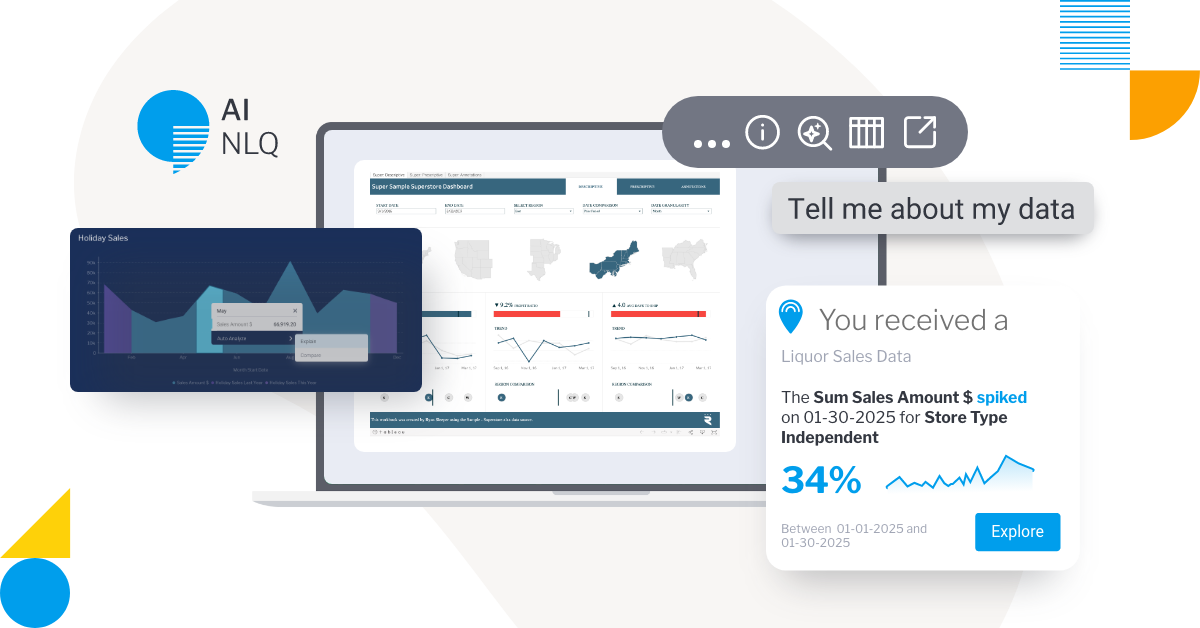
- Natural language query integration
- Data storytelling integration
Read more: 4 Key Features of a Modern BI Dashboard
The 7 must-haves for successful BI dashboards
Getting the most out of your data depends on having a dashboard that works for you, not against you.
A successful BI dashboard is more than a display; it's a tool that helps everyone from individual users to business leaders make informed decisions.
The right dashboard components can turn complex data into powerful insights that drive a better understanding of company or product performance - the following are must-have dashboard features.
1. Data visualization: The first glance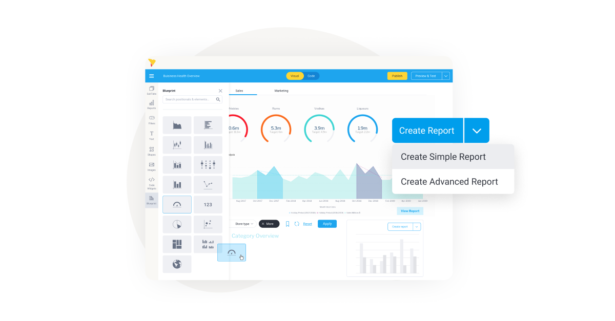
We've all been there: staring at a spreadsheet filled with numbers, trying to make sense of it all. This is where great data visualization comes in. It’s the first and most important element of an effective BI dashboard because it transforms raw data into a visual story you can easily understand.
A well-designed chart or dashboard layout helps you instantly see a dip in sales performance or a new growth trend for website traffic. It’s the key to moving past just seeing the data and starting to understand it, which is the foundation for smart, data-led decisions. Taking the time to follow data visualization best practices helps your users quickly spot problems, identify opportunities, and engage with your dashboard better.
While common types of data visualization like bar, pie, and line graphs are a great start, the best BI platforms give you a wide range of options to truly customize your view. For example, Yellowfin offers over 50 interactive charting options to help you build a dashboard that is as insightful as it is visually clear, and free guides on how to use them.
Download Whitepaper: 5 Best Practices For Data Visualization
2. Dashboard layout: Is it a map or a maze?
Once you have great visuals, the next step is making sure they’re organized.
The dashboard layout is the blueprint and what turns a collection of charts into a cohesive story that can be understood at-a-glance. If your users have to hunt for information, you’ve lost them.
A smart layout prioritizes the most important dashboard items (metrics) at the top, groups related data together in a logical structure, and uses clear, readable fonts and just enough white space to prevent visual chaos. Icons and other graphics can also be used to indicate key insights.
Putting effort into the layout ultimately helps make your dashboard feel intuitive to use and easy to navigate, so your intended audience can spend less time searching and more time acting on valuable data. To make this easier, we recommend selecting a BI vendor with a dashboard editor that allows for easy, drag-and-drop customization of your desired layout - such as Yellowfin.
Learn more: Dashboard Design - 5 Essential Tips and Considerations for 2025
3. Global filters: When one size doesn’t fit all
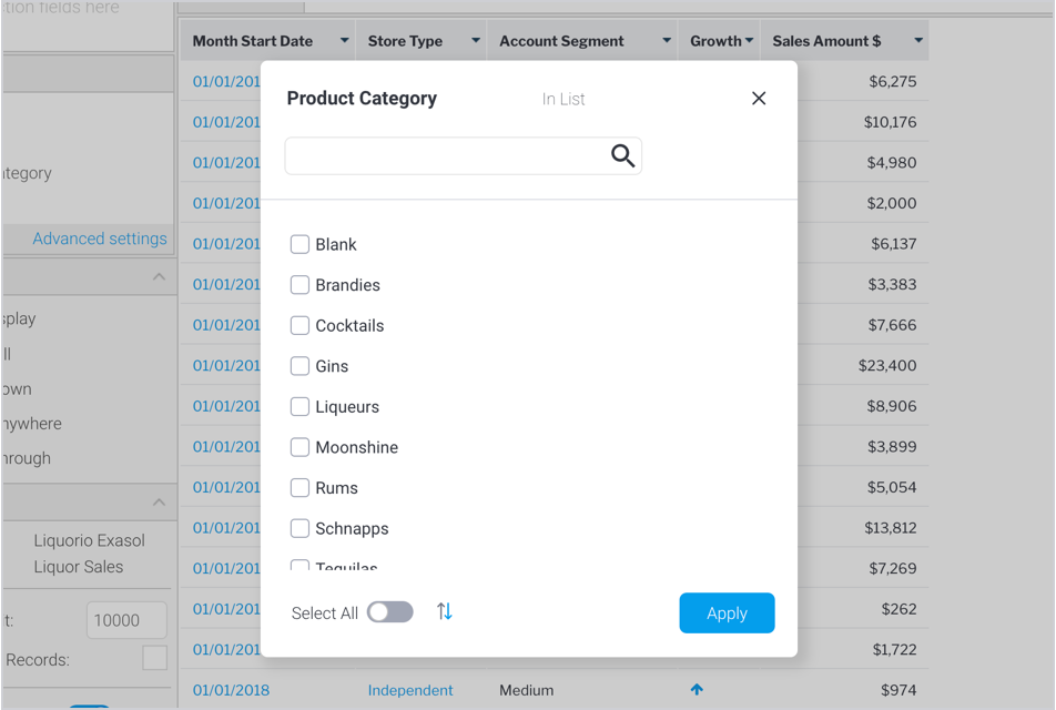
A BI dashboard with no filters is like a book with no index. It might contain all the information you need, but finding a specific answer is a frustrating waste of time.
Global filters solve this problem by giving your users control when interacting with your dashboard. They can move beyond the high-level, default view of the dashboard and instantly drill down into the data that matters most to them.
Whether they need to see performance by department, customer, or time period, filters transform your dashboard into a powerful, responsive, and personalized tool. This empowers your team to get the specific insights they need to do their jobs better.
Global filters can include filters for performance indicators, business areas, or customers. Reporting can include reports on data trends, performance metrics, or customer insights.
4. Customizable views: Giving users control
No one looking for specific answers wants to feel overwhelmed by a dashboard full of data that's difficult to understand. This is where a robust metadata feature becomes essential.
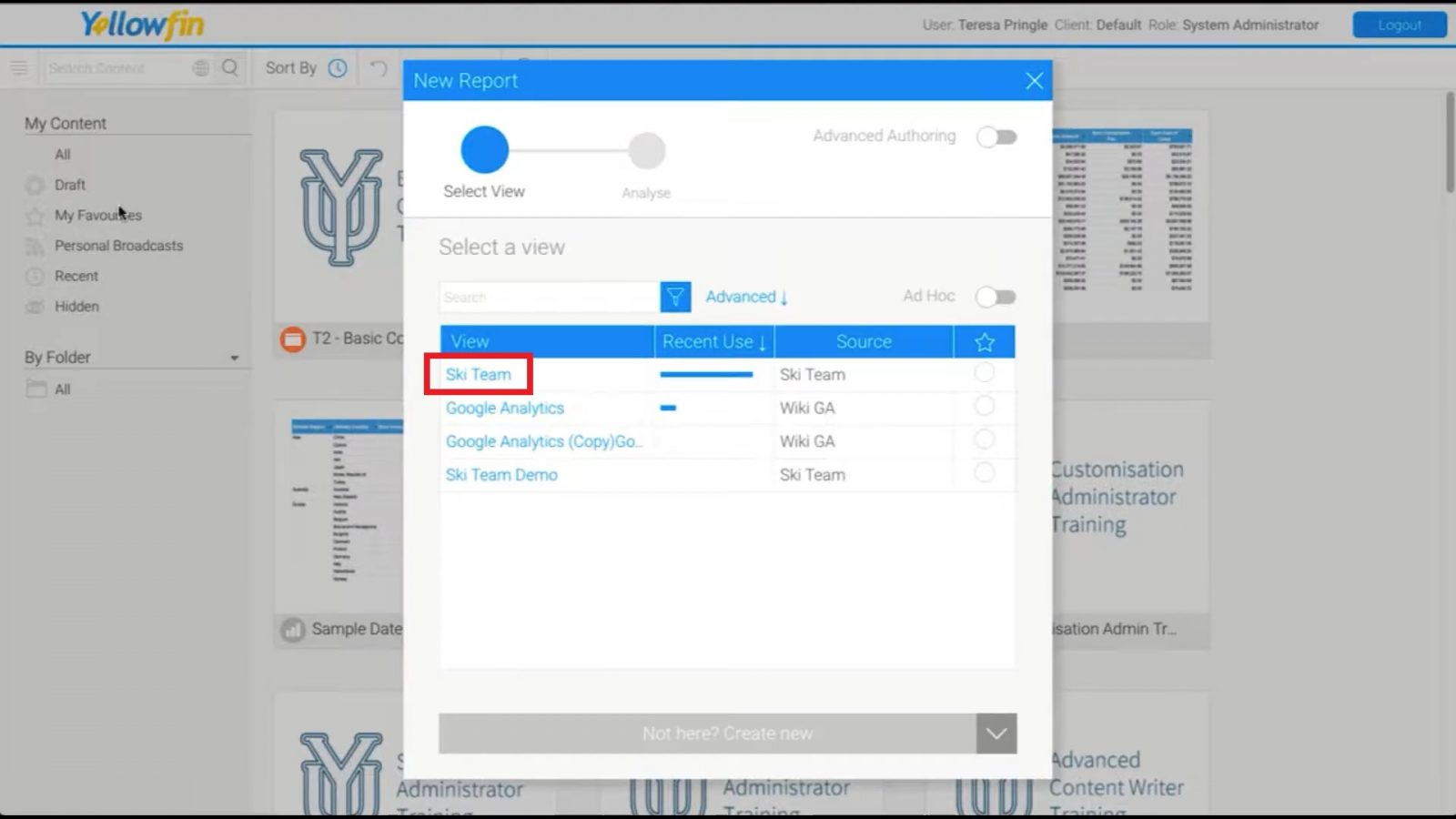
In Yellowfin BI, this functionality is called a 'View'. Built by developers, a View hides all the complicated table joins and raw data complexity, presenting your team with a clean, pre-defined dataset. It’s built on the idea that data should be easy to use. This empowers you to present data sets using a specific format or style, and focus on the insights that matter most to your dashboard audience, without needing to be database experts.
Full guide: Yellowfin Views - Overview
5. Sharing data sets: Collaborative BI
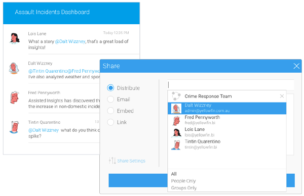
Data is most powerful when it's shared. A great BI dashboard isn't a silo, but a central hub for quick insights. But many dashboards still lack robust sharing and collaboration features, making this an overlooked but very important dashboard component.
The best BI dashboard software makes it incredibly easy to share a specific report or an entire dashboard with a colleague or a client, ensuring everyone is on the same page. This collaborative BI capability prevents data silos, improves data quality and communication, and helps your team align on a shared understanding of performance.
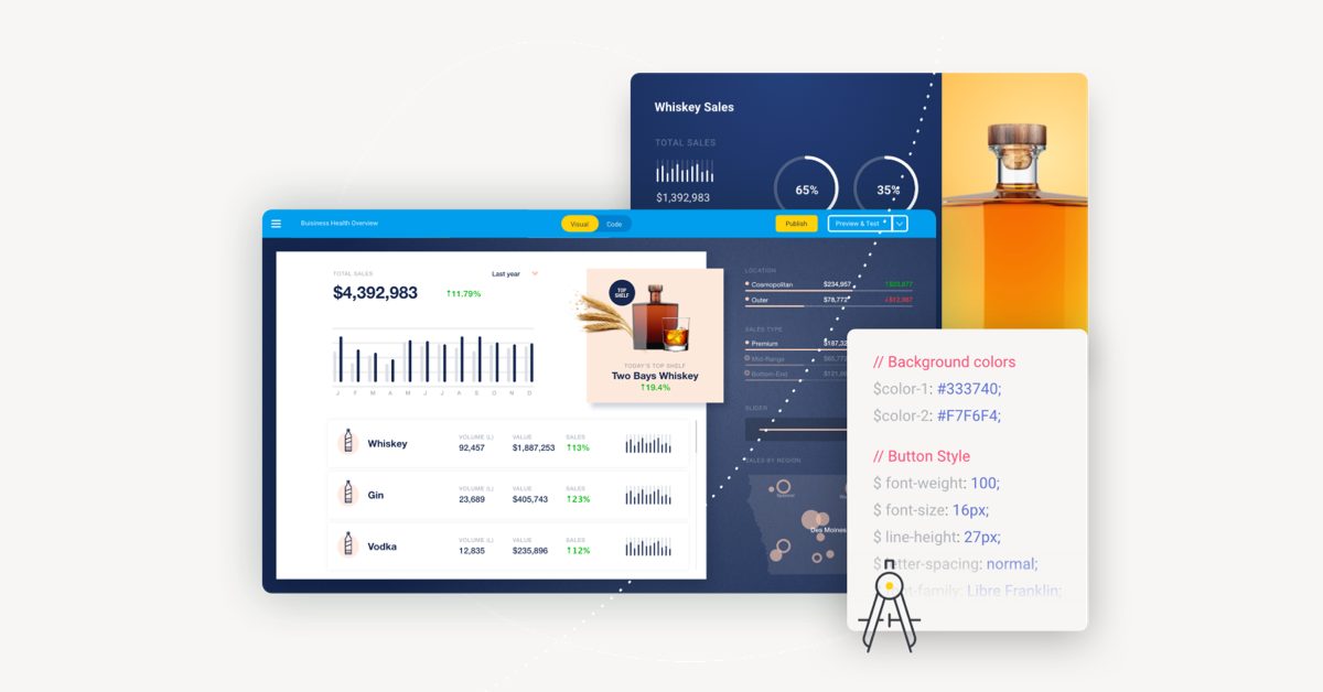
Not all vendors support collaboration and share options, so be sure to vet solutions accordingly; pictured above is Yellowfin's in-built share options for BI dashboards and reports, which also includes native and automated distribution functionality.
Related reading: What is Yellowfin Broadcast?
6. Dashboard tabs
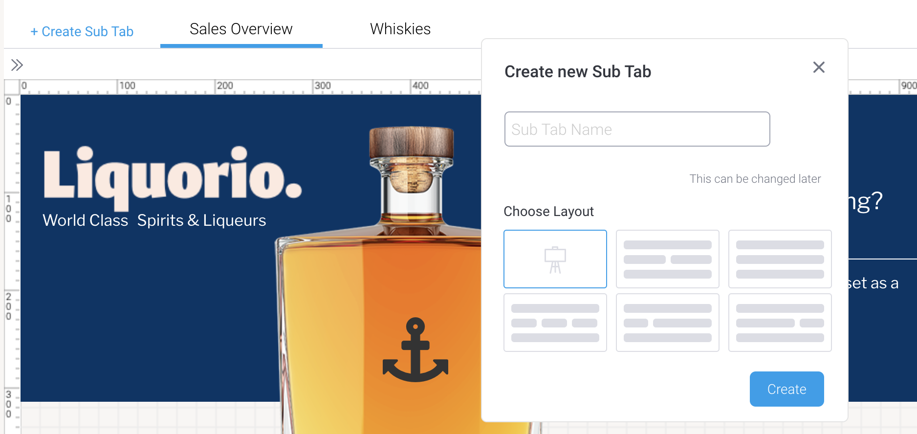
No one wants to feel lost in a dashboard that's too big and unwieldy.
Dashboard tabs are a simple but powerful feature that neatens the presentation and shows you respect your users' time by grouping related information into distinct sections. Tabs create a clean and logical flow that allows users to quickly and easily navigate different insights, such as sales performance, marketing analytics, and so on, without trying to find metrics on one crowded page.
Tabs are a key dashboard feature that makes things feel more intuitive and easy to use, but only some business intelligence solutions support this functionality; pictured above is the Yellowfin dashboard sub-tab interface.
7. Goal setting: Dashboards with purpose
An effective dashboard begins with a clear purpose. By identifying the key questions your audience needs to answer, you can ensure every element provides focused insights, not just more data.
A great approach is to consider who the dashboard is for and what decisions they need to make. You can guide your design using the SMART framework:
- Specific: Targets a particular area for improvement (e.g., "increase customer retention") by surfacing the relevant data, like customer engagement metrics.
- Measurable: Uses quantifiable metrics with a clear target (e.g., "reduce customer churn by 5%") by visually tracking progress against that goal.
- Accurate: Selects data that is relevant and timely to the dashboard’s purpose, to avoid excessive data that can overwhelm users and dilute the value of key metrics.
- Actionable: Provides insights that allow users to take a clear next step, moving beyond static numbers to drive specific business decisions.
Aligning your dashboard with specific goals transforms it from a static display into a powerful tool that drives action and helps users feel in control.

What are the most common dashboard design mistakes to avoid?
We’ve all seen a dashboard that’s cluttered and overwhelming. It’s tempting to include everything, but sometimes, less is more.
A common dashboard design mistake to avoid is designing without a clear goal. This often leads to an overcrowded dashboard that makes it difficult for users to find what they need. A good rule of thumb is to avoid anything that doesn't directly support the dashboard's purpose - irrelevant information and unnecessary graphics just add noise.
Other mistakes to avoid include:
Lack of cross-device responsiveness: Limiting your team's ability to access insights on the go.
Skipping user testing: Missing small usability issues that can make a big difference.
Using static data: Leading to poor decisions because the information is outdated.
What advantages do BI dashboards bring to businesses?
After all your hard work, a well-designed dashboard delivers incredible value.
By transforming complex data into simple visuals, dashboards help everyone make faster, more confident decisions and reduce manual errors. They also foster collaboration by aligning teams around shared insights and boost efficiency by identifying bottlenecks.
Read the full list of benefits: 15 Benefits of BI Dashboards
What are the types of BI dashboards?
Based on what a business requires, there are four main types of BI dashboards designed to help different people in your organization:
Strategic: For executives, offering high-level insights and essential dashboard items for long-term planning.
Operational: For managers, providing real-time data to support daily tasks.
Analytical: For analysts, allowing them to explore data and pinpoint root causes.
Tactical: For mid-level managers, helping them monitor departmental performance and align resources with company goals.
By selecting the right dashboard type (following our linked guide), you can ensure every dashboard user gets the precise data they need to drive decision-making.
Putting it all together
Building an effective BI dashboard can feel like a big project, a bit like trying to navigate a new city without a map. But if you focus on a few key things as we outline in our guide, it gets a lot easier.
By taking the time to understand your users, you're essentially learning their destination, so you can point them in the right direction. When you choose the right dashboard components, you're giving them the tools they need to get there quickly.
What is frequently asked questions?
1. What are the 3 layers of dashboards?
The three layers of dashboards are data layer, logic layer, and presentation layer, each responsible for handling data, analysis, and user interface, respectively.
2. Why is user customization important in BI dashboards?
User customization ensures dashboards are tailored to individual roles, improving relevance, usability, and decision-making efficiency.
3. How can data accuracy and integrity be maintained in BI dashboards?
By integrating real-time data sources, applying validation rules, and implementing strict data governance practices.
4. What makes a BI dashboard effective in 2026?
An effective BI dashboard in 2026 is focused, interactive, goal-driven, and easy to understand. It balances visual clarity with depth, allowing users to explore data, identify insights quickly, and take action without complexity.
5. What are the most important components of a BI dashboard?
Key BI dashboard components include data visualization, intuitive layout, global filters, customizable views, collaboration tools, dashboard tabs, and goal tracking. Together, these elements ensure dashboards are usable and actionable.
6. How do global filters improve BI dashboard usability?
Global filters allow users to instantly customize dashboards by time period, region, customer, or metric. This helps users drill into relevant data without creating multiple dashboards or reports.
7. Why is dashboard layout critical for decision-making?
A well-structured dashboard layout ensures users can understand insights at a glance. Poor layouts increase cognitive load, while clear hierarchy, spacing, and grouping guide users toward the most important metrics first.
8. How do BI dashboards support collaboration across teams?
Modern BI dashboards support collaboration by enabling users to share dashboards, reports, and insights easily. This ensures teams work from the same data, reducing silos and improving alignment.
9. What role does goal setting play in BI dashboards?
Goal setting gives dashboards purpose. When metrics are aligned to specific, measurable objectives, dashboards move beyond reporting and actively support performance tracking and decision-making.
10. How do dashboard tabs improve the user experience?
Dashboard tabs organize related metrics into logical sections, preventing overcrowding. They help users navigate large dashboards efficiently and focus on relevant insights without distraction.
11. What are common mistakes to avoid when building BI dashboards?
Common mistakes include overcrowding dashboards with unnecessary metrics, lacking a clear goal, ignoring mobile responsiveness, using static data, and skipping user testing before rollout.
Ready to create a good, effective BI dashboard?
We know that building a great dashboard can feel like a big project. That’s why Yellowfin BI is designed to make it easy to embed modern, intuitive dashboards directly into your software - see for yourself with our free demo.