Best Practice Guide
The ultimate step-by-step guide for analytic content creators.
 Best Practice Guide
  Dashboard Gallery
  Data Storytelling Gallery
 Layout, Grouping and Hierarchy
-
The unique features of Yellowfin Canvas ensure complete and pixel perfect design capability. This is particularly useful when planning and designing the layout of dashboards to ensure that the data displayed is easily viewed and understood by the end user so they can establish the insights they need to make effective, data-led decisions.
-
Choose the right dashboard layout
By understanding the end-user, it is vitally important that the right dashboard type is designed to align with the end-user needs and analytic capability. This is discussed in more detail here.
For example, there is no point in creating an operational style dashboard with detailed reports and charts for a senior manager who may only be needing top-level KPI style numbers. The opposite of course applies when delivering a dashboard to someone that has very detailed and operational needs. A KPI dashboard with limited detail will prove to be a frustrating experience for someone with more in-the-moment needs. As well as they may be designed, the wrong dashboard for the wrong use case will nearly always result in a low ongoing adoption by the intended audience.
-
Group related data to tell an integrated story
Quite often, certain charts are best interpreted when seen in context together. By using graphic elements such as boxes, lines and shapes, group-related data or visualizations. This will help the end-user by giving visual cues on related data and save them from having to individually work out relationships between charts.
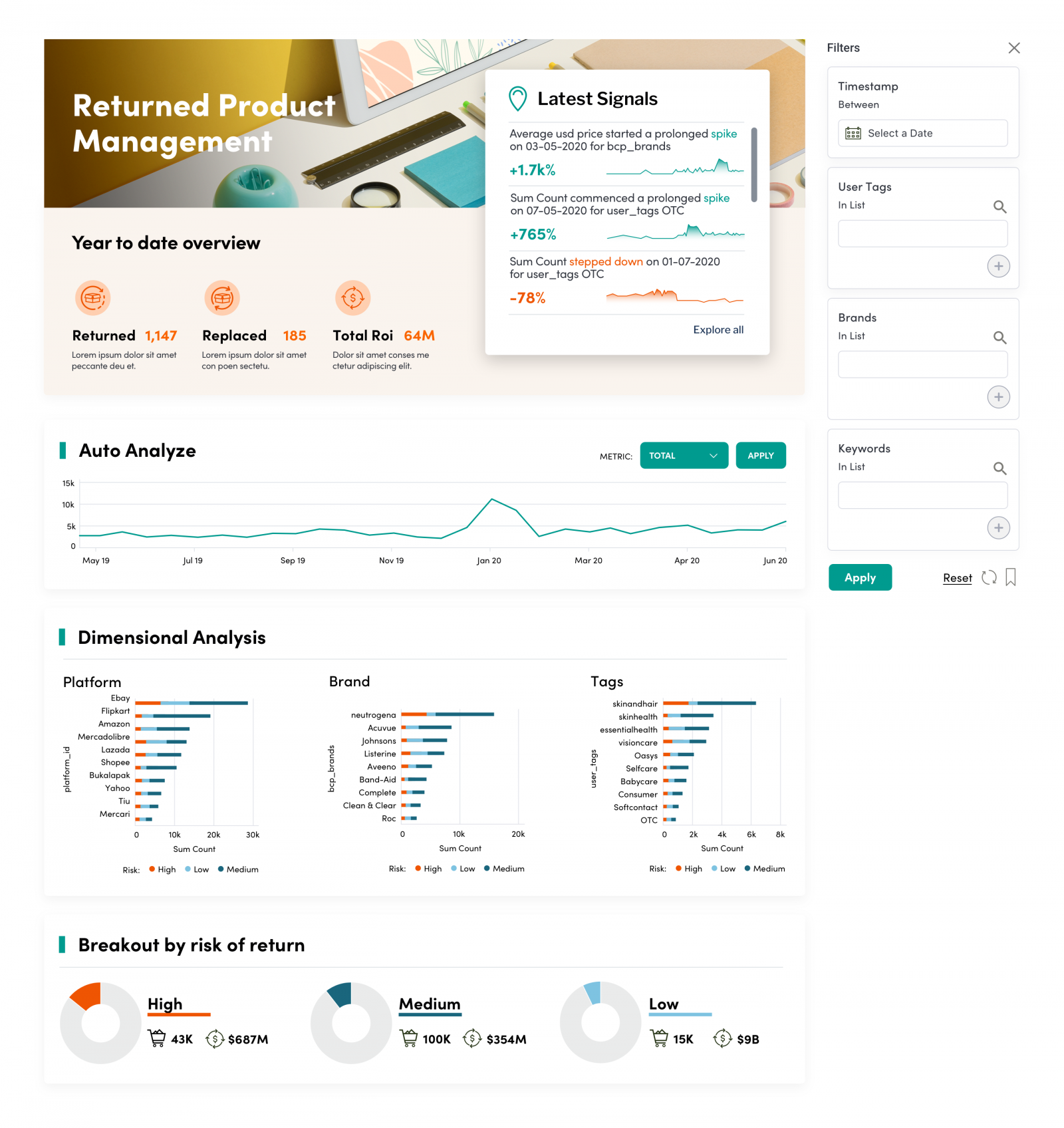
Use these groupings to guide the user to different parts of the analytics experience such as grouping KPI charts or charts that are telling different parts of the same story. With yellowfin, you also have the ability to have sub-tabs (or dashboards within dashboards) and these can be used to break complex and varying data up into more manageable segments.
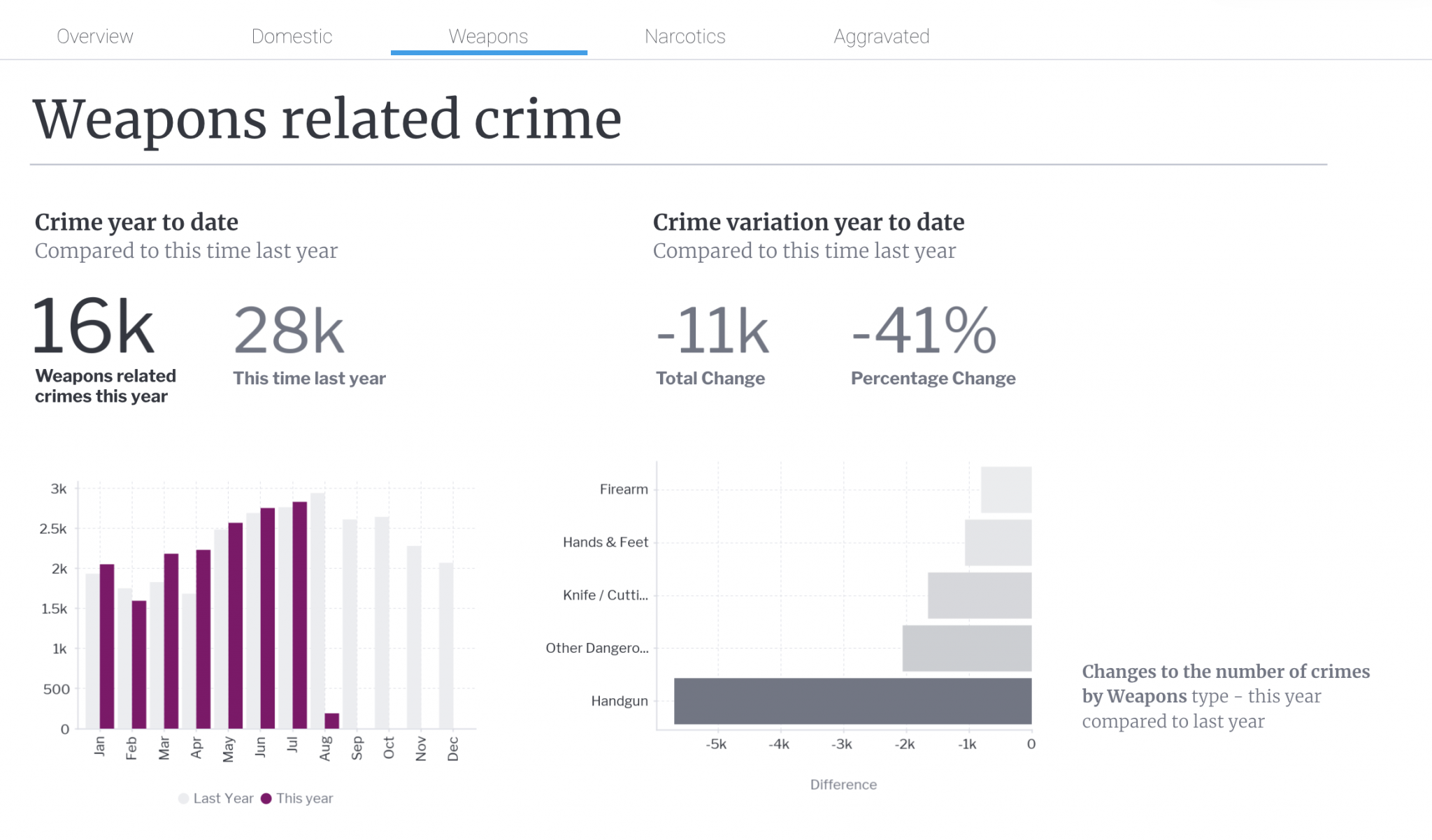
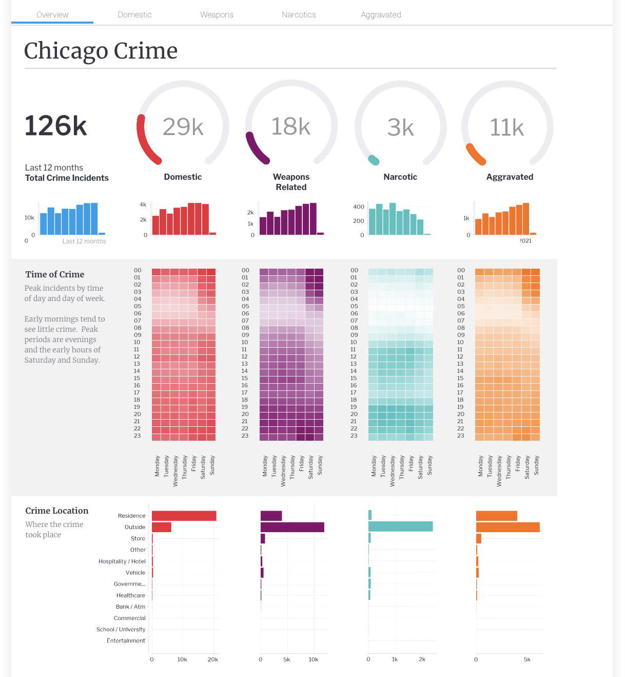
The Chicago crime dashboard displays how sub-tabs can be used. In this instance, different crime types are represented with greater depth on different sub-tabs, with the opening subtab being more of a summary or overview. This enables the user to get a top-level KPI level look at the data and then navigate to separate areas of interest on different sub-tabs using action navigation buttons.

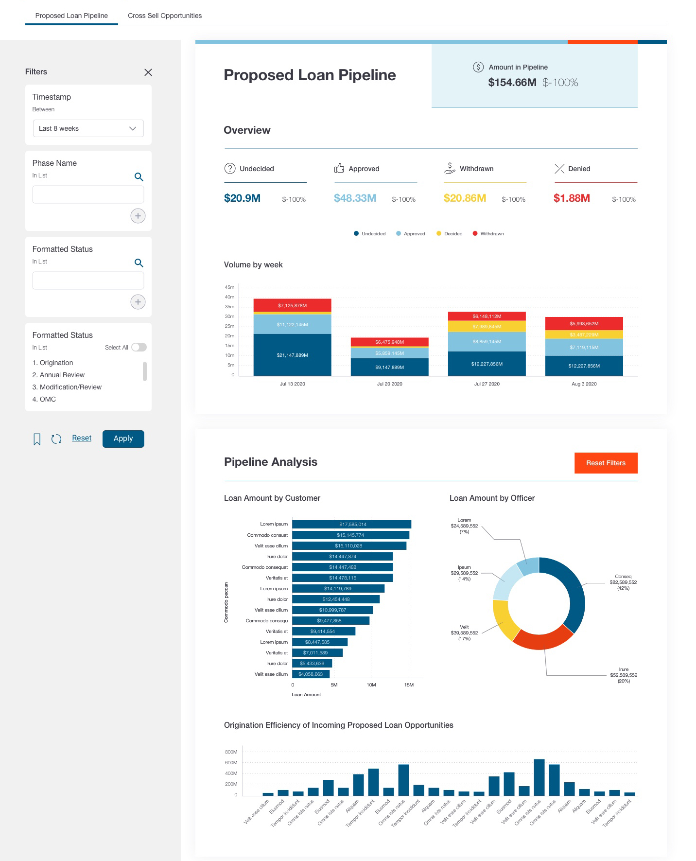
In the financial example below, white boxes and dividing lines are used to group related areas of interest. This makes a complex set of data much easier to navigate. Ultimately, use graphic elements to guide the eye from summary to more detailed analysis and reduce the cognitive load for the end-user.

In the Chicago Crime example below, the user is taken on a journey from introductory KPI dials through to more detailed overviews of each of the crime types. This is done by aligning common data and using shapes such as the grey box to divide different data scenarios and group common themes. The result is a dashboard that is easier to process, understand and use. This is also assisted by clear copy and labeling.

-
Alignment
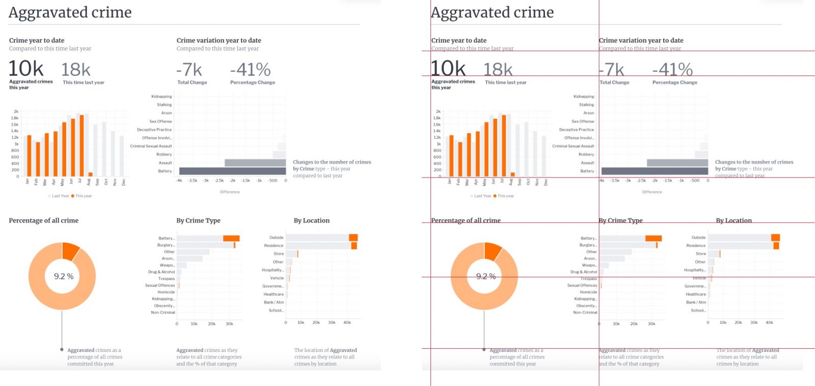
As a very simple rule, it’s best to line things up. This does not necessarily mean all components of a dashboard need to be the same size but, where possible, try creating visual alignment between multiple components. This will again lower the effort required for the user to visually navigate through the dashboard. Use alignment to help contribute to hierarchy knowing that the human eye tends to start top left and move towards the bottom right. Consider visually aligning chart headers, charts, blocks of text as shown in the example below. A considered, structured alignment will also look and feel cleaner and help convey an overall sense of simplicity.

-
Breaking the grid
Yellowfin Canvas allows elements to go anywhere on a page and therefore enables pre-defined grids to be broken. On very rare occasions, it may help to break the grid in order to make certain information pop. This could work well on ensuring the component is first seen or not missed by the end users and could include KPI dials or an automation widget as shown in the example below. In this case, small changes in data are presented as Signals and these need to be seen. For this reason, the Signals ‘breaks the grid’ and pops into the foreground.