TL;DR
Data storytelling turns charts into compelling narratives that drive action. Yellowfin pairs AI-generated insights with narrative features so any user can create stories that explain the “why” behind the numbers. This boosts engagement, understanding, and decision quality across teams.
Stories are how humans make sense of complexity. We remember cause and effect, not pie charts. We respond to tension, not tooltips. And yet, in most businesses, “data storytelling” still means downloading a CSV, sending screenshots in Slack, or fumbling through a slide deck minutes before the meeting.
The promise was beautiful. Democratize data. Make every decision backed by fact, not gut. Put analytics in the hands of the many, not the few. But somewhere along the way, the only people truly empowered were the data experts or analysts who knew how to write SQL in their sleep.
The rest? They export to Excel, make a pie chart, and call it a day.
At Yellowfin, we believe modern data storytelling tools need to offer more than fancy charts. A true data story is about finding the narrative thread that gives your data meaning and makes people care. To turn moments of insight into movements of actions - with a little help from AI.
Why is data storytelling still so damn difficult?
Data storytelling is the craft of translating raw numbers into meaning. It’s how you connect the dots between what happened and what needs to happen next.
But the process? Still brutally manual. You need to track down the data, clean it, dig for insight, shape it into a chart, and then wrap it in a narrative that your audience can follow without tuning out. Most people don’t have the time or training to do all that.
And most business intelligence (BI) and analytics solutions don’t help, either. They drop you in the cockpit of a 747 when all you wanted was to check the weather. You get too many options, too little context, and zero help with the one thing that matters: what does this data mean, and why should anyone care?
Even when you do get a clean chart, there’s no guarantee it tells a story that you can read easily. A spike in Q3 revenue might be good, or it might be a fluke. A drop in engagement might be bad, or it might be a seasonal dip. The chart on its own won’t tell you. And unless you have a full-time analyst on speed dial, you’re left to make up the story yourself.
That’s where most data stories die: in the space between what happened and what it means.
This is why the adoption of data storytelling remains quite low. With studies like the annual BARC report showing that, on average, only about 25% of analytics users are actually leveraging BI tools, we need to make valuable analytics features like data storytelling more accessible.
It’s a shift that many industry experts saw coming. In fact, Gartner predicted that by the end of 2025, data stories, not dashboards, will be the most common way people consume analytics.
More in our free whitepaper: Data Storytelling - The Power of Using Narrative to Influence and Engage the Business
The challenges of creating a data-led story
While BI tools are finally starting to catch up to the benefits of data storytelling by offering built-in data story editors, its full potential will continue to be unrealized unless vendors address the following recurring challenges.
Challenge #1: Data literacy
Think of the data story format as a compass. It’s a tool that precisely orients us through a sea of information to spot opportunities, and helps us confidently choose the best route forward with data-backed conviction.
However, not everyone can read a compass, and the same goes for creating a data story. A data storyteller needs a level of data literacy to be able to interpret data, find insights, and translate their discoveries into a persuasive story that non-technical audiences can understand.
This is a difficult task, and if a BI solution doesn’t offer the right tools to help streamline this process, data storytelling will continue to be limited to a small group of analysts.
Challenge #2: Human bias
Even with a compass in hand, an explorer's personal biases or assumptions can lead them astray.
The reality is personal perspectives shape which insights seem important. Marketing focuses on acquisition metrics while support emphasizes satisfaction scores. Confirmation bias makes people cherry-pick data that supports existing beliefs while ignoring contradictory evidence.
Avoiding these pitfalls requires experience and awareness that not everyone possesses, which can make quality data storytelling a slow and sporadic practice and lead to it being undervalued.
Challenge #3: Scalability
A single storyteller's voice can only reach so many people, and the same applies to data storytelling.
Manual analysis doesn't scale. A single analyst can only examine limited datasets and create a few data stories per month. Meanwhile, businesses generate terabytes of data daily. The gap between available data and analyzed insights grows constantly.
Overcoming these barriers means finding new ways to ensure data narratives are easier to build and remain faithful to the data, regardless of who's telling the tale - and Yellowfin does just that.
The business case for automated, AI-powered data storytelling
In the same study, Gartner predicted that by 2025, 75% of all data stories will be generated using augmented analytics, enhanced tools that leverage artificial intelligence and machine learning to streamline data analysis, and solve previous challenges by:
- Reducing the need for data literacy - Augmented analytics takes the pressure off end-users by automating complex processes, such as analyzing datasets. AI removes the need for a high level of data literacy by automatically generating stories based on problems and opportunities it detects in the data.
- Overcoming bias - Using AI and machine learning, data can be analyzed without human bias. By extending this to data storytelling, it can assist in generating helpful narratives that might be missed or undervalued when created by people.
- Scaling with AI - AI-powered automation can be used to generate data stories at scale, freeing up analysts and professionals to focus on their core tasks.
These automated benefits are exactly what Yellowfin AI provides for your users.
Yellowfin has integrated powerful technologies like automated business monitoring and natural language query into the core of our platform to directly guide your analytics end-users through the data exploration process.
Based on user feedback, we've extended this thinking to our in-built data storytelling tools, Yellowfin Stories and Yellowfin Present: If you can't or don't have time to create a data-driven story, why not have AI do it for you?
The best part? Yellowfin is fully embeddable into your software product, bringing AI-driven, embedded analytics to your users without distracting from your UX.

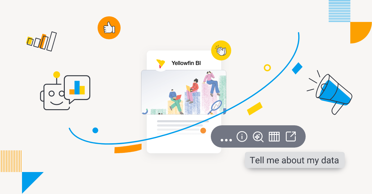
1. Start your data narrative with Story Assistant
Need some inspiration for your data story?
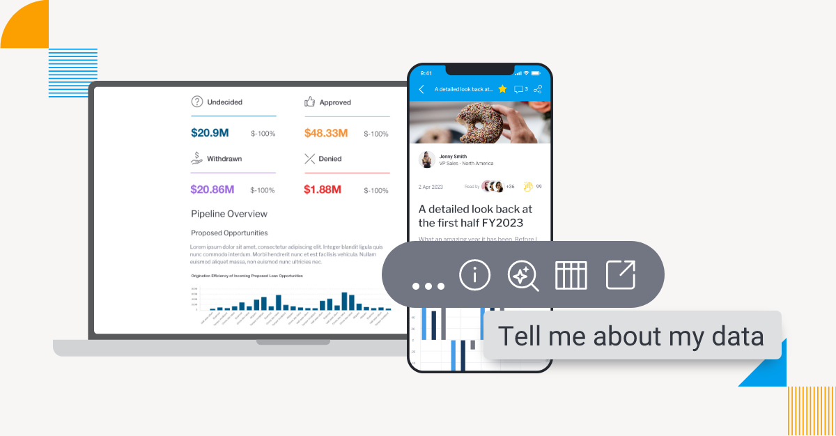
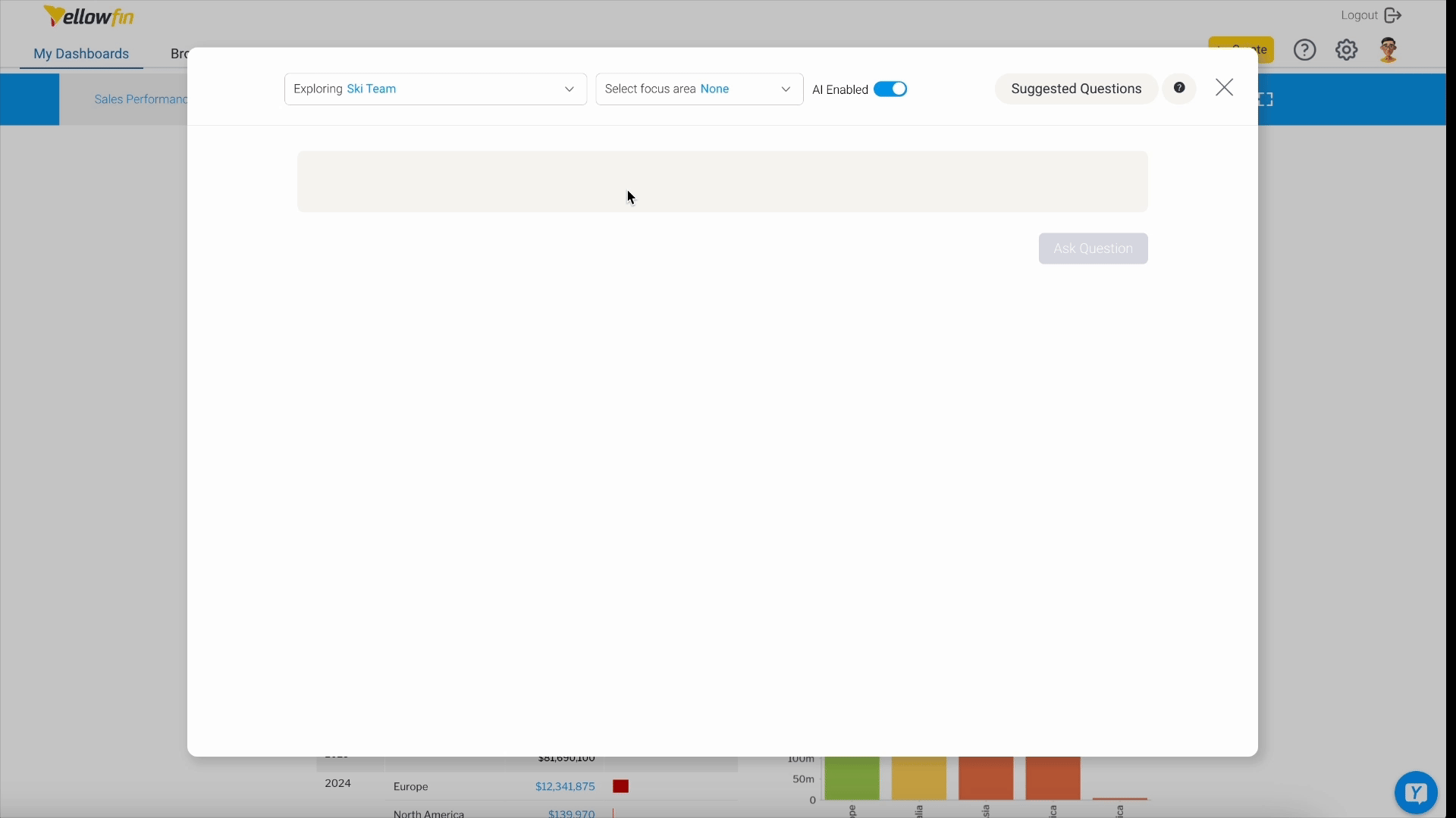
Tell Me About My Data (TMAMD) is an AI-powered feature introduced in Yellowfin 9.16 that lets you generate helpful context about the data within your dashboard, report or chart with one click.
TMAMD works by sending your data's metadata (not the raw data itself) to external large language models for analysis. Yellowfin supports connections to OpenAI, Google Gemini, Anthropic Claude, and Azure OpenAI, allowing you to choose the AI provider that best fits your organization's requirements.
In seconds, you get detailed explanations in plain language alongside supporting visualizations that anyone can understand and use, from analysts to business professionals. These contextual insights reduce manual data exploration and integrate directly into Yellowfin Stories through the Story Assistant for AI-powered, automated data storytelling.
Now, starting a new data story is as simple as clicking the magnifying glass icon in the Story editor to pull those AI insights into your presentation. Then you can begin quickly turning a blank canvas into a rich data-led narrative that inspires action.
No need to spend time away from your core tasks - Yellowfin AI brings the data story to you.
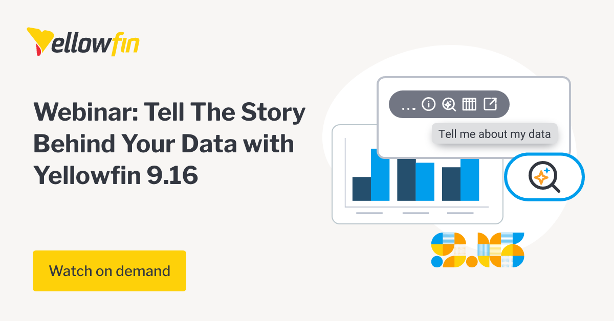
Watch our on-demand AI webinar: Tell the Story Behind your Data with Yellowfin 9.16
2. Ask the right questions with AI NLQ
Have a specific question about your data?
Yellowfin AI NLQ enables any user to type a question into a search bar using free text, and get their question automatically structured and answered via your preferred AI model. The results, like TMAMD, can then be quickly shared or imported into a dashboard or Yellowfin Story.
Our natural language query tool is designed to help both experts and non-technical analytics users quickly find a starting point for their analysis (and data stories).
But what if you don’t even know what to ask? That is where our Suggested Questions module comes in, generating a list of relevant queries for you.
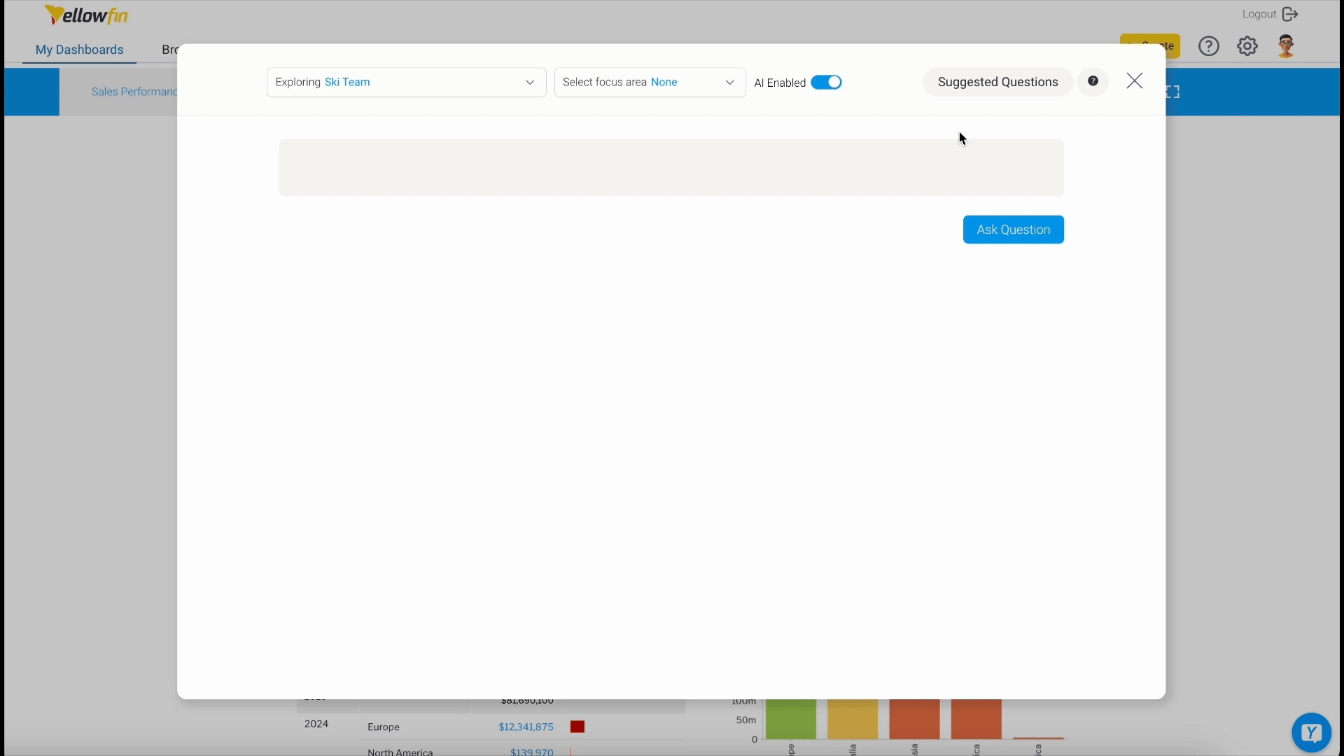
Clicking on any suggestion will generate a helpful chart or graph that presents the answer in a best practice chart or graph, which can quickly be used to support the beginnings of your data story.
3. Monitor for significant changes automatically with Signals
Manual data monitoring doesn't scale. You can't check every metric daily, and important changes slip through while you're focused elsewhere.
Yellowfin Signals continuously analyzes your data for statistically significant changes, patterns, and anomalies. When something meaningful happens (a conversion rate drops, customer acquisition costs spike, or user engagement shifts) Signals alerts you immediately with context.
This automated approach eliminates the bias and time constraints of manual monitoring. You catch problems and opportunities as they emerge, not weeks later during quarterly reviews. Important discoveries that might otherwise go unnoticed become immediate inputs for your data stories.
Data storytelling doesn't need to be complicated
With the right tools, anyone can explore data, find meaning, and share it in a way others understand. Yellowfin AI helps simplify that process with guided insights, automated monitoring, and built-in storytelling features that support everyday decisions.
Try it out and see how much easier it can be to share what your data is really saying.
Next steps: Explore Yellowfin Stories & Present
Don’t believe us? See Yellowfin’s data storytelling tools in action for yourself.