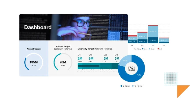
TL;DR
From bar charts to heatmaps to waterfalls, data visualizations reveal patterns and trends at a glance. Choosing the right chart type ensures clarity, accuracy, and stronger communication. Great data storytelling depends on visuals that match the audience’s needs and context. Yellowfin provides every core visualization plus advanced options, so teams can explore data their way.
Try Yellowfin free
Data visualization helps people comprehend and attain insight into big data. It represents complex data in visually interesting ways that assist in our understanding, and paves the way for a greater link between the provided raw data, and our overall engagement with it.
Nowadays, we accumulate data in ever-increasing sizes. We need an intelligent way to understand vast volumes of information. In analytics, we often use different types of data visualization tools to convey complex data. Do you ever wonder how useful it really is?
In this blog, we cover the top 10 essential types of data visualization you need to have in your solution today, and which general use cases they best fit - with illustrative examples.
What are the prevalent techniques of data visualization?
Firstly, data visualization helps businesses dive deeper into data exploration, analyze hypotheses, and communicate results effectively. Moreover, it helps people detect patterns, catch trends, and find correlations in data that numbers alone can't convey.
Are you overwhelmed by a vast landscape of data visualizations and unsure of how to choose the best data visualization for reporting? We will help you by listing their details. You can also read our guide on how to choose the right chart type for good data visualization if you're further along your journey.
Let us take you on a whirlwind tour of popular data visualization techniques.
1) Line Graph
An example of a line graph, created in Yellowfin.
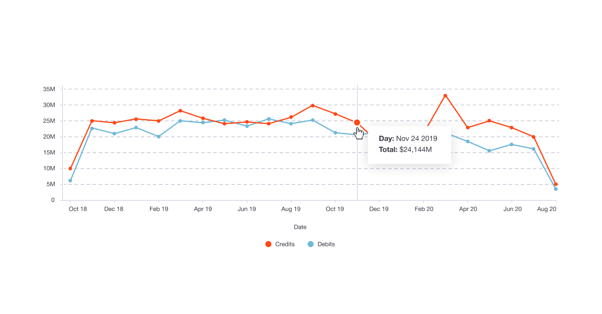
A line graph demonstrates the values of different categories over time. Specifically, it shows changes in value across continuous measurements of items. It illustrates an overall trend leaving no room for confusion. That's why people use it for several business use cases.
Overall trends and different types of graphs help business leaders forecast projections for future outcomes. When the line moves up, it often shows positive changes. On the other hand, the movement of the line going down shows negative changes. It proves handy when you explicitly want to show trends for multiple categories over the same course of time.
When to use line charts?
- While relating different groups with each other.
- Demonstrating progression
- Creating project timelines
- Navigating production cycle
2) Column Chart

An example of a column chart, created in Yellowfin.
One data visualization technique we frequently see is a column chart. People use it to compare different values side by side. Using it is a great idea when you want to pay attention to total figures instead of the shape of a trend.
A column chart is quite popular as it is simple to understand and can compare diverse kinds of data. It often shows the time on the horizontal axis, while the vertical axis displays values. Note that a column and line chart combination is a good choice when showing figures and an overall trend.
When to use column charts?
- While comparing data across different categories
- Displaying rankings and order in a dataset
- Keep track of ongoing trends
3) Bar Graph

An example of two comparative bar graphs, created in Yellowfin.
Another data visualization method is a bar graph, also called bar chart, that indicates the values by the length of the bar. The other axis, meanwhile, shows the categories that are supposed to be compared. We can draw a bar chart both vertically and horizontally. Horizontal bar charts are a good choice when plotting multiple bars.
At one glance, a bar chart helps us contrast data sets from several groups while exhibiting the relationship between two axes. Different types of data visualization bar charts also show changes in data over time.
When to use bar charts?
- Compare quantities across different categories
- Highlight differences or trends over time when categories are discrete
- Suitable for visualizing data with limited categories for easy interpretation
4) Pie Chart
Another common data visualization technique is pie charts. As a circular graph, it shows data of relative sizes through pie slices. It serves various application purposes, including showing percentages of customer types, product revenues, and country profits. It is simple to grasp, and for this reason, people employ it to demonstrate relative sizes.
Pie charts work well to display percentages as they show each element as part of a whole. The whole pie, nevertheless, shows one hundred percent of the total. The pie slices symbolize different parts of the pie chart. However, it is not a good choice when you want to display complex information for a thorough explanation. In this case, you need to pick up some other types of data visualization charts.
When to use pie charts?
- Display proportions or percentages of a whole
- Ideal for data with fewer segments to avoid clutter
- Use when you want to emphasize one part's contribution to the whole
5) Funnel Chart

An example of a funnel chart, created in Yellowfin.
Amongst different types of data visualization charts, a funnel chart is considered the best while working with multiple business contexts. It helps track users in a pipeline flow; for example, for sales, it specifically shows the decreasing values as customers go through the sales funnel.
The funnel width displays the number of users that make their way at each step. It shows a linear process comprising sequential stages and a swift picture of where people drop out of the process.
When to use funnel charts?
- Visualize data that flows through sequential stages (e.g., sales pipeline, user journey)
- Identify drop-offs or bottlenecks in processes
- Best for showcasing data that narrows down through steps
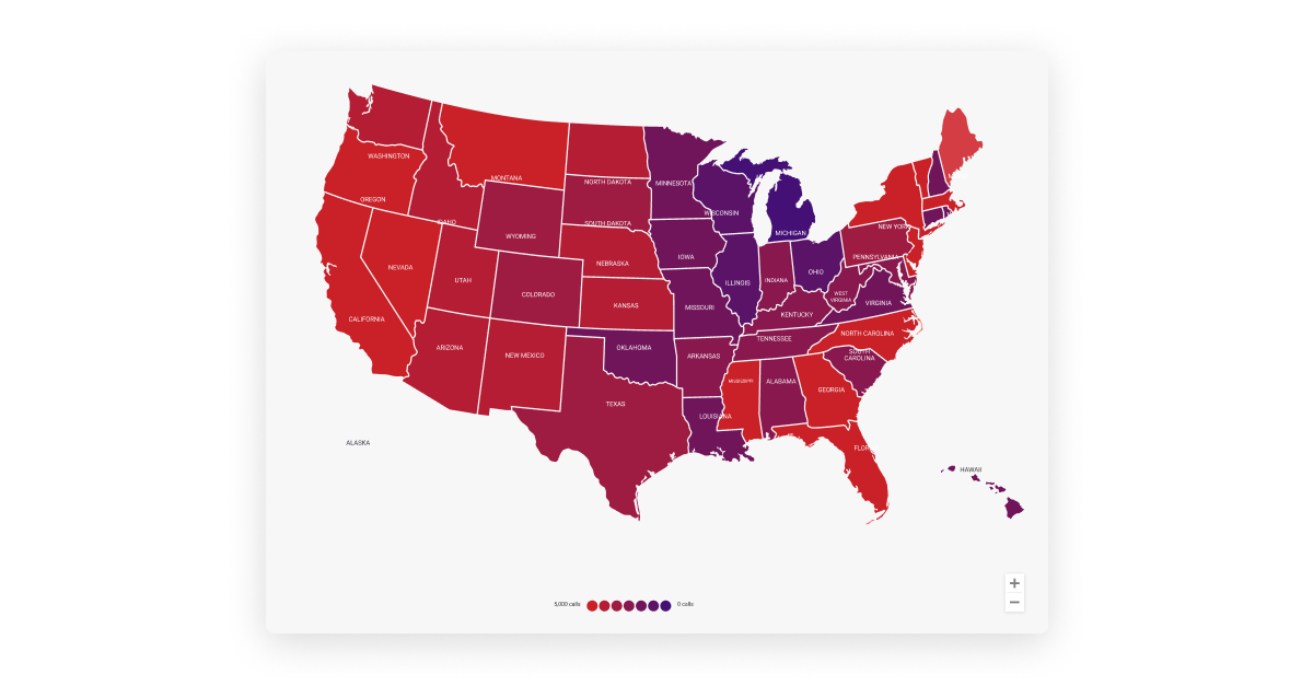
6) Map-based Plot
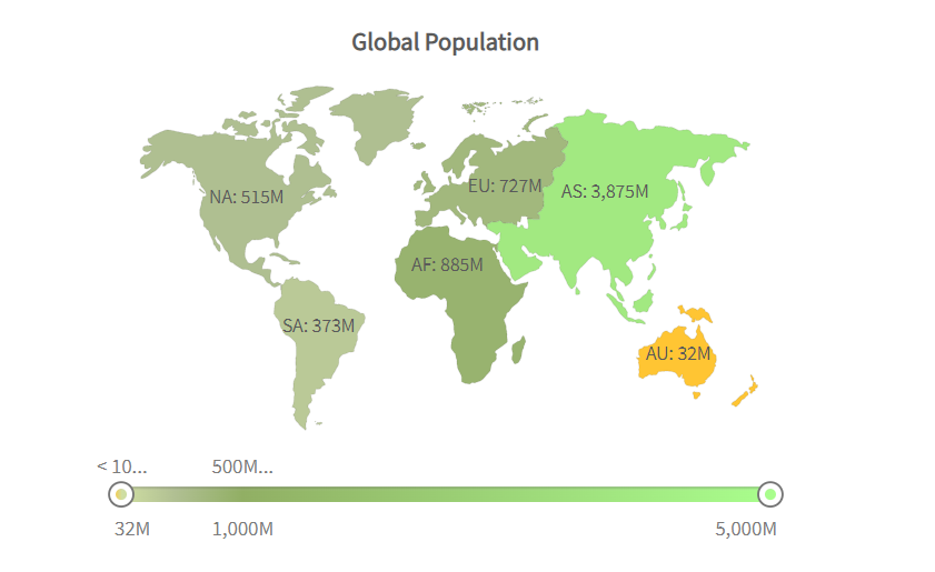
Map-based plot is another type of data visualization technique that helps show geographically related data. It is a useful method when you want to plot a dataset that corresponds to actual geographic locations. Instead of plotting values, it shows value by filling regions with color on a map.
Its data expression is crystal clear, intuitive, and presents data in the form of maps. Readers can read the distribution of data in each region, so it brings convenience to make better decisions. The aesthetic element is another significant reason to use it. It transforms boring content into eye-catching content when you equip it with an aesthetically-appealing map.
When to use map-based plots?
- Present geographically distributed data
- Compare values across regions or countries
- Use for spatial analysis or when location context is essential
7) Heat Map/Heat Grid
An example of a heatmap, created in Yellowfin.
Another type of data visualization graph that has been widely talked about is a heat map, also known as a heat grid. The heat map displays values on two variables of interest. While the axis variable can turn out to be categorical or numeric, the grid comes into shape by splitting each variable into several levels. It shows differences in data in the form of color variations.
The values of grid cells on heat grids are colored, with darker colors often indicating higher values. Colors help communicate values to the viewer so they can identify trends quicker. Hence, interpreting a heatmap is easy.
When to use heat map?
- Show patterns or intensity of data using color gradients
- Suitable for large datasets to identify clusters, trends, or anomalies
- Commonly used for correlation matrices, website activity, or resource usage
8) Waterfall Chart

An example of a waterfall chart, created in Yellowfin.
A waterfall chart visually shows the overall growth or decline in value between two specified points. Its goal is to show how a value has risen or declined over time. Amongst all types of data visualization tools, this one is considered best for understanding the final outcome.
It dis-aggregates and visualizes different distinctive components that contribute to the net change instead of reflecting starting and ending values in two bars.
When to use waterfall chart?
- Visualize cumulative effects of positive and negative values
- Best for understanding how initial values lead to a final outcome (e.g., profit/loss analysis)
- Highlight contributions or impacts of components in a sequence
9) Scatter Plot

An example of a scatter plot, created in Yellowfin.
Another data visualization technique is a scatter plot. There are plenty of data visualization examples that show the versatility of scatter plots in terms of visuals and use cases. Here, we will discuss an example with circles to showcase how data is portrayed in this type of technique. While the circle color presents categories of data, the circle size represents the volume of the data. We represent the data for two variables by points against the vertical and horizontal axis.
The purpose of a scatter plot is to show the relationship between the provided variables, which, in turn, helps identify trends or correlations in data. The usefulness of scatter plots emerges when the data is significantly large, as identification of trends is possible only in the presence of extensive data points.
When to use scatter plot?
- Display relationships or correlations between two variables
- It is used to identify trends, outliers, or clusters in data
- Effective for comparing large datasets or quantitative data
10) Pictogram Chart
Regarding data visualizations, a pictogram is another type that uses icons and images to represent data. It presents simple data aesthetically engagingly, using repeated icons to show simple data.
Apart from making the data engaging, it also proves handy in situations when cultural differences emerge as a hurdle to making the audience understand the data. Remember that a pictogram is not a good choice for large data sets as it becomes difficult to count.
When to use pictogram chart?
- Represent data with icons or images for better visual impact
- Best for simplifying data for non-technical audiences
- Use when you want to make the data visually engaging or easy to understand
What are other options for data visualization?
Data visualization is clearly a powerful tool that may help you become a better communicator in your reports and business intelligence dashboards.
Although the techniques discussed above are some of the most popular, there are many more types of data visualization available to use.
Other methods of visualizing information include:
Correlation Matrix
A correlation matrix is a grid showcasing relationships between multiple variables. Each cell in the matrix represents the correlation coefficient, often visualized with a color gradient. It's a popular choice amongst other data visualization types for analyzing patterns and relationships. It is one of the most ideal methods for identifying positive or negative correlations in complex datasets.
Bubble Charts
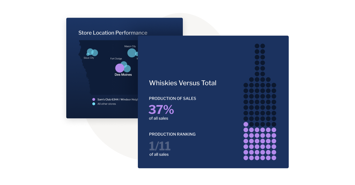
An example of a bubble chart, created in Yellowfin.
Bubble charts are scatter plots enhanced with bubbles of varying sizes to represent additional data dimensions. These types of graphs are great for comparing three variables at once. Their ability to convey relationships, trends, and proportions in a visually engaging way surely puts them on top amongst others. Some vendors like Yellowfin also offer GIS bubble maps which visualize geographic information system point data in the same style as bubble charts.
Cartograms
Cartograms are unique visualizations that distort geographic areas to visually represent the proportions of data, such as population density or GDP. They effectively guide viewers to focus on the relative magnitude of data across different regions by prioritizing data representation over accurate geographic representation.
Circle Views
Circle views utilize circular representations to depict data points, frequently arranged in clusters or hierarchical structures. This visualization method excels at portraying proportions and relationships within datasets. As a data visualization technique, circle views offer versatility and visual appeal, effectively presenting complex information in a concise and easily understandable format.
Network Diagrams
Network diagrams display connections between nodes (points) and edges (lines). It is an excellent method for mapping relationships in social networks, computer systems, or communication paths. Network diagrams stand out among different types of graphs for their ability to simplify complex interconnected systems.
Dendrograms
Dendrograms are tree-like diagrams that visually represent hierarchical relationships between items. These visualizations are frequently employed in fields such as clustering analysis, biology, and genealogy. They serve as prime examples of how graphs can effectively reveal nested structures within datasets.
Dot Distribution Maps
Dot distribution maps utilize dots to visually represent various phenomena' presence, density, or frequency across a geographical area. These maps excel at highlighting spatial patterns and distributions. One can simplify complex geographic data by employing visual symbols, making it easier to understand and interpret.
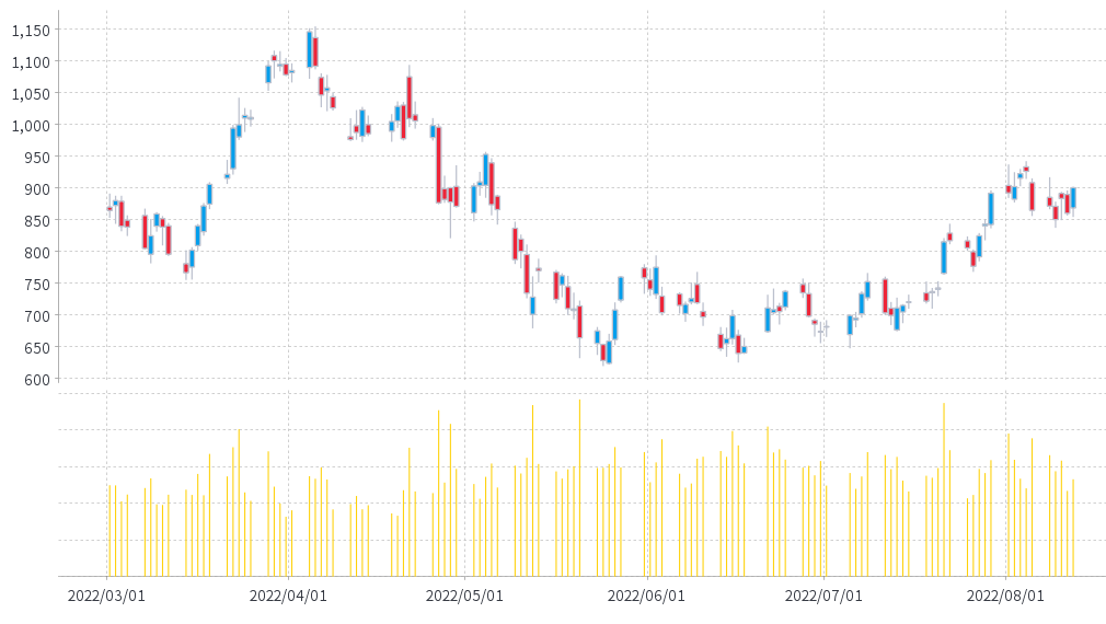
Open-High-Low-Close Charts (Candlestick Chart)
An example of a candlestick chart, created in Yellowfin.
These financial charts, commonly known as candlestick charts, are indispensable for visualizing stock market data. They effectively depict a security's opening, highest, lowest, and closing prices within a specific timeframe. Among various data visualization techniques, candlestick charts are a cornerstone of financial analysis and are a classic example of the diverse types used in the business world.
Word Clouds
Word clouds visualize text data by varying the size of words based on frequency or importance. These types of data visualization are perfect for identifying key themes in large text datasets. As one of the more artistic types, word clouds make data interpretation engaging and easy.
Polar Areas
Polar area charts utilize a circular layout to represent data proportions, similar to pie charts, but with a stronger emphasis on comparisons within categories. This visualization method is particularly effective for showcasing cyclical data trends. Polar area charts offer an innovative approach to data visualization, providing a unique and visually engaging perspective on data relationships.
Radial Trees
Radial trees are circular representations of hierarchical tree diagrams, offering a visually striking and compact alternative to traditional linear formats. These visualizations are particularly effective for displaying family trees, organizational structures, and taxonomic classifications.
Ring Charts
Ring charts, or donut charts, are pie charts with a hollow center. These types of graphs are excellent for showcasing proportions and comparisons. As a popular type of data visualization, ring charts effectively simplify complex datasets into digestible visuals.
Choropleth Maps
Choropleth maps use color shading to represent data across geographic regions. They are commonly used for demographic, economic, or political data. With the help of choropleth maps, businesses can showcase unmatched spatial data trends, aiding them to make smarter decisions.
Sankey Diagrams
Sankey diagrams display flows and relationships between entities, with line thickness proportional to the data magnitude. These types of data visualization diagrams are excellent for energy flow, budget analysis, and process mapping. Sankey diagrams are standout examples of different types of graphs for showcasing transitions.
Span Charts
Span charts effectively visualize data variability by displaying ranges or fluctuations over time. These charts are widely used in fields such as finance and environmental science to analyze trends and identify patterns. Among various data visualization techniques, span charts excel at highlighting temporal variations and identifying significant changes within datasets.
Streamgraphs
Streamgraphs are variations of stacked area charts where layers flow smoothly to represent data streams over time. They are perfect for showing changes in proportions and creating visually captivating and informative graphs.
Bullet Graphs
Bullet graphs are compact bar charts designed to compare performance against a target. They are widely used in business dashboards and are often chosen the most among other types of data visualization graphs. They are concise and highly effective for summarizing key metrics.
Treemaps
Treemaps utilize a hierarchical structure of nested rectangles to visualize the proportions of different categories within a dataset. This visualization method is particularly effective for representing large and complex datasets with multiple levels of categorization. Treemaps are a widely used data visualization technique for presenting proportional relationships in various fields, including business and research.
Wedge Stack Graphs
Wedge stack graphs utilize stacked wedges arranged in a circular format to visualize layered data. This visualization method effectively represents cumulative data proportions. Compared to standard graph types, wedge stack graphs offer a visually engaging and creative approach to data presentation.
Violin Plots
Violin plots visualize data distribution and density, combining box plots and density plots. These are excellent for comparing distributions across multiple categories. Violin plots are a versatile type of data visualization for statistical analysis.
Highlight Tables
Highlight tables enhance data comparison by employing color gradients within a tabular format to emphasize specific data points. This visualization method effectively compares numerical values, simplifying complex data sets more effectively than many other graph types. Visually highlighting trends and highlighting tables make it easier to identify patterns and insights.
Timeline
Timelines are visual representations that depict events or data points in chronological order. They are ideal for visualizing historical occurrences, project milestones, and any sequence of events. As a fundamental data visualization technique, timelines effectively illustrate temporal relationships.
Ultimately, the support for these various types of visualizations come down to the business intelligence (BI) and analytics solution you adopt, with certain modern vendors offering extensive data visualization tools - including Yellowfin.
Best enterprise data visualization tool for charting
While other solutions in the market have simple visualization options, Yellowfin provides a wide range of different types of data visualization and customization, with over 50 types of charts. In addition, it provides a flexible design canvas for novices and expert designers alike. Unlike the limited functionality offered by solutions in the market, Yellowfin provides a complete package.
Thankfully, white-labeling and integration with native apps is also possible. It also incorporates location intelligence, such as in-built mapping ability and Google Maps API for visuals. Furthermore, it carries innovative charts & supports JavaScript charting libraries that include D3 and three.js.
Learn more about Yellowfin's data visualization tools and product suite and check out how our BI solution works for various types of data visualization. It also supports them out-of-the-box for corporate and product teams.
Conclusion
Data visualization is an indispensable tool for simplifying complex datasets, uncovering patterns, and enabling informed decision-making. From line graphs that highlight trends over time to heat maps that reveal intensity through color gradients, each visualization type serves unique purposes in analytics. By understanding when and how to use different types of graphs, your business can communicate insights more effectively, spot opportunities, and drive strategic actions.
Frequently Asked Questions (FAQ)
What are the four types of data visualization?
The four main types of data visualization graphs are bar charts, line charts, scatter plots and heat maps. Each type is tailored to specific data analysis goals. Understanding these types helps create impactful and relevant visualizations.
What are the 4 levels of visualization?
The four levels of visualization include descriptive, diagnostic, predictive, and prescriptive visualizations. Descriptive shows what happened, diagnostic explains why it happened, predictive forecasts future trends, and prescriptive suggests solutions. Each level builds on the previous, offering deeper data insights.
What are the data visualization field's key objectives?
The key objectives are simplifying complex data, identifying trends and patterns, enhancing decision-making, and effectively communicating insights. Different types of data visualization types turn raw data into intuitive visuals, helping users understand information quickly. It bridges the gap between data analysis and actionable insights.
What are the 5 steps in data visualization?
The 5 steps in data visualization are defining objectives, collecting data, choosing the right visualization type, designing the visual, and interpreting results. This process ensures the visualizations are accurate, engaging, and aligned with the intended message. Each step is crucial for impactful data communication.
Next steps: Discover best data visualization tools with Yellowfin
See for yourself how Yellowfin offers stunning data visualization capability to use when building interactive dashboards, data stories and presentations.