

How to Create a Heat Grid in Yellowfin Dashboards
Welcome to the latest entry in Yellowfin Japan’s ‘How to?’ blog series!
In our previous blog, we created a pie chart that aggregates on the basis of category. By using set analysis, we were able to represent the percentage of Books Only in the numeric display, based on the composition of the items ordered.
In this blog, we would like to show you how to create a heat grid by creating a report that aggregates on the basis of Day of Week and Time of Day, providing your team with another hands-on example of adding data visualization to your Yellowfin dashboards.
Note: Throughout this series, field names will be written in [square brackets], Yellowfin settings and selections will be written in "double quotations", and parameters that must be entered manually will be written in enclosing lines and shadings. No specific rules are defined for (rounded brackets) or ‘single quotations’, so please read them as normal punctuation marks.
With that said, let's get stuck into it!
What is the purpose of a heat grid?
A heat grid, also referred to as a heatmap, is a data visualization chart that plots the intensity of a business metric across multiple categories. Think of it as a graphical representation of your important data metrics where the values are depicted and made distinct by color-coded charts.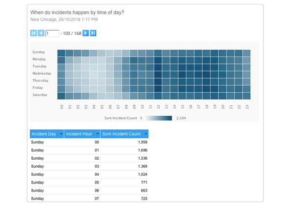 Heat grips are best used to visualize the volume of events or locations within your data to help direct the dashboard consumer's attention toward trends in a large dataset.
They are popular and useful for their ability to quickly communicate insights, as the way it is intended to be interpreted is accessible to consumers of all skill levels (i.e. the type of shade of the colors used in the chart indicates the inherent value).
Heat grips are best used to visualize the volume of events or locations within your data to help direct the dashboard consumer's attention toward trends in a large dataset.
They are popular and useful for their ability to quickly communicate insights, as the way it is intended to be interpreted is accessible to consumers of all skill levels (i.e. the type of shade of the colors used in the chart indicates the inherent value).
Step #1: Creating a table
Again, we will create a report by selecting the order history view created in #3 of the series. Let's create a table that totals the Number of Items ordered based on the Day of Week and Time of Day. The fields to be used are [Day of Week], [Time], and [ASIN]. By aggregating [ASIN] by "Count", we can display the Number of Items ordered for each Day of Week and Time of Day. Change the display of the [Count ASIN] to the Number of Items, and the table is complete. Below is an image of the completed table.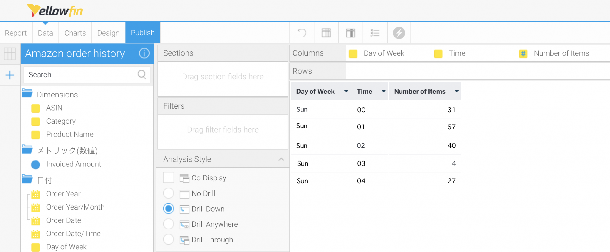
Step #2: Creating a heat grid chart
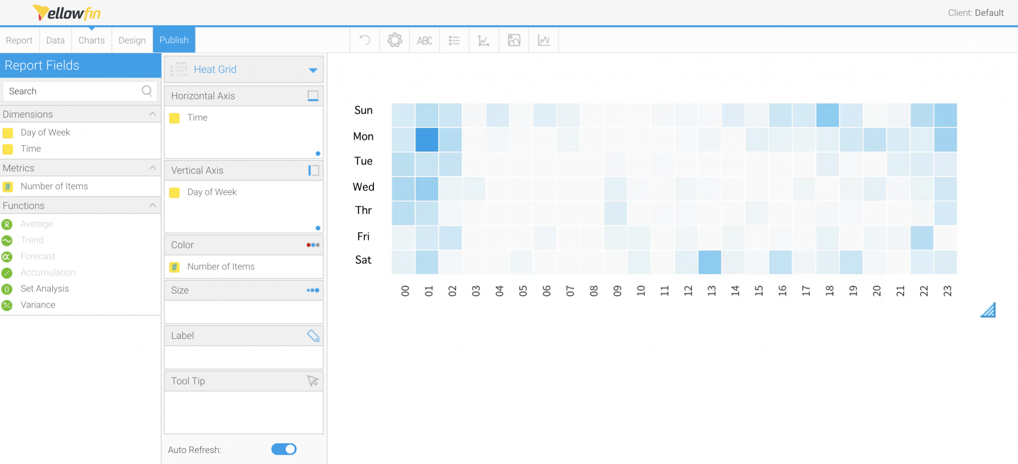
Once the table is completed, we will create a heat grid. After selecting the Chart Type to "Heat Grid," set [Time] for "Horizontal Axis", [Day of Week] for "Vertical Axis", and [Number of Items] for "Color. Since the order of the Horizontal Axis (Time) and the Vertical Axis (Day of Week) of the chart are not in the same order, rearrange them in "Ascending" of "Alphanumeric".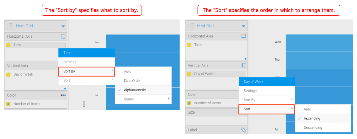 The difference between the two sortings described in the above.
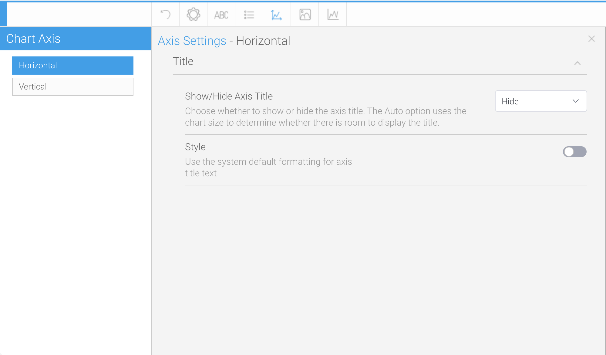
The Title and Legend for the Vertical and Horizontal Axes are not needed, so set them to be ‘Hide”. For the Legend, select "Legend" > "Position" > "Legend Position" to "None". For the Titles of the Vertical and Horizontal Axes, select "Vertical Axis" or "Horizontal Axis" from "Axis Settings" and set "Title" > "Show/Hide Axis Title" to "Hide".
The difference between the two sortings described in the above.
The Title and Legend for the Vertical and Horizontal Axes are not needed, so set them to be ‘Hide”. For the Legend, select "Legend" > "Position" > "Legend Position" to "None". For the Titles of the Vertical and Horizontal Axes, select "Vertical Axis" or "Horizontal Axis" from "Axis Settings" and set "Title" > "Show/Hide Axis Title" to "Hide".
 From here, set the Titles of the "Vertical Axis" and "Horizontal Axis" to "Hide”.
You have now created a Heat Grid. Click the "Publish" button to save the report. Below is a completed image example!
From here, set the Titles of the "Vertical Axis" and "Horizontal Axis" to "Hide”.
You have now created a Heat Grid. Click the "Publish" button to save the report. Below is a completed image example!
In the next blog, we will continue to show off the extensive data visualization tools that Yellowfin BI provides and create a line chart. Please look forward to it!