

How to Create a Pie Chart in Yellowfin Dashboards
Welcome to the latest entry in Yellowfin Japan’s ‘How to?’ blog series!
In our previous blog, we went through how to create big number and vertical column charts in Yellowfin, as well as how to add a 'back-to-top button to your dashboard.
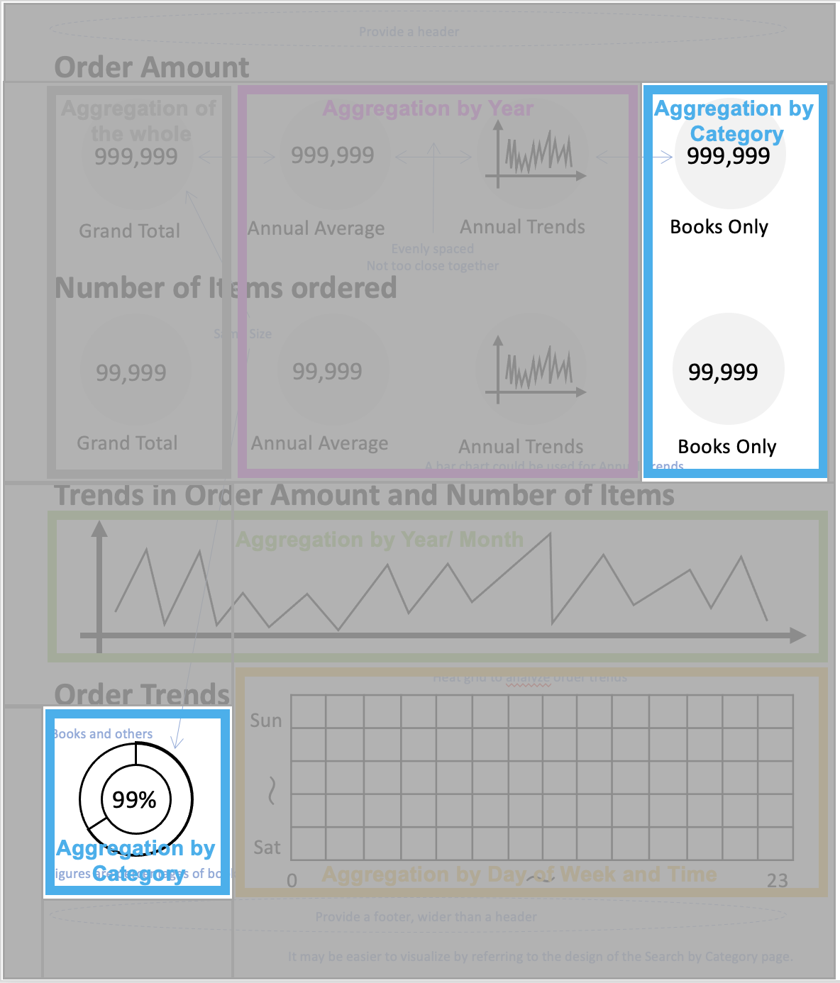
We categorized the charts to be displayed on the dashboard by aggregation axis, and created charts that aggregate on the axis of Year. Yellowfin reports are structured to create charts based on tables, so it is easier to create charts by separating reports by aggregation axis.
In this blog, we would like to show you how to create a report that aggregates on the basis of categories to create a Pie Chart and a Numeric Display, providing your team with another hands-on example of adding data visualization to your Yellowfin dashboards.
Noted: Throughout this series, field names will be written in [square brackets], Yellowfin settings and selections will be written in "double quotations", and parameters that must be entered manually will be written in enclosing lines and shadings. No specific rules are defined for (rounded brackets) or ‘single quotations’, so please read them as normal punctuation marks.
Step #1: Creating a table
To show you how to create a pie chart for your Yellowfin dashboard, we will first create a report by selecting the order history view created in our #3 blog of the series, How to Capture Data Using Yellowfin Data Tranformation Flow. Now, let's create a table that aggregates the Invoiced Amount, the Number of Items ordered, and the Percentage of Number of Items ordered, based on the categories used in the charts. The fields to be used are [Category], [Invoiced Amount], and [ASIN]. Add each of these fields to the Columns. The [Invoiced Amount] will be aggregated into "Sum". [ASIN] should be aggregated with “Count” to get the Number of Items ordered. Now you should be able to see the Invoiced Amount and the Number of Items ordered for each category. If we can calculate the Percentage of Books in the Total Number of Items, we can display the Percentage of Items ordered in the center of the Ring chart. The Percentage of Items ordered can be calculated by applying the "Percentage of total (%)" from the "Advanced Function" to the Number of Items ordered. To display the Number of Items ordered and its Percentage side by side, add another [ASIN] and apply "Advanced Function" to the field aggregated by "Count" - as demonstrated in the image below.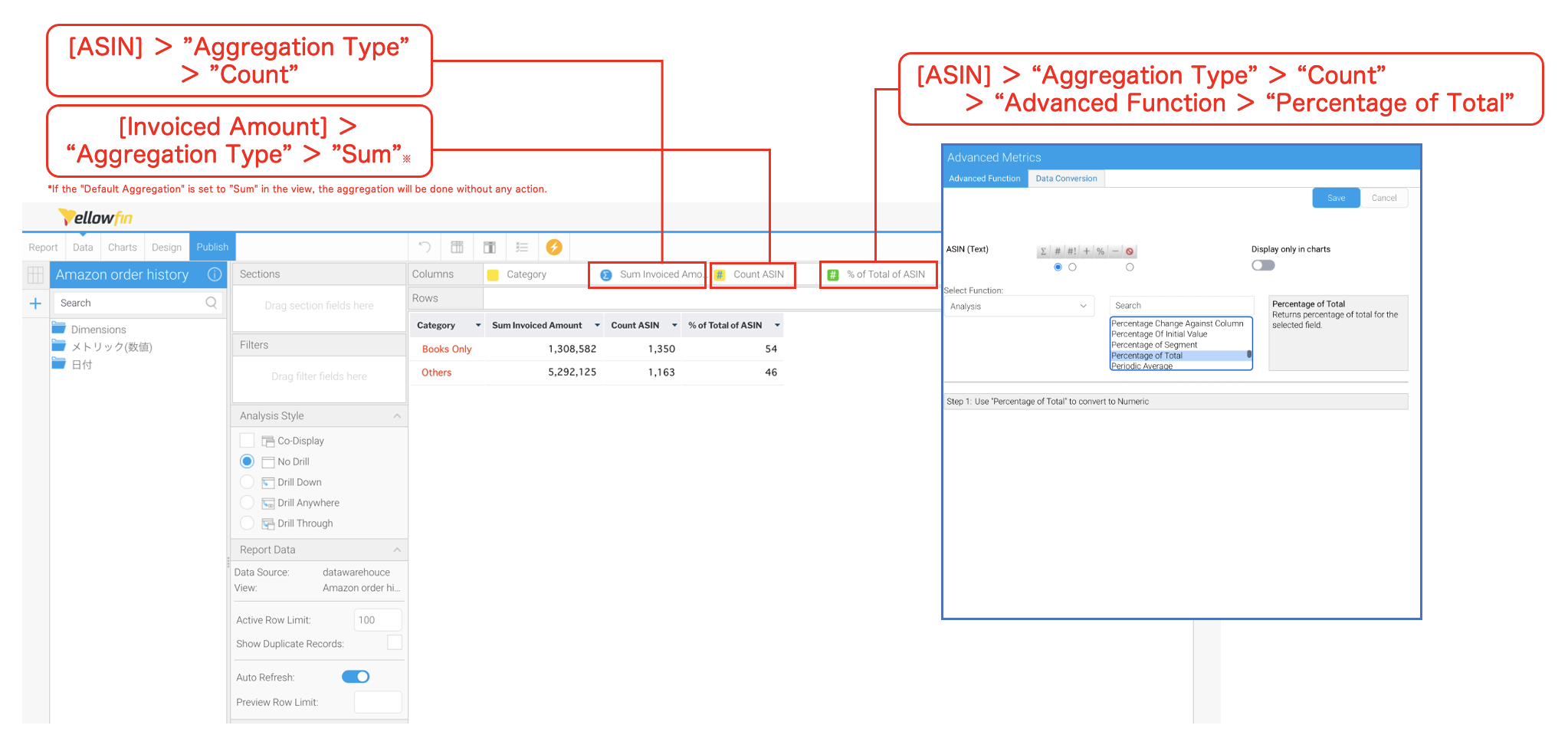 Change the "Display" of each column in "Column Formatting". Change [Sum Invoiced Amount] to Invoiced Amount, [Count ASIN] to Number of Items, and [% of Total of ASIN] to Composition Ratio.
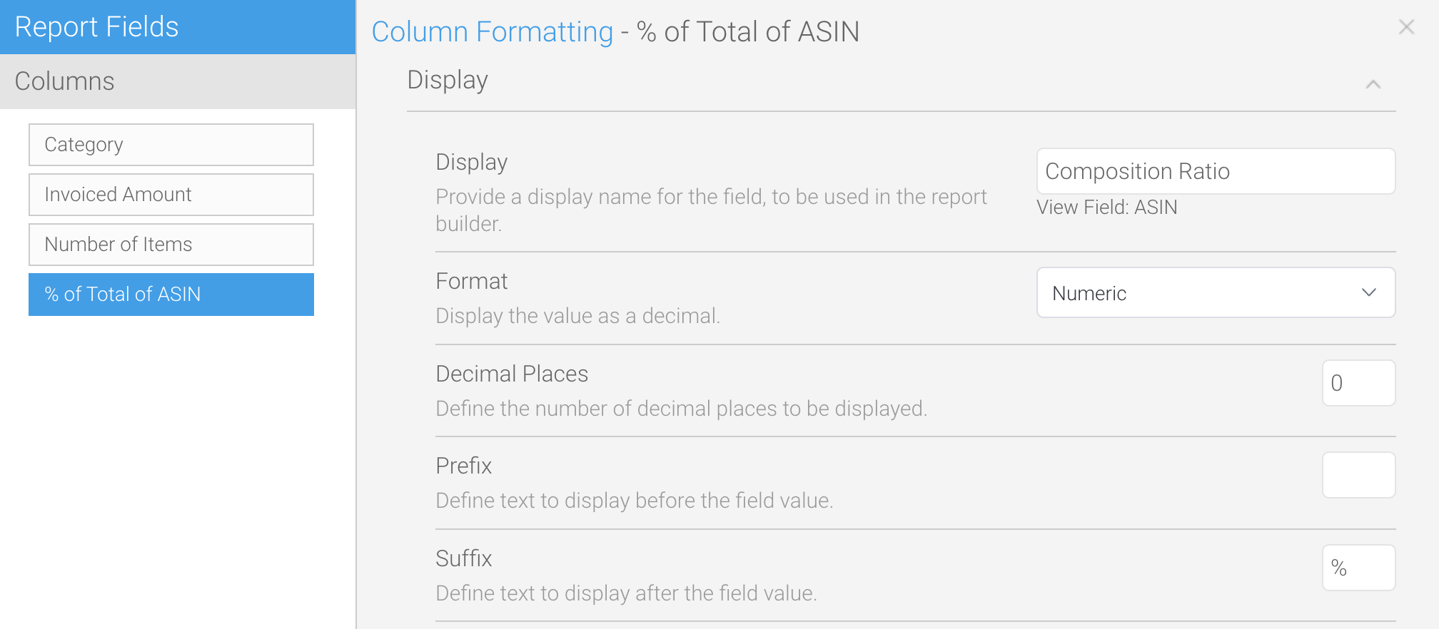 If you define "%" as the "suffix" of [Composition Ratio], it will be easier to see that it is a ratio (proportion) when viewed in the table.
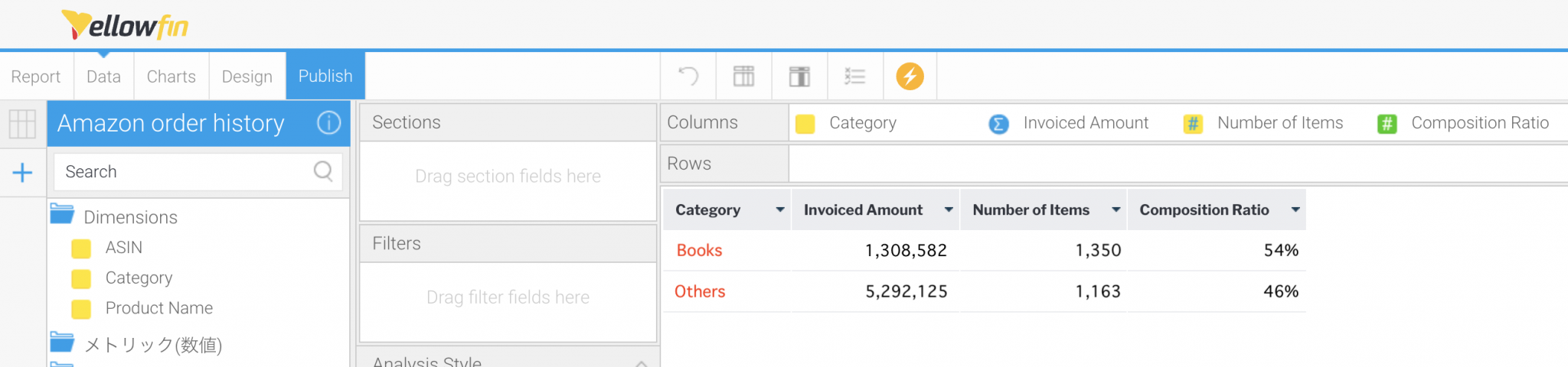
The table is now complete.
If you define "%" as the "suffix" of [Composition Ratio], it will be easier to see that it is a ratio (proportion) when viewed in the table.
The table is now complete.
Step #2: Creating our pie charts
Once the table is completed, we will create charts. First, let's create a Ring Chart, which is a type of pie chart available in Yellowfin's charting library. After selecting the Chart Type to "Ring", set "Color" to [Category] and "Size" to [Number of Items]. Since labels are not necessary, let's set them to "Hide”.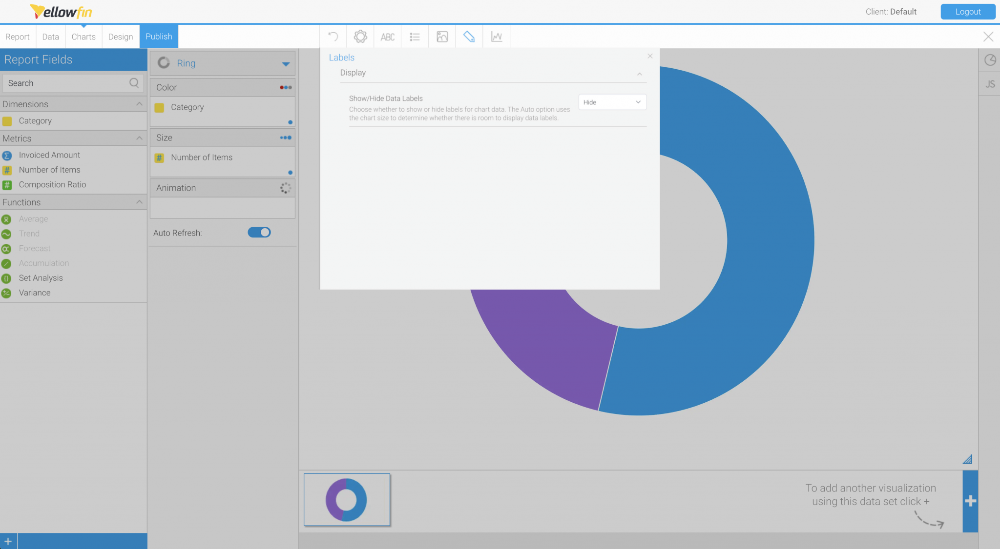 Select "Hide" in the "Show/Hide Data Labels" field.
Once the Ring Chart is created, we will create three Numeric Displays. We will start with a Numeric Display showing Invoiced Amounts for Books Only. After selecting the Chart Type to "Numeric Display," set [Set Analysis] to "Measure”. Set Analysis is a feature that allows you to create a subset by filtering the fields of interest. What this means is it can be used to display only the Invoiced Amounts of Books in a category on the chart.
Select "Hide" in the "Show/Hide Data Labels" field.
Once the Ring Chart is created, we will create three Numeric Displays. We will start with a Numeric Display showing Invoiced Amounts for Books Only. After selecting the Chart Type to "Numeric Display," set [Set Analysis] to "Measure”. Set Analysis is a feature that allows you to create a subset by filtering the fields of interest. What this means is it can be used to display only the Invoiced Amounts of Books in a category on the chart.
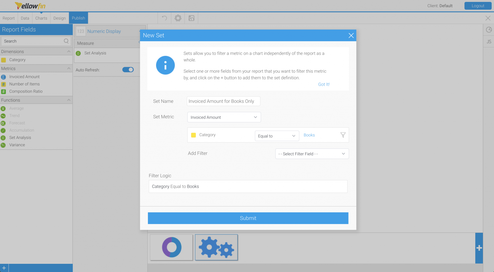 By filtering [Invoiced Amount] by [Category] = Books, you will be able to display the Invoiced Amount of books only.
As before, we will format the Numerical Display, confirming what we summarized when we created the completed image in our #2 in the series, How to Design a Dashboard P2.
By filtering [Invoiced Amount] by [Category] = Books, you will be able to display the Invoiced Amount of books only.
As before, we will format the Numerical Display, confirming what we summarized when we created the completed image in our #2 in the series, How to Design a Dashboard P2.
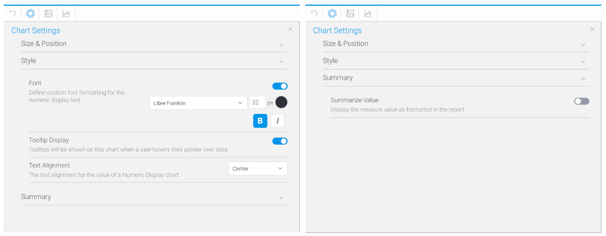 This is the formatting of the Numeric Display.
The same procedure is used to create a Numerical Display showing the Number of Items ordered for Books Only.
Again, copying the chart makes it a little easier because you do not have to reformat it. Replace the "Measure" field with a new [Set Analysis] and set the "Category" to show the Number of Items in Books. Remember to set the "Aggregation Type" to "Sum".
A Numeric Display showing the Percentage of Books is also created using [Set Analysis]. Set [Category] to display the [Composition] of Books, and you are done!
You have now created the Ring Chart and three Numeric Displays. Don't forget to click the Publish button to save the report!
In our next blog in Yellowfin Japan's "How-To" series, we will show you how to create a heat grid. Stay tuned!
This is the formatting of the Numeric Display.
The same procedure is used to create a Numerical Display showing the Number of Items ordered for Books Only.
Again, copying the chart makes it a little easier because you do not have to reformat it. Replace the "Measure" field with a new [Set Analysis] and set the "Category" to show the Number of Items in Books. Remember to set the "Aggregation Type" to "Sum".
A Numeric Display showing the Percentage of Books is also created using [Set Analysis]. Set [Category] to display the [Composition] of Books, and you are done!
You have now created the Ring Chart and three Numeric Displays. Don't forget to click the Publish button to save the report!
In our next blog in Yellowfin Japan's "How-To" series, we will show you how to create a heat grid. Stay tuned!