

How to Perform Cash Flow Analysis using Yellowfin Waterfall Charts
TL;DR
Waterfall charts help finance teams understand movement from opening to closing balances, highlighting the drivers of cash flow. With Yellowfin, you can build interactive waterfall charts in minutes, making it easy to track performance and explain results to stakeholders.
Try Yellowfin free
In this blog, the team at Yellowfin Japan demonstrates how to take advantage of Yellowfin's data visualization capability in the form of Waterfall Charts, using the example of analyzing a company's cashflow by using this visual diagram.
So, what is a Waterfall Chart, and what does it look like in Yellowfin?
Waterfall Chart Overview and Analysis Examples
What is a Waterfall Chart?
A waterfall chart is used to visualize how values increase or decrease between a starting point and an ending point using bar lengths and colors. It is so called as its shape resembles a flowing waterfall.
It is often used in presentations and corporate financial results announcement documents since the increase or decrease of metrics can be grasped at a glance.
Waterfall chart examples
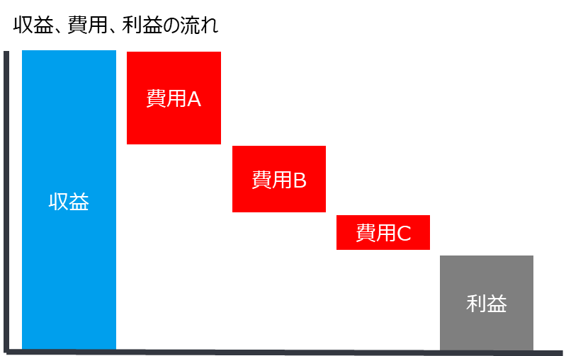
A Waterfall chart is suitable for showing cash flows. For example, here is an example that visually shows what expenses were deducted from the revenue earned and how much profit was left as a result. Clearly separating the colors of the increase and decrease makes it easier to understand.
It can also be used to show trends in monthly membership increases and decreases. The increase, slowdown, or decrease in the growth rate can be grasped at a glance.

Creating a Waterfall chart
To create a Waterfall chart, you need one axis, a metric at the starting point, and a metric for each axis item. In one of the above examples - Revenue, Cost, and Profit Flow - three items are required: an axis indicating each cost item, a revenue figure as the starting point, and a metric for each cost item. The other example - trend of membership increase/decrease - three items are required: an axis indicating the month, the number of members at the beginning (end of the previous year), and metrics related to the increase/decrease of members for each month.
Visualizing and Analyzing Tesla's Financial Performance
On July 20, 2022 local time, Tesla Inc. announced its financial results for the second quarter (April - June) of 2022. In this following section, we will visualize and analyze the cash flow movements during this quarter using a Waterfall chart.
First, we can see that cash on hand increased from $18,040 million at the beginning of the quarter (end of March) to approximately $850 million during the quarter, and increased to $18,887 million at the end of the quarter (end of June).
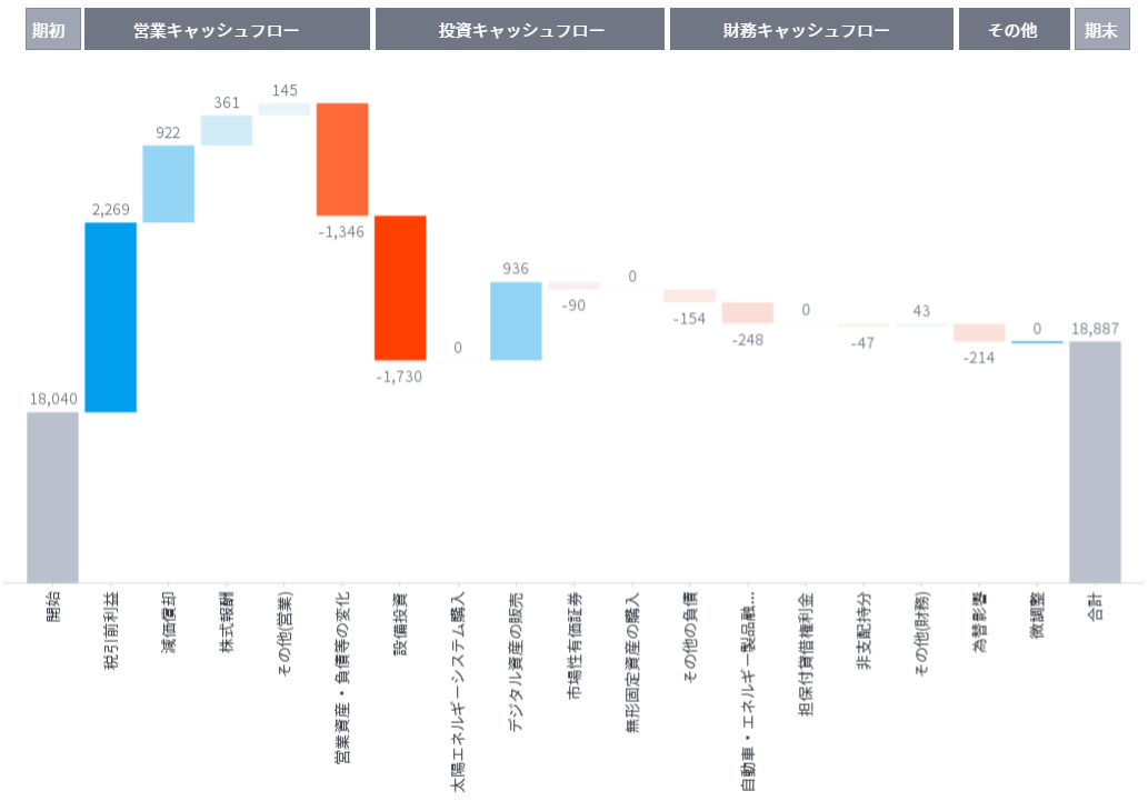
We will identify the factors that have caused the cash flow to fluctuate from three aspects: sales, investment, and financial.
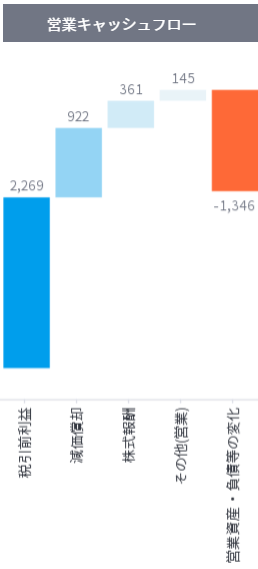
Sales Cash Flow
The factor largely responsible for the increase in sales cash flow was income before taxes, which increased by $2,269 million. We can see that the second quarter was a troubled time for Tesla, with the long term closure of its Shanghai factory and the high cost of raw materials, yet it generated a lot of cash in its core business. Although sales volume declined approximately 18% from 310,048 units in the previous quarter to 254,695 units, the decline in profit was somewhat mitigated in some aspects by the increase in unit sales price due to price increases. There is also an aspect of expansion in business areas other than automobiles. The accounting figure for operating income was $2,464 million, indicating that the difference between the two is not so large.
Amortization and stock-based compensation, which are recorded as expenses in accounting, are not actually accompanied by cash outflows and are therefore treated as positive in the amounts of $922 million and $361 million, respectively.
Sales assets and liabilities and restructuring of operations paid $1,346 million in cash. It also shows a positive investment attitude toward sales activities.
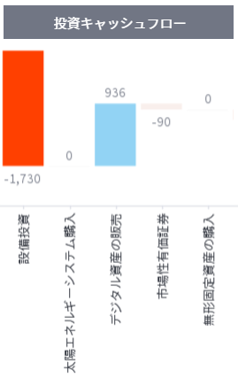
Investment Cash Flow
Of all cash flow items, capital expenditures represented the largest outflow, at $1.346 billion. In addition to California, Shanghai, and Berlin, this year the company opened its fourth manufacturing facility in Austin, Texas, which is currently in the process of being fully equipped for full operation. This positive investment attitude in facilities is reflected in the figures.
The sale of digital assets generated $936 million in cash. This is due to the sale of 75% of its bitcoin holdings in the second quarter, which resulted in $936 million in cash.
Financial Cash Flow
A cash outflow of $406 million, due in part to the repayment of borrowings and other liabilities, has had some impact on the debt ratio in the capital structure. At the end of 2019, Tesla's equity ratio was under 20%, but as of 2nd September 2022, it was over 54%. With continued capital investment expected in the future, Tesla's capital structure would also be something to keep an eye on.
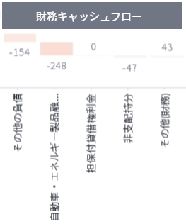
Extra outflow
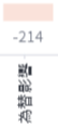
Other cash decreased by $214 million in foreign exchange losses.
Frequently Asked Questions About Waterfall Charts and Cash Flow Analysis
What is a waterfall chart used for in finance?
A waterfall chart is used in finance to show how a starting value, such as opening cash balance or revenue, changes into a final value by visualizing individual increases and decreases. It is commonly used for cash flow analysis, profit breakdowns, and variance analysis.
How does a waterfall chart help with cash flow analysis?
A waterfall chart helps with cash flow analysis by clearly displaying cash inflows and outflows step by step. This makes it easier to understand which activities are driving cash increases or decreases during a specific period.
What is the difference between a waterfall chart and a bar chart?
A bar chart compares values independently, while a waterfall chart shows how values accumulate over time from a starting point to an ending point. Waterfall charts focus on explaining change, not just comparison.
When should you use a waterfall chart?
A waterfall chart should be used when you need to explain how a total value is formed, such as changes in cash balance, revenue, expenses, or profit. It is especially effective for financial analysis and performance reporting.
Can waterfall charts be used for financial statements?
Yes, waterfall charts are commonly used to analyze financial statements such as cash flow statements and income statements by visually showing how individual components impact the final financial result.
What data is required to create a waterfall chart?
To create a waterfall chart, you need a starting value, a series of positive and negative changes, and an ending value. These figures usually come from financial or operational data sources.
Are waterfall charts useful for business reporting?
Waterfall charts are widely used in business reporting because they make complex financial movements easier to understand for stakeholders, executives, and non-finance audiences.
How do waterfall charts improve financial storytelling?
Waterfall charts improve financial storytelling by visually explaining the reasons behind changes in numbers. They help audiences understand not just what changed, but why it changed.
Can waterfall charts be interactive?
Yes, waterfall charts can be interactive in modern BI tools, allowing users to drill down into details, apply filters, and explore the drivers behind increases or decreases in values.
What are common mistakes to avoid when using waterfall charts?
Common mistakes include using too many data points, unclear labels, inconsistent colors, and applying waterfall charts where a simpler chart type would communicate the message more effectively.
Conclusion
These are just some examples of Waterfall charts with Yellowfin. In addition to cash flow movements, Waterfall charts are also useful for visualizing and explaining metrics changes, when operating income, revenues, expenses, and other money flows are expressed in an easy to understand manner, or when changes in population, membership, and other factors are clearly indicated. It also appears in presentations and IR materials.
In addition to the above, this chart can be used in a variety of other situations. Please try utilizing the Yellowfin Waterfall chart for various purposes.
Try Yellowfin Data Visualization
Learn how Yellowfin can enhance your data-rich reporting with rich, customizable graphs and charts - try our data visualization demo today.