

How to Analyze Price Movements using Yellowfin Candlestick Charts
In this blog, the team at Yellowfin Japan demonstrates how to take advantage of Yellowfin's data visualization capability in the form of Yellowfin Candlestick charts, also called keystrokes, specialized for analyzing price movements of stocks and bonds. We will utilize these charts to analyze price movements of stocks.
So, what is a Candlestick Chart, and what does it look like in Yellowfin?
Candlestick Chart Overview and Analysis Examples
What is a Candlestick?
A candlestick is a chart that serves to display price movements of stocks and bonds in an easy to understand manner at a glance, showing high, low, opening, and closing prices during a day's trading hours in a single line. By arranging daily lines for multiple days, medium/long term price movements and daily price movements can be visualized together.
The below image explains how to understand candlesticks.
![]()
Basically, lines are created on a daily basis. The blue line on the left is a ‘positive’ line, which is created when the closing price is higher than the opening price. This means that the price rose on the relevant day. The red line on the right is a ‘negative’ line, which is created when the closing price is lower than the opening price. This means that the price went down on the relevant day. In this example, blue is selected for a positive line and red for a negative line, but there seems to be no particular rule for color selection, so the choice of blue and red colors may be reversed or even shown in black and white.
Additionally, ‘High’ indicates the highest price of the day, ‘Low’ indicates the lowest price of the day, ‘Open’ indicates the price at the beginning of trading, and ‘Close’ indicates the price at the end of trading.
Looking at another level of detail, candlesticks can be classified into 9 different types. The relationship between each name and price movement is as follows (from left to right):
![]()
A ‘Long bullish’ indicates a significant increase in price at the close compared to the opening price.
A ‘Long bearish’ on the other hand indicates a large drop in price compared to the opening price.
A ‘Short bullish’ or ‘Short bearish’ indicates that the opening and closing prices were slightly higher or lower than the opening and closing prices, although there was a large price movement during the trading session.
A ‘Upper shadow bullish’ or ‘Upper shadow bearish’ indicates that the price temporarily rose sharply compared to the opening price, but closed slightly higher or lower than the opening price.
A ‘Lower shadow bullish’ or ‘Lower shadow bearish’ indicates that the price temporarily dropped significantly compared to the opening price, but closed with a slight price increase or decrease at the closing price.
A ‘Doji’ is created when the opening and closing prices are the same and there is no candlestick body.
By the way, did you know that candlestick charts originated in Japan? It is said that the chart was invented by Munehisa Honma, a rice trader at the time, at the Dojima Rice Market in Osaka, which is said to be the world's first futures market. What the Japanese invented several hundred years ago is still in use around the world.
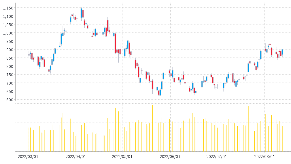
Analyzing price movement of a stock using a candlestick chart (NASDAQ Tesla stock)
Now let's analyze actual stock price movements using Yellowfin candlestick charts
In order to create candlestick charts with Yellowfin, you need ‘date’, ‘opening price’, ‘closing price’, ‘highest price’, ‘lowest price’, and ‘number of trades. These data can be obtained from many websites that provide stock price data.
In this example, we will analyze the price movement data for Tesla (stock code: TSLA, NASDAQ market) provided by Kabutan for about a six month period (March 2022 to mid August). From the chart, you can see that the price has moved wildly from a high of over $1,100 to a low of just over $600. There were also signs that prices have risen and fallen significantly over the course of the day. From July onwards, prices have been relatively increasing.

Clicking on an individual daily candle shows the details of the price movement. The price movement on 26th April was particularly dramatic, with the price dropping nearly 12% in a single day, as can be seen from the Long bearish candle.
![]()
From the Long bullish candle on 29th July, we can see that the price increased by about $49 in one day from the start of trading to the end of the day.
![]()
The Lower shadow bearish on 10th August shows that there was a $43 difference between the high and low, indicating that although the price was down significantly at one point, it was only down a modest $8 at the end of trading.
![]()
A Doji was created on 15th July, confirming that the value had not changed ($720) at the start and end of trading. The price movement on the day was within $20, indicating that the trading was relatively calm.
![]()
As you can see from the above examples, candlestick charts allow you to visualize a lot of information together in one chart. This is very useful for analyzing price movements of stocks and bonds.
Note that you can see a yellow bar chart at the bottom of the candlesticks. This time, the chart shows the number of shares traded during trading hours. As for Tesla stock, there does not seem to be a strong correlation between the size of price movements and the number of trades.
Analysis with Keystroke charts
What is a Keystroke?
Keystroke charts are also commonly used for analyzing price movements along with candlestick charts.
A Keystroke chart adds lines only when the price swings up or down by a certain amount or rate (the former: Fixed Rate keystrokes, the latter: Declining Balance keystrokes), and the line is always downward when the price is down and always upward when the price is up. Generally, this chart is used to confirm rough price movements, often using the previous day's ratio of the closing price on a daily basis.
We will first explain how to create a keystroke line using sample data. This time, we will create a keystroke using a 3% declining balance method.
On 2nd April, the market closed with a 3.0% price increase over the previous day. Therefore, we create a line upward.
![]()
On the following day, 3rd April, the price dropped 3.9% in the opposite direction, so once the line is created horizontally, it creates a downward line.
![]()
Although the price was raised by 1.0% on 4th and 5th respectively, the line is not added for both days as the price movement of 3% has not been reached.
![]()
On 8th April the following week showed a 4.0% price increase compared to the end of last week, so we added a 3 day line altogether.
![]()
Analyzing price movement of a stock using keystroke charts (NASDAQ Tesla stock)
Now that you understand the basics of keystroke charts, we will use it to represent the price movement of Tesla stock.
To create a keystroke chart with Yellowfin, you need ‘date’, ‘closing price’ and ‘rate of change (amount)’. As with candlestick charts, we used data from Kabutan.
The upward trend is shown in blue and the downward trend in red, allowing you to grasp the general price movement at a glance. In the example below, the line is created using a 5% declining balance method. Note that although date is placed on the horizontal axis, it is not strictly a time series axis.
![]()
After a relatively downward trend in Tesla stock from late April through early June, we can ascertain that the stock has been on an upward price trend since the beginning of July.
On 20th July local time, the company announced its financial results for the second quarter of fiscal year 2022 (March - June), with YoY increases in sales, operating income, net income, and production volume. The results of the financial results were favorable, so the price appears to have been on a relatively upward trend since then.
Conclusion
This time, we analyzed price movements of stocks using Yellowfin Candlestick and Keystone charts. We believe that you may gain new insights by visualizing the same data using various charts. Try using Yellowfin stock price analysis charts to analyze price movements of your company's stocks and holdings from multiple perspectives.
Feel free to contact us if you would like to hear more details about how to create charts with Yellowfin.
Try Yellowfin Data Visualization
Learn how Yellowfin can enhance your data-rich reporting with rich, customizable graphs and charts - try our data visualization demo today.