

How to Create Big Number and Vertical Column Charts in Yellowfin
Welcome back to Yellowfin Japan’s ‘How to?’ blog series!
In our previous blog, we went through how to capture data using Yellowfin's Data Transformation flow, and the preparation and steps for creating reports using Yellowfin View. It may seem like a lot of simple work, but as the number of reports to be created increases, the importance of data preparation becomes far more apparent.
So, what about after you’ve done all the setup? Well, it’s now time to create reports!
In the next 3 blogs, we will each create one or more charts from one report. The reports will be created separately for each axis of aggregation of the metrics used in the charts, so please keep that in mind as you read through.
Note: Throughout this series, field names will be written in [square brackets], Yellowfin settings and selections will be written in "double quotations", and parameters that must be entered manually will be written in enclosing lines and shadings. No specific rules are defined for (rounded brackets) or ‘single quotations’, so please read them as normal punctuation marks.
Considering the aggregation axis of each chart
From the rough sketch created in How to Design a Dashboard in Yellowfin: Part One of our “‘How to?” series, we will consider the axis of aggregation for the charts to be created. Yellowfin reports are structured by creating a single table on the Data Step, and then creating a chart based on the created table - as demonstrated in the image below.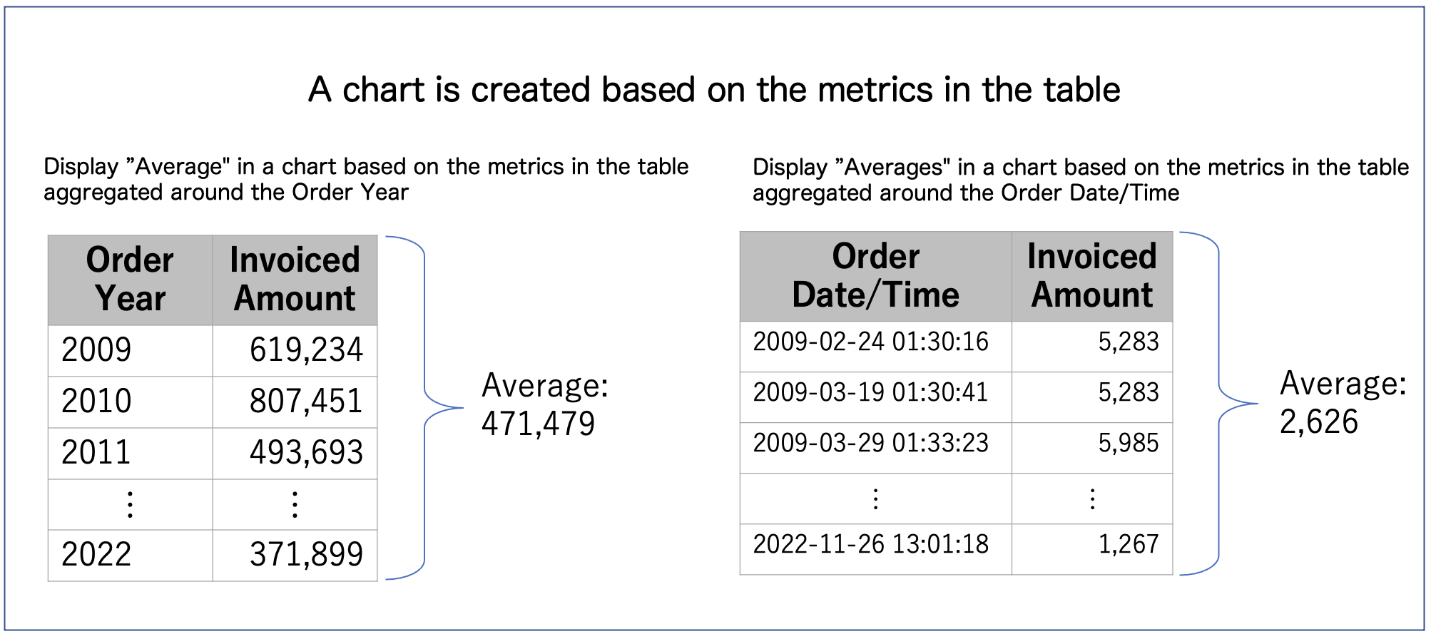 For example, if you want to create a chart that displays annual averages, you must create the chart from a table that aggregates on the axis of the year in order to properly aggregate the data.
Since a chart is based on the metrics of the table, you can identify the tables (reports) that need to be created by sorting charts by axis of aggregations. Basically, you can assume that charts with the same axis can be created from the same report.
The following five categories can be used to categorize the charts by axis of aggregations this time:
For example, if you want to create a chart that displays annual averages, you must create the chart from a table that aggregates on the axis of the year in order to properly aggregate the data.
Since a chart is based on the metrics of the table, you can identify the tables (reports) that need to be created by sorting charts by axis of aggregations. Basically, you can assume that charts with the same axis can be created from the same report.
The following five categories can be used to categorize the charts by axis of aggregations this time:
- Aggregation of the whole
- Aggregation by Year
- Aggregation by Category
- Aggregation by Year/ Month
- Aggregation by Day of Week and Time
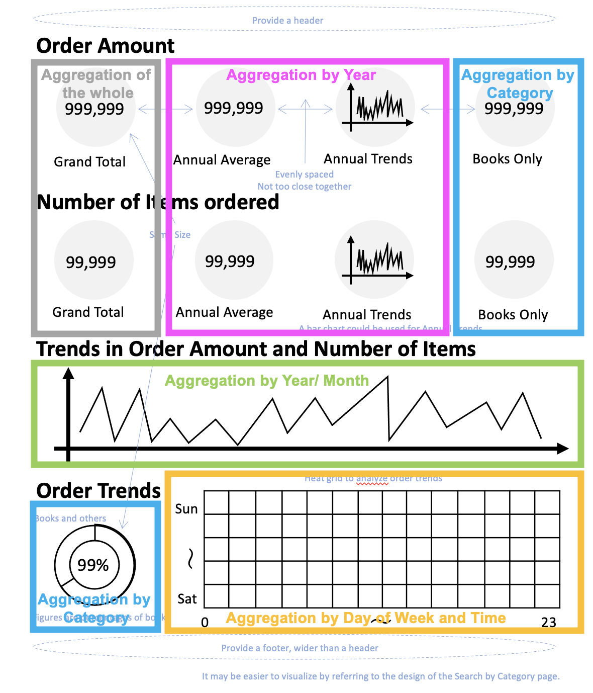 We have color-coded each of the aggregation axes.
As for a chart that is created by aggregating the whole metrics, since in this case we are only displaying the total of the whole metrics, it can be created in the same report as charts with other aggregation axes. Note, however, that this is not the case for reports that display overall averages or require complex aggregations.
This time, we will create a report that aggregates on the basis of Year, and create six charts, one aggregating overall. As you may have noticed from the title of the series, we have decided to create a Vertical Column chart for the Annual Trends, as demonstrated below.
We have color-coded each of the aggregation axes.
As for a chart that is created by aggregating the whole metrics, since in this case we are only displaying the total of the whole metrics, it can be created in the same report as charts with other aggregation axes. Note, however, that this is not the case for reports that display overall averages or require complex aggregations.
This time, we will create a report that aggregates on the basis of Year, and create six charts, one aggregating overall. As you may have noticed from the title of the series, we have decided to create a Vertical Column chart for the Annual Trends, as demonstrated below.
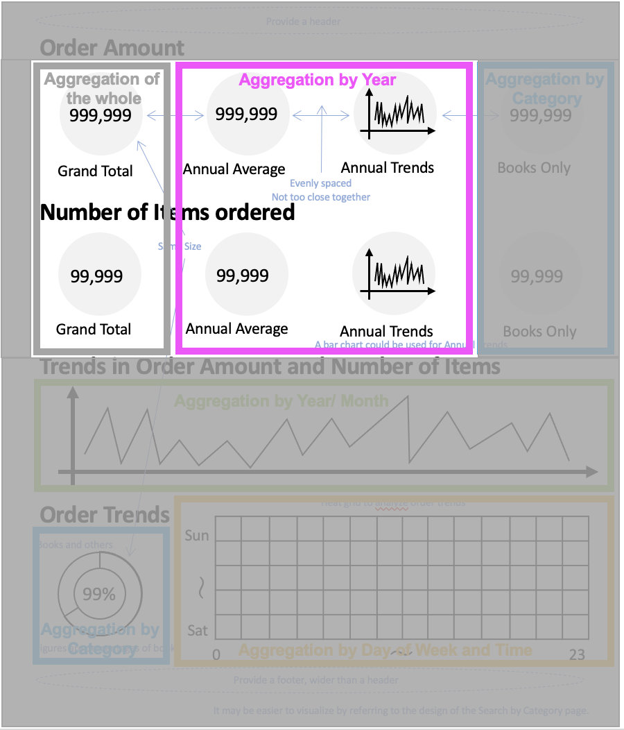 These are the six charts we will be creating.
Creating a report step-by-step
1. Creating a table
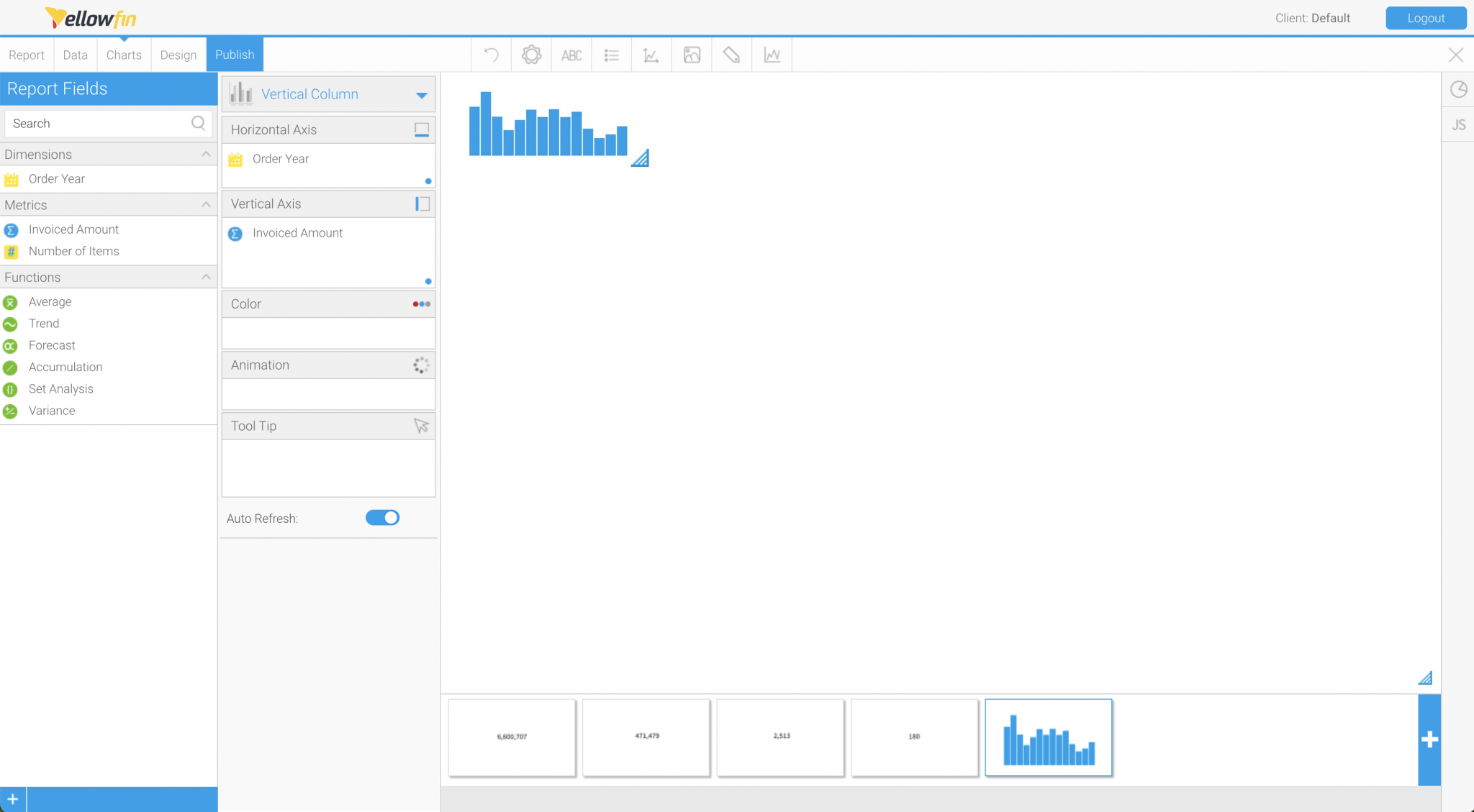
Create a report by selecting the previously created view of order history. In order to graphically represent Annual Average and Annual Trends, we will create a table that aggregates the Invoiced Amount and the Number of Items ordered, with the Order Year as the axis. The fields to be used are [Order Year], [Invoiced Amount], and [ASIN]. Add each of these fields to the Columns. The [Invoiced Amount] will be aggregated with “Sum”. [ASIN] should be aggregated with “Count” to get the Number of Items ordered.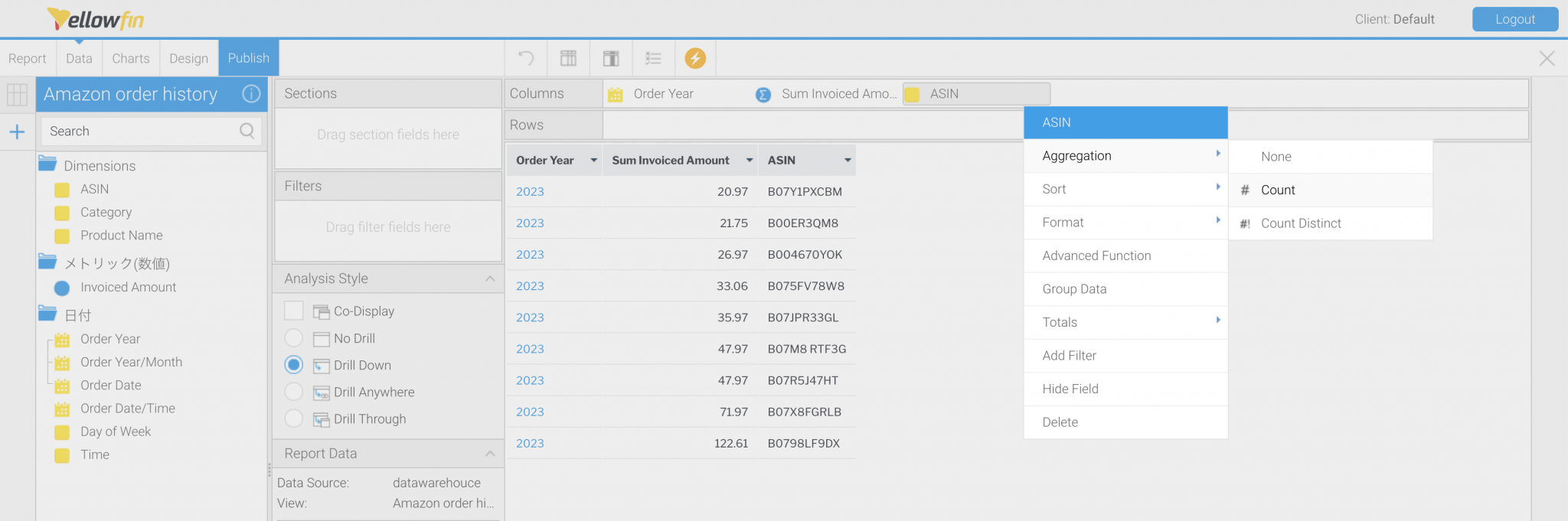 Select [ASIN] > “Aggregation” > “Count”.
The table is completed by renaming the columns [Sum Invoiced Amount] to Invoiced Amount and [Count ASIN] to Number of Items respectively.
Select [ASIN] > “Aggregation” > “Count”.
The table is completed by renaming the columns [Sum Invoiced Amount] to Invoiced Amount and [Count ASIN] to Number of Items respectively.
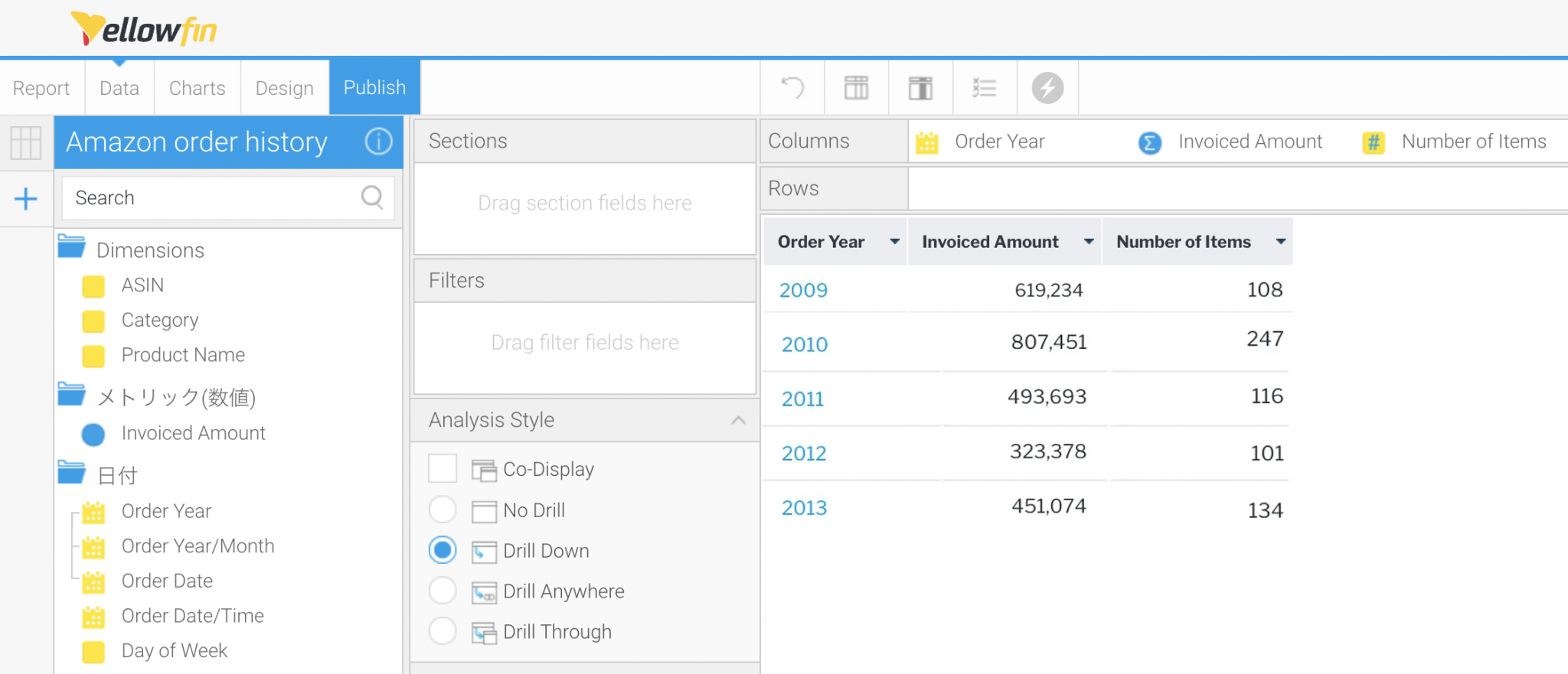 Above is an image of the completed table.
2. Creating charts
Once the table is completed, we will create charts. First, let's create a Numeric Display that displays the Total Amount of Orders. After selecting the chart type to "Numeric Display", set "Invoiced Amount" to "Measure".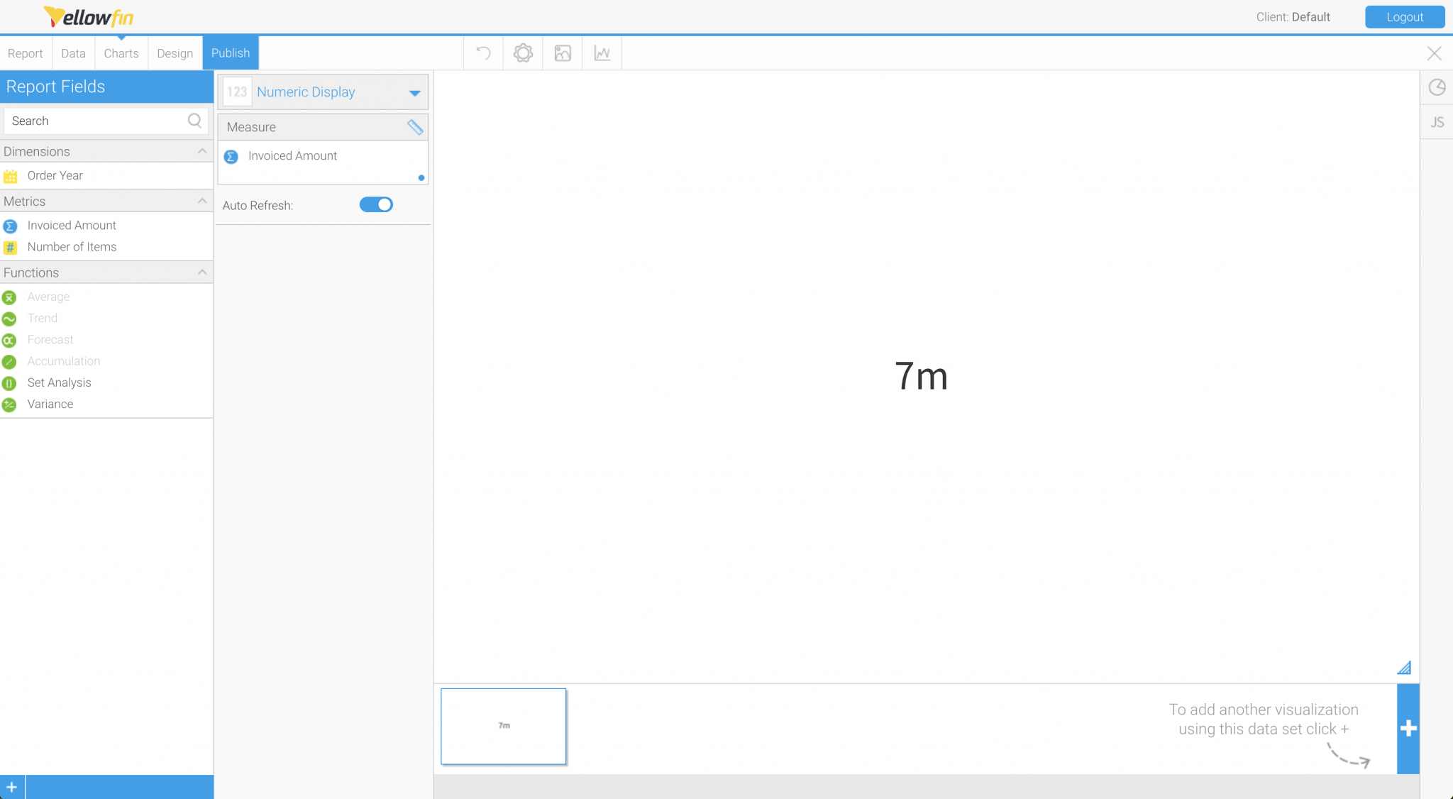 This is a plain Numeric Display chart with no formatting applied.
To improve the appearance of the chart, we will set the formatting. Go to "Chart Settings" > "Summary" and disable "Summarize Value”. Likewise, change the style and size of the "Font" from "Chart Settings" > "Style". This is where the information we summarized when we created the completed image in #2 comes in handy.
This is a plain Numeric Display chart with no formatting applied.
To improve the appearance of the chart, we will set the formatting. Go to "Chart Settings" > "Summary" and disable "Summarize Value”. Likewise, change the style and size of the "Font" from "Chart Settings" > "Style". This is where the information we summarized when we created the completed image in #2 comes in handy.
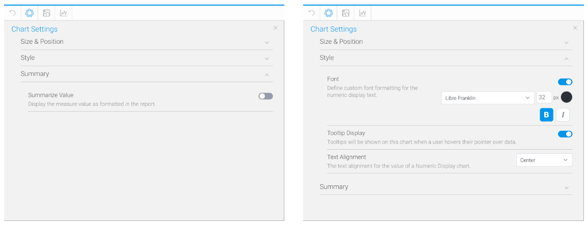 Here is the formatting for the Numeric Display.
The first chart is now completed. We will follow the same step to create the remaining Numeric Displays, but let's make it a little easier. By clicking on the upper right corner of the chart thumbnail in Chart Builder, you can copy the chart. The Chart Formatting will also be copied as are, so saving you the trouble of setting the Formatting individually.
Here is the formatting for the Numeric Display.
The first chart is now completed. We will follow the same step to create the remaining Numeric Displays, but let's make it a little easier. By clicking on the upper right corner of the chart thumbnail in Chart Builder, you can copy the chart. The Chart Formatting will also be copied as are, so saving you the trouble of setting the Formatting individually.
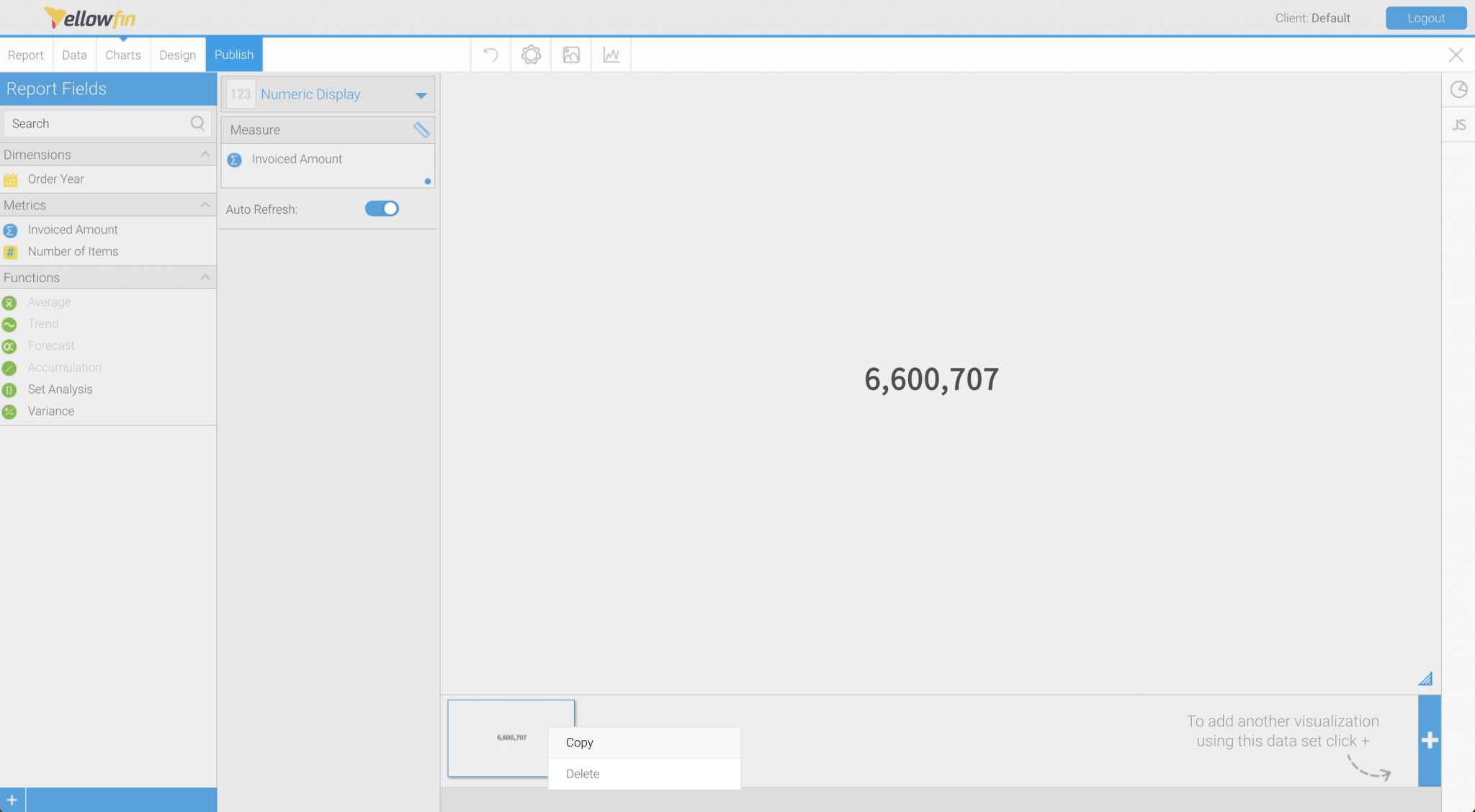 Copying a chart that has already been formatted will unify the Chart Formatting (from the design perspective).
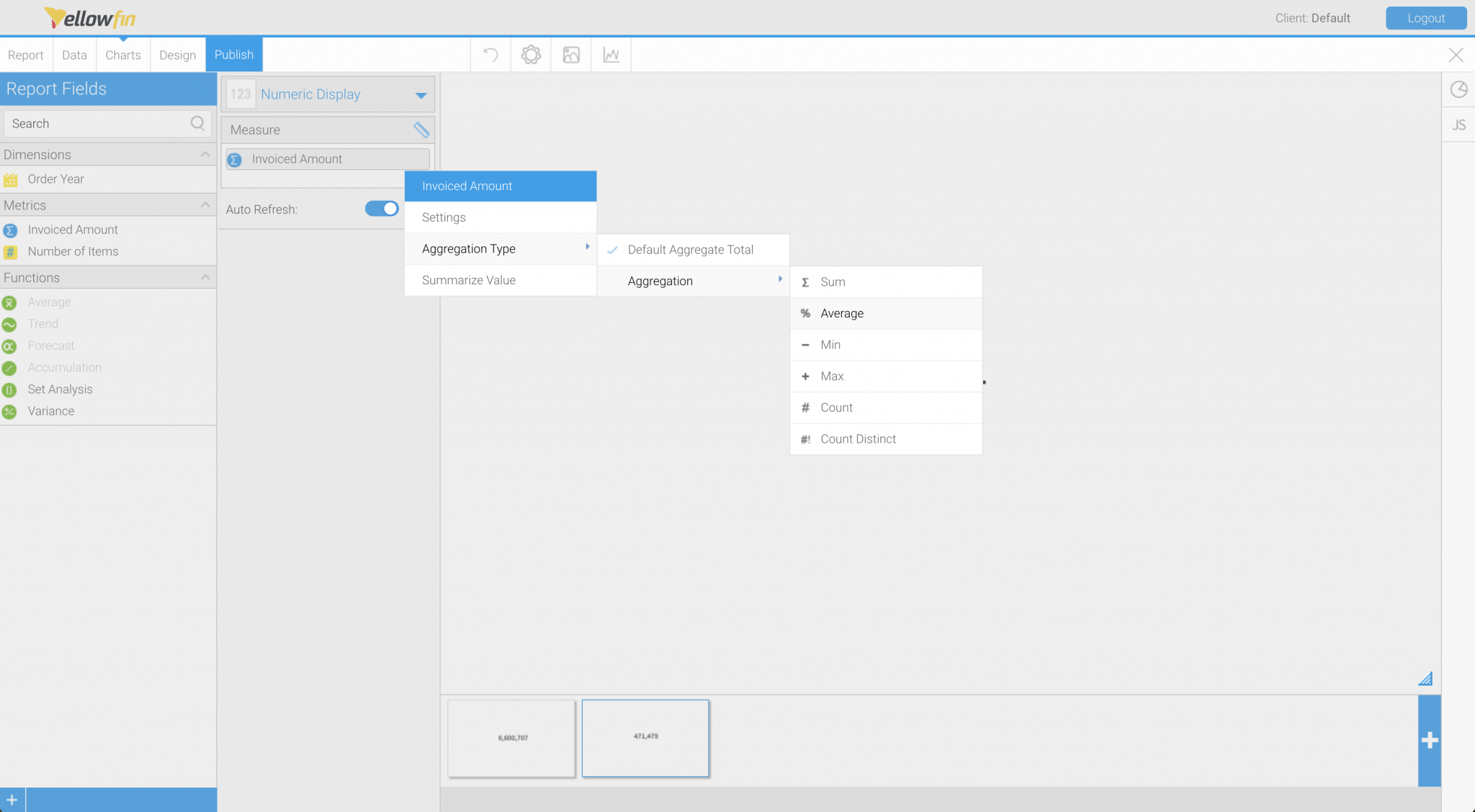
Set the "Aggregation Type" for "Invoiced Amount" to "Average" for the second copied chart. This will create a Numeric Display showing the Annual Average of the Order Amount. Note that the Aggregation Type set here is a mechanism for calculating totals, averages, etc. using the metrics in the table. Since the table shows the total order value for each year, the chart will show the average of the Annual Total Order Amount.
Copying a chart that has already been formatted will unify the Chart Formatting (from the design perspective).
Set the "Aggregation Type" for "Invoiced Amount" to "Average" for the second copied chart. This will create a Numeric Display showing the Annual Average of the Order Amount. Note that the Aggregation Type set here is a mechanism for calculating totals, averages, etc. using the metrics in the table. Since the table shows the total order value for each year, the chart will show the average of the Annual Total Order Amount.
 It is a simple operation to change the "Aggregation Type" to "Average”.
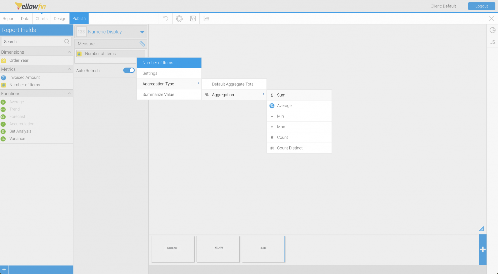
Then copy the chart to create a Numeric Display showing the Total Number of Items ordered. To do this, replace the "Measure" field from "Invoiced Amount" to "Number of Items" and set the "Aggregation Type" to "Sum".
It is a simple operation to change the "Aggregation Type" to "Average”.
Then copy the chart to create a Numeric Display showing the Total Number of Items ordered. To do this, replace the "Measure" field from "Invoiced Amount" to "Number of Items" and set the "Aggregation Type" to "Sum".
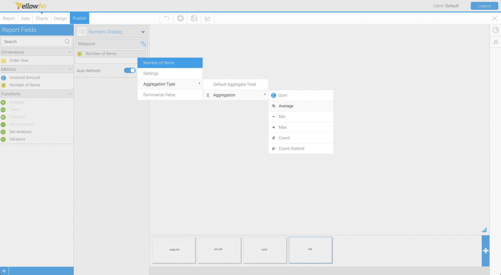
 If you copy the third chart and set the "Aggregation Type" for the Number of Items ordered to "Average," you will also have a Numerical Display showing the Annual Average Number of Items ordered.
 We now created four charts with a fraction of time!
3. Creating Vertical Column Charts
The only thing left to do are two Vertical Column Charts showing Annual Trends. This time, since they cannot be created by copying, click the Add Chart button in the lower right corner of the Chart Builder to create the Charts. After selecting the Chart Type to "Vertical Column," set [Order Year] for the "Horizontal Axis" and [Invoiced Amount] for the "Vertical Axis”. The Vertical Column Chart of Annual Trends will be displayed in a small size on the dashboard, so we will save the design as much as possible. Before setting the formatting, it will be easier to get an idea if you set the "Width" and "Height" in the "Chart Settings".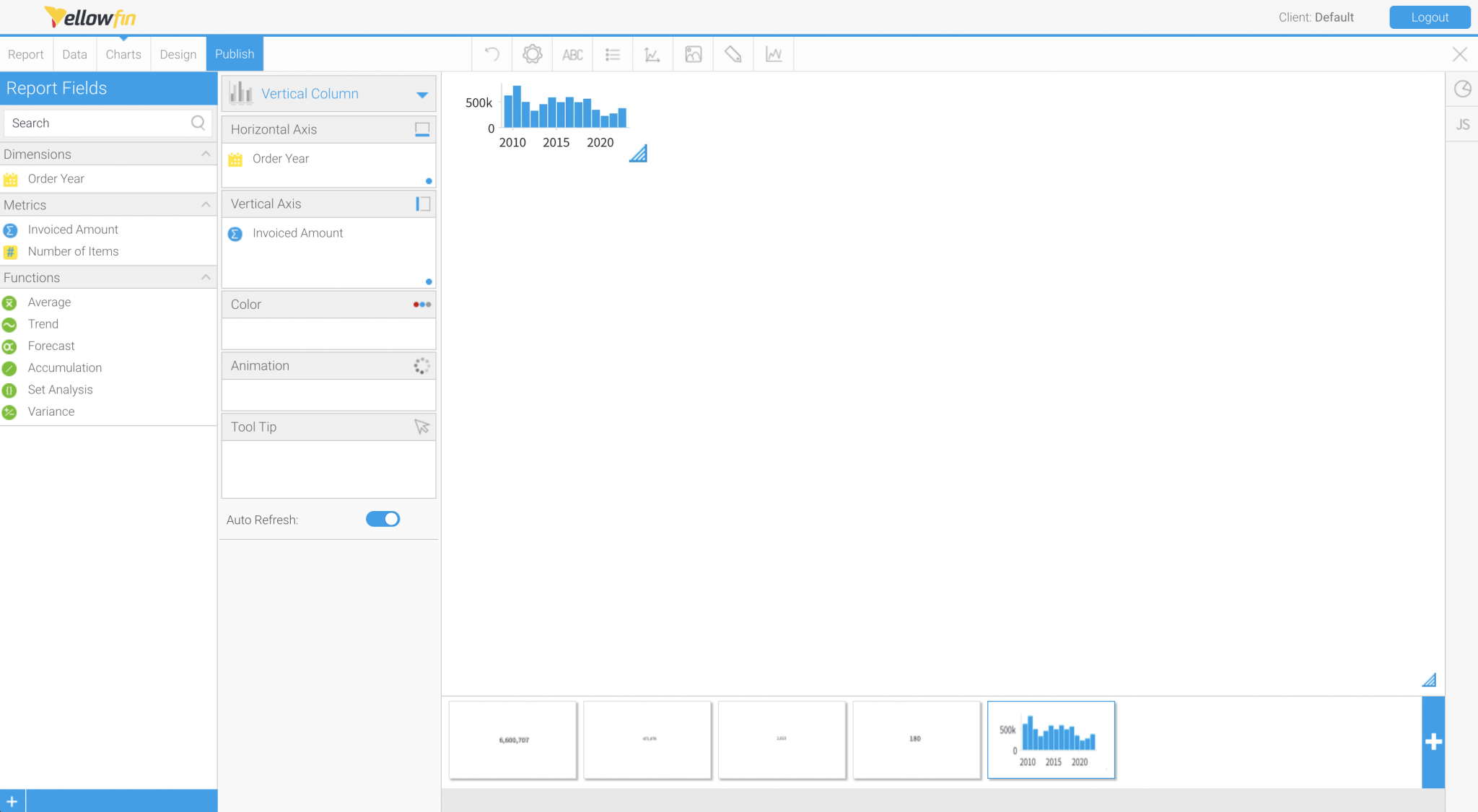 We want the chart to be as large as possible within the 180pt x 80pt area, so we will omit the extras.
The labels for the vertical and horizontal axes take up most of the area, so let's hide them. If there are no labels, we may as well omit the tick marks and axis lines. Let's set the axes themselves to be hidden.
We want the chart to be as large as possible within the 180pt x 80pt area, so we will omit the extras.
The labels for the vertical and horizontal axes take up most of the area, so let's hide them. If there are no labels, we may as well omit the tick marks and axis lines. Let's set the axes themselves to be hidden.
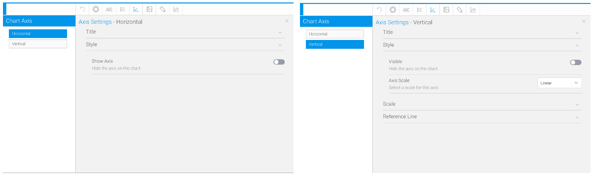 Set "Horizontal" > "Style" > "Show Axis" and "Vertical" > "Style" > "Visible" to disabled, respectively.
By hiding the axes of the chart, the size of the chart can be extended to the entire area. The background grid lines are also hidden for a cleaner look.
Set "Horizontal" > "Style" > "Show Axis" and "Vertical" > "Style" > "Visible" to disabled, respectively.
By hiding the axes of the chart, the size of the chart can be extended to the entire area. The background grid lines are also hidden for a cleaner look.
 If you set "Background" > "Gridlines" > "Gridline Style" to "Custom", you can set "Show Gridlines:" to "None".
You now have a Vertical Column Chart displaying the Annual Trends in Order Amount. Copy this chart to create a Vertical Column Chart showing the Annual Trends in the Number of Items ordered. It will be completed if you replace the "Vertical Axis" field to "Number of Items ordered" instead of "Invoiced Amount," but to make it easier to distinguish from the chart of the Invoiced Amount, let’s change the color of the Number of Items ordered chart. In the "Series Settings," select "Number of Items ordered" and specify the "Color”.
If you set "Background" > "Gridlines" > "Gridline Style" to "Custom", you can set "Show Gridlines:" to "None".
You now have a Vertical Column Chart displaying the Annual Trends in Order Amount. Copy this chart to create a Vertical Column Chart showing the Annual Trends in the Number of Items ordered. It will be completed if you replace the "Vertical Axis" field to "Number of Items ordered" instead of "Invoiced Amount," but to make it easier to distinguish from the chart of the Invoiced Amount, let’s change the color of the Number of Items ordered chart. In the "Series Settings," select "Number of Items ordered" and specify the "Color”.
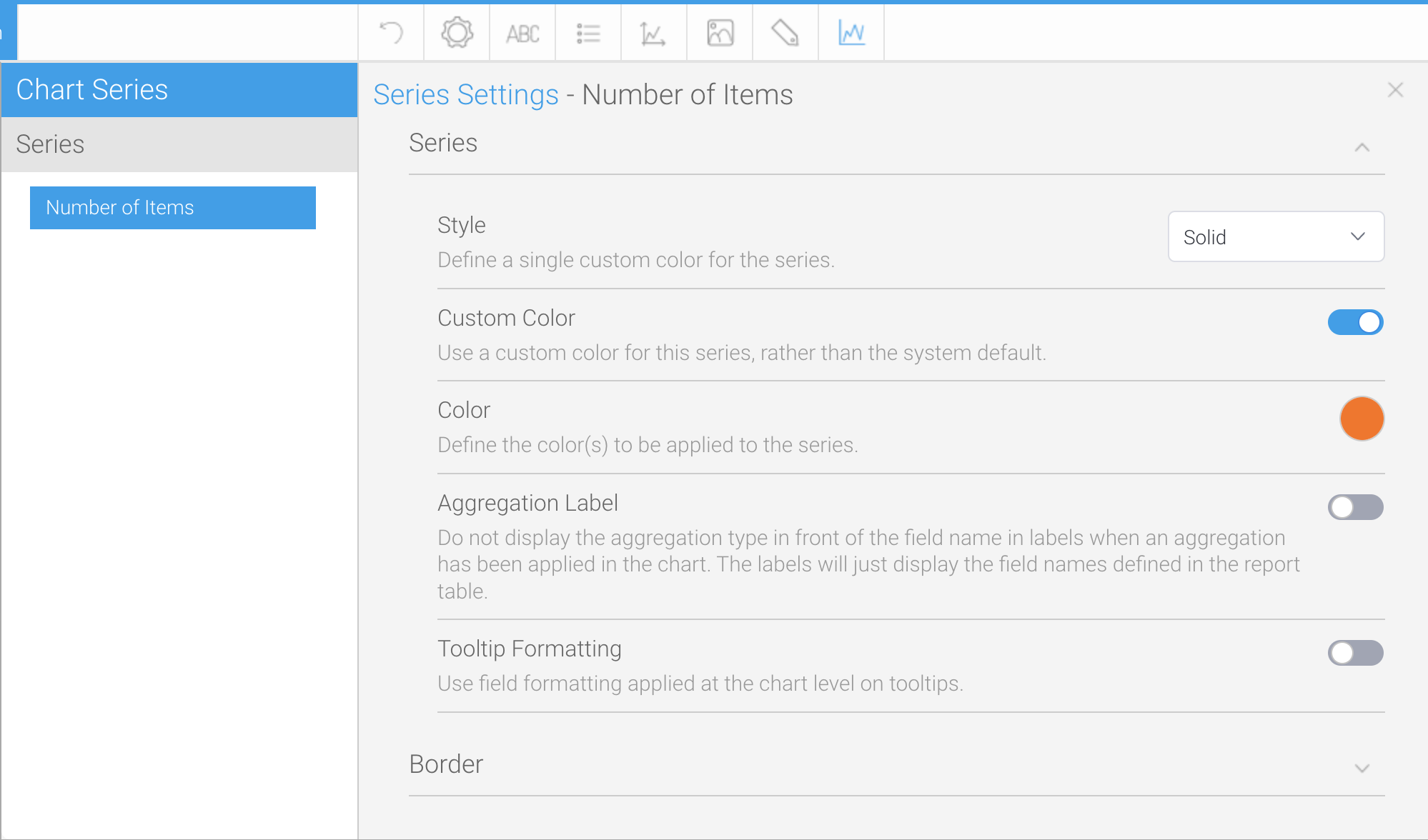 If you set "Style" to "Solid" and "Custom Color" enabled, you will be able to specify the "Color”.
We have now created six charts from a single report. Click the "Publish" button to save the report. You're done!
If you set "Style" to "Solid" and "Custom Color" enabled, you will be able to specify the "Color”.
We have now created six charts from a single report. Click the "Publish" button to save the report. You're done!