Create smart, beautiful, augmented business intelligence dashboards
Simply the best
You can do more with Yellowfin Dashboards
Beautiful
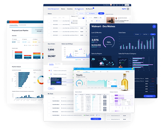
Put simply, the world's most beautiful dashboards
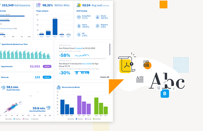
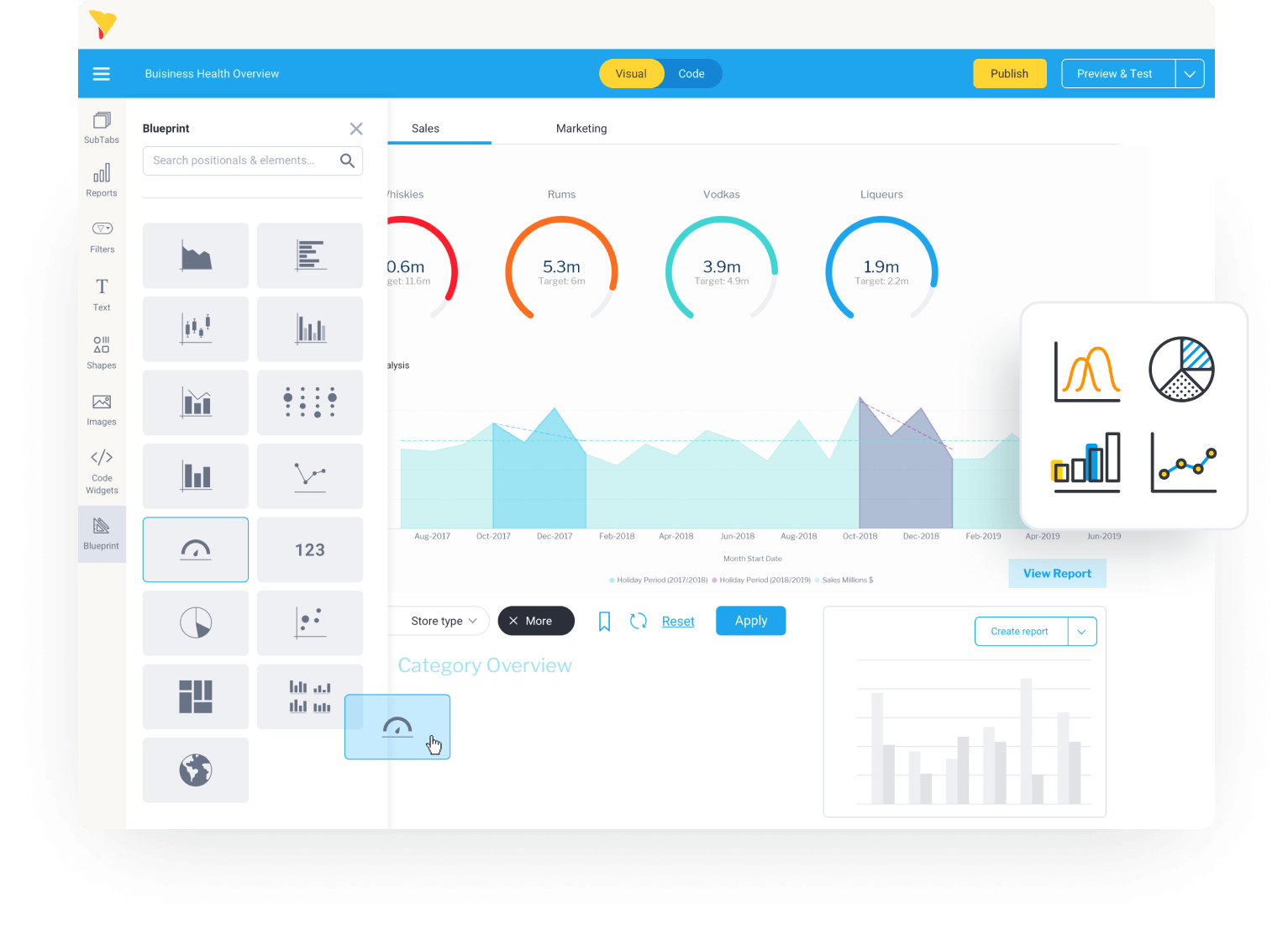
Yellowfin has created a free-form dashboard that canvas designers (and end users) will love. Drag and drop charts and a range of graphic tools to easily assemble creative, pixel-perfect and on-brand infographics and dashboards. With Canvas you have the freedom, in any grid or layout, to create engaging analytic experiences by adding shapes, text and images, and then augment the dashboard experience with automation and data storytelling.
Actionable
Data. Dashboard. Action!
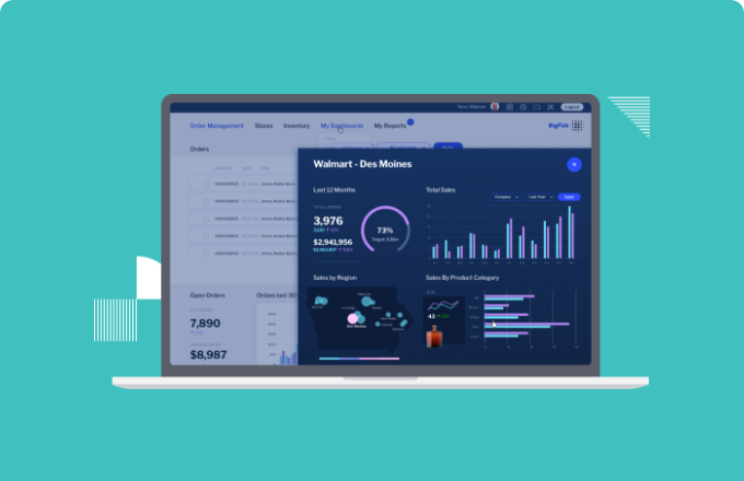
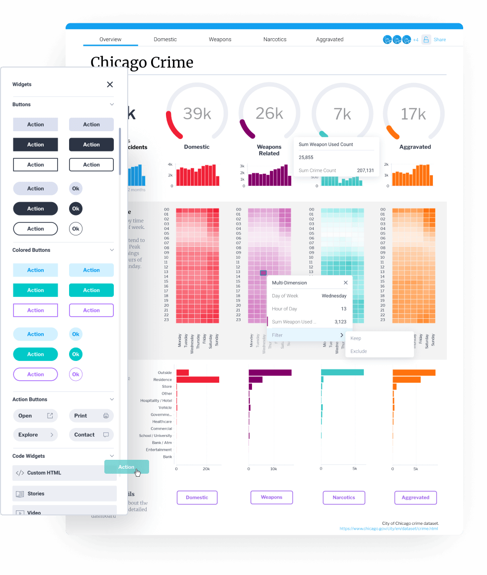
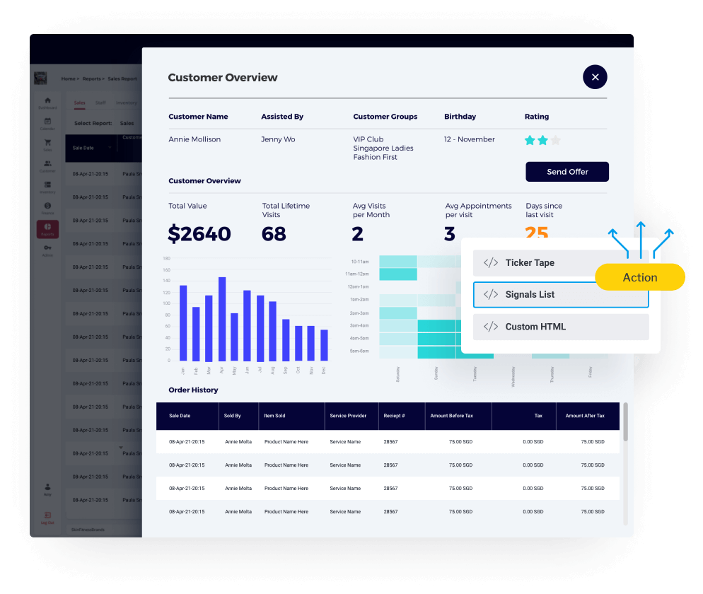
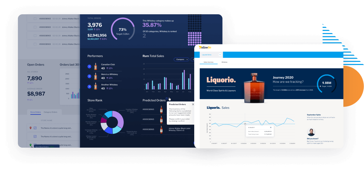
Until now, dashboards were something you only looked at. Our no-code/low-code action buttons give you the ability to support and trigger workflows directly from within your Yellowfin dashboards. This gives users the ability to act on data and immediately do things, like adjust an order, log a ticket or add a note without having to switch applications. It's a totally new analytics experience.
Automated
Insights find you with AI and Machine Learning
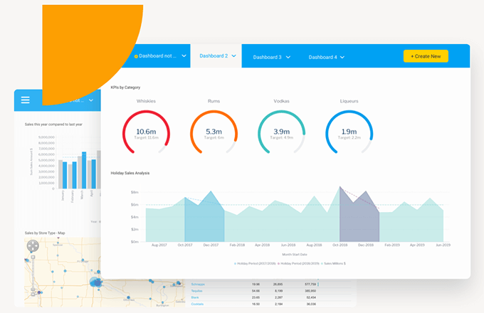
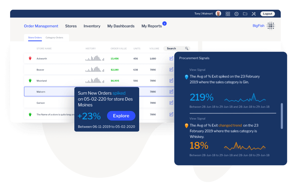
Augment your Yellowfin Dashboard with assisted insights, automated business monitoring and data science integration. Imagine everything you need to understand the trends and changes in your data. Yellowfin helps you to discover and analyze these changes and outliers in your data with incredible efficiency. Ask a question and Yellowfin automatically analyzes your data and tells you the answer. Or better still, discover the answer through automated AI—your users will never miss a critical change in their data.
Embeddable
Easily deliver dashboards to your customers.
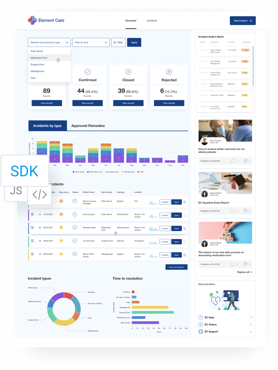
Delight your customers with stunning and actionable dashboards that are fully white-labeled, customized and embedded into your product. Leverage robust embedding methods from iFrames to APIs and SDKs to deliver unique analytical experiences anywhere. Integrate the whole dashboard module or contextually embed individual dashboards directly into your application’s workflows to drive better decision-making by your end-users.
Flexible
It's that simple
Yellowfin Dashboards look great out of the box, and with our user-friendly design and our flexible developer tools, you can easily embed or extend and create highly customized analytic experiences to suit your specific needs. Advanced widgets, action buttons and no code/low code functionality partnered with our JavaScript API give you the freedom to do things in your dashboards that we haven’t even thought of.
Extendable
Do what you want to do
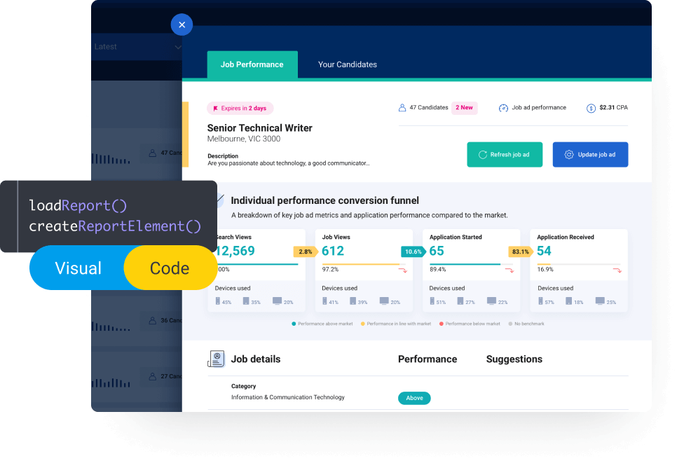
Experience the power of code mode to extend the interactivity of your dashboards. Through non-proprietary coding languages like HTML, CSS and JavaScript, create new and unique experiences—slide-out panels, animations, custom filter controls or whatever else you can dream up. Create widgets for resue to turn action buttons, forms, and more into widgets you can reuse across all your dashboards.
Contextual
Tell the whole story
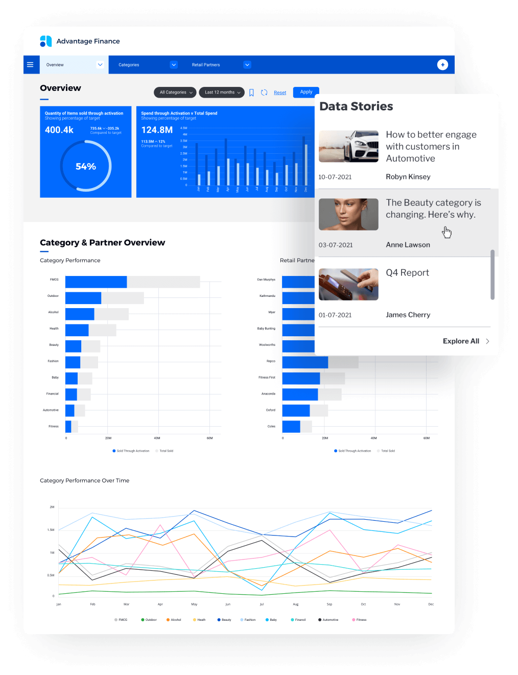
Increase the adoption and understanding of your dashboards by incorporating data stories directly within them. With a story widget, your users can access weekly, monthly or quarterly retrospectives that explain what happened in the data — and why. Provide greater context and clarity for all your users by bringing the power of data and narrative together into your dashboards.
Augmented
Bring powerful contextual extensions to the dashboard experience
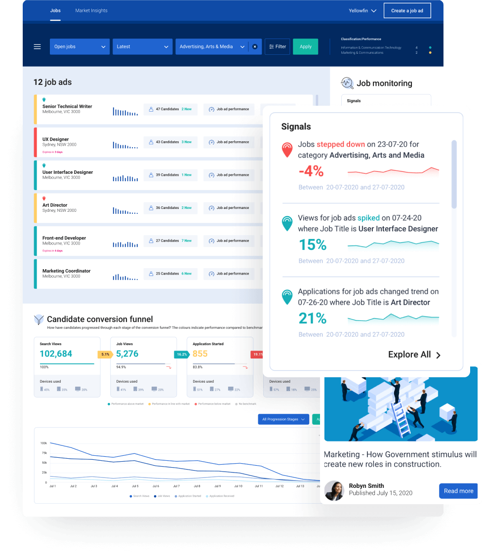
A dashboard is just the start. Deliver a unified analytics experience and streamline how to find out which insights are the most important and actionable by augmenting your Yellowfin Dashboard with assisted insights, automated alerting and data storytelling. Incorporate a Data Storytelling feed and surface contextual data stories relevant to content on your Yellowfin dashboards. And be alerted to relevant shifts in your data through a Yellowfin Signals feed to discover critical changes and insights directly from your dashboard.
For software companies
Create outstanding data-driven customer experiences. Easily embed and white label a highly-flexible Yellowfin dashboard into your software and improve your product experience by leveraging data. Build on our action-based dashboards and create integrated workflows via code mode into your own apps.
For businesses
A better way to monitor, decide and take action. Make the best decisions possible with governed and secure data that the business will trust. Yellowfin dashboards are simple to build and even easier to use, and with embedded actions, you can enable the integration of workflows into your dashboards.
Interactive Dashboard Gallery
Explore a beautiful library of dashboards
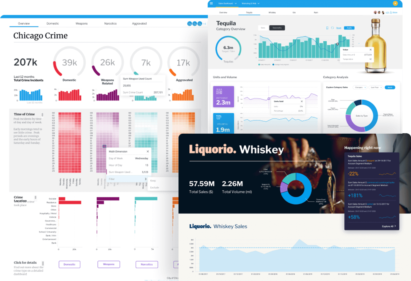
Explore the Yellowfin interactive dashboard gallery and see actionable, beautiful dashboards in action. The library contains a selection of KPI and operational dashboards each with notes highlighting the many unique features offered by Yellowfin.
Watch what you can do with Yellowfin Dashboards
Resources and further reading
Dashboard Design: 5 Essential Tips and Considerations for 2025
Explore 5 key dashboard design principles that exist to ensure you create a relevant dashboard that guides and simplifies the user experience, makes it as easy as possible to interpret what is presented no matter its complexity, and increases the adoption of BI.
The Business Intelligence Dashboard in 2025: What Is It & How to Use
Learn what a business intelligence dashboard is, as well as its features purpose, use cases and the considerations and challenges you need to address before adopting BI dashboards successfully - and what vendors offer the best dashboard options.
8 G Benefits of BI Dashboards
Understand the practical benefits of business intelligence dashboards for your business or use case, ranging from better data accessibility to empower users with better information to make data-driven decisions based on real-time, actionable insights that can be shared, drilled down and analyzed by more people.
 Free Trial
Explore Yellowfin now on our sample dataset or try for free on your own dataset for 30 days.
Get a Demo and see for yourself
Request a Demo of Yellowfin in action to see how the Yellowfin analytics solution solves data complexity through automation, dynamic data storytelling, collaboration and beautiful action-based dashboards allowing more people to discover, understand and do more with their data.
 Request a Quote
Yellowfin is priced so that it is simple, predictable and scalable to suit your enterprise or embedded analytics needs.
