
Do’s and Dont’s of Location Intelligence
I came across this example of location intelligence and GIS reporting today, and thought it worthy of discussion. This is a good topical example of maps used as a data visualization, and there are some good and bad points to how this mapping visualization has been used.
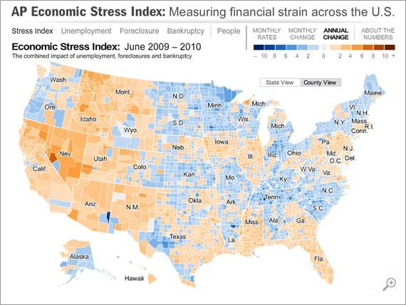
source: http://hosted.ap.org/specials/interactives/_national/stress_index/
The good points:
Relative Metrics
Use of % change as the metric. (well except for the Monthly stress level)
With maps you always have to be careful about the proportion of the population in each region. Using a % change makes the heat map relative and removes population distortion.
Time Slider
Great use of a time slider for the monthly rate chart. But why not use it in the monthly change?
Color Selection
The use of blue and brown colors to depict positive change versus negative change was really good.
Stuff I did not like
Legend
It took me a while to get used to the legend. A reduction in the level of stress is a good thing but was labeled on the negative side of the axis. This was hard to interpret – I kept wanting to good stuff to be on the right side of the legend.
Non-Relative Metric – Monthly Stress rate
Whilst this is not a bad metric the visualization of it is poor. Firstly they use the ‘negative color brown’ used for the change metrics to depict any level of stress. So when using the time slider to move between months it all looks bad but the annual change map shows things improving.
Also this should have been a metric relative to the long-term norm. There will always be some level of unemployment etc but how does the current period compare to a normative value so that you can get a sense of the degree to which it differs.
Also this should have been a metric relative to the long-term norm. There will always be some level of unemployment etc but how does the current period compare to a normative value so that you can get a sense of the degree to which it differs.
Zoom
The zoom-in was arbitrary. Would have been good to been able to select the point on the map to zoom into.
Impact on the economy
By looking at the stress level of the county you do not know the impact on the total economy. So this is a micro view with no way to extrapolate to macro one.
However, all said and done the good news is that things are on the improve in the US economy.