: Best Practices")
How to Proceed with a Dashboard Proof of Concept (PoC): Best Practices
Welcome to the latest entry in Yellowfin Japan’s long-running ‘How to?’ blog series.
This series of blogs aims to provide a step-by-step guide of how to get the most out of your Yellowfin BI experience, such as how to create your own Yellowfin dashboards. Catch up on the series below:
1. How To Design a Dashboard in Yellowfin: Part One
2. How To Design a Dashboard in Yellowfin: Part Two
3. How To Capture Data using Yellowfin Data Transformation Flow
4. How to Add a ‘Back to Top’ Button to Your Yellowfin Dashboard
5. How to Create Big Number and Vertical Column Charts in Yellowfin
6. How to Create a Pie Chart in Yellowfin Dashboards
7. How to Create a Heat Grid in Yellowfin Dashboards
8. How to Create a Line Chart in Yellowfin Dashboards
9. How to Drill Through in Yellowfin Dashboards
10. How to Use Conditional Formatting on Charts in Yellowfin
This latest article from our consultants over at Yellowfin Japan will show you how to proceed with a Proof-of-Concept (PoC) for data analysis, based on their experience in data analysis with business intelligence (BI) for more than 10 years.
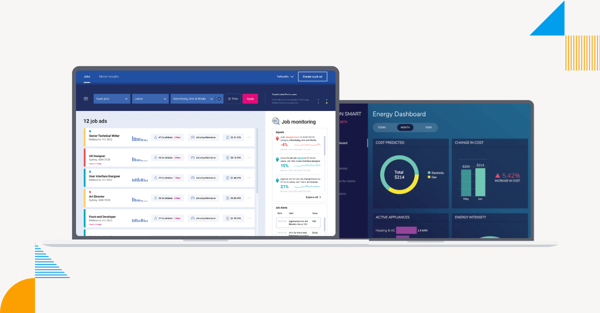
Sharing a dashboard image
Whether or not your client has a clear image of their desired dashboard is an important starting factor in measuring the level of seriousness and success of their BI deployment. Taking the time to establish both the look and purpose of their desired dashboard implementation means their necessary requirements for data analysis will naturally come one after another. Then, we will be able to more easily select the appropriate charts, graphs and other graphical elements to visually represent the client's business data according to their exact vision, allow their end-users or customers to analyze data in the intended manner, and solidify the final branding, user experience and dashboard design. Rushing both the initial proof-of-concept and into the dashboard implementation without adequately discussing and understanding the client's unique analytics use case will only lead to avoidable and costly dashboard design mistakes. A good way to start proceedings is to present several images of the PoC dashboard based on the client's use case, and solidify final design with the client's active feedback.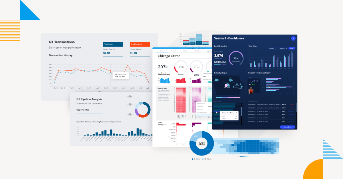 If the purpose of implementation is clear to the client prior to the PoC, some customers may present a ready image of their desired dashboard user experience, and a list of requirements at the PoC kickoff. In that case, of course, this step is not necessary.
However, in many cases, it takes time just to try to draw an image of the analysis screen. At this point, the client may realize that they have not actually drawn out a clear screen image or list of requirements - that is totally fine. It is good to regard this process as a critical step to properly identify the functional requirements for the PoC and project.
If they are not able to draw a clear dashboard image, you may want to create a chart or two. It is also a good idea to have them think about the requirements in this process.
Related reading: The Business Intelligence Dashboard in 2025: What Is It & How to Use
If the purpose of implementation is clear to the client prior to the PoC, some customers may present a ready image of their desired dashboard user experience, and a list of requirements at the PoC kickoff. In that case, of course, this step is not necessary.
However, in many cases, it takes time just to try to draw an image of the analysis screen. At this point, the client may realize that they have not actually drawn out a clear screen image or list of requirements - that is totally fine. It is good to regard this process as a critical step to properly identify the functional requirements for the PoC and project.
If they are not able to draw a clear dashboard image, you may want to create a chart or two. It is also a good idea to have them think about the requirements in this process.
Related reading: The Business Intelligence Dashboard in 2025: What Is It & How to Use
Identifying dashboard challenges and issues
The following is a list of common challenges and issues in preparing data for eventual use in the client's dashboard. This is based on the Yellowfin Japan Team's experience, so there may be many more factors than those listed below.1. Granularity of data
It is natural that the granularity of budget and performance is different. This is because budgets are set on a monthly, quarterly, annual, etc. basis, while actual results are accumulated on a daily basis. In order to perform a forecast and/or actual analysis, the actual data must be summarized into the units necessary to match the budget.2. Coding scheme
The requirement to combine data across multiple systems often arises. It is natural that different systems will have different coding schemes, and in some cases, it may be necessary to create a matching table to match the codes. Some codes, such as corporate organization codes and product codes, are commonly used throughout the company. Even in such cases, there is a great possibility that minor adjustments will be required, such as when the numerical part of the code is filled with zeros when matching digits, or when the connecting characters for major, medium, and minor categories are different (e.g., 001-1234 and 11234).3. No data in database
In some cases, actual values are stored in a database, but planned values are managed in Microsoft Excel or other formats. In this case, the Excel data must be imported into the database.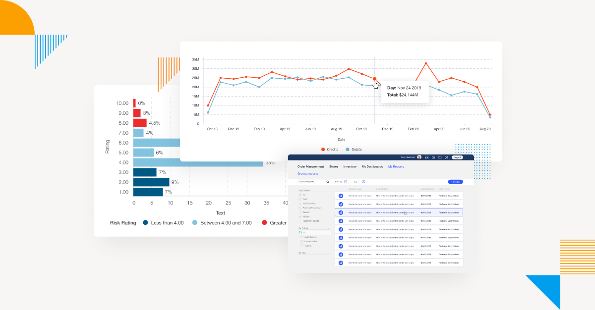
4. Handling of data noise
Data that is not needed for analysis may be included. For example, in typical sales performance data, suppose you want to correct an expensive incorrect order that occurred in May with the June performance data. In this case, since sales that should not have been raised have been raised, the information for both months would not be appropriate if the actual results are summarized on a monthly basis. We can either proceed with this just as a PoC, or if a flag exists to remove the relevant rows, we can use the flag.5. Data accuracy
Since this is only a dashboard PoC, it is important not to go too deep into the accuracy of the data. However, if you know the data well, you may look at the visualized results and realize that the data is not natural. Looking at past sales for each organization, our consultants sometimes found such data. Because of the misuse of organization code, past data was showing impossible results. Although it was unrelated to the scope of the PoC, as the person in charge of the project, we were concerned about it. Even when looking at aspects other than codes, Japanese, for example, is a language that is particularly prone to language fluctuations, such as double-byte and half-byte kana, double-byte and half-byte alphanumeric characters, and Chinese numerals. English has its own unique fluctuations that, while seemingly minor, can affect the accuracy of data input into our dashboards if not careful. With regard to data accuracy, we would like to keep in mind the issues identified in the PoC dashboard and cleanse the data at the time of production deployment.PoC dashboard scope and timeframe
Once you have the dashboard image and the data you have prepared, determine the scope (range) you can implement within the time frame. Since it is a PoC dashboard, it is important to focus on what is necessary for evaluation. Although it is related to the scope, it is important to determine the implementation period precisely. The necessary considerations for this are as follows:1. License validity period
When conducting PoC with evaluation licenses, it is necessary to consider the license expiration date.2. Evaluation period for a client
There must be an opportunity to evaluate the environment created in the PoC within the client's company. Such opportunities should be fully considered as part of the implementation period. Specifically, the person in charge may operate the dashboard created and make a presentation to internal stakeholders. Or, you may want to deploy an environment built on a server and have multiple people try out the dashboard online to see how it works. These internal customer evaluation periods should also be included in the implementation period. Additionally, the elements to be implemented may need to be narrowed down to those functions that are easy to evaluate.