The Use of Time Series Charts in Yellowfin Business Intelligence
By James Bardsley
Everyone knows about time. It’s the crazy dimension you can’t move around in. If I were to describe it, I might say it’s like some sort of train. A one way train. Never coming back.
As a data visualization nerd I’m interested in time. Specifically, how to effectively represent changes in data over time.
In this blog post I’ll attempt to explain the difference between time series charts and categorical charts.
When creating a chart in Yellowfin – if it’s a line, bar or column chart and you select a date field as your label – you will have a check box marked “Time Series” pop up:
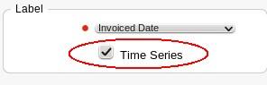
But what does it actually do?
When it’s selected, the X-axis on the chart becomes a time series instead of categorical. This means that all time within the bounds of the dataset is represented on it, and each data point is represented at its appropriate location along the axis regardless of its position in the dataset. To give you an example, take the following dataset:
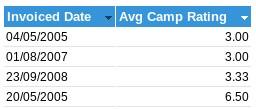
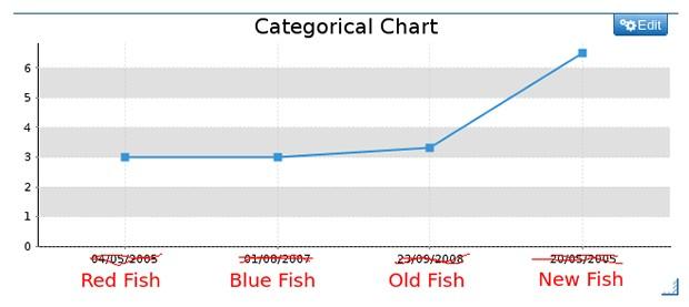
You can see that there are a couple of dates which are quite close together (04/05/2005 and 20/05/2005), and the other dates are years apart. Also note that I’ve sorted the data by Avg Camp Rating, so the dates aren’t in order on the table. If I create a line chart based on this, but leave time series unchecked, I get this result:
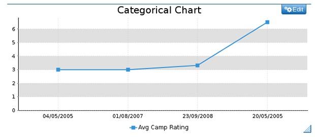
A couple of things to take note of: There are four dates displayed on the axis (the dates from our dataset), they’re evenly spaced out, and they’re not in date order. They’re in the order they’re represented in the dataset. This is because I’ve left “Time Series” unchecked, so as far as the chart knows there’s nothing special about the dates being dates – they’re merely interpreted as labels. I may as well be plotting different types of fish as far as the chart is concerned:
However, if I do go in and check time series, something wonderful happens:
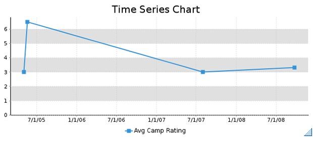
The data is now in date order. More significantly, the data points are actually placed at appropriate positions – the data in 2005 is close together, and the data which is years apart actually appears to be years apart. Also, dates which don’t necessarily have data are now represented along the axis. This is because it’s not a direct representation of the dataset, the axis is now a representation of the timeline between 04/05/2005 and 23/09/2008 – the bounds of my dataset.
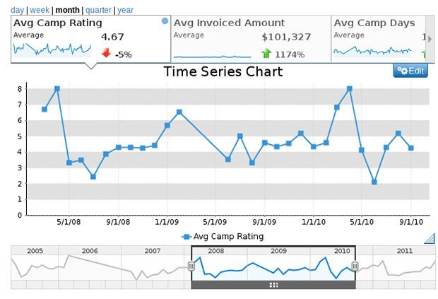
Turning “Time Series” on means that the temporal relationship of the data is preserved and graphically represented. Because the chart now knows that it’s representing a time period, new options are available – data can be aggregated based on granularity, and our sexy time slider (which lets you control the range of dates visible) becomes available.
If you’re using a time dimension on your chart, please always turn the “Time Series” option on – unless you have a really compelling reason not to. Remember: It’s time data, it wants to be treated as time. And, turning it on will give you a whole new selection of cool chart options: