
Putting the “U” in “Usability”
(Or: About the usability improvements in Yellowfin 7)
Hello again, blog lovers. In my previous articles I’ve boringly lectured you about how best to create certain chart types. I’ve talked about how time series charts work. I’ve talked about cartographic projection. I’ve even made something of a case for animated charts. Did all that lecturing become a little withering? Well good news! Today, I’m going to put the lecturing aside… to tell you about how Yellowfin’s lecturing will be automated as of version 7 (the next release of our Business Intelligence software)!
For the sake of this article, I’ll show how the usability improvements will apply to GIS maps.
“But James,” you say. “I don’t need help creating a GIS map! I know all there is to know! I just click around until something vaguely resembling a map appears!”
Well, Mr or Mrs Imaginary Yellowfin Expert, why won’t Yellowfin let you select that particular field as your geometry field? Wouldn’t it be handy if you had some information telling you that you had the wrong data type? Well, have a look at Yellowfin 7…
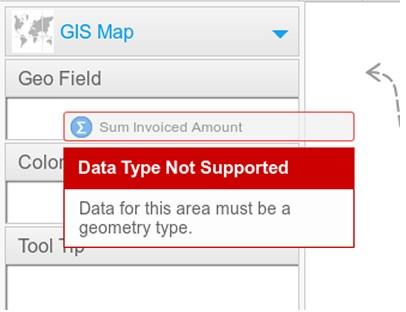
Pow! It’s so user friendly it makes me want to cry.
I can hear what you’re thinking now. “Wow, James. That really is user friendly. And you’re so handsome, too”.
Why thank you. But there’ll be time for compliments later. Right now, I need to show you what Yellowfin does if you attempt to create a map without having the appropriate data in your report. First, gaze in wonder upon the new chart type selector!
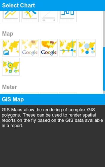
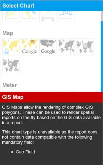
It’s blue and everything is peachy. But what if I wanted to make a GIS map, but had no geo data in my report? Wouldn’t it be a time saver if the chart builder told me what was going wrong? We’ve got you covered:
These usability enhancements will make Yellowfin even easier to use, and generally create a more pleasant experience. This means, in concluding this blog post, I can finally fulfill my commitment to the marketing team and say that Yellowfin is making Business Intelligence easy!