

Intelligent BI: What is data visualisation and how can I use it?
#3 in a series
“Imagine you’re in an open field. How far can you see? About 50 miles. How far can you hear? Maybe a mile or two. How about smell? 10-20 yards, assuming that the wind is not blowing. How about touch? Just an arm’s length. Taste? A couple of inches.”1
Our sight is our most powerful sense. That’s why making data understandable through visuals – data visualisation – is so important.
We have a constant influx of data in businesses today, from financial statistics to sales numbers and marketing campaign conversion rates to customer demographics. But data is just numbers.
You want to understand how the numbers relate to each other, right? You want to see change over time and how that compares to norms. If, three years ago, the data point read 1 million and today it reads 1.6 million, is that good, bad, unremarkable? How does this number compare to other numbers? What makes up this number? That’s where data visualisation comes in.
Making sense of data with our senses
The easiest way to process things is to use our physical senses. Of our five main senses, sight is the fastest processor and has the highest input capacity. Researchers at the University of Pennsylvania calculated that our eyes can transfer data at approximately 8.75 megabits per second.2 And, with roughly 30 percent of neurons in the brain’s cortex dedicated to vision,3 it’s easy to see (pardon the pun) why we process visuals so quickly.
That’s why we try to understand data with visuals. We are literally making sense of the data with our sense of sight.
Try this. Which of the following two reports gives you a better understanding of the amount invoiced over the year?


The two images above contain exactly the same data, but the second is much easier to digest and understand. Providing insights into the data is the crux of data visualisation.
Using comparison with other data points, you can quickly get an impression of what your data point represents. Compare it with the same data point at a different time. Take profit in March versus profit in December and you get comparison over time. Or compare it with different data points of the same type. Try comparing sales of mobile apps with sales of desktop software, and you get comparison across categories.
So they’re the basics. But you probably knew all of that anyway. These are 2D, linear ways of seeing data. Simple, impactful, and quick to understand. But you can do more complex visualisations. Here’s where it gets even more fun.
Visualising your data in 3D
For a long time, we have been restricted to rendering the world around us using two dimensions – rock, canvas, paper, screens. In painting, we see visualisations begin as flat cave drawings. They developed to more intricate paintings that rendered greater detail and colour. But not before the Pompeian wall paintings of about 80 B.C.E.4 do we see the use of linear perspective to represent depth and volume5. (Bear with me here, there is a point to this Art History lesson.) But, the art of depicting 3D space in painting fell out of fashion and seems to have been lost until Brunelleschi’s 1410 experiment in painting the Baptistery in Florence. It was Brunelleschi who rediscovered the art of painting with mathematical perspective.
What has art got to do with data visualisation?
Well, thanks to Brunelleschi’s rediscovery of how to portray three-dimensional space on two-dimensional mediums, we can do incredible things with data visualisations. We can deliver a third dimension on which you can visualise data. No, I don’t mean 3D bar charts (or worse, 3D pie charts). In a just world, those would be banned. I mean visualisations that require a second axis along the same plane. Thanks to Brunelleschi, we can map data to a building plan, or any three-dimensional object. We can use space to demonstrate extra dimensions and the interplay of more data sets. We can also make these visualisations interactive using tool tips and drilling, and make them responsive so they change colour with changes in the data.

However, in all of the excitement of these advancements, there is beauty in the simplicity of two dimensions. The above visualisation is kept simple with just colour coding. But we’re able to understand the information faster when there are fewer dimensions to process. In two dimensions, form and colour can create more distinct contrast because they are seen side by side. You will find most data visualisations in two dimensions because that is often the most efficient way to deliver information.
Never make your visualisations complex or ‘pretty’ for the sake of it. You are in the business of delivering insights fast. If your fancy effects slow understanding, and therefore delay insights and business decisions, you are hindering the business, not helping it. Kill your extravagant designs before they reach the dashboard.
Data as your fortune teller and how to use it

It seems that we all want to know the future. In ancient Greece, large decisions were brought to the prophetess who sat in the temple at Delphi. But a recent discovery reveals that she was high on ethylene that leaked from the geological faults running beneath the temple!6
Today, businesses are turning to data as their fortune teller. Fortunately, this source is much more accurate than the stoned Oracle of Delphi’s foretellings. But remember, data isn’t infallible.
You will be using data to answer business questions. How much did we turn over this year? How much profit did we make? What elements of this process can we make more efficient? How did this campaign compare to the last? If all things stay the same, what will my sales look like over the next two months?
To answer these questions you will need:
- An understanding of business and the questions your users will be asking
- An easy-to-use platform that your analysts can rapidly create reports on and your users can intuitively use
- An understanding of the data sets you have, how to bring them together to answer the questions, and which visualisations work best to deliver each answer
You need to understand what your users want. Ask, what is the one thing you want to know from this report? When you really understand the need, you can pull together the relevant data sets to create reports that answer each query. Compile related reports into a dashboard and set the data to update as frequently as you need. Now, you have a dashboard that can be used again and again.
Make sure you follow data visualisation best practices so that the information is ordered and presented optimally. Label your reports with axes labels, titles and keys. You might even need to provide a small amount of written context and add helpful features like tool tips.
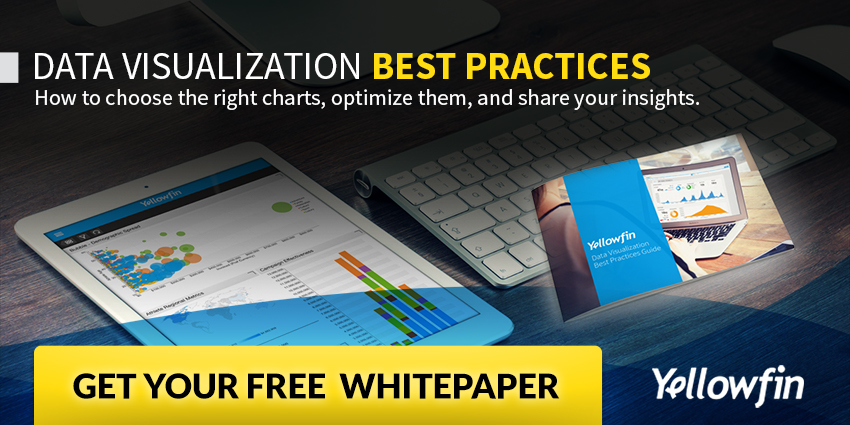
If you want to know how to optimise your data visualisation, download this data visualisations best practices ebook here >
Read #1 in the series: Intelligent BI: The three cornerstones of impeccable BI data governance >
Read #2 in this series: Why you need trustworthy business data >
Read #4 in the series: Intelligent BI: What is data governance and how do I implement it?