

One easy-to-forget step you need to enhance your data visualizations
The best business decisions are the outcome of the most accurate data, and that data needs to be framed in the bigger picture. It needs context.
I recently bought a house.
Apparently, that’s one of the top 10 most stressful events in life. Why? Because of all the decisions.
And those decisions don’t have straightforward ‘yes’ or ‘no’ answers. There are so many variables. The thing is, you need a lot of data to make the best house investment. And that data needs context, because a change in one factor can alter all the other options.
The estate agent’s beautiful photos of a house give no context. You need to see the street to know if you’d like to live there. Even the Google street view can look deceptively nice when the sun’s out. And the estate agent would probably never tell you that the pretty park behind the house fills with loud teenagers after school hours, but an after-school-hours viewing can show you that. Or you might not know that there is a new development at the bottom of your road so lorries, trucks for my American friends, will be rumbling past all day. You have to drive around the area and spot the construction site to know that.
Context is crucial. And it’s no different for business data.
Without context attached to your data visualizations, you simply can’t make the best business decisions.
It’s the one ingredient too many analysts forget.
Why Your Data Visualizations Are Not Helping Anyone
It’s amazing how often you can see misleading data visualizations; not the sort that are deliberately trying to skew your perspective, but the sort that compares absolute numbers, omitting the context. In those cases, adding relevant data or annotations would tell a very different story.
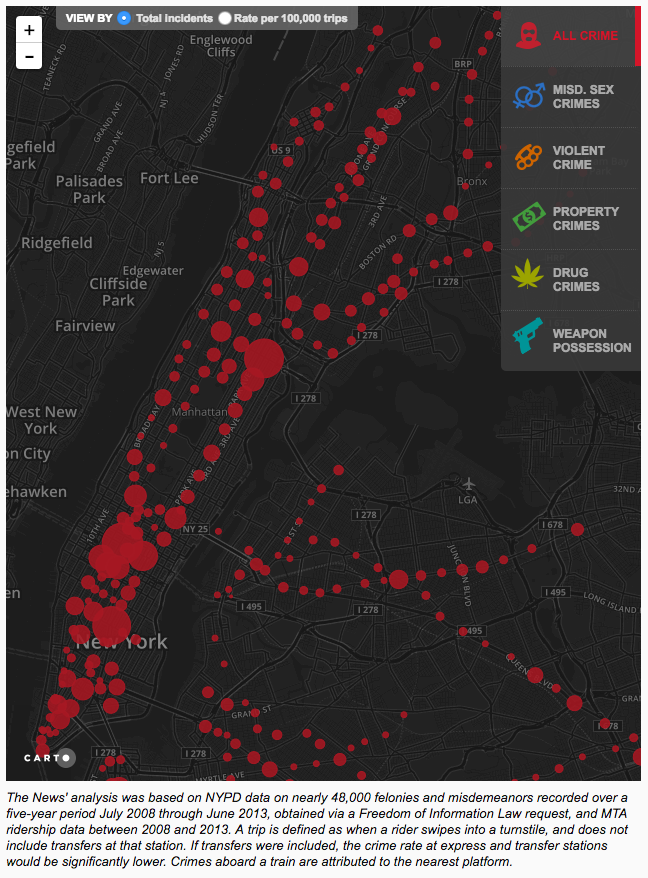
Take this example. This map of crime at New York subway stations is carefully annotated with the number of felonies, the time period covered, how they measured details and more. By the look of it, I would consider avoiding Times Square, 14th St-Union Square, and 125th Street – the ones with the largest red circles showing the highest number of crimes.
Now, take a look at the next map below. It uses exactly the same data set as the map above. But this time, the filter (at the top of the image) has been switched to show the number of crimes per 100,000 trips through the station. Would seeing this second map change your mind about which stations should be avoided? It changes my mind. The ones I thought were particularly dangerous, are now seen to be some of the safest. Though I’d still keep an eye out at 125th Street, I’d put East 143rd Street-St Mary’s Street on my watch list.
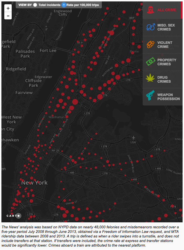
The context that was missing in map one was the station’s usage – how many trips were made through each station. More people means more opportunity for crime. So, of course, the busiest stations have the largest total number of crimes. But when those crimes are measured per 100,000 people, the story changes.
Similarly, if I told you that there were 14,267 McDonalds restaurants in the US versus 7,920 in Europe, you’d imagine that the US was the larger portion of McDonalds’ revenue, right? But no. Investopedia states that only 31.5 percent of McDonald’s revenue comes from the United States, which is less than from Europe overall. To know that, you need the context of revenue figures, not just absolute numbers of stores.
So how do we put context at the forefront in our data?
Build a Bigger Picture
When it comes to business decisions, the best decision can only be the outcome of having the most accurate data and that data needs to be framed in the bigger picture. It needs context.
Context comes in the form of text. From the very basics of labeling your axes and providing color keys, to using data point labels and annotations on the visualization or adding explanatory paragraphs in an article, context is crucial. Without these, at worst the data visualization can be meaningless and useless, or at best it can be difficult to glean worthwhile insights.
Context enables you to provide a valid interpretation of the data, flesh out the bigger picture, add emphasis, guide the reader to the correct inferences and enable comparisons. They can also preempt the reader’s curiosity about an outlier or trend.
You Have Two Options…
Nicholas Diakopoulos, writing for ‘The Tow Centre for Digital Journalism’, defines two types of context: Observational and additive.
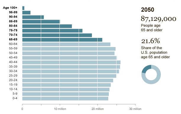
Below is an example from the New York Times to demonstrate how observational context does not add additional information to the data already there – you can work out the figures for yourself – but it clarifies and reinforces the point that the data provider wants you to focus on. Here, the text on the right highlights the specific number, projected for 2050, of citizens over 65 years old. It also shows that number as a proportion of the projected US population to clarify the context. That’s not new information when you can see the graph, but is helpful and precise context.
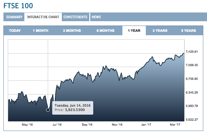
Another type of observational context is data point labels that give you a precise figure. Below is a FTSE 100 chart which, when you hover over a data point, provides the specific figure and precise date of that data point. This just helps you observe the facts with more clarity. It makes the details more visible.
In contrast, additive context provides additional information that wouldn’t otherwise be known from observing the data visualization.
Conditional Canvas Widgets give data visualizations more context
There’s a fun new way of providing some additive context within Yellowfin using conditional canvas widgets. You can conditionally format widgets to change with your data. In the example below, the arrow widget shows performance in comparison to targets. The figure shows revenue, but to know whether that is good or bad, you need some external information – your targets.
You can condition the arrow widget to point up and turn green when the figure goes over a certain number – here it’s $100 million. Below $50 million? The arrow will point down and turn red. 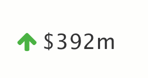
This arrow, providing additive context alongside your figure gives an immediate answer to ‘how does it fare in comparison to my objectives?’ It’s external information you wouldn’t know from observing the single data point of revenue. In contrast, if you had the targets written out next to the revenue, the arrow could serve as observational context.
Another example of additive context in use is this tidy and straightforward bar chart from the Guardian. It shows the fall and rise of physical book sales worldwide.Taking a look at this, we can see that Brazil’s book sales more than doubled in 2013-14. But Brazil also had the largest dip in sales in 2015-16. Why? We don’t know from just looking at the graph. And we don’t know why the UK and US have been doing so well with physical book sales increasing each of the past three years.
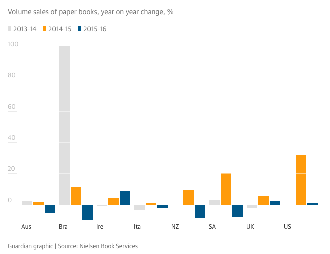
But the Guardian took the time to add context to the numbers in the form of paragraphs of text surrounding the graph that explained the UK and US’s political turbulence made satirical books that riffed on childhood classics very popular over the past couple of years. For Brazil, the incredible performance in 2014 was almost entirely down to the runaway success of a cookbook by priest-turned-chef Padre Marcelo Rossi. Sometimes, long-form text is the best form of adding context as you can provide a much fuller picture.
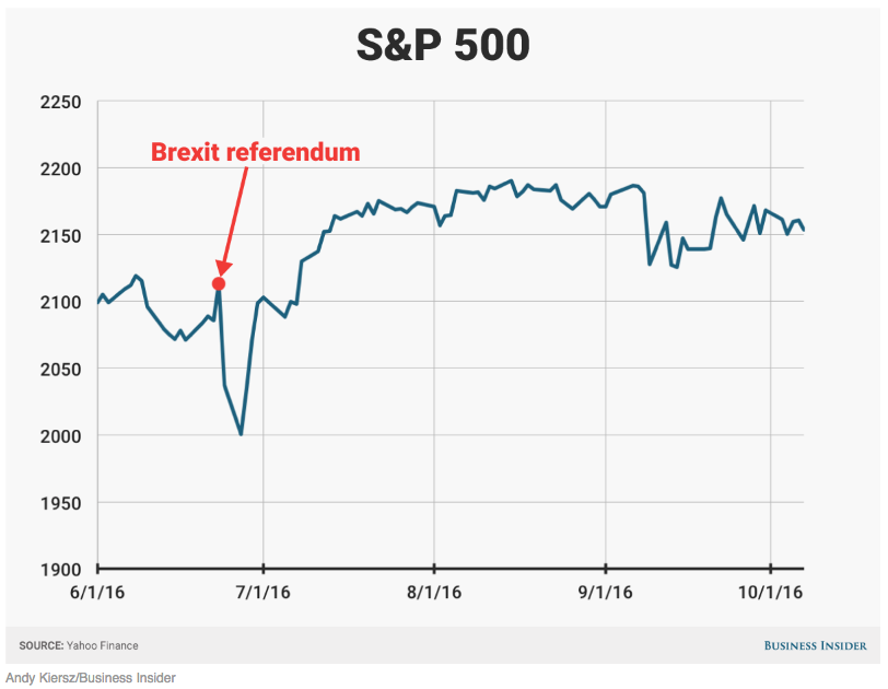
How about placing annotations directly on the graph? Without the annotation on the line graph below, we wouldn’t know why the S&P 500 dropped so dramatically on the 23rd of June, 2016. It seems an out of the ordinary dip, but it is explained by the label showing the crash happened directly after the Brexit referendum where Britain voted to leave the European Union, sending shock waves through the market. This additive context helps to explain ‘why’ by using external data.
So next time you go to serve up a beautiful data visualization – think.
- Can I add clarity to the data I’m providing by highlighting or reinforcing a point?
- Do I need to spell out details that aren’t easy to see?
- Is there an outlier or trend that can be explained with external data?
- Most importantly, think: How can I help the reader make the best business decision?
Context is crucial and the difference between a shallow, pretty visualization and true data insight that will propel the reader into action.
Find out more about Yellowfin Conditional Canvas Widgets here >