3 components you need to create the ultimate dashboard design
The dashboard builder’s ideal
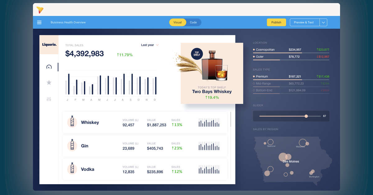
In the ideal world, when a developer builds a dashboard, they want that dashboard to be used to its fullest extent. Dashboards would engage users with their design, provide users with both information and the means to take immediate action (without leaving the dashboard), and become part of users’ everyday workflows.
The former dead-end dashboards and dull designs will be upgraded to eye-catching, actionable dashboards designed to engage every employee. One day, even the desktop of the least data literate, the people struggling to post a GIF, the individual struggling to understand the stacked bar chart, will have dashboards designed for their needs that they use every day.
And to bring relief to all the designers who hold the brand guidelines so close to their hearts and really dislike the look and feel of your analytics module, the dashboards will be beautiful and finally conform to your brand guidelines. That’d be the ultimate in dashboard design.
The dismal dashboard design reality (that you’re about to change!)
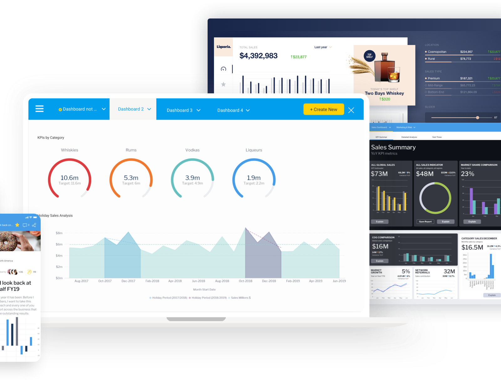
But, despite all those aspirations, the dismal reality of dashboard design is that dashboards aren’t always engaging, they rarely conform to the brand identity of the organization, and they are never built to allow the end user to take action. The design of dashboards is often functional and communicates accurately but, because of the constraints of the grid format, it looks bland and boxy.
Typically, dashboard platforms have kept design options limited to analytical layouts. For example, four charts laid out 2x2 across a single page, which is best practice for clear data display. However, while this makes sense and appeals to the analyst designing the dashboard, this often doesn’t represent how the business user - the largest user group of dashboards - ultimately will use that data for action. We’re all used to sleek looking applications and brands because brands know that design creates an environment that people want to stay engaged with. And keeping people engaged with data is crucial to building a data culture where decisions are made based on the data rather than what seems to have worked in past experience.
Design is a key consideration whether you are offering analytics internally or to customers as an embedded part of your software application. Great dashboard design can engage users and create ownership for them when the analytics reflect the brand. Dashboard design can also facilitate a seamless workflow from data discovery to actionable outcome.
Traditional dashboards haven’t cut it, so here’s how you can use modern dashboards to design dashboards that get daily use.
1. Design dashboard prototypes in collaboration before you build
Step one is creating the dashboard layout. A dashboard is usually requested by an end user and built by an analyst or IT. This initial stage can be the difference between the daily use or total abandonment of the data dashboard.
Often, the end user has a reasonable idea of what they want the dashboard to look like. Nevertheless, a design explanation often requires a meeting in person and scribbles on a notebook that can be difficult to decipher a couple of days later. If the analyst doesn’t understand the business user’s role and requirements, the end product is unlikely to be what the user wanted and the dashboard fails. It takes a lot of time and effort to build a dashboard, so nobody wants to waste time on a dashboard design that flops.
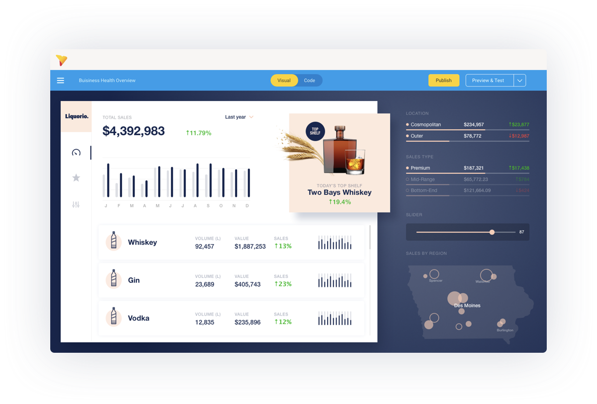
Instead, you can now let the end user in on the build process by choosing a dashboarding platform that offers a dashboard prototyping or wireframing capability to ensure they get a dashboard that fulfills their needs. They can quickly and easily lay out exactly what they want, collaborate with you in the real-time chat function, and both get an agreed understanding of what is needed, all from within the analytics platform itself.
With a tool like Yellowfin Blueprint, you can make your users happy with dashboards designed exactly how they need them. No more to and fro. No more pulling together data into reports that get ditched the moment you show the end user. Blueprints allow you to get the dashboard right first time. From there, you not only place the right reports in the right order on the dashboard, you can start to design for the user’s workflow.
2. Design dashboards for action (really!)
The second step is designing around how the dashboard is built - the build is influenced by the user journey which in turn influences the dashboard design.
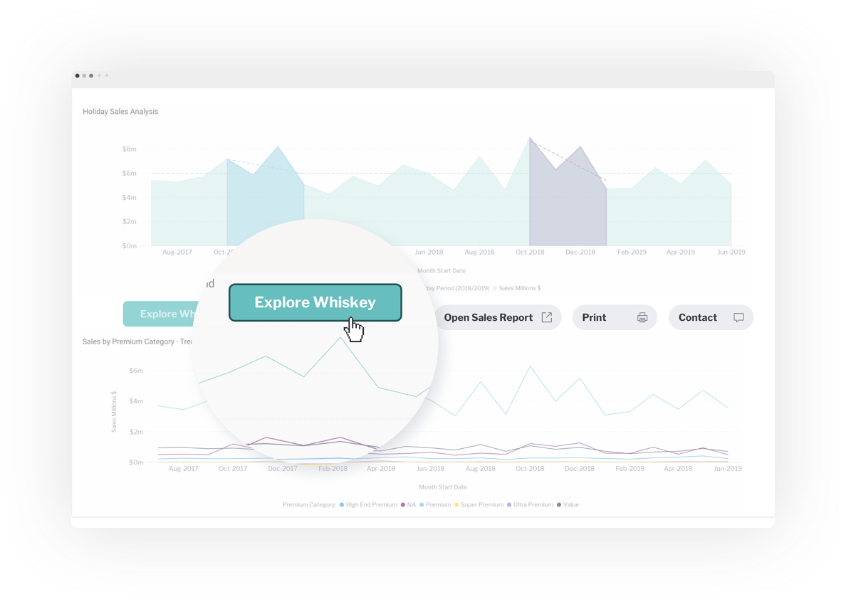
An actionable dashboard requires actions to be embedded into the dashboard - buttons and forms embedded in the dashboard next to the report with the relevant data. This ability to action insights in this way is a brand new feature that comes from Yellowfin exposing the code - HTML, CSS, and Javascript - of dashboards to allow full customization. For example, there could be a form to order more stock next to a stock report on the retail manager’s dashboard. A dashboard that is actionable needs to be designed to help users flow from data consumption to action.
The placement of buttons and forms and the use of color and form are critical for helping a user journey through the dashboard workflow. And you have complete flexibility to design for every scenario.
3. Custom-design dashboards using its HTML and CSS
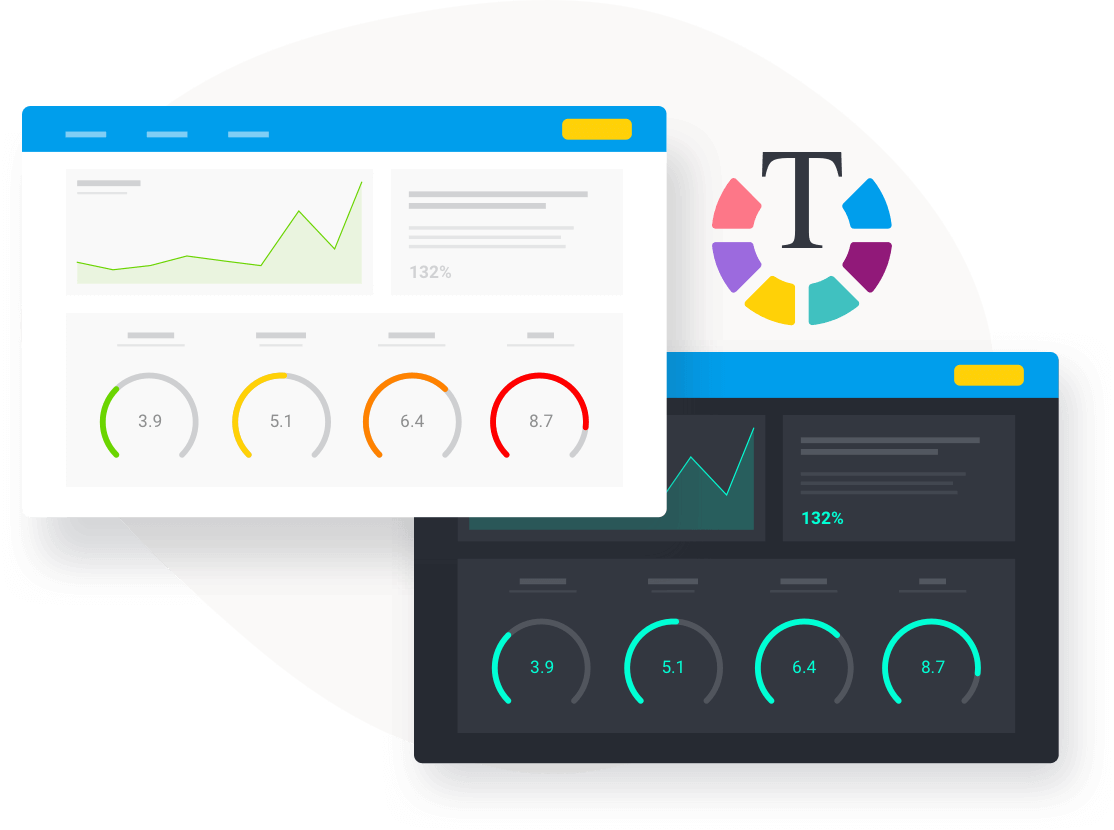
Having fully customizable and flexible dashboard design is ideal if you are a software vendor with analytics embedded in your application. Dashboards are an integral part of your application and should look and feel just like the rest of your software. And for those who are using dashboards internally in your organization, branding and visual appeal are important to the adoption and use of your analytics. Today’s analytics platforms are finally allowing you to design dashboards, not just individual reports, with complete freedom - no more adherence to the fixed grid layout.
With direct access to the CSS and HTML in Yellowfin's Code Mode you can set your own styling and, with the canvas functions, you can break out of the grid layout to place images, buttons, forms, and reports anywhere on the canvas. You can completely alter the CSS to meet your needs - add everything from responsive design to brand colors. Developers and graphic designers can customize and extend dashboard design using a GUI drag-and-drop or code elements directly (depending on complexity and preference). With that breadth of functionality, you have complete freedom to produce dashboards however you want them and produce bespoke analytical experiences.
This design freedom enables software developers to provide a seamless brand experience between the analytics module and the rest of the application. The design flexibility also allows you to make the dashboard visually appealing and logical for end users so they are fully engaged with the application and the dashboards become the key component in their daily workflow.
Your next steps
So, if you want to design the dashboard that will become part of your user’s day-to-day life, look for:
- In-platform dashboard prototyping
- The ability to design and build dashboards that drive action for end users
- Fully customisable code so you can design to your (or your UI designer’s) specifications
Build your dashboards around the end user’s workflow. Design to help guide them from receiving the information held in their dashboards to taking action based on the insights they uncovered. With modern dashboard design capabilities, you can design pixel perfect dashboards that reflect your brand, the topic of the dashboard, and that engage users visually with the content.
Here’s to the ultimate dashboard design becoming a reality.
All the new dashboard capabilities
Take a look at all the new capabilities in dashboards and dashboard design from Yellowfin in the latest release.