

10 Key Dashboard Design Principles: Analytics Best Practice
Effective dashboards highlight the most important information, minimize clutter, and guide the viewer’s eye. Following best practices in layout, chart choice, and user experience helps ensure adoption. Dashboards should be actionable, intuitive, and aligned to business goals. With Yellowfin, you can apply these principles quickly using pre-built templates and customization options.
What Are Dashboard Design Principles?
For many organizations, achieving effective dashboard design is a recurring problem. Simply put, a lot of effort is likely going into creating dashboards your intended audience don’t even look at. However, it's a problem that can be easily remedied following a few core principles.
In this blog, we explore 10 key dashboard design principles that exist to ensure you create a relevant dashboard that:
- Guides and simplifies the user experience
- Makes it as easy as possible to interpret what is presented
- Handles complexity clearly
- Increases the adoption of your BI investment
What goes on a dashboard?
The main purpose of a business intelligence dashboard is to communicate business data in a visual, interactive form that:
- Highlights to the reader what is important
- Arranges it for clarity
- Leads them through a sequence that tells the story best
- Helps them make better data-led decisions
Elements and principles of design and an understanding of how humans make decisions exist to assist this purpose. Unfortunately, we often see the best ideas come undone by poor design execution and bad decisions: Put users under cognitive overload and Render dashboards unusable. The challenge is highlighted by the fact leading organizations continue to face difficulty in becoming data-driven, with reports finding:
- 72% have yet to forge a data culture
- 69% have not yet created a data-driven business (Big Data and AI Executive Survey)
Part of the problem is a lack of follow-through with fundamental dashboard UI design considerations. This is key to address before your designers can even move to specific design tips such as: Colors, Imagery, Layout and Analytics best practice
The challenges of dashboard design today
But first – where does the problem stem from? Dashboards often communicate complex scenarios, with a lot of different elements for the user to take on board:
- Visualizations
- Metrics
- Dimensions
- Descriptions
- Colors
There are also emerging features such as: Automated business monitoring, Data storytelling and Natural language query (NLQ)
These have become an increasingly expected part of the modern dashboard experience and now have to be considered when accounting for necessary visual elements. Understandably, this all makes conveying data in an engaging, clear way a challenge. It is therefore essential dashboard designers:
- Guide and simplify the experience for the end-user
- Make it as easy as possible to interpret what is being presented
Put simply, design should never complicate the experience and get in the way of gaining information. Instead, it should be an effective vehicle by which the story is best communicated.
Read more: Why design matters in BI
What are the 10 dashboard design principles?
Creating a great dashboard starts with clear principles of design that ensure data is easy to understand, relevant, and actionable. Here are the key factors of designing a dashboard.
#1 - Effective information presentation
Always begin with a clear understanding of the end-users the dashboard is intended for.
Consider:
- Each user’s analytics capability
- Their needs in terms of how data can better inform their decisions and actions
This is then delivered using an appropriate dashboard interface, designed in a way that guides the user through the data journey needed to deliver the insights they need. There are five main types of dashboards to consider:
- Strategic dashboards: Created for executives and decision-makers, these dashboards provide top-level KPIs that demonstrate long-term objectives and corporation-wide performance.For users monitoring the overall business, or a specific functional or operational area to understand its trends, benchmarks and relative performance.
- Operational dashboards: These dashboards are used by frontline staff for day-to-day tracking, as they offer real-time data to support monitoring processes, workloads, and alerts.For users managing day-to-day operations of the business; mainly used for transactional decision making, and tend to be very subject area specific.
- Analytical dashboards: Designed for use by data analysts, these dashboards offer deep dives, drill-downs, and flexible filtering to dig into root causes and trends.Leveraged by more experienced users such as analysts to slice and dice data in search of anomalies, insights and exceptions to drive decision-making.
- Informational dashboards: Provide overall updates on how the business is performing by highlighting revenue, expenses, and profits. Constructed for a fast overview and is helpful for busy executives.Used primarily to educate about a certain topic, often represented visually as infographics.
- Contextual: A unique form of operational dashboards that are tightly embedded into third party applications and support or trigger workflows and transactions for users.
Understanding these various types of dashboards and choosing the right dashboard type for the user in question is critical as a foundation for implementing all other design principles.
#2 - Visual consistency
Why Is Visual Consistency Important in Dashboard Design?
Clear dashboard design is ensured and delivered through consistent adherence to and use of: Typography, Colors, and Graphic elements. Dashboard design exists to aid the end-user and should be used as a subtle, almost sub-conscious tool to guide them through the intended analytics experience.

How Should Fonts and Colors Be Used Consistently in Dashboards?
Not over-designing the dashboard is as important as conveying the right information clearly.
Limit:
- The number and size of fonts
- Headings in terms of size
Ensure the colors used are consistent throughout. If you use a specific color to highlight a certain key dimension or metric, use that same color for it across all dashboards.
What Is a Common Color Mistake in Dashboard Design?
A common mistake we see are dashboards using the same color for different fields. The viewer has to spend more time to interpret it properly, potentially causing confusion. But when color is used correctly, it can enhance the importance of metrics all the better. Looking at the example above, at a top level, the dimension of aggravated crime is consistently highlighted in orange, catching the eye toward the most important figures.
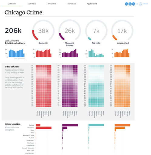
Why Does Hierarchy Matter in a Smart Data Dashboard?
Finally, there should be an orderly hierarchy and method to presenting all the visual elements on a smart data dashboard. Without one, you risk:
- Over-complicating the data
- Confusing viewers on where to look
- Failing to convey information in a clear or engaging way
In this follow-up example of the same dashboard, the most important information is clearly structured from top down and concisely divided into rows and columns, making it easy to quickly reference the metrics needed from each distinct dimension.
#3 - Efficient interactions
How Do Efficient Interactions Improve Dashboard Design?
Yellowfin sees many dashboards built with multiple graphical and interactive elements that aren’t necessarily needed at all. It’s important to remember just because you have access to a particular report or visualization, it doesn’t mean you have to use it.
To ensure the user's time interacting with the information on the dashboard is efficient:
- Any visualizations superfluous to the needs of the user should be removed
- Filters, actions or interactions need to be clear
- Interactions should logically align with the end-users’ workflow
For instance, in Yellowfin, designers can add actions into tables via low-code, no-code mode, which enables the integration of workflows at the right moment when someone is looking at a chart.
Instead of a user looking at a sales chart on which ads are working and aren’t working and having to go somewhere else to then advise or change it, you can just add buttons within the dashboard to send the user the relevant additional context.bThis sort of functionality allows for more efficient interactions to have around a dashboard.
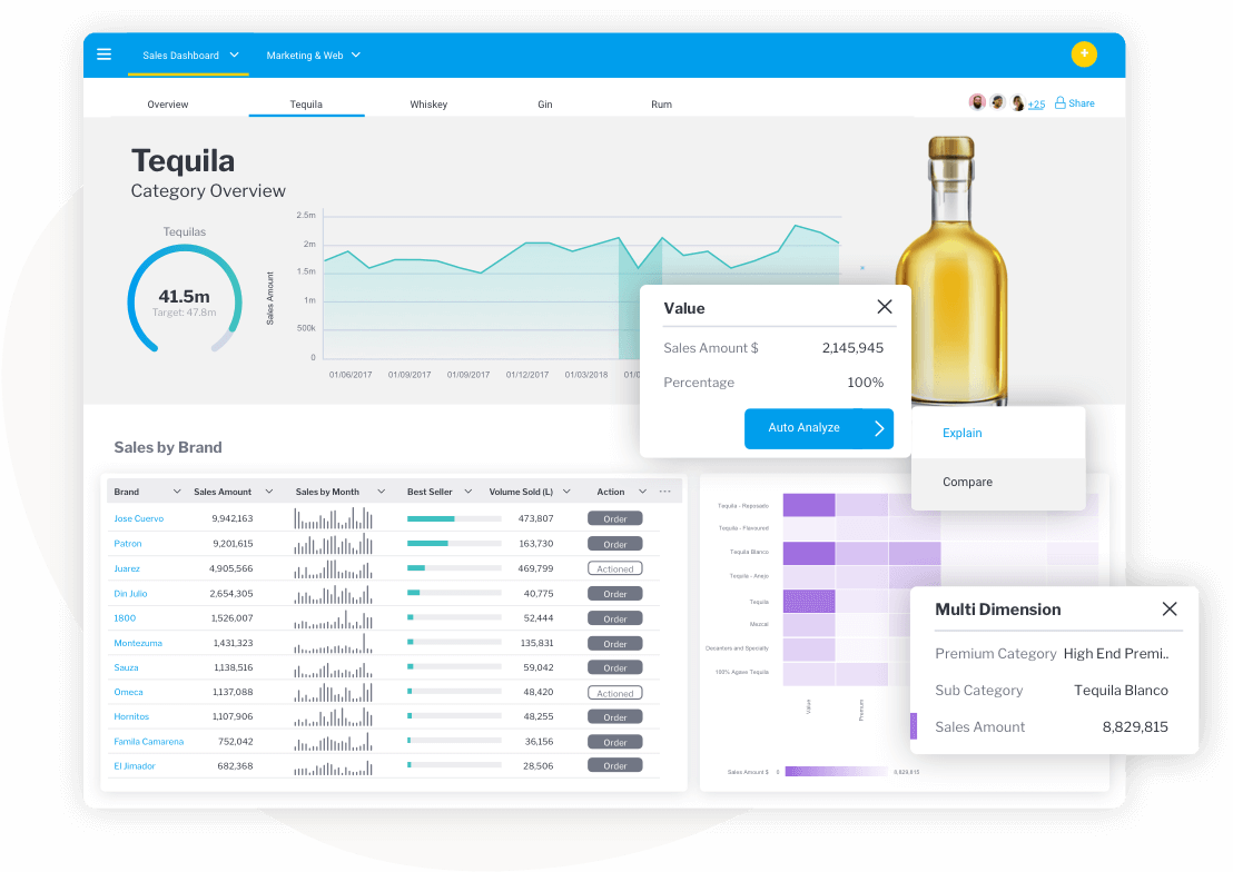
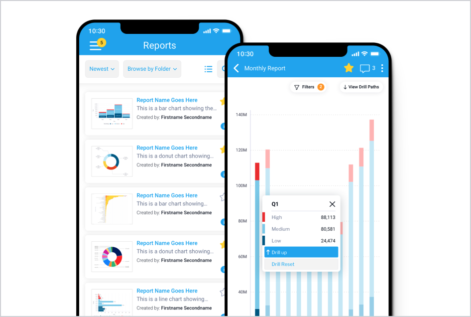
Yellowfin Dashboards Data Visualizations
What Should You Avoid to Prevent Dashboard Overload?
An efficient data dashboard design will not try to cram everything onto a page because it is available, but space elements out appropriately to avoid information overload.
- Show only the data the user needs to make the decisions they need to make
- Don’t cram information in for the sake of it
- Understand the context of how someone is looking at a dashboard
- Understand decisions and actions they need to take
- Provide them the data they need to do that
Anything superfluous to this general flow of dashboard interactions becomes an overload on the viewer and unnecessary.
It can even make people potentially disengage with the dashboard.
Ultimately, it’s about having a good understanding of the end-user and their needs and collaborating with them to understand how best to create a suitable dashboard that allows them to do what they need to do as efficiently as possible.
#4 - Effective use of language
Why Is Language Important in Dashboard Design?
Language is as much a design or user experience tool as color, font and style. Using clear and considered labeling, notes, and explanations is essential to ‘speak to’ and guide your end-users through complex visualizations and layouts.
Be descriptive when you label a chart and don’t assume the person you’re building the dashboard for knows what’s going on – this is a big problem we see a lot of at Yellowfin.
How Should You Label Charts in a Dashboard?
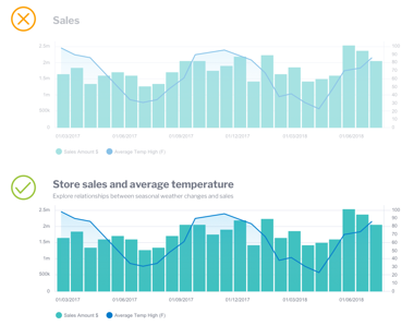
Using the example above – instead of just labeling part of the dashboard ‘Sales’ and leaving it to the user to work out its place in the overall narrative, describe the dashboard’s specific focus using typographic tools for better and detailed labeling.
For example:
- Store sales and average temperature for the main header
- A brief, expanded description beneath to make it clear to the viewer what metrics they're analyzing
Following this simple principle means any user looking at a dashboard for the first time understands what is being conveyed quickly, easily and ultimately has a really good experience with it overall.
Yellowfin offers many canvas type options that allow your designers to be very descriptive in how they label a chart for users. You can also add tabs in your dashboard to break up dashboard layouts into more manageable chunks, such as: Having an overview and Additional tabs focusing on sales performance of specific products
#5 - Minimize the cognitive load
Why Is Minimizing Cognitive Load Important in Dashboard Design?
Studies show people love the idea of choosing something, but are quickly overwhelmed by their options. Without meaning to, many people avoid interfaces or situations that are mentally straining.
Adding too many can quickly lead to people choosing nothing, and leads to using the slow thinking part of the brain, which often drives people towards the safe and familiar. This is what’s called the choice paradox, and it is highly relevant here.
Whilst design is often described as something to be visually pleasing, it’s primary aim is to really be mentally pleasing. Yes, it should look good, but it must also ‘feel’ good to be considered ‘good design’.
That means following the other principles closely, and:
- Limiting what visual elements you choose to share
- Limiting actions you enable on the dashboard
- Getting design down to what’s essential and removing what’s superfluous
Overall, good dashboard design is successful when it reduces the effort required by the end user to be as minimal as possible when they attempt to interpret and use the data presented in front of them to make decisions.
Well-executed information dashboard design provides effective visual communication of data, and requires a clear hierarchy – more important things at the top, less at the bottom, so the viewer’s eye naturally goes on a journey.
If they can’t engage without feeling overwhelmed, they’ll probably move away from your dashboard, which definitely isn’t ideal after all the effort you put into it.
#6 - Make it responsive
Why Is Responsive Dashboard Design Important?
An ideal dashboard must work perfectly across all devices and platforms – whether it’s checking a KPI dashboard or on a smartphone while traveling. A responsive dashboard design data visualization automatically adapts to screen sizes and device orientations to ensure its: Clarity, Usability and Performance qualities.
How Do You Build a Responsive Dashboard?
To build a responsive dashboard, it’s recommended to:
- Use scalable layouts and flexible grid systems.
- Optimize font sizes and chart spacing for smaller screens.
- Make less significant elements on mobile.
#7 - Design for speed
Why Does Dashboard Speed Matter?
A dashboard that takes too much time to load can impact user engagement. Speed and performance are two of the most important parameters that have a direct effect on users' satisfaction and productivity.
Slow-down can take your dashboard audience out of the experience, and potentially dissuade them from engaging with your BI investment. In order to provide a seamless experience to the user, the prioritization of data dashboard design for speed is necessary.
How Can You Optimize Dashboard Speed and Performance?
Here are some of the ways to optimize dashboard speed and performance:
- Reduction of the number of complicated visualizations per page.
- Filtering data as it gets onto the dashboard.
- Planning data refreshes when the traffic is low.
- Using load-on-demand widgets where possible.
#8 - Augment with AI
How Does AI Improve Dashboard Design?
Generative AI is becoming more useful day by day and helping businesses to gather data and complete tasks more efficiently.
Modern dashboards not only show data but also integrate artificial intelligence (AI analytics) tools, which automatically analyzes and interprets data, such as Yellowfin’s AI Natural Language Query feature.
What Capabilities Do AI-Powered Dashboards Offer?
AI in dashboards offers several strong capabilities:
- Find out the outliers or anomalies in real-time.
- Surface key trends or unexpected changes.
- Generate narratives that describe the data in plain language.
AI-powered dashboards limit the amount of manual analysis while helping users uncover insights that they might overlook otherwise.
#9 - Keep the dashboard updated
Why Is Keeping a Dashboard Updated Important?
It is important that dashboards are always up-to-date with regard to the most relevant data in order for a dashboard to be effective. Old metrics can cause: Bad decision-making, Inefficiency and A lack of user trust. In order to present data using a clean, efficient dashboard design, you must also ensure the information shown is current and reliable.
How Do You Keep Dashboards Valuable and Relevant?
To keep your dashboards valuable:
- Schedule regular data updates or use live data connections.
- Review KPIs and metrics periodically to ensure relevance.
- Audit dashboards for broken links, unused filters, or outdated labels.
Regular maintenance ensures that your dashboards grow with your business needs.
#10 - Maintain data accuracy
Why Is Data Accuracy Critical in Dashboard Design?
Maintaining data accuracy is essential for a better dashboard and determines its effectiveness for decision-making. If your data analytics dashboard design provides wrong or contradictory data, then it can bring about wrongful decisions regarding business initiatives.
Thus, data accuracy is important not only for technical performance, but for the credibility and usefulness of the dashboard as well.
How Can You Ensure Data Accuracy in a Dashboard?
Ensure data accuracy by:
- Pulling data from authentic and clean sources.
- Using consistent rules of transformation and validation.
- Testing visualizations to prove satisfactory results.
- Engaging subject matter experts in order to review outputs.
Conclusion
Effective dashboard design goes beyond looks— it must be created with a focus on clarity, relevance, and usability. By applying dashboard design principles like information hierarchy, visual consistency, AI-driven insights, and much more, you can build dashboards that generate a real impact on business operations.
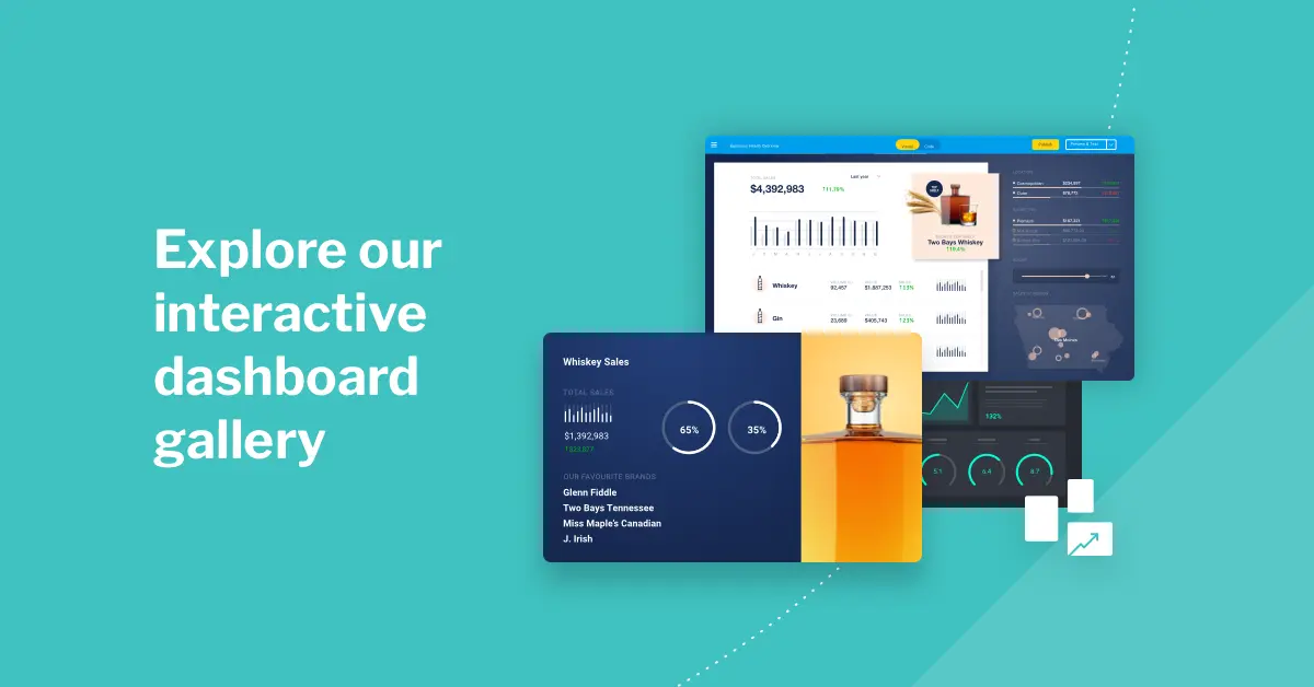
With robust features from Yellowfin, you can construct intelligent, actionable, and user-friendly dashboards to boost the efficiency of your teams and increase your ROI. See for yourself how our dashboard design features stack up with our free, interactive dashboard gallery.
Frequently Asked Question (FAQs)
What are the best practices for dashboard design?
Transforming simple data into useful information is more important for a good dashboard than just showing charts and metrics. Below are the dashboard design best practices that ensure usability, engagement, and data-driven decision-making:
- Know your audience: Make the dashboard according to the needs and user role.
- Define clear objectives: Define your targets so the dashboard only shows the information you need.
- Choose the right visualizations: Use appropriate chart types when you need to show different kinds of data, so it's easier for people to see what you mean.
- Prioritize data hierarchy: Place the most essential information first and put everything in order.
- Keep it simple: Remove clutter and only put up the essential things to reduce cognitive load.
- Ensure consistency: Ensure that colors, fonts, and layout stay the same throughout your materials.
What are the four elements of dashboards?
The four key elements of dashboards are data sources, visualizations, KPIs/metrics, and interactive filters.
What is the 5-second rule for dashboards?
The 5-second rule in dashboard design states that users should be able to identify the main message or key insight within five seconds of viewing the dashboard. If they cannot, the layout, hierarchy, or clarity likely needs improvement.
What are the 3 layers of dashboards?
The three layers of dashboard design typically include:
- Summary layer: High-level KPIs and performance overview
- Diagnostic layer: Deeper breakdowns and comparisons
- Detailed layer: Granular data and drill-down capabilities
This layered approach supports both quick insights and deeper analysis.
How many visuals should be on a dashboard?
Ideally, 5–9 visuals are recommended on a dashboard to maintain focus without overwhelming the user.
What are the key dashboard design principles?
The key dashboard design principles include clarity, visual hierarchy, consistency, limited KPIs, actionable insights, and minimal cognitive load. An effective dashboard should guide users to the most important metrics first while eliminating unnecessary clutter. Good dashboard design prioritizes usability and decision-making over decoration.
What makes a good dashboard design?
A good dashboard design presents relevant data clearly, uses consistent colors and typography, limits the number of visuals, and aligns with business objectives. It allows users to understand the main insight within five seconds and supports fast, informed decision-making.
How many KPIs should a dashboard have?
Most dashboard design best practices recommend displaying between 5 and 9 key metrics on a single screen. This prevents cognitive overload and ensures users can quickly focus on the most important information without distraction.
What’s the difference between executive and operational dashboards?
Executive dashboards focus on high-level KPIs, trends, and strategic performance indicators presented in a clear, summary format. Operational dashboards, on the other hand, support day-to-day monitoring and often include more detailed metrics, real-time data, and actionable insights. Good dashboard design principles ensure each type is tailored to its intended audience and decision-making needs.
What does a good KPI dashboard layout look like?
A good KPI dashboard layout prioritizes visual hierarchy and clarity. The most important metrics are placed at the top, supporting charts follow in logical groups, and unnecessary visuals are removed to reduce cognitive load. Effective dashboard design ensures users can understand performance at a glance and drill deeper when needed.
What chart types work best for showing KPI trends over time?
Line charts and area charts are commonly used to show KPI trends over time, especially when tracking performance against targets. Adding reference lines or goal markers helps users quickly see when metrics cross thresholds. Choosing the appropriate chart type is a core dashboard design principle that improves readability and decision-making.
When should you use a table instead of a chart in a dashboard?
Tables are best used when users need precise values, detailed comparisons, or access to underlying data. Charts are better for identifying patterns, trends, and relationships quickly. Effective dashboard design balances both formats depending on whether the goal is exploration, monitoring, or detailed review.
What are common dashboard design mistakes that hurt usability?
Common dashboard design mistakes include overcrowding with too many visuals, inconsistent color usage, unclear labeling, lack of hierarchy, and slow performance. These issues increase cognitive load and reduce adoption. Following dashboard design best practices helps ensure dashboards remain intuitive, actionable, and aligned to business goals.
Next steps: Try Yellowfin Dashboards for yourself
Leverage the best dashboard UI design features for your analytics deployment. Get a free demo of Yellowfin dashboards today.