

When is it Time to Upgrade Your Data Visualization Software?
Analytics and data visualization are essential parts of modern business intelligence (BI). These tools help you better understand your business and improve overall decision-making. However, as your data grows and your users' analysis needs evolve, it may be time to upgrade your visualization solution to achieve better capability and reporting.
Whether you are a product owner or enterprise business analyst, there are a few key factors to consider when deciding when to upgrade your data visualization solution.
In this article, we'll explore when it might be time to upgrade, and give you some tips on how to evaluate which software is right for your needs.
The Purpose of Data Visualization
Data visualization is the process of creating graphic representations of data to help make it easier to understand and use. It can be used for a variety of purposes, including business analysis, data mining, and decision making. Data visualizations can be used to create a many different types of charts, graphs, heat maps, and scatter plots, including:
Bar charts
Line charts and line graphs
Pie charts
Cone charts
Donut charts
XY charts
Related: What is Data Visualization and its Importance in Business Intelligence?

What Are the Different Types of Visualization Software?
There are a variety of different types of data visualization products in the market. Here are 4 of the most common types.
1. Graphical User Interfaces (GUIs)
Graphical user interfaces (GUIs) are the most common type of data visualization product. They are typically easy to use, and include a variety of features.
2. Web Applications
Web applications are visualization software that is accessed through a Web browser. They are often more user-friendly than traditional software, and include a variety of features.
3. Desktop Applications
Desktop applications are data visualization solutions that are installed on a computer. They are often more powerful than web applications, and include a greater range of features.
4. Hybrid Applications
Hybrid applications combine elements of different types of data visualization. This allows them to be more versatile and user-friendly than either traditional or Web-based applications.
What are the Characteristics of Data Visualization Solutions?
Analyzing big data can be a daunting task. However, with the right visualization software, it can be made easier and more efficient.
1. Graphical Representation
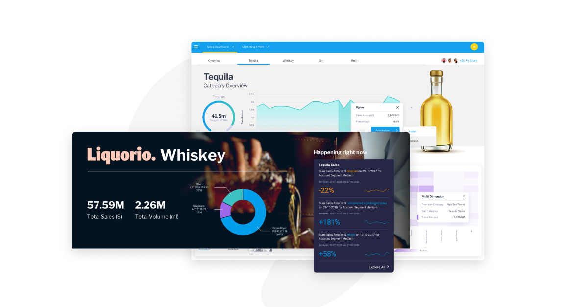
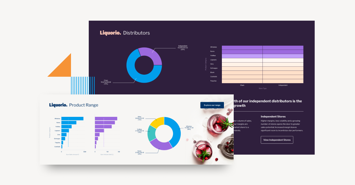
One of the most important features of data visualization capability is its graphical representation. This allows users to see the data in a way that is easy to understand, whether through chart, graph, bar chart or pie chart, as some examples. These helpful graphics can also help visual users to make connections and see patterns that they may not be able to through tables of metrics or text-based reports alone.
2. Customization
Data visualizations should be customizable and white-label friendly, so that users can make each data visualization look the way they want. This allows users to create a unique and personalized experience for their customers, app end-users, and internal users.

3. Analysis Tools
Data visualization solutions should also include analysis tools. This allows users to analyze the data in different ways and find patterns. It can also help users to make better decisions.
4. Flexibility
Any BI product with data visualization capability should be flexible so that it can be used in a variety of different ways. This allows users to find the best way to use it for their specific use cases, challenges and data-sources.
When to Upgrade Your Data Visualization?
Big data is here to stay, and the demand for data visualization tools to help businesses make sense of it is only going to increase. So, when is it time to upgrade your tool?
1. Lack of Modern Features
Customization and integration capabilities are two key factors to consider when upgrading your software. If your current software doesn't have the features you need to meet your specific needs, it might be time to look for a new tool.
2. Limited Tools and Features
Another key factor to consider is the tools and features. Charts and graphs, analysis, and charting options are all important factors to consider when upgrading your software.
3. Growing Data Volume and Complexity
Another key factor to consider is the data volume and complexity. As your data volume and complexity grow, your need for more sophisticated tools will increase. You'll also need to evaluate the tool's ability to handle complex data sets.
4. Increasing Business Requirements
As your business requirements change, so too will your need to visualize information . You need to be able to quickly create chart and graph shapes that illustrate your findings. As your business grows, you'll likely need to upgrade your big data tool to keep up with the changing needs of your team.
5. Not As Attractive Or Interactive As Other Tools
One factor to consider when deciding when to upgrade your visualization software is how attractive and interactive it is. User experience is key when it comes to visualization, and if your current tool isn't as user-friendly as other options out there (such as the Yellowfin BI suite), it might be time to consider an upgrade.
How Can You Choose The Best Data Visualization Tools?
BI dashboards are a great way to get a quick snapshot of your data and see how it's changing over time. However, as your data volume and complexity grow, so does the need for more sophisticated tools.
When evaluating tools, you need to consider the features you need, the data volume and complexity you're dealing with, and the complexity of your BI dashboard. It's also important to evaluate the tool's customization and integration capabilities. For example, if you need to connect to external data sources, you'll need a tool with robust integration capabilities.
BI dashboards are a great way to get real time, valuable insights from your data, but as your data volume and complexity grow, you'll need to upgrade your visualization software to keep up. A good dashboard or visualization tool should have the following features:
1. Flexible data visualization: Your data should be easy to visualize, no matter how complex it is.
2. Scalability: Your visualization tool should be able to handle large volumes of data with ease.
3. Fast data loading: Your visualization tool should be able to load information quickly so you can get started analyzing it right away.
4. Advanced analysis features: Your visualization tool should have powerful analytics features to help you make better decisions based on your data.
5. Customizable reporting: Your visualization tool should allow you to customize the reports it produces so you can get the information you need in a format that works best for you.
6. Wide range of supported platforms: Your data visualization should be compatible with a wide range of platforms, so you can use it no matter where you are in your business.
7. Interoperability: Your visualization tool should be able to work with other software applications and databases, so you can easily share your insights with other members of your team.
What Are the Benefits of Data Analytics and Visualization Software?
Data analytics and visualizations software can provide many benefits to businesses. These tools can help businesses make better decisions, understand data better, and communicate findings more effectively - which makes finding the right one so important.
Some of the benefits of using analytics and visualization software include:
1. Better decision-making: Data analytics and data visualization tools can help businesses make better decisions by providing insights into their data. This information can help businesses make informed decisions about their products, services, and marketing campaigns.
2. Improved understanding of your data: Data analytics and visualizations tools can help you understand your data better. This information can help you identify trends and patterns, and make better decisions based on this information.
3. Improved communication of your findings: Data analytics and visualization tools can help you communicate your findings more effectively. This information can help stakeholders understand your data, and make informed decisions.
Why the Need to Update Visualization Software?
There is no one-size-fits-all answer to this question.
Each business will have different needs when it comes to data analytics and visualizing software. That said, the general guidelines above help you assess your current tool-set, and decide whether or not to update or use an existing data analytics and visualization.
Need An Up-To-Date Visualization Software?
Visualizing data can be a complex and time-consuming task, so you'll need the right tool to help you get the most out of it.
Yellowfin dashboards offer a wide range of data visualization features that are perfect for small to large businesses. If you're looking for an extensive, self service platform to visualize data that can handle large and complex volumes of business information, look no further than Yellowfin.