
What’s what and when to use what: Descriptive, predictive and prescriptive analytics
By analytics professional and Yellowfin user Rohan Wickramasuriya
This post was syndicated from Rohan Wickramasuriya’s DPP Analytics blog with permission from the author. The original post can be found HERE >
Find out more about Rohan and his professional career HERE >
An overview
Descriptive, predictive and prescriptive are three terms that have caught the attention of everyone in the analytics circles lately. The truth is that majority of the techniques falling in these three broad groups have been in existence for decades, at least among the academic communities. While the three terms have been defined elsewhere, we ought to begin this discussion by defining the three terms here so as to set the right platform for the rest of our discussion.
Defining descriptive analytics
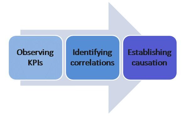
Descriptive analytics concerns what has happened in the past. ‘Past’ could mean the previous decade, year, day or even the second. Methods and techniques used in this group have a range of sophistication (Figure 1).
At the low end of the spectrum, one would make calculations and data transformations to observe how some KPIs or variables have changed (e.g. how did sales vary over the last 12 months).
Next level up, the interest of the involved parties is to identify correlations between variables (e.g. sales varied proportionally to the spending on a new digital advertising avenue). Correlation is not causation. Hence, the high end of the descriptive spectrum looks to establish causation by means of carefully planned and executed experiments.
Defining predictive analytics
On the other hand, predictive analytics answers the question what is likely to happen in the future. Predictive analytics does this by learning models based on the past experience or data, hence a thorough descriptive analysis becomes a prerequisite for a good predictive model. Although accuracy is the end goal of a predictive model, there is often a price to pay for that extra bit of accuracy, which is the ‘computational performance’. In particular, computational performance becomes a critical factor when the models have to calculate propensity scores in real time.
Another common mistake analysts make is coming up with a complex predictive model when in fact ‘inference’ is the requirement. For example, the question “how does the advertising spending on each channel contribute to my overall sales?” cannot be answered by an ensemble that blends 1000 different models together. This type of questions requires analysts to fit statistical models that make it easy to explain the main effect of individual explanatory variables, as well as interaction effect of explanatory variables on the dependent variable (sales in this case).
Defining prescriptive analytics
Knowing the desired future state, prescriptive analytics helps us answer the question “what should we do to get there”? Hence, prescriptive analytics naturally inherits elements from both descriptive and predictive analytics. The most common prescriptive analytics technique is the mathematical optimization. Given the objective and constraints, mathematical optimization is able to find the optimal solution that meets the objective. Travelling salesman problem (TSP) is a well-known example solved by mathematical optimization. Given a list of places to visit and the road network, the optimization comes up with the shortest path the person should take to reach all waypoints.
Optimization becomes challenging when faced with uncertainty. Some key factors that drive uncertainty are (a) complexity of the system, (b) length of the future time horizon, and (c) irrational human behavior. When the system for which we attempt to make predictions becomes complex, models encompass many components with uncertainty.
For example, an urban system is a much more complex system to model compared to the previously discussed TSP. Uncertainty also increases with the length of future time horizon for which we make prescriptions. The possibility of new situations coming into play is much higher over a long time window. For example, the current transport models will not work all that well when the driverless cars hit the road in the next decade or so. More often than not the systems we predict or prescribe for involve irrational human behavior. Let’s take the transport model as the example again. Vehicle routing in classical transport modeling assumes all ‘vehicles’ to have the perfect knowledge of all road links. On the contrary, we all know how human drivers make decisions while driving!
Under such complex and uncertain situations, humans by far are the best decision makers. Hence, the best thing we can do as data scientists or analysts is to empower decision makers with the right tools, rather than letting the tools make decisions for them. Our tools should facilitate an educated discussion that forces decision makers to be explicit about assumptions or parameters.
For example, it is no longer sufficient to say that the advertising budget associated with the new channel will be ‘very high’ in the next year. Everyone around the strategy table should know what exactly one meant by ‘very high’ in terms of a dollar figure. Furthermore, the tools we build should enable decision makers to explore multiple plausible futures, rather than a single definitive future. The essence here is that the elements that hold true across multiple scenarios are more likely to pay dividends.
While there are a few established methods and techniques to tackle the problem at hand, we will focus on a simple, nonetheless equally powerful interactive what-if analytical dashboard to open the tutorial series.
Rohan’s what if analysis tutorial
This post accompanies a hands-on tutorial that explains how to create a what-if analytical dashboard for prescriptive use.
We’re going to begin the tutorial series by putting the human decision maker at the center of decision-making: tools are playing an important, but a supportive role here. This tutorial explains, step-by-step, how to create an interactive what-if dashboard, taking retail location planning as an example.
It involves setting up tools in a cloud environment (Amazon Web Services to be specific), importing and organizing required data, and creating interactive charts that are assembled in an interactive dashboard.
We are going to use Yellowfin as the visualization tool, because:
(b) Yellowfin supports spatial data stored in PostgreSQL/PostGIS, the open source RDBMS we’re going to use
(c) Yellowfin’s impressive mapping capability
(d) Yellowfin is the BI tool with which I’m most familiar
Once the tutorial is successfully completed, you shall own a prescriptive what-if dashboard like below.

I wanted to make it so simple such that even a beginner is able to step through it. This resulted in a fairly long tutorial, which I decided to convert into a PDF document.
You can download the PDF tutorial HERE >
You can leave any feedback on the DPP Analytics blog HERE>