
Add Mean and SD to chart
24 November, 2014
I have average sales per year report. Also in the report are advanced calculated values for the mean sales amount and the standard deviation of sales amount. My chart has the bars for total sales per year but I would also like to add a line showing the mean value and a gray band showing the standard deviation. How can I add these elements to my chart?
Hello,
Is it possible to put up a few screenshots showing
your report and chart thus far?
Also, what version and build of YF are using? E.g. 7.1, Oct build.
Thank you.
Kyle
Is it possible to put up a few screenshots showing
your report and chart thus far?
Also, what version and build of YF are using? E.g. 7.1, Oct build.
Thank you.
Kyle
Kyle,
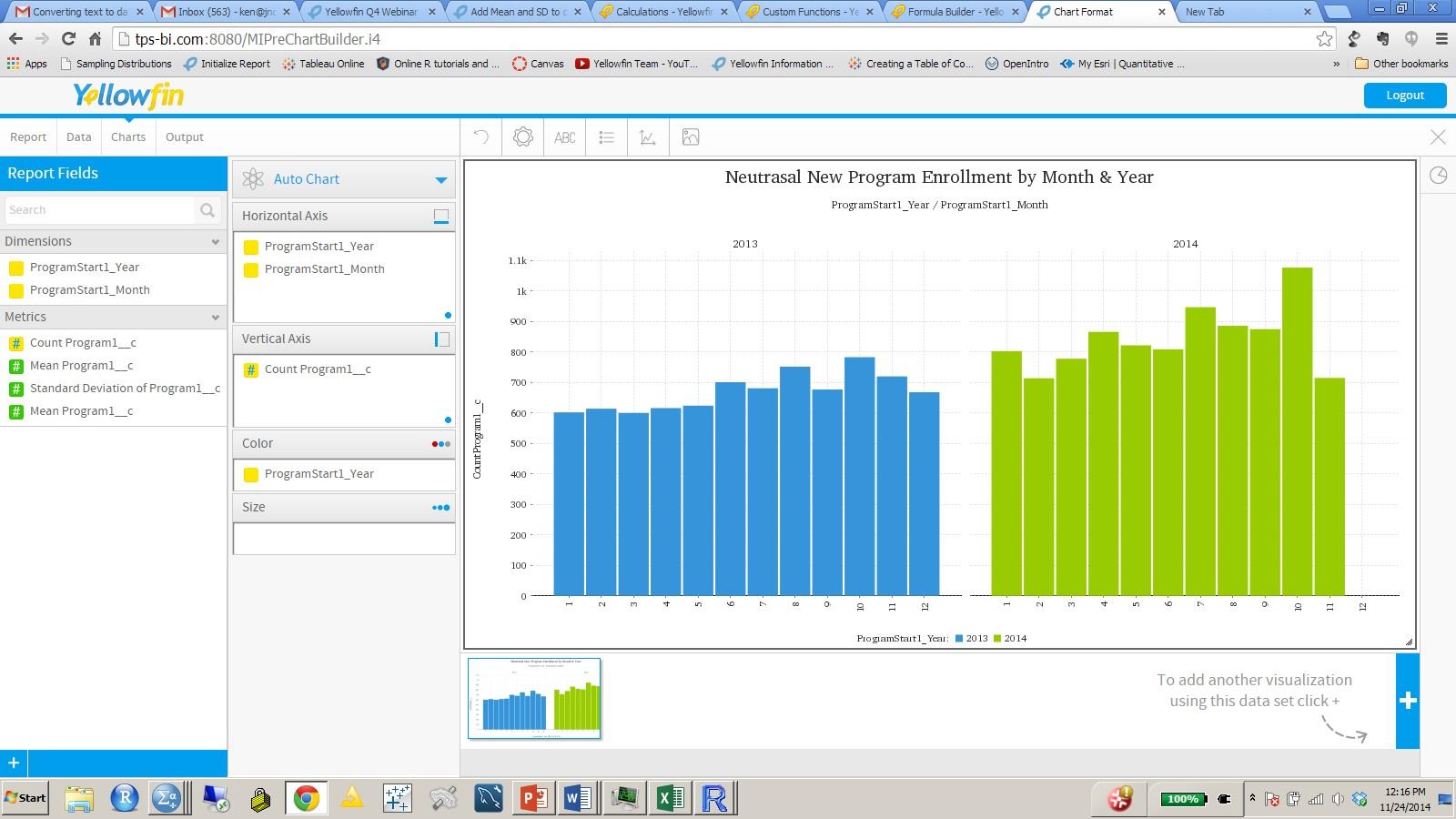
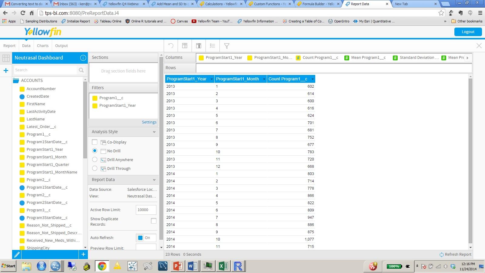
Attached are the screen shots of what my data and chart screens look like now.
I am running 7.1 build 20140827
thanks,
Ken
Attached are the screen shots of what my data and chart screens look like now.
I am running 7.1 build 20140827
thanks,
Ken
Hello Ken,
The screenshots didn't come through.
Is it possible to try again?
Thanks!
The screenshots didn't come through.
Is it possible to try again?
Thanks!
Let me know if you can see them now.


Let me know if you can see them now.

Hi Ken,
The screenshots came through, thank you.
We will have a look at your request as soon
as we can and reply accordingly.
Regards,
Kyle
The screenshots came through, thank you.
We will have a look at your request as soon
as we can and reply accordingly.
Regards,
Kyle
Hi Ken,
Wasn't sure if you had checked out the Wiki section
on Charts?
Please have look at this page, specifically the Combination chart option.
In the meantime I will continue to have look at this
for you.
Thanks!
Wasn't sure if you had checked out the Wiki section
on Charts?
Please have look at this page, specifically the Combination chart option.
In the meantime I will continue to have look at this
for you.
Thanks!
I have tried combination charts but It does not allow for the mean and standard deviation to be shown
Hello Ken,
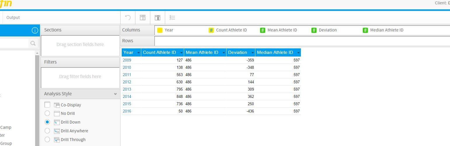
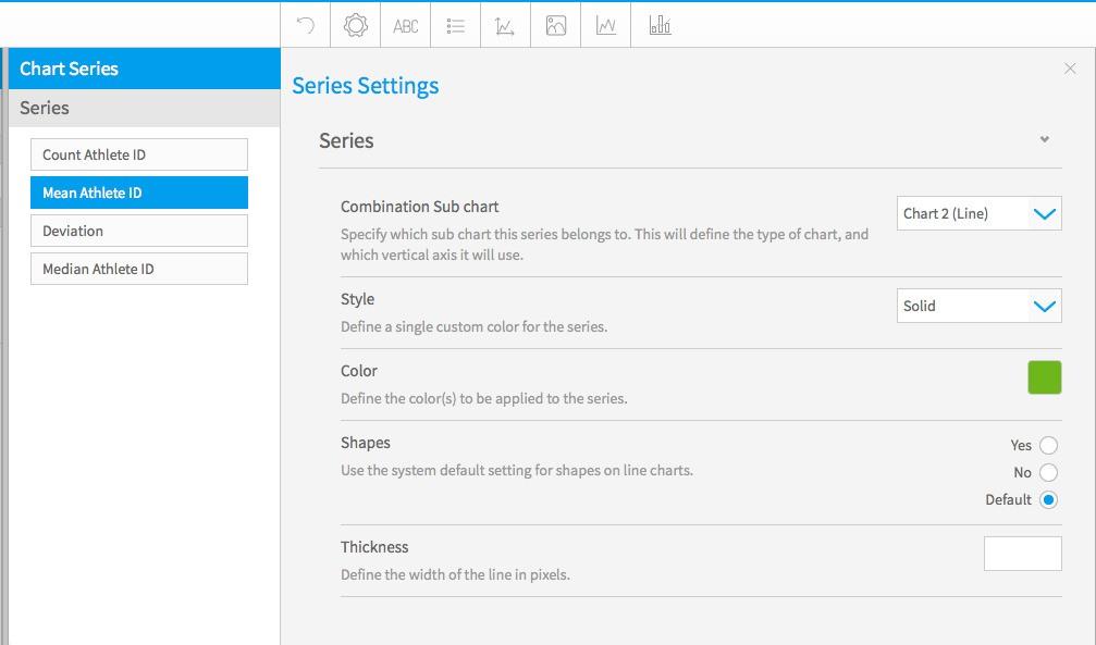
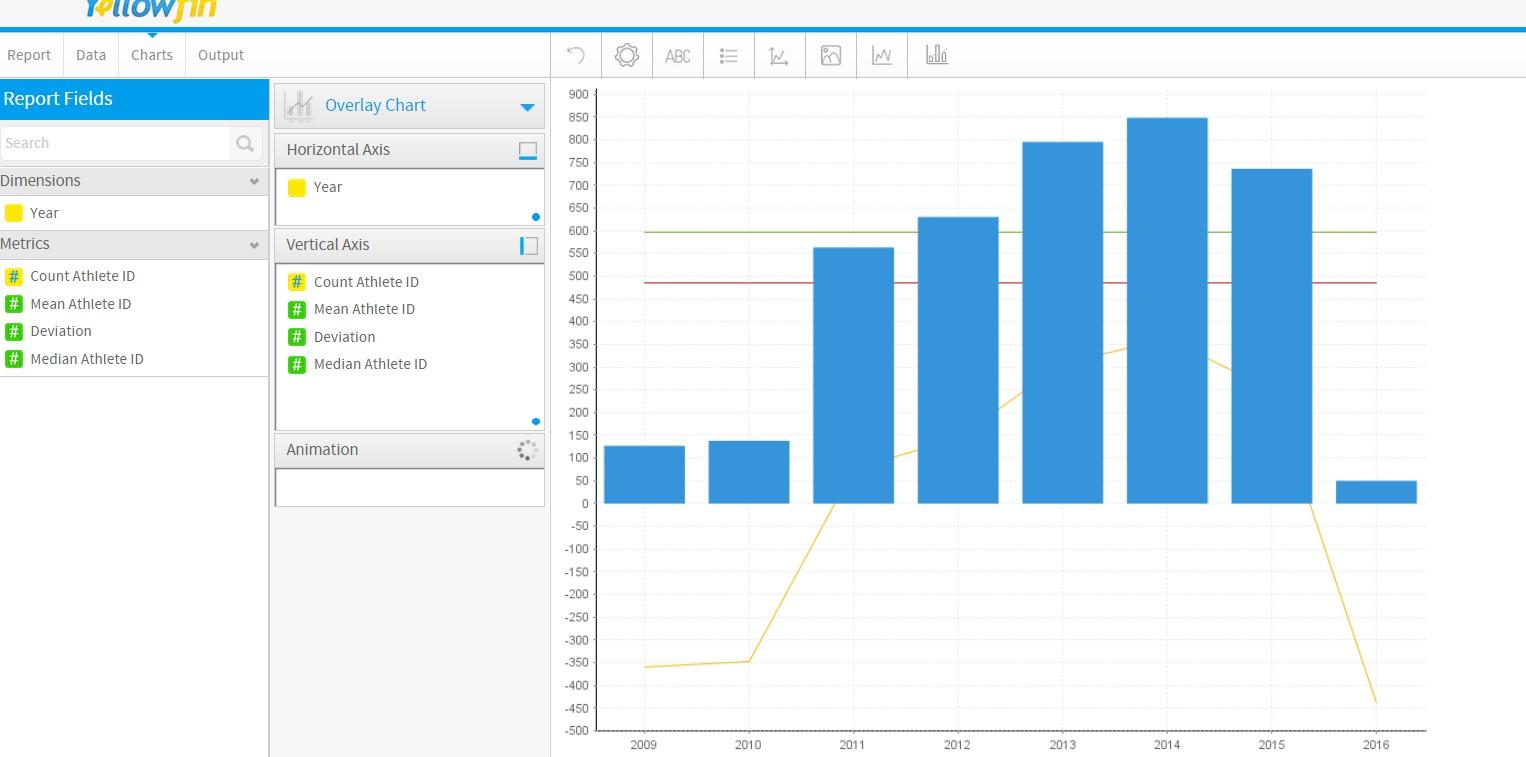
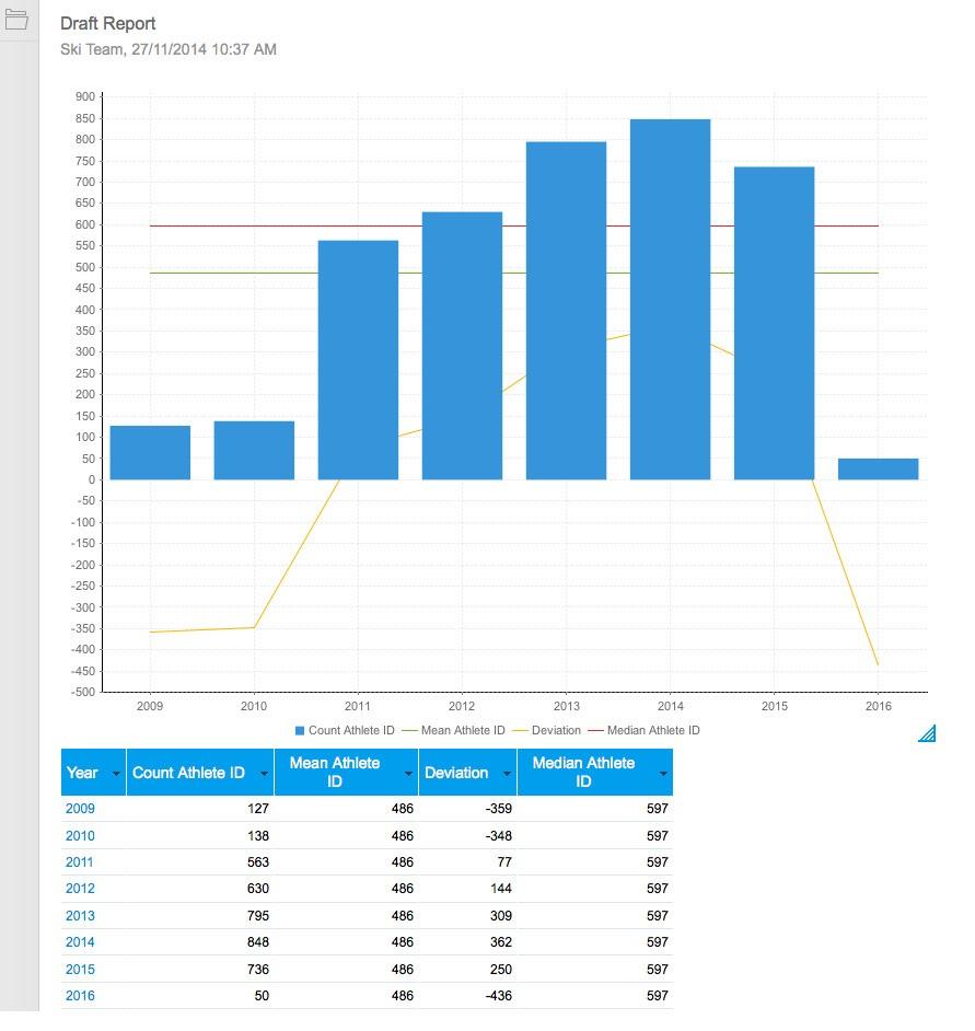
If you try using an Overlay chart, then add 2 sub-charts through the Combination Chart option, you can then link the Mean and Standard fields to the sub-charts, and set the sub-charts to display as Line, which should give you the desired result.
Here is an example created using Ski Team data ;
If you have any questions surrounding this, please let me know.
Kind Regards,
Danny