
Average using cube data
27 March, 2013
Hi,
I'm trying to get data in a time series chart to show as an average, rather than it summing the values. Is there a way do do this using cube data?
Many thanks
Dean
I'm trying to get data in a time series chart to show as an average, rather than it summing the values. Is there a way do do this using cube data?
Many thanks
Dean
Hi Dean,
Really sorry for the delayed response.
When applying aggregations to measures, they need to be done at the cube level. As we just pull in the cube.
Sorry we cannot be of more assistance, though we are limited to how we can affect a cube.
Please let us know how you go.
Regards,
David
Really sorry for the delayed response.
When applying aggregations to measures, they need to be done at the cube level. As we just pull in the cube.
Sorry we cannot be of more assistance, though we are limited to how we can affect a cube.
Please let us know how you go.
Regards,
David
Hi David,
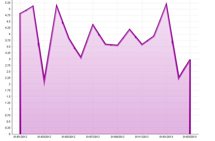
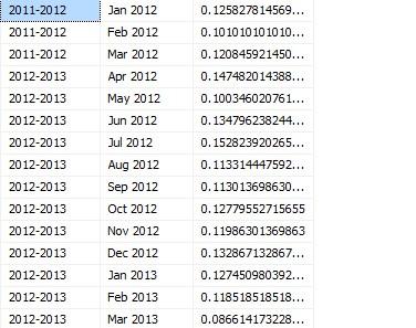
I've included 2 images below (hopefully they come over OK). The first one shows the chart in YF, the second shows the data the chart is based on (shown in management studio).
As you can see the data in management studio varies monthly from 0.1 (10%) and 0.15 (15%), but in YF it is displaying it between 2.5 and 5.1. What it appears to be doing is summing each daily amount and providing that as the figure in the graph, as opposed to showing an average figure like in management studio. i.e. 0.15 average figure per day * 31 days = 4.65 (rather than a figure of 0.15).
Am I doing something wrong here that you can see, as it appears to work fine from the cube in SSMS?
Thanks
Dean
Hi,
You are correct that it's summing values for the same date.
When there are multiple values for the same date in the dataset the values need to be aggregated, usually it attempts to do this using the aggregation on the metric, and if there isn't one it uses sum.
Since cubes are pre-aggregated there is no aggregation on the field, and it cannot be set in Yellowfin.
Although, given cubes are pre-aggregated, it looks like the chart is using a coarser granularity than the cube data is.
Can you try setting the date-unit to something lower so that it's not having to aggregate multiple values at the chart level?
Thanks,
David
Hi David,
I changed the date unit from monthly to day on the chart and it seems to display the data correctly, although I want to be able to give users the ability to choose to see the data, daily, weekly, monthly, quarterly and yearly via a visible unit selection.
So when using a visible unit selection YF is aggregating the data up by summing the values, rather than than using a presetup hierarchy to move from daily/weekly/monthly etc?
Is there a way around this so that I can point the chart to a pre defined hirarchy instead?
Thanks
Dean
Hi Dean,
Unfortunately since the data is not aggregated when returned from the cube, and the chart applies SUM by default, there is no way around this.
On other datsource connections you can just change the aggregation type, but this is not the case for subes.
I have created an enhancement request (TASK ID = 128730) so that we can have a chart setting that allows the user to switch the default between SUM/AVG. At this point in time no ETA can be given as we are about to release 6.3, this will need to be considered for Yellowfin 6.4
Apologies for the inconvenience.
Regards,
David