
Change y-axis to % number format
29 July, 2014
Hi all,
I have a chart with a single measure which is a % value.
In the data tab I have formatted this to % but can't see to work out how to do this in a chart. I can append a % but the decimal point needs to be shifted.
Thanks, Clinton
I have a chart with a single measure which is a % value.
In the data tab I have formatted this to % but can't see to work out how to do this in a chart. I can append a % but the decimal point needs to be shifted.
Thanks, Clinton
Hi Clinton,
When in charts you can head to the Formatting Bar at the top and you will be able to format the axis.
Here is a link to our Wiki with information on Chart Formatting and the functions you can use.
I hope this is the information you need. If you have further questions, please let me know.
Kind Regards,
Katie
Thanks Katie, however this doesn't solve the problem.
I have a field that returns a value between 0 and 1 which I would like displayed as a percentage. In the axis formatting options I can append a % but i end up with axis values like 0.05% which I want dispalyed as 5%.
Is this possible?
Thanks, Clinton
I have a field that returns a value between 0 and 1 which I would like displayed as a percentage. In the axis formatting options I can append a % but i end up with axis values like 0.05% which I want dispalyed as 5%.
Is this possible?
Thanks, Clinton
Hi Clinton,
Thanks for the clarification on your request.
I have done a little searching and discovered an enhancement task which I believe is based around the same issue (TASK ID: 154908). When I tested using a percentage myself I could apply it on the data page but this was not then transferring to the chart.
I hope i have understood your query correctly. Please let me know if you have any other questions or I can assist you further.
Kind Regards,
Katie
Thanks Katie
Has there been any progress on this - TASK ID: 154908 - it would be great if the format of the axis could be controlled on all charts. For example needing to have 50,001,067 shown on the axis as $50M, but as 50,001,067 when hovering over the chart i.e. the answer isn't to reformat the data itself before charting it...
Hi Kevin,
This was discussed not too long ago with the dev team.
The plan is to allow greater customizations of the axis in the future, though no actual ETA as yet.
Sorry for this.
The autochart builder can actually display thousand as K, and millions as M, but this is not possible to set when manually creating charts.
Apologies for the inconvenience this has caused.
Regards,
David
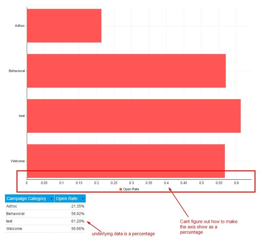
Is there any update to this? I need to build a large number of charts with % (percent) as one of the two axis. Per image below, my axis shows as a decimal.

Hello Scott,
Unfortunately there hasn't been any movement to the enhancement request that you have referenced above. I have gone ahead and added your wishes to the enhancement to see this functionality added.
Can I ask what version and build of YF you are using? E.g. 7.1, March?
Are you using the Auto Chart functionality? It is possible that there are a few work arounds to help you
get what you are after.
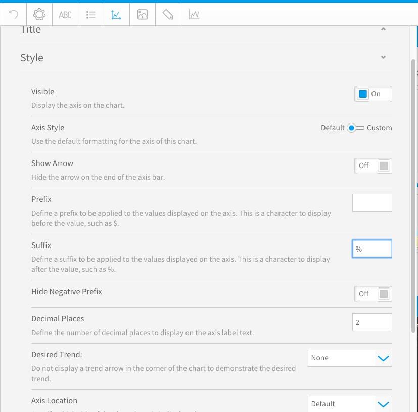
I am on 7.1, March build and I am not using the Auto Chart option, instead the Horizontal Bar Chart. This gives me more options with axis formatting.
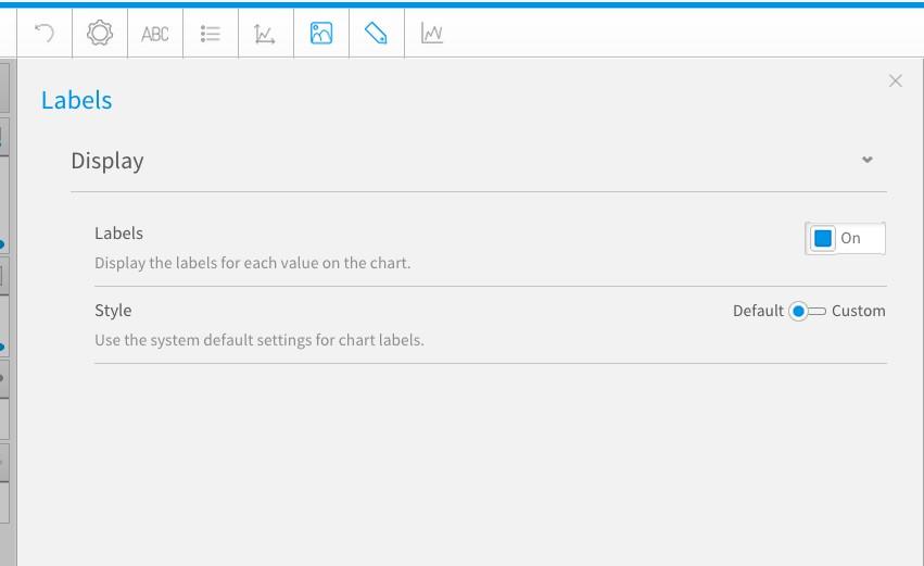
It also gives me the Labels option, which might assist you in your requirement.
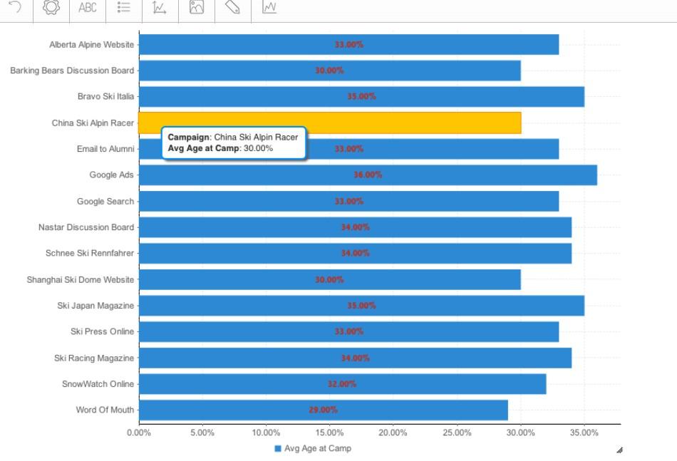
This is how my chart appears.
Is this what you are after?
Thank you,
Kyle
Unfortunately there hasn't been any movement to the enhancement request that you have referenced above. I have gone ahead and added your wishes to the enhancement to see this functionality added.
Can I ask what version and build of YF you are using? E.g. 7.1, March?
Are you using the Auto Chart functionality? It is possible that there are a few work arounds to help you
get what you are after.
I am on 7.1, March build and I am not using the Auto Chart option, instead the Horizontal Bar Chart. This gives me more options with axis formatting.
It also gives me the Labels option, which might assist you in your requirement.
This is how my chart appears.
Is this what you are after?
Thank you,
Kyle