
Color session of bar/column charts doesn’t accept non numeric field while Auto Chart can do
9 December, 2015
We have data of 3 column Month (date), Type (boolean), and Num (bigint) from Postgres database.
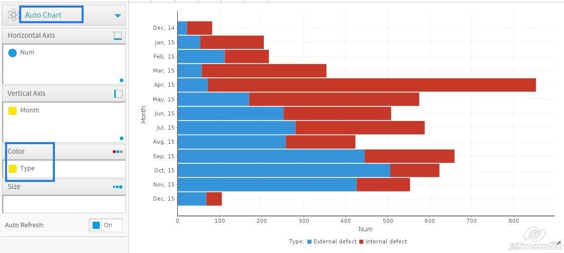
Now I creates a Auto Chart with "Num" in Horizontal Axis, "Month" in Vertical Axis, well, it will create a bar chart. Then, I put the "Type" to Color, the bar char now looks great.
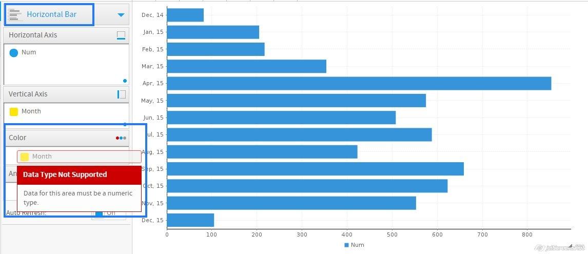
However, I would like to display in Column chart, when I select the Column chart in chart list, it doesn't accept "Type" in Color session, and an error shows up "Data for this area must be numeric type". The same when I select Bar chart.
So, in Auto chart, the application could make the Bar chart with color in any type of column, but in specific Bar/Column chart mode, it requires numeric type. It doesn't make sense here.
You can find in attachments.
Could you tell me how to workaround this case to show them on Column chart?
Thank you.
Now I creates a Auto Chart with "Num" in Horizontal Axis, "Month" in Vertical Axis, well, it will create a bar chart. Then, I put the "Type" to Color, the bar char now looks great.
However, I would like to display in Column chart, when I select the Column chart in chart list, it doesn't accept "Type" in Color session, and an error shows up "Data for this area must be numeric type". The same when I select Bar chart.
So, in Auto chart, the application could make the Bar chart with color in any type of column, but in specific Bar/Column chart mode, it requires numeric type. It doesn't make sense here.
You can find in attachments.
Could you tell me how to workaround this case to show them on Column chart?
Thank you.
Good Morning Guest,
Hope you are well,
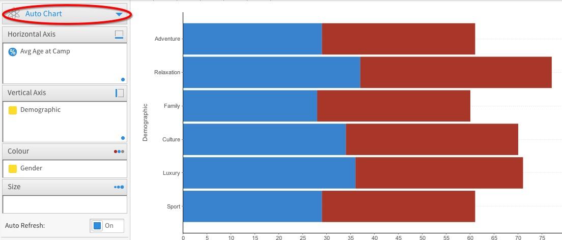
I have been looking in to this question and it took a bit of time and testing but I have found a report that allows you to use a dimension as a colour the same as the Auto Chart does, the report is a Trellis report.
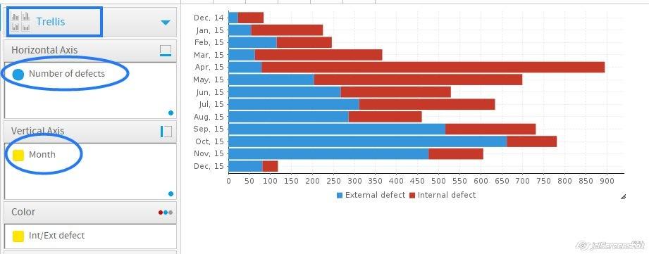
As you can see below I can create the report using the auto chart

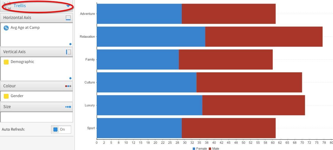
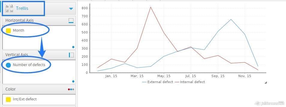
I also tried the same layout in Trellis and get the same result as you can see below
I hope this helps you to get the report you need. If you do have any further questions please feel free to contact us.
Thanks
Adam
Hope you are well,
I have been looking in to this question and it took a bit of time and testing but I have found a report that allows you to use a dimension as a colour the same as the Auto Chart does, the report is a Trellis report.
As you can see below I can create the report using the auto chart
I also tried the same layout in Trellis and get the same result as you can see below
I hope this helps you to get the report you need. If you do have any further questions please feel free to contact us.
Thanks
Adam
Thanks Adam for the point to do with Trellis chart, but I still get the problem with this.
Using Trellis chart, it shows random type of chart between bar and line chart.
Trellis in bar chart, it looks nice.
But I want to show in Column chart, so I switch fields between Horizontal and Vertical Axis, but it displays in Line chart only, I can't find the way to show them in Column chart.
For reference, I tried your sample data, and it displays well in Bar and Column chart using Trellis chart, it doesn't show up the Line chart.
So, in my case, is there any way to specify the Column chart displaying when using Trellis chart?
Thank you.