
Condtional formating of items on X and Y axs of a graph
18 October, 2014
(Yellowfin 7.1, Build september 2014)
Is it possible to have the conditional formatting options for the items on the axis of a graphic as that they can be used on data-section of the report?
Reason:
We use the colour-options of a graph to show different metrics in different colours. The dimensions that are used on the other axis have a certain "meaning" that in the data-section of the report is expressed with a certain colour (e.g. productlabel belongs to my own organisation is red, others are black). This formatting should also be visible on the label-items that are displayed at my axis.
Hi Peter,
Thank you for your post.
If I have understood you request correctly, YES, conditional formatting that is applied at the report level can be applied to the chart.
Here is my example of my report with conditional formatting applied at the report level.

Depending on the chart the colours applied for conditional formatting are accessed differently.
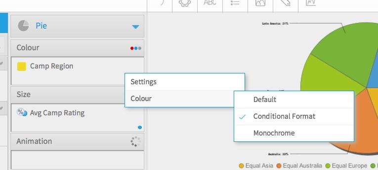
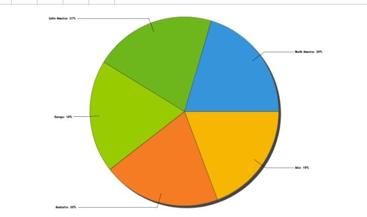
Pie Chart Example
Place the field you wish to use in the Colour Field>Drop Down Menu>Select Conditional Format
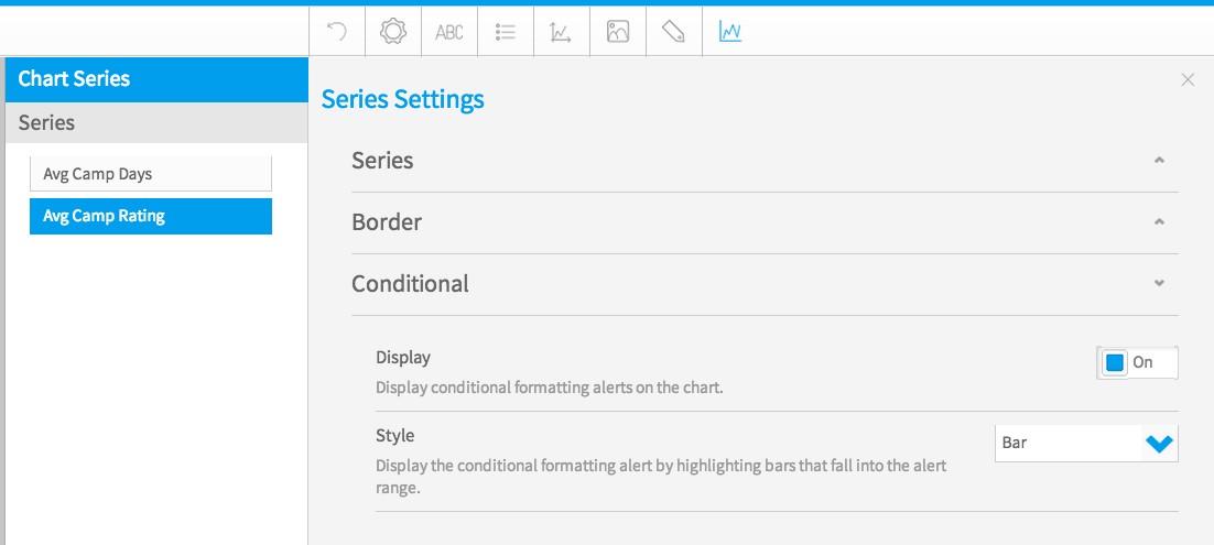
Vertical Column Example
Place the field(s) you wish to use in the Vertical Axis>Chart Series Menu>Conditional>Turn On>Select Style. Extra information on our wiki, head to Chart Formatting
I hope this provides the information you need but if I have misunderstood your request, please let me know and I can do further investigating for you.
Kind Regards,
Katie
Thank you for your post.
If I have understood you request correctly, YES, conditional formatting that is applied at the report level can be applied to the chart.
Here is my example of my report with conditional formatting applied at the report level.
Depending on the chart the colours applied for conditional formatting are accessed differently.
Pie Chart Example
Place the field you wish to use in the Colour Field>Drop Down Menu>Select Conditional Format
Vertical Column Example
Place the field(s) you wish to use in the Vertical Axis>Chart Series Menu>Conditional>Turn On>Select Style. Extra information on our wiki, head to Chart Formatting
I hope this provides the information you need but if I have misunderstood your request, please let me know and I can do further investigating for you.
Kind Regards,
Katie
Hello Katie,
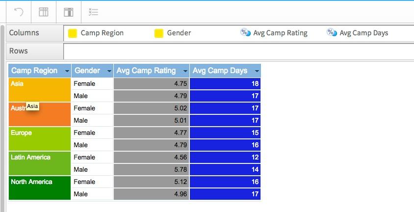
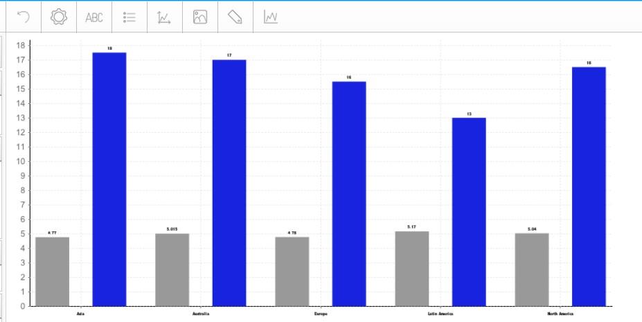
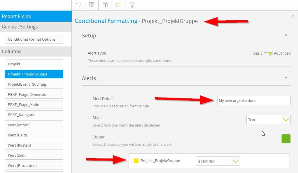
What you are showing is using the colours in the metrics that are displayed. In your last example the bars are shown in the colours you assigned in the data-section. The colourset that is used on the "Camp Regions" however can't be used in this graph. What i like to have is an option to have the label-text of the X-as in your example displayed in the colours that are assigned to the different CAMP Regions.
In our case we would use it for benchmarking where the "labels" of our customer are displayed (e.g.) in black and the "labels" of the competitors in (e.g.) green. In that case a user can easily see how his brands are positioned "against" the rest.
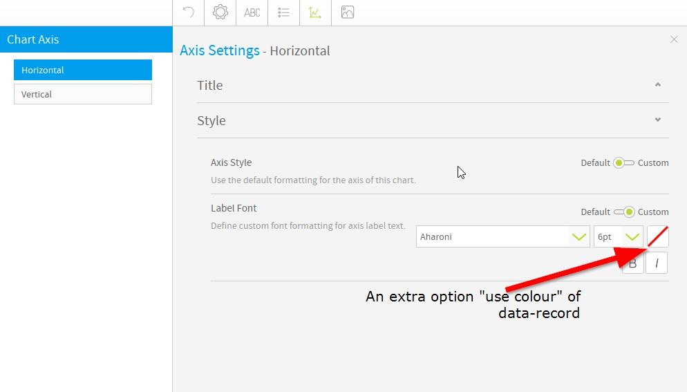
As a programmer i would create a indicator that references my conditional formatting of X-Axis field value. See screen-shots:
What you are showing is using the colours in the metrics that are displayed. In your last example the bars are shown in the colours you assigned in the data-section. The colourset that is used on the "Camp Regions" however can't be used in this graph. What i like to have is an option to have the label-text of the X-as in your example displayed in the colours that are assigned to the different CAMP Regions.
In our case we would use it for benchmarking where the "labels" of our customer are displayed (e.g.) in black and the "labels" of the competitors in (e.g.) green. In that case a user can easily see how his brands are positioned "against" the rest.
As a programmer i would create a indicator that references my conditional formatting of X-Axis field value. See screen-shots:
Hi Peter,
Thank you for the clarification on this request and the screenshots.
I have created an enhancement request for this to be considered (TASK ID: 176694).
If you have any questions, please let me know.
Kind regards,
Katie
Thank you for the clarification on this request and the screenshots.
I have created an enhancement request for this to be considered (TASK ID: 176694).
If you have any questions, please let me know.
Kind regards,
Katie