
Create a date highlight bar
26 November, 2014
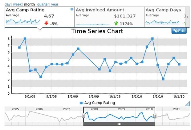
I came across the image below in one of the Yellowfin blogs. I would like to include the following in my charts:
1. a date slider like the one shown, so that you can highlight certain date ranges.
2. create the option to switch to day, week, month, quarter, year like it has it at the top of this image.
Is there any documentation on how to create both of these?
Hi
Thank you for the post!
Why yes there is documentation on setting up Time Series charts.
This link is for the latest version 7.1 of Yellowfin.
Here you go
Link
Mark
Thank you for the post!
Why yes there is documentation on setting up Time Series charts.
This link is for the latest version 7.1 of Yellowfin.
Here you go
Link
Mark
Thanks for the link. I tried to turn on "Time Series" for date fields that are in the horizontal axis shelf, but the "time series" option does not appear.
Possibly the data you are setting up the Time Series Chart with is set as Text and not Date?
-Where is the data from you are using for the chart?
-Is it a CSV file or just data from an existing database?
Try going to Advanced Functions on the column you are looking to use Time Series with and see if it is setup as Text or Time and Date.
Here is some further instruction for that.
Link
Lets see if that allows the Time Series option to appear.
Mark
I went to Advanced Functions for the variable and the variable is in date format. The data is being read from a SQL database.
I discovered the problem. If the line chart is made via "Auto Chart" the "time series" option does not appear. However, when I go and select line chart the "time series" option appears.
I encountered another problem
To create the visual unit selection the instructions (http://wiki.yellowfin.com.au/display/USER71/Time+Series) say
"Enable the Visible Unit Selection option through the chart Settings menu"
"Visible" Unit Selection" does not appear in my Setting menu
The instructions also say to set units by
"Select the desired Units (granularity) in the chart Settings menu"
"units" does not appear as an option on my menu
Great to hear you were able to get Time Series option to show up!
Since we were talking about Line Charts I assumed you has already chosen it over Auto.
So for next question you are not seeing the two options in the attached screen shot?
Thank you
Mark
Since we were talking about Line Charts I assumed you has already chosen it over Auto.
So for next question you are not seeing the two options in the attached screen shot?
Thank you
Mark
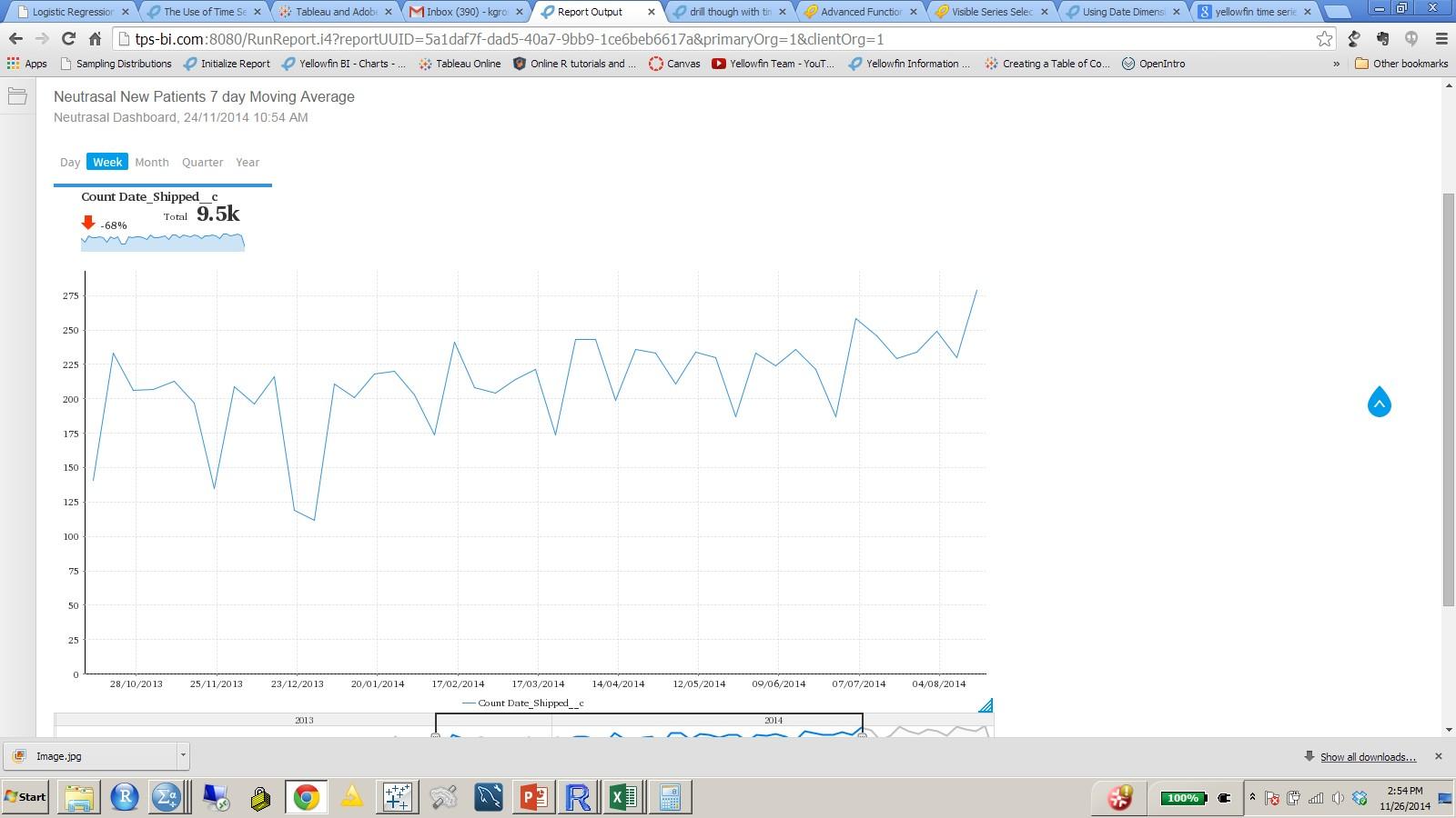
I see why the slider was not showing. When "yearly comparison" is checked it does not allow for the various interaction options. Another question:
In the image below, what does the summary at the top left represent? It shows -68% but I am not sure how that value was calculated

In the image below, what does the summary at the top left represent? It shows -68% but I am not sure how that value was calculated
Hi,
that figure should be the difference between the initial and final values of the time frame expressed as a percentage of the initial value. For example, if the initial value is 3, and the final value is 9, then the difference is 6 which is 200% of the initial value.
regards,
Dave
that figure should be the difference between the initial and final values of the time frame expressed as a percentage of the initial value. For example, if the initial value is 3, and the final value is 9, then the difference is 6 which is 200% of the initial value.
regards,
Dave
In the example I posted above the first value is lower than the last value but the % change is showing up as negative. Any idea why?
Hi,
yes, unfortunately it looks like it's a bug! I have managed to reproduce the issue of the incorrect % change over here so have raised a product defect (Support Task 180480) and have entered it onto the agenda for the next dev meeting for discussion and allocation.
thanks for alerting us to this issue, and apologies for the inconvenience caused.
regards,
Dave
While this bug is getting fixed, do you know if there is any way to turn off the % change and only show the Total in these summaries?
Hi,
I'm sorry but unfortunately that can't be done.
regards,
Dave
I'm sorry but unfortunately that can't be done.
regards,
Dave