
How can we change colors on the pie chart?
31 March, 2011
Can the colors can be changed on a pie chart?
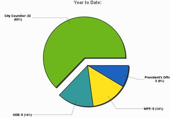
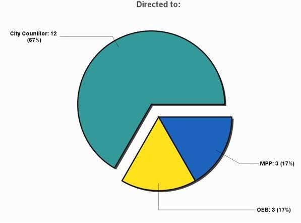
Note MPP is yellow on top and blue on the bottom.
The client wants the colors to stay the same.
Especially when distributing the information, it can be confusing for presentations.
Any thoughts?
Note MPP is yellow on top and blue on the bottom.
The client wants the colors to stay the same.
Especially when distributing the information, it can be confusing for presentations.
Any thoughts?
Hi,
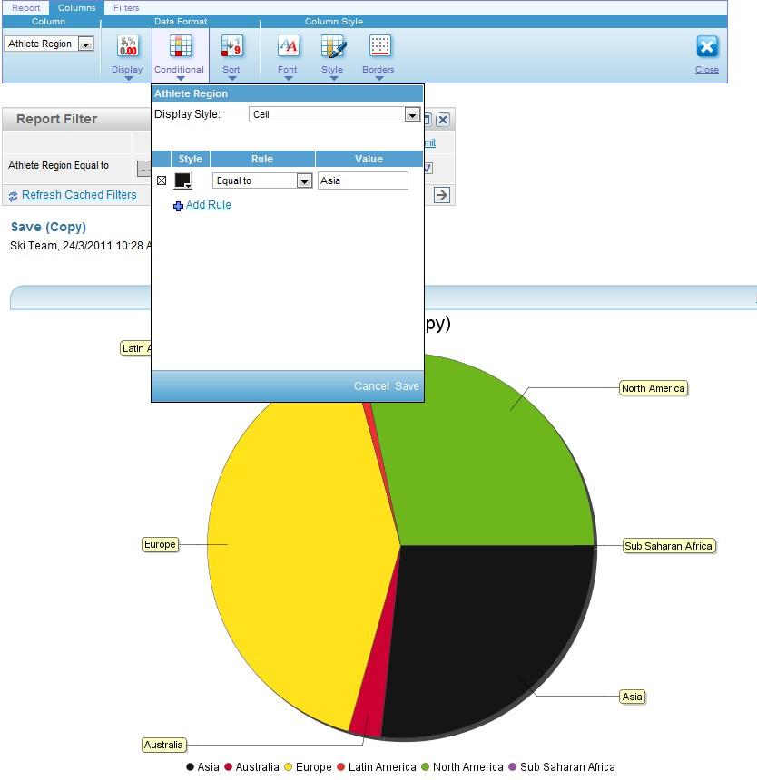
You can manually change the colours of the pie charts by using conditional formatting.

At the moment, there is no way to have all pie-charts use a certain colour scheme (same column 'MPP' to be red when used in any chart), though this is being looked at and we are hoping to include such functionality in a future release.
Regards,
David
You can manually change the colours of the pie charts by using conditional formatting.
At the moment, there is no way to have all pie-charts use a certain colour scheme (same column 'MPP' to be red when used in any chart), though this is being looked at and we are hoping to include such functionality in a future release.
Regards,
David
Hey David,
That was back in March. Any updates in regards to having this in as a feature?
That was back in March. Any updates in regards to having this in as a feature?
Hi,
Unfortunately there has been no movement with this enhancement, the pie chart will simply use the default chart colors.
As you can imagine the ability to treat each dimension value as a separate dimension/series requires quite a lot of development time, which has also been added as an enhancement request for bar/column charts.
However we are currently discussing the ability to use a range of colors for the pie chart.
This will allow you to pick a start color and an end color, the pie chart will then display the segments in the color range.
Though this is still being discussed and has not been confirmed as yet.
Apologies for the inconvenience.
Regards,
David