
Yellowfin 7.3+: Refreshing Meters, Gauges, and Dials
In Yellowfin 7.3+ (coming next month), we have refreshed the look-and-feel of our meter, thermometer, and dial charts – and along with it, introduced some new functionality to allow more customization and flexibility.
So what exactly can we do with this enhancement? Plenty.
Some of the enhancements, grouped in categories, include:
Outline
Decide if your meters and dials should have a styled outline or not – this gives you the ability to create speedometer-like charts, or ones that look like circular rings from smart watches. Customize dial extent and start angles to give a fresh and new display for your chosen charts.
Ticks
Choose to show major, minor, or no ticks for your meters, gauges, and dials. Tick labels can be fully customized to your selected font, size, and colour - including the tick length.
Summarization
Metric values can be shortened to the nearest unit, followed by a unit label. $10,250,016.82, $10.25M, or $10M – we enable you to select the best way to display these values.
Color Bands
Customize color bands and opacities for different metrics from a given palette, or have your report conditional formatting colors be used in the chart itself. Color Band width and offsets can also be applied to stylistically change your meters and dial charts.
Value Display & Indicators
Select the right indicator for your meters, gauges, and dials – this can be a needle pointer, or styled value and target ticks on the color band. Enhancements here also allow you to toggle field names for your chosen metrics and targets, as well as having them scale automatically to the allocated space.
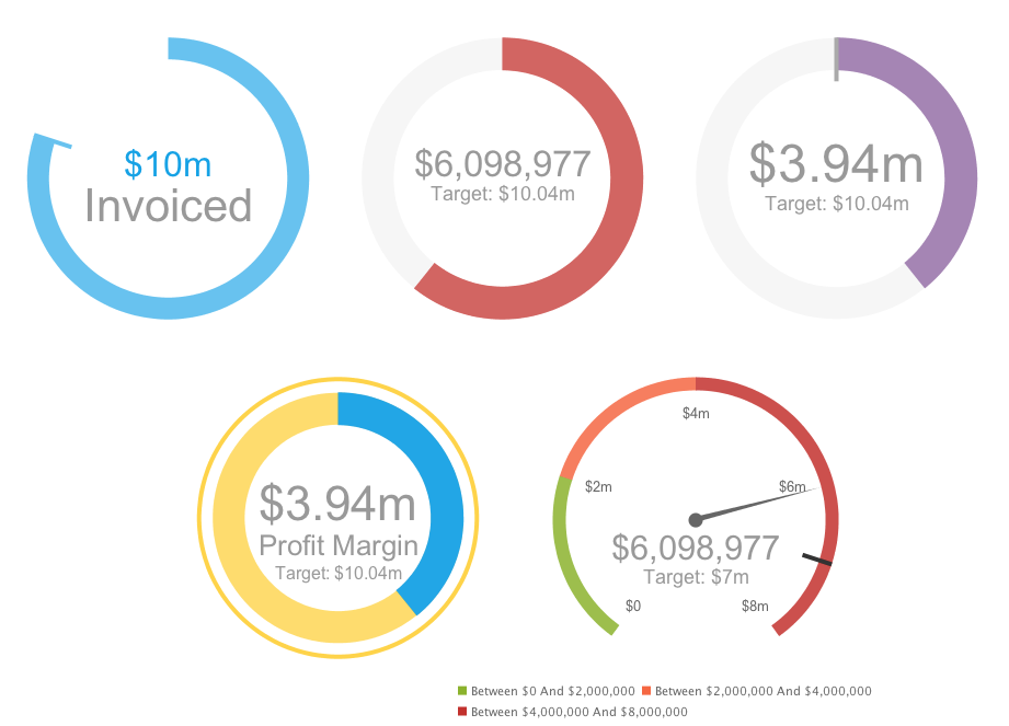
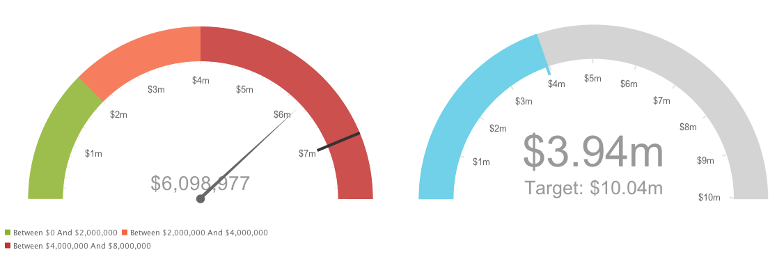
Just to give you an idea of what’s possible, here are a few examples of the refreshed dial and meter charts in Yellowfin 7.3+:
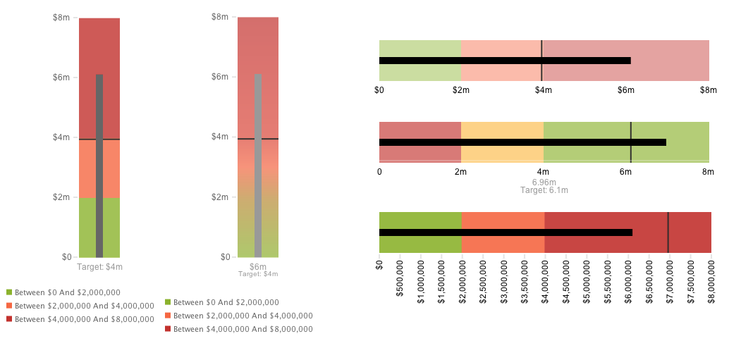
But wait, there’s more: Introducing Bullet Graphs
As part of this refresh, thermometer charts have also gotten a makeover – you can now choose to customize the bulb shape, degree of rounded corners, as well as the orientation. With these enhanced settings, you can now create bullet graphs with your data!
As you can see - whether you are in team meters, gauges, and dials or in team bullet graph - we’ve got something for both sides in Yellowfin 7.3+.
Want to see more? Register for the official Webinar launch HERE