

Top Power BI Alternatives for Embedded Analytics
True embedded analytics isn't about dashboards; it's about giving your users the confidence to act. It's about turning your application into the one place where data becomes a story, and differentiating it from those that lack a cohesive narrative.
This guide explores how smoothly or painfully different BI platforms let you connect, embed, and share analytics within your product. You’ll learn what it really takes to close the analytics loop so that insights surface in the right place, at the right time, for the right user.
The stakes here are unusually high. This isn’t about choosing a back-office tool. Adding embedded analytics to your app shapes your product’s identity, influences user trust, and directly affects how much pain your developers have to endure. We’re not here for the brochure copy. We’re looking at the trade-offs that actually show up in real deployments.
Why Power BI doesn’t cut it in 2025
For many businesses in the Microsoft ecosystem, Power BI seems like the default choice for analytics. It's powerful and ubiquitous. However, embedding it directly into your product for customers often reveals significant compromises. The fact is, Power BI’s branding is ever-present and detracts from your product's identity. Consuming and sharing embedded reports also requires user licenses, and deploying them can be a manual, technical burden, drawing your team into complex custom scripting and deeper reliance on Azure services. This often results in a fractured experience, creating a clear disconnect between your product and its analytics. What appears as the easiest path rarely leads to the best, fully integrated solution.Branding limitations
Achieving complete white label analytics (sometimes called OEM analytics) with Power BI can be difficult. In practice, embedding Power BI usually involves iframes and Microsoft branding that can’t be fully hidden, so dashboards feel like Power BI dashboards rather than part of your app. One review bluntly notes that embedding Power BI can cause you to “lose control of the user experience,” introduce performance issues, and make costs hard to predict. Related reading: Embedded Analytics - 5 Key Features to Have in 2025Complex content deployment
Instead of the automated content delivery found in modern solutions, your team is forced to wrestle with manual processes, scripting with REST APIs for every single client workspace. This complexity only spirals when it's time to make the data usable. The built-in Power Query Editor quickly hits a wall with serious data transformations, pushing your developers out of the tool and into the sprawling world of Azure Data Factory: another platform to learn, another system to manage, and another drag on their time.Confusing pricing models
Power BI's pricing has several layers (Power BI Pro, Power BI Premium, Fabric, etc.) that can be difficult to navigate, making it hard to select the most appropriate plan and forecast expenses accurately. Beyond the main tiers, specific use cases introduce other pricing dynamics:
- Embedded pricing: The cost for embedding analytics is consumption-driven. You pay for dedicated processing power through Azure SKUs (from A1 to A6). This capacity-based model can work for smaller applications with consistent usage but creates unpredictable costs for businesses that experience rapid growth or sudden surges in user activity.
- Sharing licenses: Sharing dashboards and reports requires each user to have a Power BI Pro license. While priced at $10 USD per user, this cost can accumulate quickly as you provide access to more people in your organization.
Product complexity
While Power BI is a powerful tool, its vast set of features can create a steep learning curve. For new users, the platform can feel overwhelming, which often slows down widespread adoption and user proficiency. To truly unlock its capabilities, your team needs to move beyond drag-and-drop features. This means learning specialized languages like M language for data transformation and DAX (Data Analysis Expressions) for creating custom calculations, which requires dedicated training and adds to your development overhead.Vendor lock-in
Power BI is deeply integrated into the larger Microsoft Azure and Fabric ecosystems. While this tight integration offers advantages if you're fully committed to Microsoft's environment, it can also lead to significant vendor lock-in.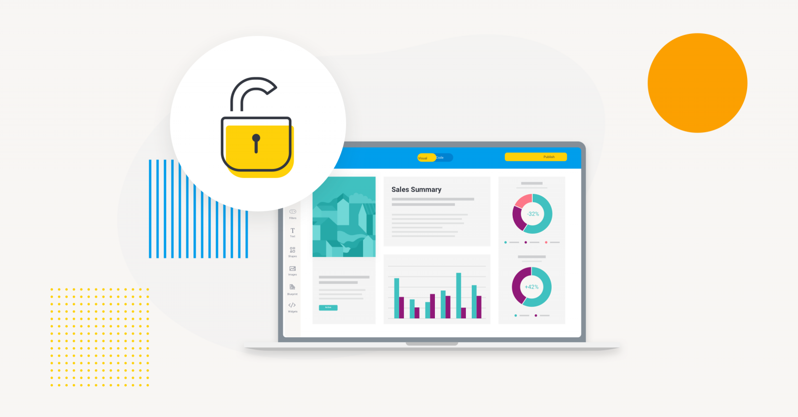 This makes it much more difficult, costly, and time-consuming to transition to alternative analytics solutions or integrate with non-Microsoft technologies in the future, potentially limiting your architectural flexibility as your tech stack evolves.
Power BI alternatives for embedded analytics
Now that we’ve gone over Power BI limitations, let’s take a look at the top embedded analytics platforms you can add to your software product or enterprise app.Yellowfin: BI that anyone can use
Yellowfin is architected from the ground up with a singular focus on seamless, native embedded analytics. It’s designed to disappear into the fabric of your product, preserving your brand and your user’s trust. It also provides true, code-free white-labeling and a secure, multi-tenant foundation that works out of the box. But its vision goes further. Yellowfin seeks to make analytics a natural conversation. With natural language query, users can simply ask questions and get an AI-generated summary of their data in plain language. With data storytelling, insights are woven into a narrative, providing valuable context behind the numbers and guiding users to an answer rather than just presenting a chart.
This is a solution for those who believe analytics should feel less like an add-on and more like an innate part of their software product.
But its vision goes further. Yellowfin seeks to make analytics a natural conversation. With natural language query, users can simply ask questions and get an AI-generated summary of their data in plain language. With data storytelling, insights are woven into a narrative, providing valuable context behind the numbers and guiding users to an answer rather than just presenting a chart.
This is a solution for those who believe analytics should feel less like an add-on and more like an innate part of their software product.
Tableau: Beauty with a hefty price tag
Tableau is famous for beautiful, sophisticated visualizations, and many teams love using it for deep data analysis. That visual prowess makes it a natural choice when end users build and explore reports extensively. However, embedding Tableau introduces overhead. You must run Tableau Server (or use Tableau Cloud), incurring hosting, security patches, and potential downtime just like any other service.
Yellowfin BI and Tableau dashboards compared
While Tableau offers embedding APIs and theming, its dashboards still carry a distinctive look-and-feel. In practice, many have found that no amount of CSS fully hides that “Tableau look,” meaning the analytics can still feel like a separate branded experience rather than part of your product.Cost considerations
Cost is another concern. Tableau’s traditional licensing model is per-user, which can be manageable for an internal analytics team but becomes prohibitively expensive when exposing dashboards to hundreds or thousands of external customers. Even Tableau’s newer consumption-based pricing, billed per session, may not offset those costs for high-usage embeds. Because of these factors, teams sometimes describe using Tableau for quick contextual analytics as using “a professional camera when you need a smartphone photo.” It’s technically powerful, but heavy and costly for simpler embedded needs. In sum, Tableau delivers unmatched visuals and a wide variety of chart types, but in embedded use, it can feel like overkill for lightweight, in-context insights. Its strength lies in enabling analysts to drill deep, not in invisibly blending analytics into another product, and its licensing reflects that focus. Read more: How Yellowfin Complements Tableau to Expand Analytics Use CasesBold BI: Scalable Analytics Platform
Bold BI is an analytics platform that combines self-service dashboard creation with embedded analytics capabilities. It includes a drag-and-drop designer with a wide range of visualizations and supports integration through APIs and SDKs. The platform connects to numerous data sources and offers deployment flexibility across cloud, on-premises, and containerized environments. AI features assist users in generating dashboards and insights through natural-language queries.- Flexible Deployment and Connectivity: Supports over 120 data connectors and multiple hosting options.
- Embedding Capabilities: APIs and SDKs enable easy integration of dashboards and analytics into existing applications.
- AI-Driven Insights: Provides natural-language interaction for creating and interpreting analytics content.
Looker: The developer’s choice
Looker approaches analytics with a unique architecture centered around its semantic modeling layer, LookML. This allows your team to define business logic and metrics once, ensuring that they're used consistently across all reports, which is a huge plus for data governance. The platform is also designed to be "API-first," meaning developers can control nearly every feature programmatically. This, along with its strong Google Cloud integration, makes it an appealing choice for development teams.The trade-offs for embedded analytics
When it comes to embedding BI, Looker presents some clear challenges.- Limited UI customization: Most embedded dashboards are rendered in iframes that closely follow Looker’s default look and feel. With few out-of-the-box theming options, achieving a fully branded experience is difficult.
- Steep learning curve: Mastering LookML requires a significant time investment, and teams without dedicated data engineers often struggle to implement and maintain it effectively.
- Expensive scaling: The pricing model is typically per-user, which means the cost can escalate quickly when embedding analytics for a large number of external users.
Sisense: Backend muscle, frontend compromises
Sisense shines with a powerful backend for crunching big datasets using its "ElastiCube" engine. It offers flexible deployment (cloud, on-prem, hybrid) and various embedding options, including JavaScript APIs and their Compose SDK for a "headless" approach. This gives developers decent tools to integrate, and they promise white-labeling for brand alignment.The reality check for embedded BI
Despite the power, Sisense can present challenges in the front-end for truly native-feeling embedded analytics.- Not exactly low-code: Gartner reviews consistently report that even relatively simple tasks like adding custom visualizations or dashboard UI formatting demand extensive JavaScript (JS) coding, including widgets. This can be a pain for developers to achieve specific branding or UI for their end-users’ needs beyond the out-of-the-box options.
- Disruptive updates: Many reviews point to a constant need of maintenance windows or frequent updates that often break existing deployments, which can create ongoing development and operational headaches to reliably ensure application uptime.
- Performance bottlenecks: While Sisense is designed for large datasets, customer reviews on Gartner note the default iframe embeds sometimes take longer to load as dashboard complexity or user volume increases, which might subtly remind your users they're interacting with a third-party tool rather than a native feature of your app.
ThoughtSpot: The power of search, with trade-offs
ThoughtSpot has carved out a unique niche with its "search-driven analytics" approach (AI analytics features) and dedicated ThoughtSpot Embedded solution, designed with ease of integration in mind via simple to drop interactive dashboards into your existing applications using low-code APIs - a big draw for product teams who want to enhance their software offerings.The caveats for ease of embedding
While the "search to insight" experience is attractive, there are some key limitations on the development side to getting the most out of an embedded analytics deployment with ThoughtSpot:- Limited data visualization: ThoughtSpot excels at generating quick visualizations from natural language queries but customer reviews on PeerSpot note it lacks deeper customizable chart and UI features compared to other vendors, meaning it might take some clever workarounds to move beyond its default aesthetic and achieve a branded look and feel.
- Data modeling complexities: Though lauded by end-users for its ease-of-use, developer reviews note several frustrations when modifying data sources and the data model, including a lack of an intermediate layer for data loading which affects dashboard stability whenever databases experience issues - making your analytics stick out like a sore thumb from the rest of the app experience.
- Consumption-based costs: A consumption-based pricing model means you pay for what your users actually do, such as the queries they run and the data they access. For some teams, this is ideal, but for others with high, unpredictable usage across hundreds of external customers, it can lead to rapidly escalating costs that are hard to budget for.
Bonus: Three questions to ask yourself before choosing an embedded analytics solution
Before committing to a platform, ask yourself these three critical questions to ensure you're making a strategic choice, not just a technical one.1. Does it make your users feel smart?
First, consider how the analytics platform serves your end-users. Does it merely present static dashboards, locking users into a passive role of consumption? Or does it provide tools for genuine discovery, self service analytics, and communication, transforming them into active participants in their own data analysis? The goal is to empower, not just to display.2. What's the real cost to build and maintain it?
Next, evaluate the true cost for your team to implement, customize, and maintain the solution. This extends far beyond the license fee. It includes the learning curve for your developers, the overhead of managing additional infrastructure, and the hidden operational costs that accumulate over time. An efficient developer experience is critical to a healthy total cost of ownership. Related reading: How to Lower TCO and Increase ROI with Embedded Analytics3. Will it play nicely with your other tools?
Finally, assess how well the platform integrates into a modern software stack. Is it a monolithic block that creates vendor lock-in and dictates your technical choices? Or is it a composable set of services that respects your existing architecture and allows for future evolution? The right choice should be a flexible component, not a restrictive ecosystem.Time to make the call
When it comes to embedded analytics, Microsoft's default BI tool is a common starting point, but it primarily operates at the basic content integration level, even when using its specific Power BI Embedded tier. The user experience is centered on consuming pre-built reports, offering limited capabilities for true, unguided self service BI, or branding the analytics content with the same look and feel as your app. For developers, achieving even a moderately seamless experience requires significant effort wrestling with APIs and adjacent Azure services, driving up the total cost of ownership. Architecturally, Power BI is a monolithic block designed to pull you deeper into the Microsoft ecosystem, making it a poor choice for those seeking flexibility or a path toward a truly composable analytics experience. The final decision rests on your product's strategic priorities. Are you simply displaying reports, or are you building a product where user-led discovery is a core differentiator? An honest assessment of the trade-offs in user empowerment, total cost of ownership, and architectural freedom will lead to a partner that doesn't just fit your app today, but helps define its value and competitive advantage for years to come. Ready to escape the Power BI complexity? Read your Power BI migration guide.