Animated Charts in Yellowfin – An Apology
As people who follow my blogs (so my mum) may remember, several years ago I wrote an article entitled The Problem with Animated Charts. In this blog, I talked about why animated charts were a terrible concept, why they would never be part of Yellowfin, and why you should never, ever, ever use them.
Well, I have some great news! Animated charts are coming to the next version of Yellowfin’s Business Intelligence (BI) software – Yellowfin 6.3. And, you’ll soon have the chance to use them!
That’s right, fans of James (hi Mum!), I’m backtracking on my assertion that animated charts have zero value, and that using them would be a crime akin to burning down an orphanage. I was dragged kicking and screaming into the world of animated data visualization, and you know what? I don’t hate it.
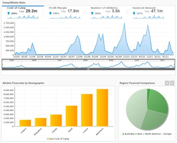
I stand by the assertion that animation, in this sense, does not add any value to the data. But being merely philosophical about data viz can often ignore the value of making a good impression. Forget your data-ink ratios for a moment. Imagine you have a presentation to give. Now, imagine how good this dashboard will look (see below) when you move the time slider and all the reports start animating. It will blow the socks off everyone in the room, leaving great big gaping holes in their shiny leather shoes!
Animations may actually enhance the experience of data consumption by drawing attention to charts. Let’s be honest, charts aren’t very exciting for folks who aren’t data viz nerds, and who don’t already have an attachment to the data. Making them dance may help create that attachment for someone seeing a chart for the first time.
That said, I still think that if you’re looking at the same reports over and over, animated charts will not only be useless, they will quickly become infuriating. That’s why we’ve added another cutting edge feature: