
Location Analytics for Business Intelligence: Dude, where’s my context?

Data source: HealthData.gov, Centers for Disease Control and Prevention (USA), “Community Health Status Indicators (CHSI) to Combat Obesity, Heart Disease and Cancer”.
Data visualization: Data visualization, Business Intelligence solution and commentary brought to you by Yellowfin 7.1: Delivering beautiful maps for brilliant insight.
The Business Intelligence (BI) industry has firmly latched onto the concept and possibilities afforded by Big Data. And, much like that discarded Band-Aid at the public swimming pool that winds up on your face, it just won’t let go.

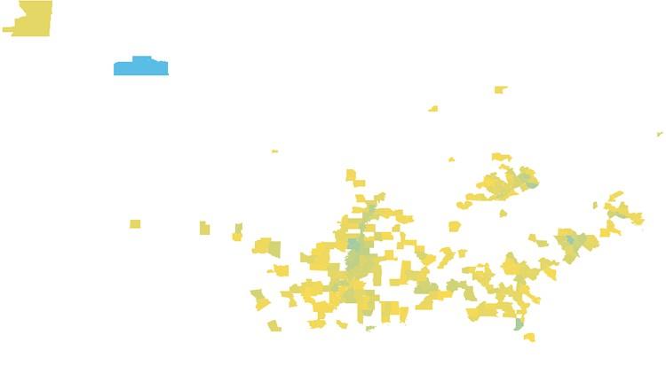
However, as indicated by the above image, is it possible that this obsession is obscuring our vision – preventing us from maintaining a more holistic view of the BI market and its usefulness?
As Austin Powers (among others) famously put it: It’s not the size, it’s how you use it.

So perhaps it’s time we stopped obsessing about collecting voluminous amounts of data, and focused a little more attention on performing better, deeper, more insightful analysis, and enhancing the information at hand.
Adding multidimensional insight to your data with location analytics
Integrated mapping capabilities – often referred to as location analytics or Location Intelligence – empower you to combine traditional BI data with location-based information. The significance of this is two-fold. It adds another crucial dimension to existing data, as well as context, by allowing you to plot other significant location-based information alongside organizational data to reveal crucial relationships.
Like to learn more about Location Intelligence and how we’re making it simpler and easier than ever before? Register for the official Webinar launch of Yellowfin 7.1
REGISTER NOW >
See how to quickly and easily combine your existing business data with location-based information. Create beautiful maps that deliver a brilliant analytical experience. Discover your next big business opportunity with Yellowfin 7.1.
“If the ability to understand the relationships between key data sets – your infrastructure, your customers, your suppliers – and discover new opportunities is important to you and your business, then this Webinar is a must.”
- Yellowfin CEO, Glen Rabie
And, because, according to IDC and others, around 80 percent of your company data is spatially significant, the benefits of location analytics can be harnessed by a multitude of industries and business functions.
From retail, to mining and exploration, the financial services industry, healthcare providers or transport and logistics, to customer analysis, advertising and marketing promotions, sales territory design, supply chain management or field service planning and tracking. The applications are near endless, as explained in Steve Benner’s (founder of the Location Intelligence Institute) article What location technology, and location intelligence, can do for you and our very own Location Intelligence: Top 12 industries.
For example, when optimizing supply chain management, mapping manufacturers, distribution warehouses, retail outlets and cross referencing their associated transportation routes with items ordered, stock-in-warehouse, stock-in-transit and available transport vehicles, can boost the number of timely deliveries and facilitate efficient dispatch. Determining the fastest transportation routes, enabling effective forecasting (matching store locations with the size of surrounding populations can be used as a guide to determine potential profitability) and optimizing warehousing processes and stock flows (based on the consumption rates of particular products by locality) are other important potential location-based assessments.
But, location analytics doesn’t just help answer critical questions such as ‘where are my most profitable customers located?’, ‘what’s the best location to build my next retail outlet?’, or ‘dude, where’s my car?’.

It also delivers insight by helping you understand previously unidentified patterns and interrelationships – between existing organizational datasets as well as third-party geographic information – that prompts you to ask previously unthought-of questions. Let’s use an example to illustrate the point.
Using Location Intelligence to assess the association between poverty and life expectancy
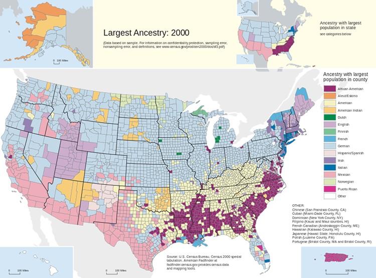
America’s HealthData.gov website offers a number of location-rich data sets. One of the more morbidly intriguing sets is supplied by the Centers for Disease Control – Community Health Status Indicators (CHSI) to Combat Obesity, Heart Disease and Cancer. This dataset provides “key health indicators for local communities and encourages dialogue about actions that can be taken to improve community health”, enabling you to assess the health of individual county communities by comparing life expectancy and prevalence of disease to a range of environmental and behavioral factors. In fact, the CHSI report contains over 200 measures for each of the 3,141 US counties.
Detailed base layers: Enabling fast multilayered mapping and providing perspective to location-based data
To meaningfully plot such insights by region requires the ability to overlay data points on a map, or base layer. Without that familiar framework, the visualized data lacks the necessary context to convey a meaningful message.
One of the major additions within Yellowfin 7.1’s enhanced mapping capabilities includes a base layer for the world. Essentially, this improvement makes it faster and easier to create multilayered maps. Instead of pulling a map layer from a third-party source – such as Google Maps, Yellowfin now uses shape files to create an image. The advantage? You can now export multi-layered maps, complete with base layer, straight to PDF to collaborate and share with colleagues. And, because you don’t have to source (or pay for) your map layer from a Web-based third-party provider, you can conduct map-based analysis offline. Pretty handy if you’re attempting to explore your data in an intranet environment.
The content creation process and query performance is also faster, because you:
- Don’t need to write a separate report to create multi-layered maps
- Can switch between different map types quickly and easily
- Don’t have to run separate reports for multi-layered maps
Poverty rate by US county
Using our CHSI data, in combination with detailed base layers, we are able to visualize the poverty rate by county across the USA. Income per household is plotted as an average per county figure. The green-to-red color scale we’ve applied shows the percentage of each county’s population that is living below America’s official poverty line, with the upper end of the scale set at 30 percent. In 2014 the American government’s definition of ‘poverty’, which does not vary geographically, is set at $23,850 total “money income before taxes” for a family of four (excluding capital gains and noncash benefits, including public housing, Medicaid or food stamps).
What’s immediately evident is that counties lining America’s southern border generally have a higher proportion of people living below the official poverty line. The few exceptions to this rule include a number of counties within the states of Arizona and California.
Other notable outliers include the fact that the majority of counties within Kentucky State have a significant number of people living below the poverty line. Similarly, the citizens of South Dakota seem to be doing it tough, with more than 30 percent of residents in the counties of Ziebach (33%), Todd (34%) and Shannon (36%) living in poverty.
Average life expectancy by US county
When assessing average life expectancy by US county there are a number of patterns and correlations that are easily identifiable.
Counties clustered along the eastern stretch of America’s southern border have an obviously lower average life expectancy compared to other regions. The noticeable outliers in this dataset are the South Dakota counties of Shannon, Bennett, Jackson, Todd and Mellette – all with a lowly average life expectancy of 67.
Interestingly, these patterns also form strong correlations with poverty.
Exploring the correlation between poverty and life expectancy
Many of the southern counties struggling economically also have some of the lowest average life expectancies. The same relationship can also be found in many of the counties in South Dakota.
Without Location Intelligence capabilities, in conjunction with detailed base layers, these patterns and correlations in the CHSI dataset may have gone unnoticed.
However, whilst fascinating and potentially actionable / useful in their own right, it’s the ability to identify such patterns and correlations that empowers us to ask deeper, more sophisticated questions – which is where the true value of location analytics lies.
Now, we can start asking those previously unthought-of questions, such as why is there a correlation between poverty and average life expectancy? And more importantly still, why are certain southern counties and those in South Dakota most heavily affected? Which environmental, behavioral, economic, social and cultural factors have contributed to these groupings? Conversely, why is the association between economic hardship and average lifespan less strong among counties along the western portion of the US-Mexico border?
Preliminary data from the US Census Bureau points to a number of patterns relating to ethnic grouping, which may contribute to these findings. For example, counties situated along the US-Mexico border have a substantially higher proportion of Hispanic / Mexican residents, while the South Dakota counties with both low household incomes and low average life expectancies have large Native American populations. Further, along the eastern section of America’s southern border, many counties have significant numbers of African American inhabitants.
And, supposing that ethnicity is an important factor in determining average income and lifespan, which socio-political and economic dynamics underpin advantage or disadvantage? Now these are interesting, if not controversial, questions!
Where to next?
Like to learn more about the insights attainable via integrated location analytics? Come and check out the launch of Yellowfin 7.1 to discover how we’re empowering business users of all backgrounds, and organizations of all sizes, with the Location Intelligence capabilities they need to quickly create beautiful maps that deliver a brilliant analytical experience.
REGISTER NOW >