

Why your users leave, and where your real growth potential lives
This data story will help for those times when you’ve struggled with churn and trying to grow your product’s usage
We are using a music streaming app as an example, but this strategy can apply to any business. The goal of this story is to help you think critically with a data-driven perspective to inform your decision-making process.
Let’s start with something simple and obvious; the more users listen to songs, the more likely they are to stick with the platform.
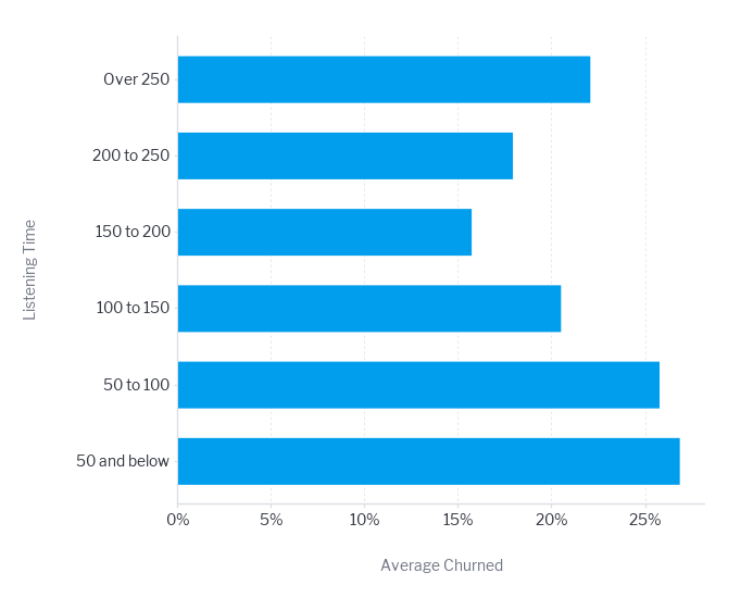
This can be useful because your customers service team can group most loyal users and have them suggest new features and participate in beta testing.
This way you can plan out your product roadmap in advance and get ideas from those who care most about your product.
You could also ask them for a G2 review or something like that as they are most likely to rave about your product.
Let’s now look at churn rates by device.
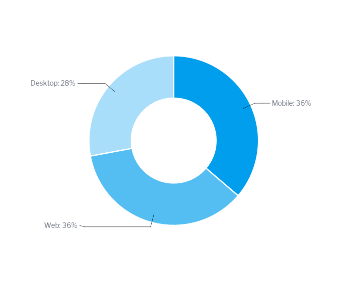
Churn by device type
As we can see, mobile and browser-based users churn more than desktop users. This could be because desktop users are usually more invested as they listen to music on their PC, but it might also signal potential issues with:
- App performance/bugs
- Mobile UX/UI design
- Feature parity
- Loading times or battery drain
You might want to focus on improving the weak platform or doubling down on the strong one. Either way, you have the data to back up your resource allocation, decisions and give you the confidence to act. Again, you need to talk to your customers to complete the picture with qualitative analysis and quantitative feedback.
How many ads will users tolerate before you risk them deleting your app?
You want to make as much money as possible from your free listeners, but every ad you show them potentially makes them more likely to walk out the door, perhaps lost forever.
We are working with the following assumptions: user churn = app deletion. Revenue you make from ads = $30 for 1,000 impressions.
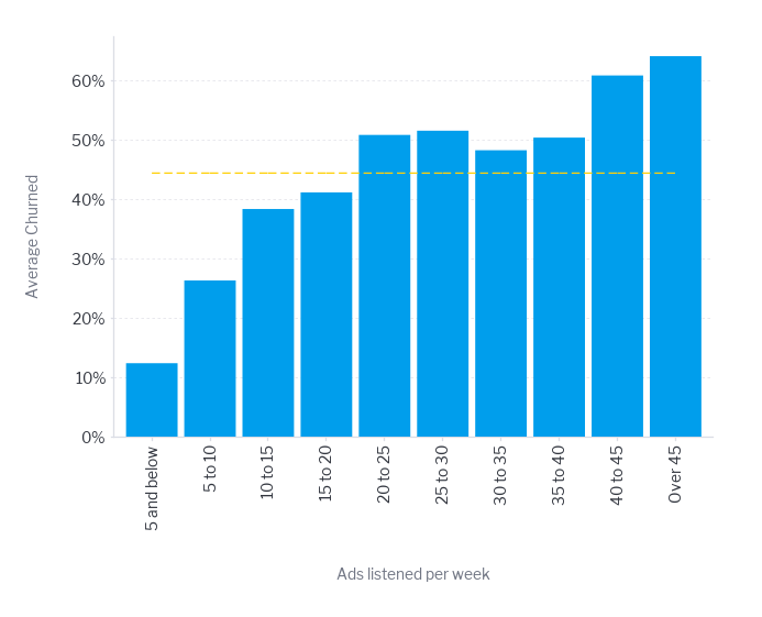
Churn by ads listened per week
We crunched the numbers and found the absolute best balance is right in the 35 to 40 ads per week range (which is about 5.4 ads every day)
You are annoying people enough to make them generate a lot of revenue for you, but you haven’t quite pushed them over the cliff yet. You’ll lose about half of these users, but the money you collect from the half that stick around is the absolute maximum you can earn from this group.
You are annoying people enough to make them generate a lot of revenue for you, but you haven’t quite pushed them over the cliff yet. You’ll lose about half of these users, but the money you collect from the half that stick around is the absolute maximum you can earn from this group.
Your retention strategy shouldn’t be one-size-fits-all.
Some user segments are flight risks. Others are rock solid. Knowing which is which tells you where to invest.
The cost of going with the gut feeling here is that you’re essentially paying the same price for users with wildly different lifetime values.
Note: brighter red shows higher churn
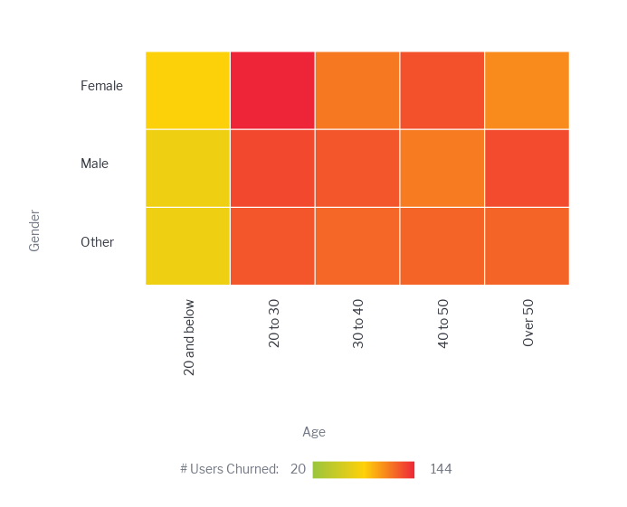
Streaming App Churn
We are working with a realistic but random dataset. This heatmap could look very different for you, and you might be surprised to see fundamental differences in how younger vs. older users engage with your app.
Research shows that different age groups exhibit varying preferences for technology, influencing both design and marketing strategies.
Products aimed at younger consumers typically feature bold aesthetics and cutting-edge technology, while offerings for older demographics might prioritize ease of use and functionality
Every consumer interaction, product launch, and marketing campaign hinges on how well a business knows its customers. Demographic segmentation is one of the most functional and
effective strategies in a marketer’s toolkit.
-Mailchimp, Demographic Segmentation
Let’s now look at the average churn rate in different countries, analyzing only those on the premium the plan.
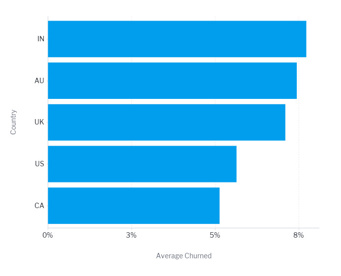
If I had the same CAC for AU and CA, I would invest more in attaining users from Canada. Since those users churn at a lower rate, they will remain active customers for longer, generating more revenue over their lifetime.
This means a higher LTV for the same acquisition cost, making CA users more profitable and a better use of our marketing budget.
Once you are done with your data story, you can share it with key stakeholders and even get them to collaborate on it.
Try Yellowfin free today and start making data-driven decisions yourself, with the confidence to act.