
How Much Data do You Need to Use Data Visualization Software?
Contributed by Technologyadvice.com, written by Zach Watson
Data visualization software is perhaps the most exciting area of the Business Intelligence industry today. Powerful analytics capabilities have existed for over a decade now, but it’s the increase in visual capacity that’s currently driving innovation in many parts of the data universe.
And, it’s not difficult to see why. Visual learning is one of the oldest and most powerful methods of comprehension. Within minutes, visualizations can communicate information that took researchers hours to find and structure.
However, when constructing a visualization, or choosing data visualization software, the question of requirements often springs to mind: Exactly how much data do you need to warrant using data visualization?
Before exploring the more complex topics of statistical significance and sample size, let’s clarify the distinction between data visualizations and infographics. Infographics are simpler representations of data, and often seek to advance a particular perspective. They have an agenda.
Data visualizations are neutral: They represent data as it exists or in relation to other relevant data. They don’t seek to forward an agenda other than what can be drawn from the data. Data visualizations can also be much more complex than infographics, and often feature interactive elements so users can view data through different perspectives.
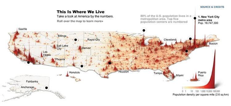
Here, TIME illustrates the fact that 80 percent of Americans live in metropolitan areas.
Now that we’ve cleared that up, let’s examine how much data is required to warrant using data visualization software. In truth, the sheer amount of data you poor into a visualization is often less important than the number of data sources you include.
When to utilize a data visualization tool
While visualization tools do work well for combining data from multiple sources, most aren’t adept at taking raw data and transforming it. The data will need to be normalized, such as in a data warehouse or CSV file, before it can be used to create a visualization.
Using a data warehouse assumes that the amount of data you’re using has outgrown simple table software, like Microsoft Excel. Again, there’s no hard cap on this type of purchase, but your business will know when working in Excel has become unmanageable.
Some of the post powerful insights attainable from visualizations come from integrating a number of different sources to paint a picture that either describes the relationship between two data sets or offers a canvas on which viewers can dig deeper and discover correlations.
Of course, data visualizations can also be used to showcase data from a single source, such as in TIME’s earlier example. While this visualization shows viewers data about population density in an appealing way, it doesn’t necessarily tell the viewer anything new. There’s little exploration to do.
To best utilize this medium, organizations and content creators should strive to offer new areas of exploration within the data. For example, GE does an excellent job of allowing users to explore the evolution of Germany’s energy sources.

Source: http://visualization.geblogs.com/visualization/germanenergy/
This type of visualization would be quite difficult to create from a table-based program. Again, there’s no hard cap on when you should or should not use data visualization; it’s a question of balancing a program’s capabilities against the number of data sources used.
The science of good visualization
In a recent interview with Yellowfin, notable technology analyst Dr. Robin Bloor more dismissed the term “data scientist” as a truism, saying that the title provides no new information. Scientists work with data by default, making the term data scientist redundant.
But more important than his dismissal of data scientist as a job title, Dr. Bloor draws attention to the overlapping scientific principles in data analytics, and therefore in data visualization.
Data visualization comes in two broad forms:
The data in explanatory visualizations is subject to a number of scientific principles, particularly in terms of statistical significance. Creating explanatory visualizations without proper statistical significance can result in mistaking correlation for causation. This is a common mistake, which can lead to false inferences and poor business decisions.
Fortunately for most business users, the analytics department will likely handle the heavy statistical lifting. However, if you’re a power user, or you’re taking the self-service BI route, seek out a tool to do these advanced calculations for you.
2. Exploratory, which seeks to visualize data in a manner that’s conducive to further exploration and hypothesis testing. Business users breathe easy; exploratory visualizations aren’t subject to statistical methods that are as strict. Why? Because they work more as frameworks in which to explore, rather than as explanations of specific business problems.
Both types of visualizations generally require software to create, as the most effective visualization will draw from several data sources. If you’re considering whether to create data visualizations, it’s imperative to first determine how many sources the project will draw from, and then consider if you have the right tools to execute. Remember, it’s not necessarily about the quantity of data, but from how many places you’re drawing – the relationships you’re showing, fresh interrelationships you’re able to reveal, and new questions you’re able to ask and answer as a result.
About the author
Zach Watson is the content manager at TechnologyAdvice. He covers gamification, healthcare IT, business intelligence, and other emerging technology. Connect with him on LinkedIn.
Data visualization software is perhaps the most exciting area of the Business Intelligence industry today. Powerful analytics capabilities have existed for over a decade now, but it’s the increase in visual capacity that’s currently driving innovation in many parts of the data universe.
And, it’s not difficult to see why. Visual learning is one of the oldest and most powerful methods of comprehension. Within minutes, visualizations can communicate information that took researchers hours to find and structure.
However, when constructing a visualization, or choosing data visualization software, the question of requirements often springs to mind: Exactly how much data do you need to warrant using data visualization?
Before exploring the more complex topics of statistical significance and sample size, let’s clarify the distinction between data visualizations and infographics. Infographics are simpler representations of data, and often seek to advance a particular perspective. They have an agenda.
Data visualizations are neutral: They represent data as it exists or in relation to other relevant data. They don’t seek to forward an agenda other than what can be drawn from the data. Data visualizations can also be much more complex than infographics, and often feature interactive elements so users can view data through different perspectives.
Here, TIME illustrates the fact that 80 percent of Americans live in metropolitan areas.
Now that we’ve cleared that up, let’s examine how much data is required to warrant using data visualization software. In truth, the sheer amount of data you poor into a visualization is often less important than the number of data sources you include.
When to utilize a data visualization tool
While visualization tools do work well for combining data from multiple sources, most aren’t adept at taking raw data and transforming it. The data will need to be normalized, such as in a data warehouse or CSV file, before it can be used to create a visualization.
Using a data warehouse assumes that the amount of data you’re using has outgrown simple table software, like Microsoft Excel. Again, there’s no hard cap on this type of purchase, but your business will know when working in Excel has become unmanageable.
Some of the post powerful insights attainable from visualizations come from integrating a number of different sources to paint a picture that either describes the relationship between two data sets or offers a canvas on which viewers can dig deeper and discover correlations.
Of course, data visualizations can also be used to showcase data from a single source, such as in TIME’s earlier example. While this visualization shows viewers data about population density in an appealing way, it doesn’t necessarily tell the viewer anything new. There’s little exploration to do.
To best utilize this medium, organizations and content creators should strive to offer new areas of exploration within the data. For example, GE does an excellent job of allowing users to explore the evolution of Germany’s energy sources.
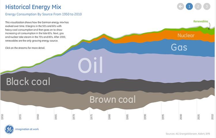
Source: http://visualization.geblogs.com/visualization/germanenergy/
This type of visualization would be quite difficult to create from a table-based program. Again, there’s no hard cap on when you should or should not use data visualization; it’s a question of balancing a program’s capabilities against the number of data sources used.
The science of good visualization
In a recent interview with Yellowfin, notable technology analyst Dr. Robin Bloor more dismissed the term “data scientist” as a truism, saying that the title provides no new information. Scientists work with data by default, making the term data scientist redundant.
But more important than his dismissal of data scientist as a job title, Dr. Bloor draws attention to the overlapping scientific principles in data analytics, and therefore in data visualization.
Data visualization comes in two broad forms:
1. Explanatory, which seeks to describe the casual relationship between two sets of data. For example, identifying the relationship between the types of content that convert among blog readers. Explanatory visualizations are often found in business dashboards, where they display performance factors relative to company goals.
The data in explanatory visualizations is subject to a number of scientific principles, particularly in terms of statistical significance. Creating explanatory visualizations without proper statistical significance can result in mistaking correlation for causation. This is a common mistake, which can lead to false inferences and poor business decisions.
Fortunately for most business users, the analytics department will likely handle the heavy statistical lifting. However, if you’re a power user, or you’re taking the self-service BI route, seek out a tool to do these advanced calculations for you.
2. Exploratory, which seeks to visualize data in a manner that’s conducive to further exploration and hypothesis testing. Business users breathe easy; exploratory visualizations aren’t subject to statistical methods that are as strict. Why? Because they work more as frameworks in which to explore, rather than as explanations of specific business problems.
It’s this ideology that has led to the prevalence of interactive visualizations. These visual maps of data sets allow you to change the data presented in order to formulate new ideas to test.
Both types of visualizations generally require software to create, as the most effective visualization will draw from several data sources. If you’re considering whether to create data visualizations, it’s imperative to first determine how many sources the project will draw from, and then consider if you have the right tools to execute. Remember, it’s not necessarily about the quantity of data, but from how many places you’re drawing – the relationships you’re showing, fresh interrelationships you’re able to reveal, and new questions you’re able to ask and answer as a result.
About the author
Zach Watson is the content manager at TechnologyAdvice. He covers gamification, healthcare IT, business intelligence, and other emerging technology. Connect with him on LinkedIn.