

Yellowfin 7.4 Little Things: Variance function advancement
Yellowfin 7.4 lets you stay one step ahead by generating quality content with ease and effortlessness.
Helping you get to the Why of your business data faster is Yellowfin’s goal. That is why the next enhancement we reveal in this blog series is one of our highly sought after chart functions, Variance. We’ve revamped Variance as part of the new core functionality being brought to you in Yellowfin 7.4.
Brand New Advanced Formulas
You may have used this chart-field function to compare the differences between your metric data by running them through formulas. Along with simple calculations to discover the basic differences in data as either a numeric value or percentage, now you can discover detailed insight with advanced options to calculate the changes. Yellowfin has added some advanced formulas to let you further analyze your data and help you recognize changes that would otherwise be easy to overlook. The update will allow you to calculate the percentage of total variance and the percentage change in relative proportion.
The newly included formulas shed light on the changes in the proportion of contribution between different data fields or sets. For example, looking at the changes in your expenses, you notice that your travel expense had the biggest increase, but when seen as a percentage of all expenses, this expenditure did not really change. It could be that all the expenses increased, but travel contributed the most because it’s already expensive. However, your office equipment expenditure, which showed an average level of change, had an increased percentage of contribution, indicating that something significant must have happened.
Hidden Set Analysis Incorporation
Another function related to this one is Yellowfin’s Set Analysis. This neat little functionality lets you filter mountains of data and create different data sets right there on the chart builder. Say your chart is displaying the average profits made by your entire sales team, but you only want to see the profits made by the male team members, you can use this function to do exactly that, by creating a data set of just the male members without having to create a new field in the database.
But this time, we’ve integrated this handy tool directly into the variance function, so that now you don’t need to create sets of data separately before using the variance function. With this update, you can simply create them while applying variance and view the contributions of each data set. This saves content creators from performing additional steps when calculating discrepancies in their data, making their jobs really easy.
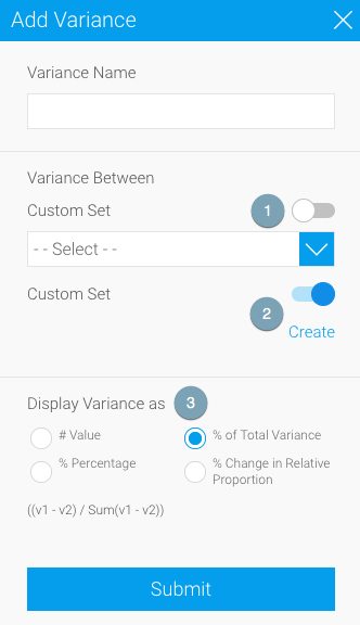
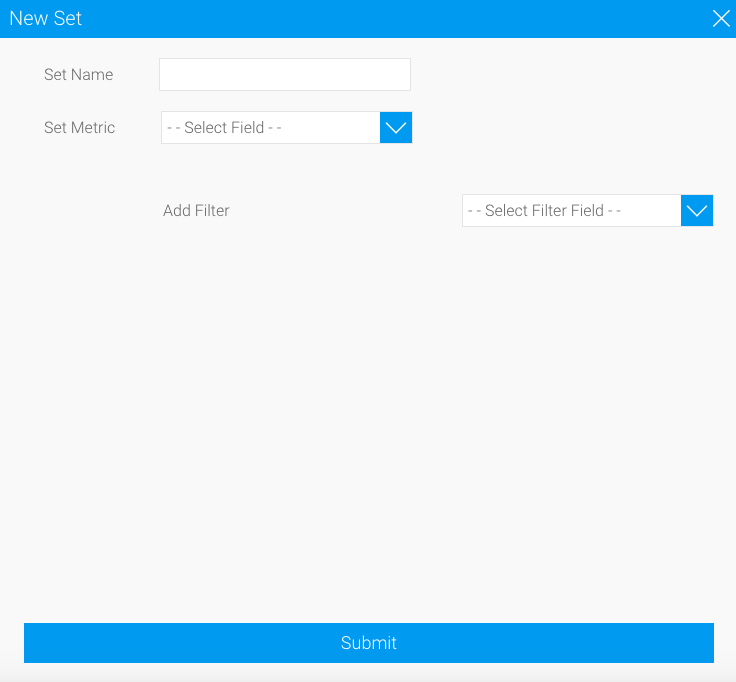
On applying this function to a chart axis field, you will notice the above popup appear. You can either choose a pre-existing report or chart field for the comparison (#1), or enable the button to generate your new set analysis (#2) through the Create button. This leads you right to the set analysis setup window.
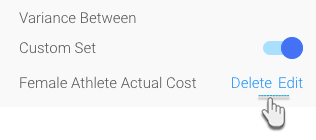
Once you have selected your data fields, simply choose the variance formula (#3) matching your business needs, and view the results. It’s as simple as that! And all you had to do was use a single chart function. What’s equally interesting is that now you also have the power to edit or delete your customized data sets through the same feature, using newly added buttons to do so.
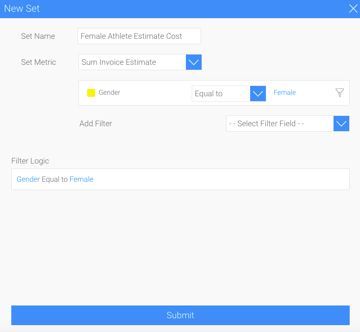
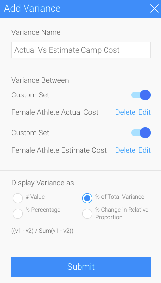
Let’s use a real example. Using this single function, we can discover the variance between the estimated cost of running a camp for female athletes versus the actual cost for the same female group in different geographical regions. We simply generate two custom data sets in our variance function: one that extracts the actual camp cost for only the female athletes from data that contains this information for all athletes.
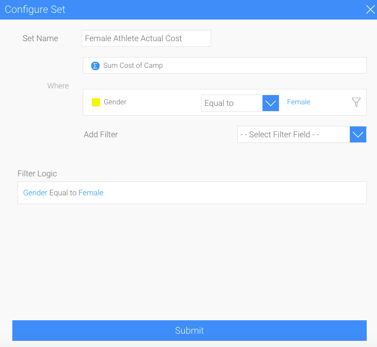
And the other which derives the estimated camp cost for female athletes.
Then choose the type of variance you want to view between these two cost types by selecting a formula. We want to see the percentage of the total variance between the estimated and actual costs.
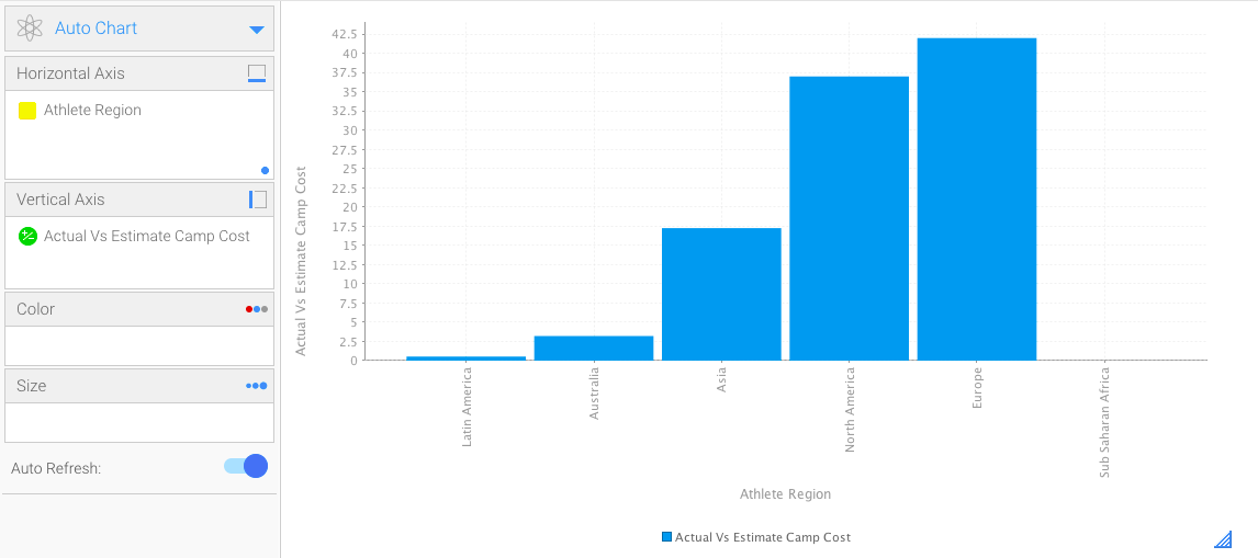
And with the click of a button, our chart will display the difference between the two types of costs to give us the result we want.
The advancements made to this already progressive functionality will let data creators stay one step ahead by generating quality content with ease, while minimizing the steps required to achieve the same as results before.
Download Yellowfin 7.4 and discover the updates, little and big.