

Makeover Monday with Yellowfin: Equal Measures 2030 Insights
Makeover Monday is a social data project where each week the organizers post a link to a chart and its data, and then people rework the chart. Maybe they re-tell the story more effectively, or find a new story in the data.
This week’s Makeover Monday is extra special as the organizers collaborated with Equal Measures 2030 for International Women’s Day, using a data set that shows how aware and informed policymakers from selected countries are around 5 issues related to women and girls.
We had 3 submissions this week with each one having a few technical highlights, and here they are:
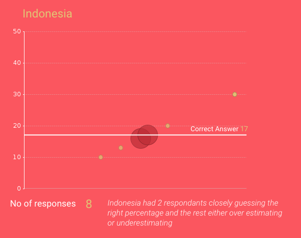
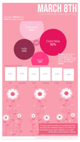
Chithresh decided to focus on the estimates around the share of parliamentary seats held by women within Colombia, Indonesia, India, and Senegal.
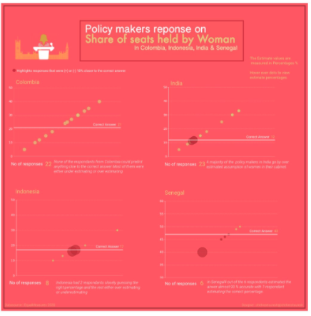
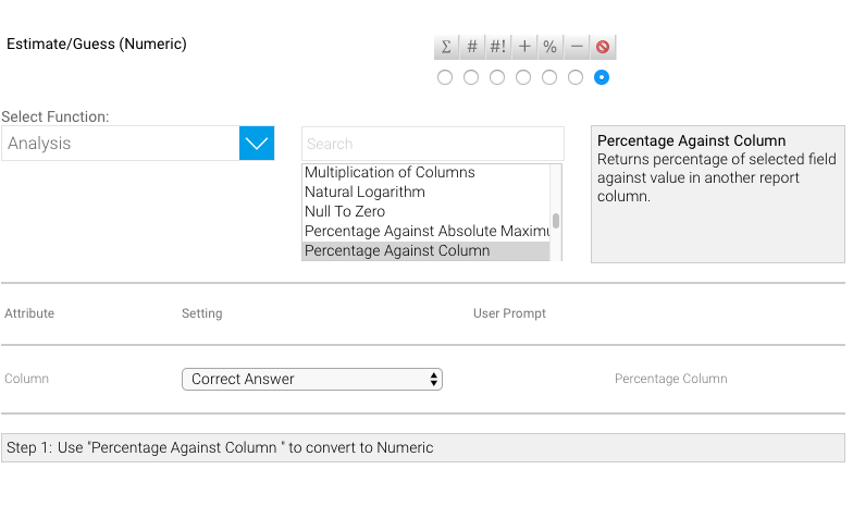
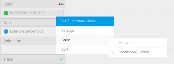
Every respondent’s estimate was visualized on a Scatterplot chart but an interesting highlight here was the usage of Conditional Formatting and a Calculated Field to draw attention to estimates that were within +/- 10% to the correct answer:
To do this, you can use the Percentage Against Column Advanced Function with Estimate as the numerator, and Correct Answer as the denominator to produce your Estimate %.
After that, it’s just a simple Conditional Formatting rule to colour estimates inside and outside of the percentages. This is applied on the same column with the Advanced Function above.
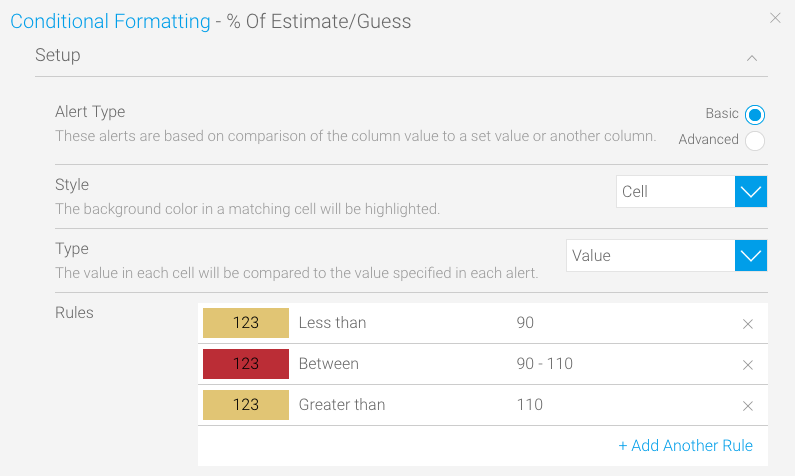
Finally, just drag this column onto the Chart Colour section and set the Colour settings to “Conditional Format” and voila!
2. The percentages of women with some secondary education
Tyler & Tom investigated the percentage of women with some secondary education and discovered a few alarming metrics along the way:
The moving packed bubble chart visualizing secondary education percentages is powered by the popular D3.js library and implemented as a JavaScript Chart.
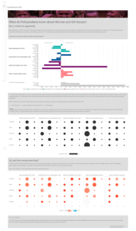
3. What do these policymakers know?
I went for a slightly snarky take on just how wrong most of the given estimates were e.g how much did the policymakers under/overestimate the figures?
Rather than manually calculate this under/overestimation in a Calculated Field, I went for a Variance on the chart itself and dropped it into my diverging bar chart:
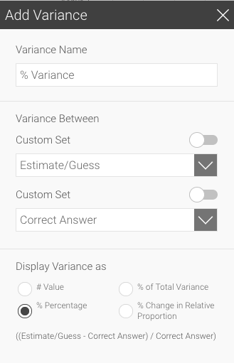
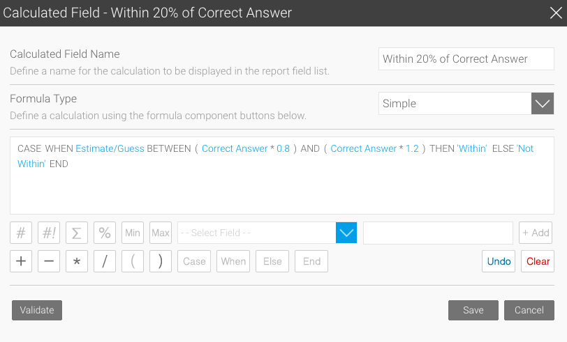
For the “correctness” of an estimate, the original Equal Measures 2030 article had a +/- 20% band where estimates within this range were deemed “correct”. For the sake of variety, I used a Calculated Field perform this calculation and output a “Within”, “Not Within” result:
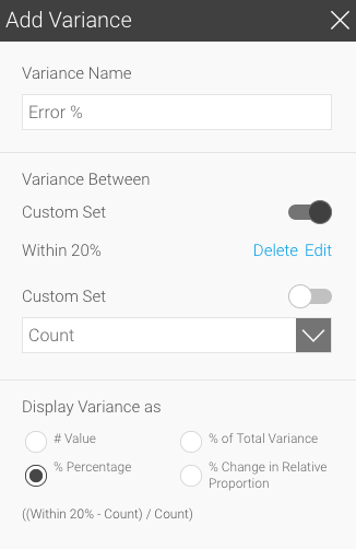
This was then later used in a Variance Set Analysis on the Chart to automatically calculate the error percentages and be used to colour my Heat Grid chart:
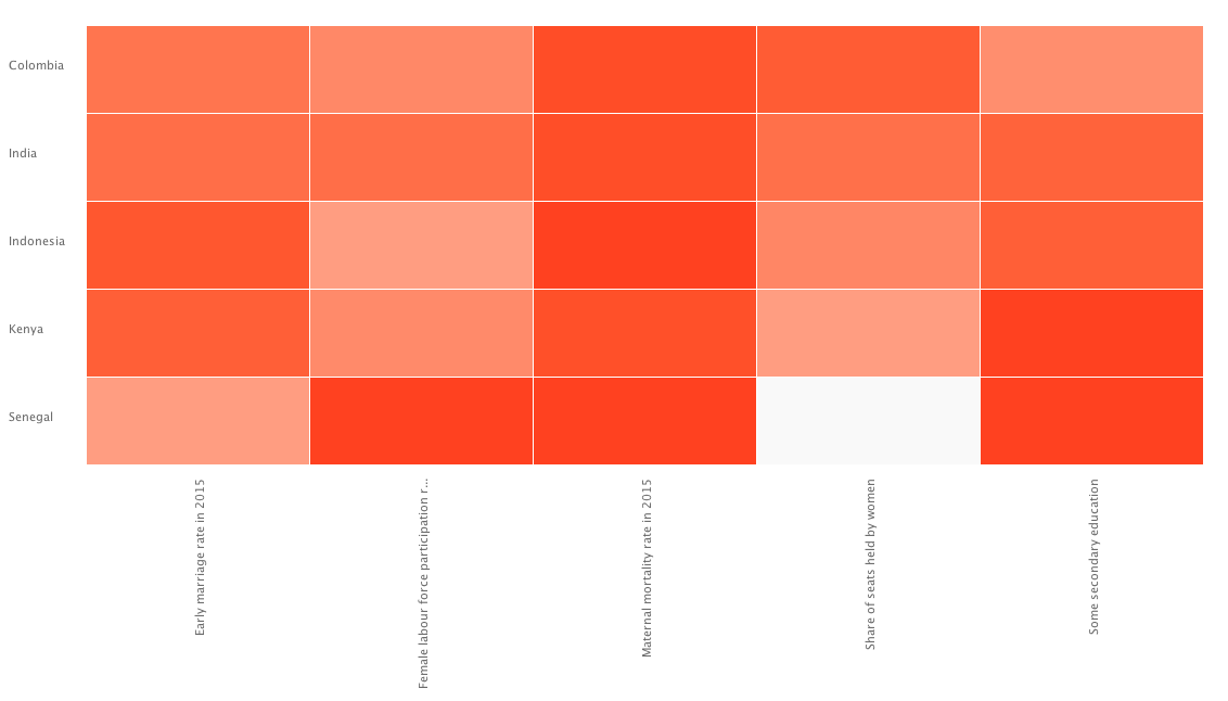
And here’s the final Heat Grid chart:
And there you have it! Three very different submissions utilizing different areas of the platform to visualize that there is so much more that needs to be done to all levels to empower women and achieve gender equality. If you are interested in see what Yellowfin is doing to make this future a reality from a STEM front, please read more about it here.
If you’d like to participate in Makeover Monday, come join us at Data.World, otherwise you can follow our submissions and interact with us on Twitter and Instagram.