

3 Examples of Successful Embedded Data Visualization Tools
Today, businesses are hyper focused on developing data-driven applications and experiences. Whether for customers or end-users, they want to offer software that contains interactive dashboards, personalized data visuals, infographics, and charts.
The reason is simple: Better access to data in the same workflow means more people will be more data-driven in their decision-making. If you need your application to display data in charts, graphs or other data images, you need embedded data visualization tools.
This article will explore the benefits of embedding data visualization in your applications. It will also see tools that embed data visuals in any software application. But first, let's quickly recap the benefits of embedding data visuals within your business application.
Why you should integrate embedded data visualization tools into your app
Embedded data visualization tools help configure, visualize and render data into quick and accessible visual information, rather than just tables of numbers. These tools offer better end-user experiences to support more accessible and quicker enhancements.
With data analysis becoming a more significant part of everyday workflows, built-in visualization capability is essential to help every type of business user analyze their data. That's what the 'embedded' part means; it's integrated into the software alongside reporting and dashboard modules, to help users create real-time visuals without having to rely on third-party solutions that take them outside your software experience.
Enterprise's applications with embedded analytics tools, which come as a pre-packaged platform solution, help provide deeper insights to business users as they move through their day-to-day activities. It enables decision-makers to make informed decisions with important data points, and consume reports summarized into digestible graphical formats. It also allows more experienced data experts to analyze complex insights fast.
Read more: What are embedded data visualization tools?
3 examples of embedded data visualization tools
Dealing with data sets that contain hundreds or thousands of data points is a complex, time-consuming task. However, creating a visualization of your reports can make decision makers' jobs a lot easier. These data visuals are helpful in any use case information needs to be interpreted and acted on fast.
There are multiple embedded data visualization tools for large data sets in the market today, offered as just one part of broader embedded analytics platforms, but only a few offer the level of capability required to turn data into engaging, interactive, visual information. To help you understand, we cover 3 leading solutions in the space.
Yellowfin
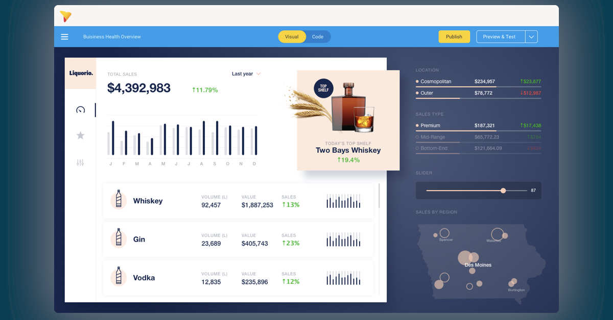
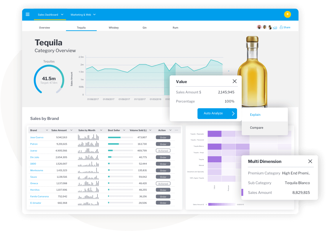
Yellowfin dashboards are great for picturing data from different data sources with stunning visualizations. It is also helpful in spreading strategic and in service dashboards over multiple tabs. It is perfect for embedding or developing internal or external applications.
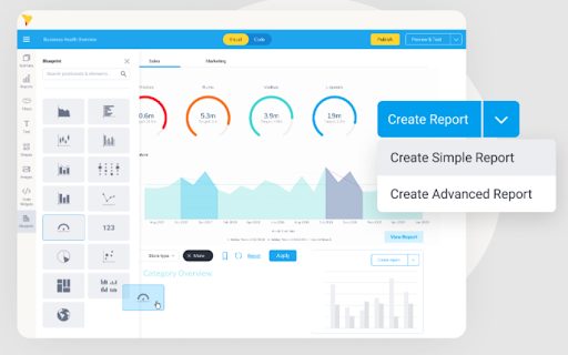
It also brings dashboard reports to life with sparklines and contextual actions, and Yellowfin dashboards are the only product that combines a unique set of automated and narrative features that enhance data visualizations. These include data storytelling and automated analytics with true design resilience.
Yellowfin's free-form dashboard is also great for canvas designers and beginners alike. Its drag-and-drop charts and graphic tools assemble creative, pixel-perfect, and on-brand infographics.
With the Canvas feature, a user also has the freedom to create engaging analytic experiences. It does so by adding shapes, images, and text. It also augments the dashboard experience with data visualization.
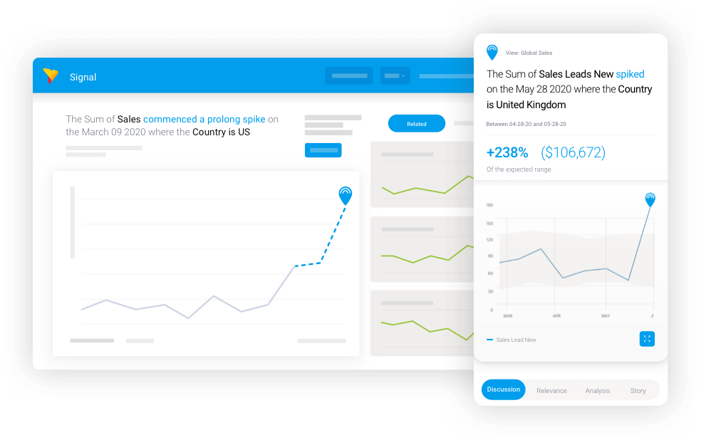
Yellowfin dashboards also allows automated business monitoring and data science integration. With this, a user can discover and analyze the changes and outliers in the data with efficiency.
Its main features include a low-code or no-code action button. It supports and triggers workflows directly from Yellowfin dashboards. It also automates business monitoring, data science integration, and flexible developer tools.
Tableau
Tableau has various options available. These include a desktop app, a free public option, a server, and hosted online versions. It has hundreds of data import options that range from CSV files to Google Ads and Analytics data.
With this, designers can create color-coded maps that showcase essential data. It shows data in a format that is much easier to understand than a table or chart.
Tableau comes with a public version that is free to use for anyone. It is useful for those who want a powerful way to create data picturing in various settings. It provides a wide gallery of infographics and visuals with a public version to serve as inspiration.
Its main features include mapping ability and a free public version. It also provides hundreds of data import options. The main challenge with Tableau is while its suite is powerful, its visualization tools are not as easy to pick up and create with for regular business users, unless reports are pre-prepared for consumption by knowledgeable experts.
Google Charts
Google Charts is a robust, free data visualization tool that can create interactive charts to embed online. It couples with dynamic data, and the outputs are on HTML5 and SVG. So, it can work in browsers without the additional plugins.
Data sources of Google Charts include Google Spreadsheets, Google Fusion Tables, SQL databases, and Salesforce.
It also includes other charts. That includes maps, scatter graphs, columns and bar charts, area charts, pie charts, timelines, gauges, and histograms. The fantastic thing about these charts is their customized feature. So, you can customize every chart with simple CSS editing.
The top feature of Google Charts includes its wide variety of chart formats. It also has cross-browser rapport, dynamic data working, and a free plan. So, if you are not comfortable coding and want a free solution, Google Charts is for you.
Transform your software with embedded analytics tools - try Yellowfin
There is no denying the fact that data has become so critical that a business cannot survive without that. Enterprises have to use data to make executive decisions. They need to rely on data for their past growth and future strategy. However, it is also a fact that not all executives can read data. So, what's the panacea for them?
The embedded analytics tools of analytics solutions like Yellowfin can help in such cases.
Yellowfin's embedded analytics platform can solve data complexity with automation, storytelling, and collusion. Its action-based dashboards are simple and leverage users to understand and do more with their data.
You can also augment Yellowfin's embedded analytics platform with assisted insights and automated business monitoring. It helps enterprises discover and analyze changes in the data with incredible efficiency.
This is all on top of its stunning data visualization capabilities.
So, if you want to put complex data into beautiful and simple designs, Yellowfin has a solution for you. To make full use of your data and grow your business like never before, try the embedded data visualization tools of Yellowfin embedded analytics tools now!
Embedded Data Visualization FAQs: Tools, Benefits, and Best Practices
What Are Embedded Data Visualization Tools?
Embedded data visualization tools allow businesses to embed charts, graphs, dashboards and other visual analytics directly into their software applications. This feature enables users to analyze and understand data without leaving their workflow or switching to external tools.
Why Should Businesses Use Embedded Data Visualization in Their Applications?
Embedded data visualization helps users to understand the data by transforming complex data into easy-to-understand visual insights. It helps decision-makers to identify trends, measure progress and make better decisions faster with real-time data.
What Are the Benefits of Embedded Analytics and Data Visualization?
Embedded analytics is the integration of reporting, dashboards and visualizations into an application to make data more accessible to users. It reduces the need for separate analytics platforms while allowing organizations to scale data-driven decision-making across their teams.
What Are the Best Embedded Data Visualization Tools?
Popular embedded data visualization tools are Yellowfin, Tableau and Google Charts. Each has unique capabilities, from advanced dashboards and storytelling to interactive charts and broad data source integrations.
How Does Yellowfin Support Embedded Data Visualization?
Yellowfin offers interactive visualizations, customizable dashboards, automated business monitoring, and data storytelling abilities. Low-code design tools enable organizations to provide engaging analytics experiences to internal and external users.
Is Tableau Good for Embedded Analytics and Data Visualization?
Tableau is a popular tool for building interactive visualizations and connects to hundreds of data sources. Its strong mapping and reporting capabilities make it a good choice for organizations that need advanced analytics, but it may require more technical expertise than some alternatives.
What Makes Google Charts a Popular Data Visualization Tool?
Google Charts is a free visualization library that allows developers to create interactive charts using HTML5 and SVG. It supports various chart types, dynamic data sources and rich customization options making it suitable for web based applications.
How Do Embedded Dashboards Improve Business Decision-Making?
Embedded dashboards showcase key business metrics through visualizations that are easier to digest than raw spreadsheets or tables. It enables users to understand how they are performing, spot trends and take quick action with real-time insights.
Can Embedded Data Visualization Handle Large Datasets?
Yes, modern embedded analytics platforms are built to efficiently visualize large and complex data sets. Explore data without manually sifting through thousands of rows of information thanks to interactive charts, dashboards and automated insights.
What Features Should I Look for in an Embedded Data Visualization Tool?
Some of the key features include interactive dashboards, multiple chart types, real-time data integration, customization options, automated insights, storytelling capabilities, and developer-friendly embedding tools. These features enable organizations to deliver more engaging and actionable analytics experiences.