

Analyzing Population Percentages Using Yellowfin Box and Whisker Charts
In this blog, the team at Yellowfin Japan demonstrates how to take advantage of Yellowfin's data visualization capability in the form of Box and Whisker charts, using the example of analyzing the percentage of foreign population prefectures.
So, what is a Box and Whisker Chart, and what does it look like in Yellowfin?
Box and Whisker Chart Overview and Analysis Examples
What is a Box and Whisker Chart?
A Box and Whisker chart is shaped like a box with whiskers extending vertically or horizontally as shown in the image below. This is why the diagram is called that. In English, it is also called box plot or Box and Whisker plot and was developed in the U.S. in the 1970s.
It can show Maximum/Minimum values, average, etc. collectively on a single chart and allows a lot of information to be viewed at a glance, so is used for various purposes.
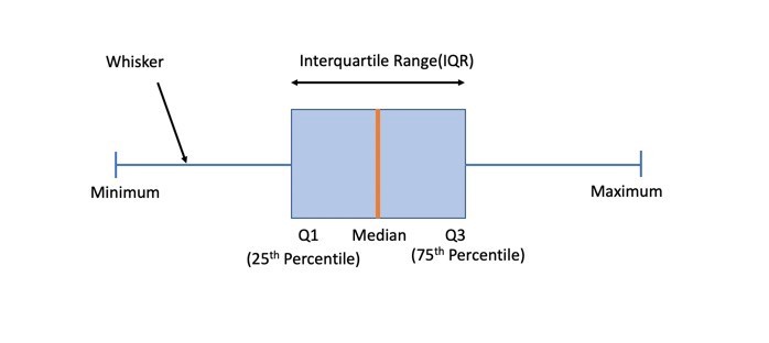
The First Quartile indicates the value located in the bottom 1/4, and the Third Quartile indicates the value located in the bottom 3/4. The value located exactly in the middle is the Median.
Creating a Box and Whisker Chart
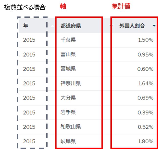
To create a Box and Whisker chart, you need at least one axis and one aggregated value. If you want to display multiple Box and Whisker charts side by side, you will need another axis.
The table below shows the percentage of foreigners by prefecture. For the purpose of analyzing a single year, you can create a Box and Whisker chart with only two columns, one for the prefecture axis and the other for the aggregated values. In order to create Box and Whisker charts for multiple years and compare trends for each year, a year axis is also required.
Analyze using a Box and Whisker chart (for Single Year)
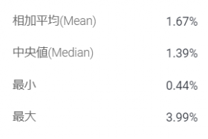
We have created a chart using data from 2020 (*1). Both the Mean and Median are above 1%. The First Quartile is below 1%, and we can see that more than a quarter of the prefectures do not have a foreign population of 1%. The Third Quartile is 2.40%, meaning that in at least a quarter of the prefectures, more than one in 50 residents is a foreigner.
The difference between the Minimum and Maximum values is 3.55 points. The Maximum value is in the largest international city of Tokyo, where 3.99% are foreigners. Aichi Prefecture (3.63%), Gunma Prefecture (3.24%), Mie Prefecture (3.16%), and Gifu Prefecture (3.00%) followed, indicating that in addition to being large cities, prefectures with a thriving manufacturing industry also have a high percentage of foreign residents. This reflects Japan's current reliance on foreign workers in various economic activities, including manufacturing centers, in order to compensate for worker shortages.
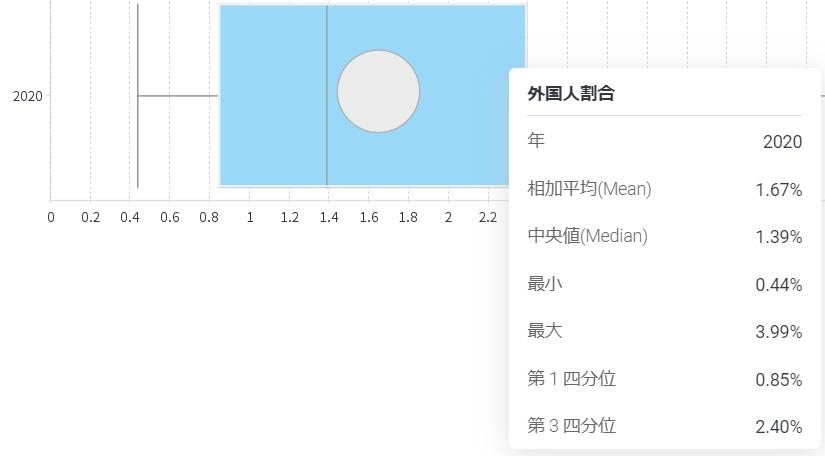
Please note that this above chart was created using open data published by the Bureau of Statistics and may differ slightly from actual figures due to differences in the timing of the collection of the two types of data (total population by prefecture and population of foreign residents) used to calculate the 2020 data.
Analyze using Box and Whisker charts (for Multiple Years)
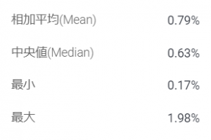
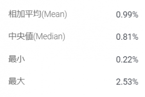
This time we have created Box and Whisker charts for multiple years side by side to see the trends in decadal units: 2000, 2010, 2020. We can see all values - Maximum, Minimum, Median, Mean, First Quartile, and Third Quartile - are rising steadily. In particular, each value has increased significantly during the 10-year period from 2010 to 2020.
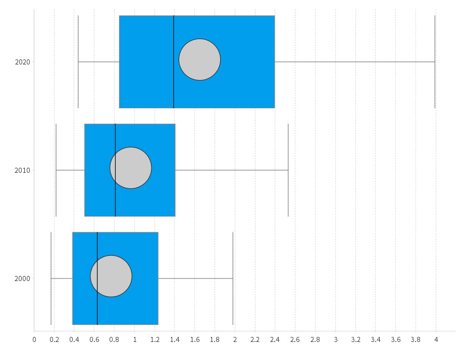
One reason behind the large increase in numbers between 2010 and 2020 is the government is becoming more active in accepting foreign workers. A representative measure is the foreign technical internship program that commenced in November 2017.
In Japan, a country with a declining birthrate and an aging population and a particularly large decline in the productive labor force among developed countries, expanding the acceptance of foreign workers is a major challenge, along with improving labor productivity. It's a complex dataset to visualize, and the whisker and box charts are the best data visualization charting options to represent this information.
Conclusion
Box and Whisker charts can pack a lot of information at a glance and are very useful for getting an overall picture of data. We encourage you to take advantage of Yellowfin's Box and Whisker charts to grasp the trends of various data.
Try Yellowfin Data Visualization
Learn how Yellowfin can enhance your data-rich reporting with rich, customizable graphs and charts - try our data visualization demo today.