

ChatGPT vs Yellowfin for Data Analysis and Visualization
- ChatGPT is great for quick, conversational exploration. You ask in plain English, it remembers the context, and it gives you a chart or table with a simple explanation. The downside: visuals are static and sometimes the math isn’t bulletproof.
- Yellowfin is a full BI platform. You still get NLQ (guided or free-text) but the SQL is governed, the visuals are interactive, and the insights are explainable. Plus, you can turn results into dashboards, live presentations, or narrative Stories.
- In practice: I use ChatGPT for one-off analysis and Yellowfin when I need reliable, sharable, and scalable insights.
If you’d like to try Yellowfin for yourself, go ahead and request a free trial.
Generative AI has made it easier than ever to analyze data with plain English. You’ve probably seen dozens of videos showing how to use ChatGPT for data analysis — upload a CSV, ask a question, and get a chart.
But I wanted to see how that stacks up against Yellowfin, which is designed for analytics from the ground up. So I ran the same queries in both tools, compared the outputs, and here’s what I found.
Breaking down AWS storage prices by region
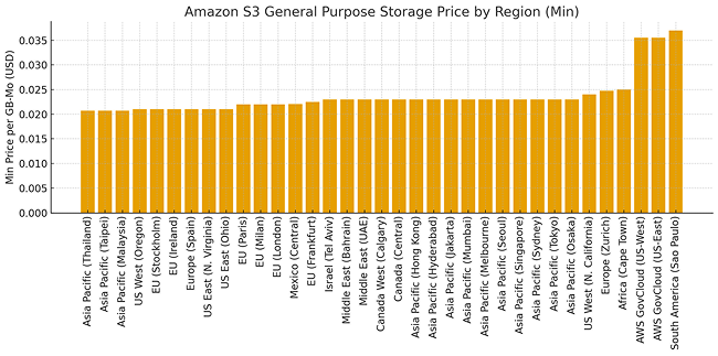
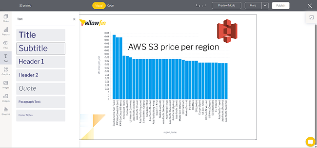
The first test was relevant to anyone working in the cloud: analyzing the minimum price of AWS S3 General Purpose storage across regions.
In Yellowfin, I opted for Guided NLQ instead of freetext question, simply because I wanted full control over the query:
Show avg(PricePerUnit) by Location
Where Storage Class = 'General Purpose' and Unit = 'GB-Mo'
The output was a clean, interactive chart where hovering reveals exact values.
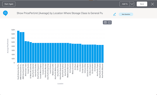
In ChatGPT, I asked the following question:
“Break down the average PricePerUnit by Location, filtered to General Purpose and GB-Mo.”
The response was almost identical in terms of values but the experience was different. Yellowfin’s chart is fully interactive, while ChatGPT provides a static PNG image.
Overall, I found ChatGPT to be a great companion when I needed to verify the accuracy of Yellowfin’s charts. It never hurts to double-check the veracity of your data. Many professionals first explore these kinds of tools and workflows when learning analytics concepts in a data analytics course, where they practice asking questions in natural language and interpreting the resulting visualizations.
Can ChatGPT keep up with Yellowfin when the query gets more complex?
Adding analytics can be a powerful way to create new revenue streams, but that’s easier said than done.
Next, I tried to visualize storage class prices by region:
List region_name and storage_class by price_per_unit (Average)
Where unit = GB-Mo For All Time
ChatGPT gave me a breakdown in a table and suggested a heatmap. It was legible but basic.
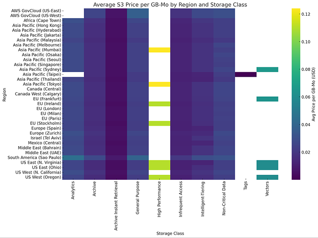
Yellowfin produced much better results than ChatGPT. It had a polished heatmap, with tooltips, color scales, and a great set of filters baked into the Yellowfin's solution.
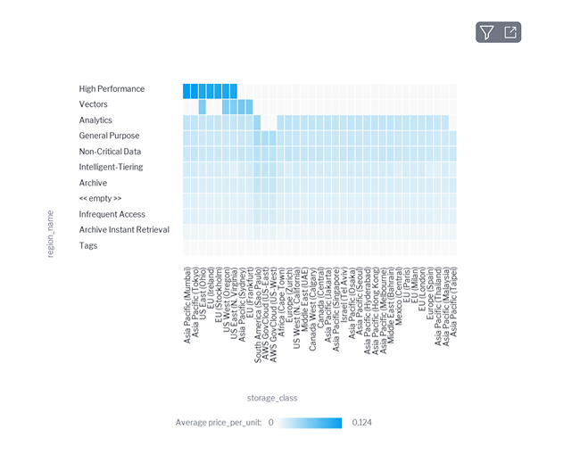
ChatGPT can generate a quick visual, but Yellowfin makes something I’d actually want to show in a meeting (if I was a FinOps guy looking to cut cloud costs).
Context matters: insights vs explanations
One of the biggest differences I noticed was in how each tool adds context.
- ChatGPT always explains the result in words: “High-performance storage class costs most, followed by Vectors…”
- Yellowfin does things differently. You click the magnifying glass — Tell Me About My Data — and Yellowfin generates Assisted Insights: related findings, anomalies, and comparisons, all backed by the dataset.
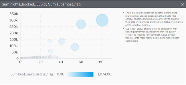
For example, on a separate Airbnb database, Yellowfin identified an insight that Superhosts with multiple listings were more likely to get higher bookings. Not shocking, but it’s the kind of data-driven confirmation you don’t have to hunt for.
What happens when the audience asks a question mid-presentation?
Here’s where Yellowfin started to pull ahead for me. With ChatGPT, every chart is a static PNG. If I want to share results in a meeting, I’m copy-pasting screenshots into PowerPoint. That works, but it’s frozen in time.
In Yellowfin, I can build a live presentation using Present. It feels like PowerPoint but with actual, governed data behind each slide.
If someone in the room asks “what about São Paulo versus Oregon costs,” I can quickly click the bar and drill down to show a detailed answer. No switching tools, no “I’ll get back to you later.” That makes presenting data a lot less stressful.
How to turn numbers into stories?
Another feature I leaned on was Yellowfin’s Stories. ChatGPT gives you explanations automatically, which is nice, but Yellowfin lets me compile those explanations into a blog-style article right inside the platform, complete with live charts, images, even comments from colleagues.
When I was looking at Airbnb neighborhoods in Barcelona, I used a Yellowfin Story to put the chart side by side with my commentary about tourism demand for rentals in Barcelona.
Anyone in the team could open my newly created Story, see the live numbers, and leave a comment. It becomes a record we can all return to, not just a one-off explanation in a chat window.
Here's what I found by comparing Yellowfin with ChatGPT
Ultimately, the right choice depends on your specific situation. There is no one-size-fits-all answer when it comes to building or buying analytics. But there are many considerations to address.
ChatGPT behaves like a smart analyst off of which I can bounce ideas. It’s fast, flexible, and conversational. But when I need to turn my findings into something reliable, shareable, and grounded in truth, I move into Yellowfin.
If you want to see how Yellowfin can take you from quick questions to interactive dashboards, presentations, and stories, book a demo.