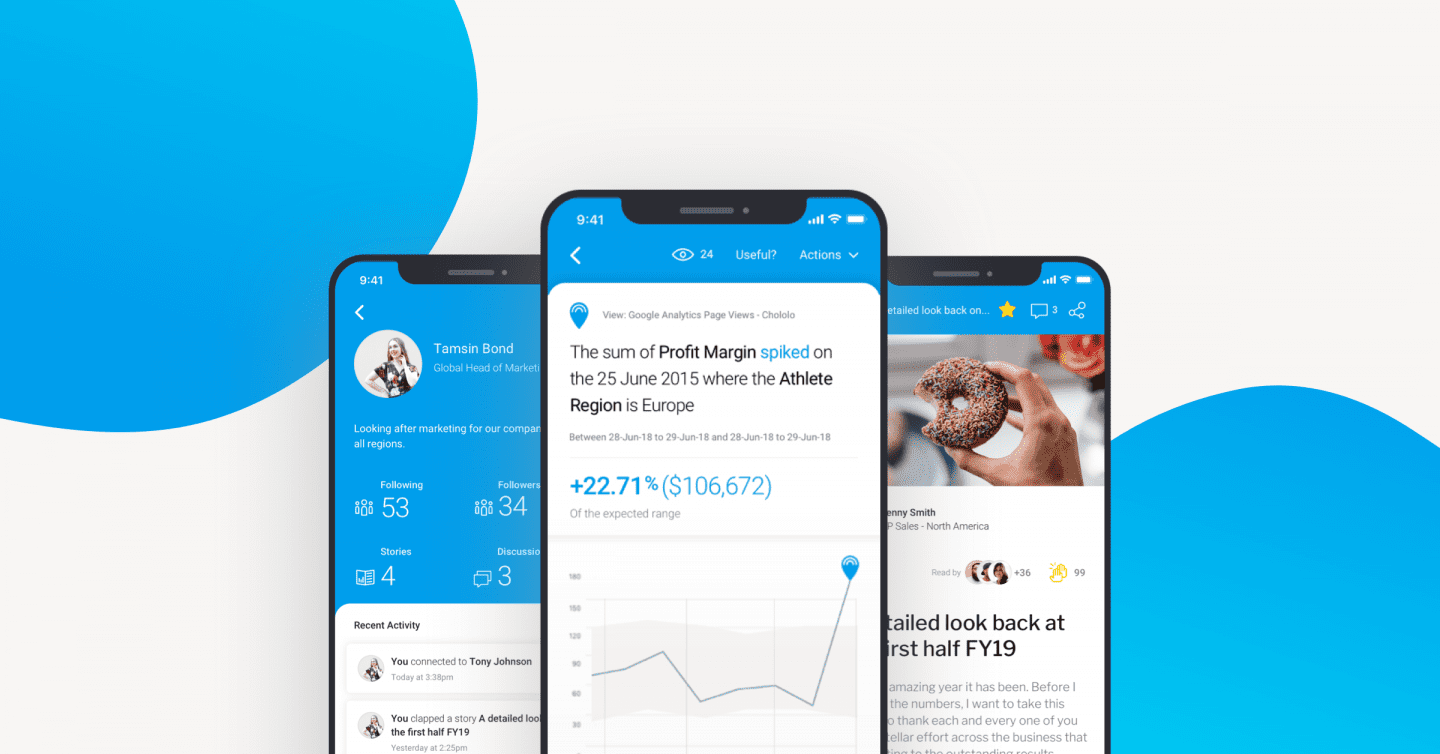
Data to the people – Why this app will change the way more people engage with data
The answer to creating an inclusive data culture is in your hands.
At Yellowfin, we firmly believe that organisations are far more successful when all their people engage with data. And whilst this has always been the goal of organisations on their journey to being “data-led”, the reality is most are still a long way off. For this to happen, all decision makers need access to insights, in a way that they can understand, not just the data analysts. They then need to be able to share and discuss those insights and act on what they have learned.
It was this belief and thinking that underpinned the product and design philosophy behind our new Mobile App.
What, no dashboards? - The elephant in the room.
The first thing that you will notice is that dashboards are not currently supported in the new Yellowfin app. In that past, most if not all major analytic apps, including our own legacy app, tried (and we think failed) to recreate the desktop BI experience. It’s an easy mistake to make. If your BI software is all about reports and dashboards, then put these on a mobile so people can have access wherever they are. But serious data analysis is not a great experience on a mobile device. The working space is small, interactivity is clumsy and complex analysis is compromised. That’s why there has been such a low adoption of these kinds of BI tools, even by data analysts. So by looking at the needs of the everyday business user, we quickly established that the experience on the mobile needed to be vastly different to how a user interacts with data on the desktop. And the first casualty was dashboards.
When do I want to look at data on my phone and what do I want to do?
We all look at our phones a LOT! Most look at their mobile when they get up, when they travel, when they are away from their desk and importantly, away from their desktop device. Riding in a lift, waiting for a coffee, in between stations. In these moments, they want small ‘snackable’ bits of information. Things that are easy to consume and are possibly the starting point for a bigger action or piece of work. They want to be notified, to interact, to share, to learn, to be kept up to date and to do it quickly. If you have ever used Google analytics, consider the difference between the desktop and mobile experience. One is for heavy, deep analysis and one just gives a topline summary. So why would we expect this would be any different for a BI tool?
Going back to our belief in the power of enabling more people to engage with data, we needed to create a familiar experience that most people would want to use. Not just that data analysts. You see for an organization to be data-led, the interaction with data can’t just sit with the ‘data evanglisists’. That is the obstacle we have overcome with the app.
When something happens, tell me about it. Wherever I am.
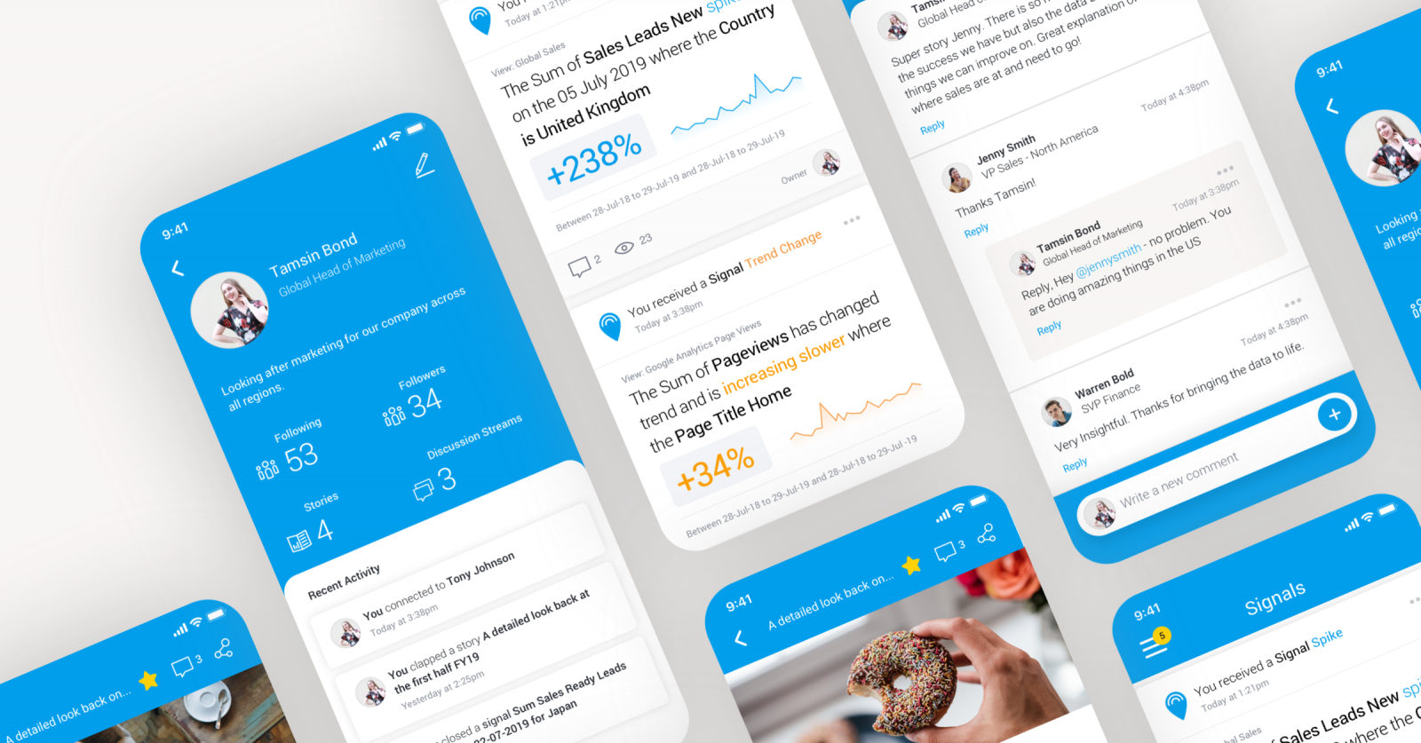
The rise of automation and having innovative products within our platform like Yellowfin Signals (automated insights) enabled our vision for data consumption to become a reality. The mobile is the perfect device to feed automated AI driven alerts to people when something changes in their data. The don’t need to go looking through reports and dashboards, it’s just there in their hand wherever they are.
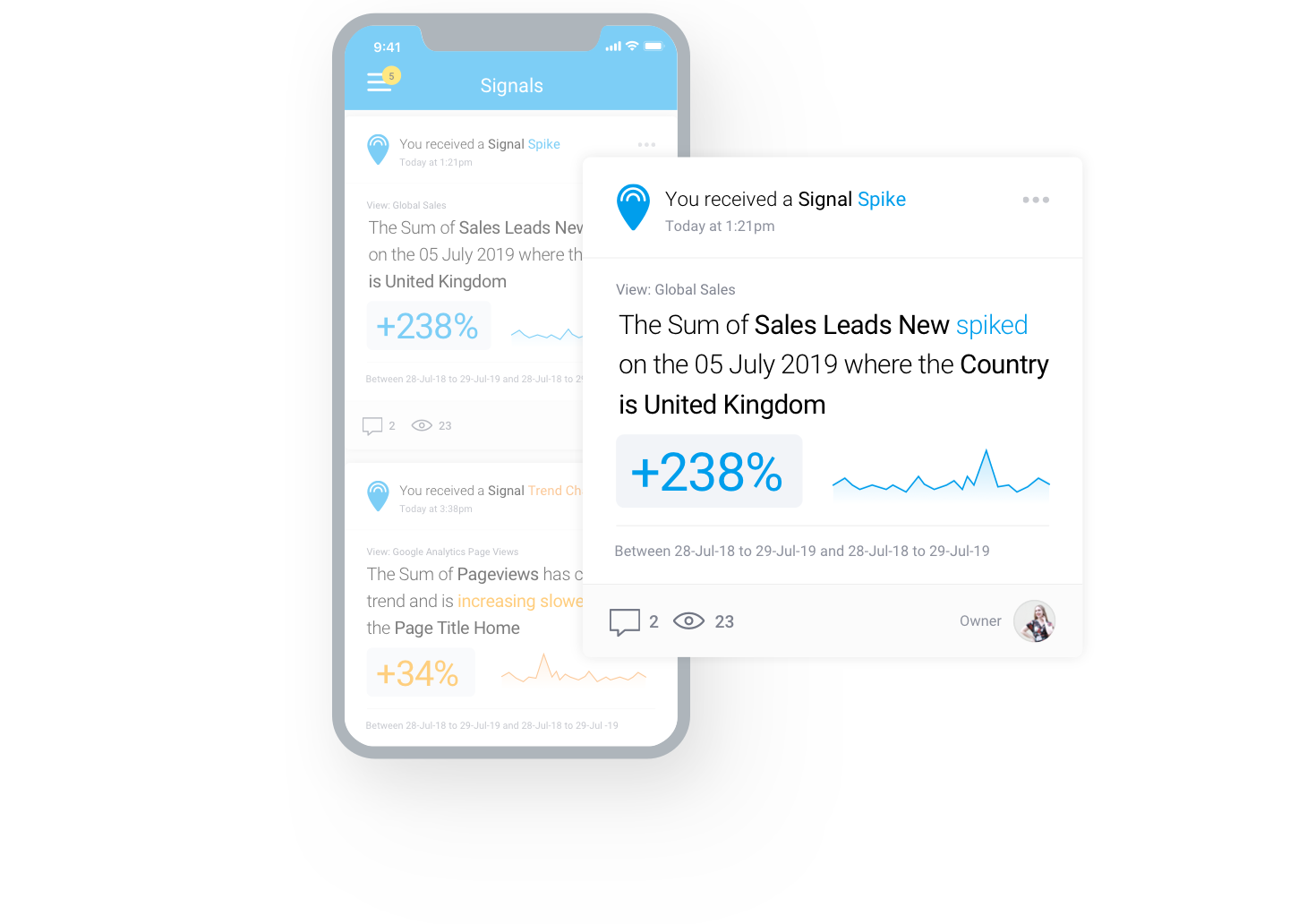
Then let me do something about it.
The app then facilitates actions around these changes. This may include sharing changes with others, taking or assigning ownership of any issues or bookmarking important changes worthy of a deeper evaluation at a later time on a more appropriate device. Once a user has become aware of a change in their data that requires significant analysis, the expectation is that analysis is performed in the desktop app.
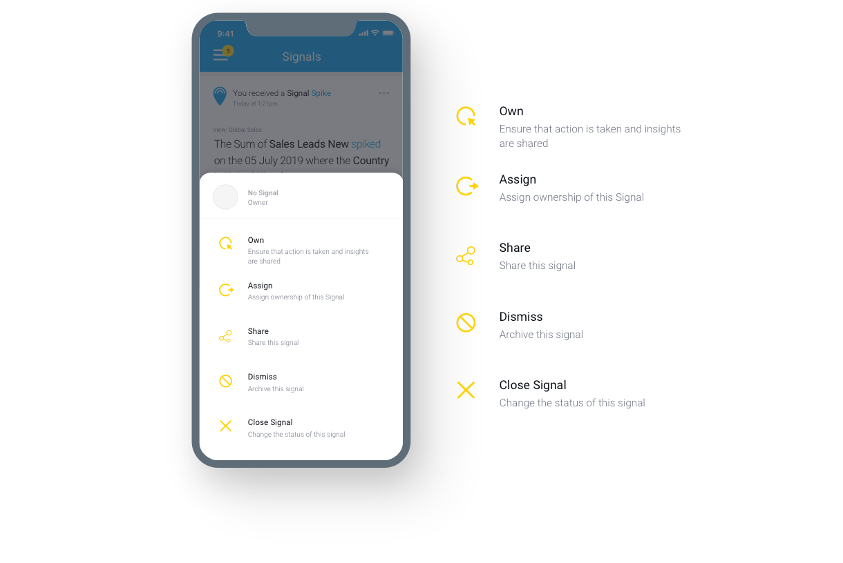
And keep me updated.
Our data storytelling tool ‘Yellowfin Stories’ allows people to tell stories with their data by combining trusted data with written narrative, images and video in an article style design. Sharing insights, in this format is the best way to enable a wider audience to understand and learn from the insight. Delivering these stories through the the app very much supports the known way people look at news and updates on their mobile. Designing the experience this way doesn’t ask the user to change their mobile habits and is therefore more inclined to becoming a part of their daily work ritual.
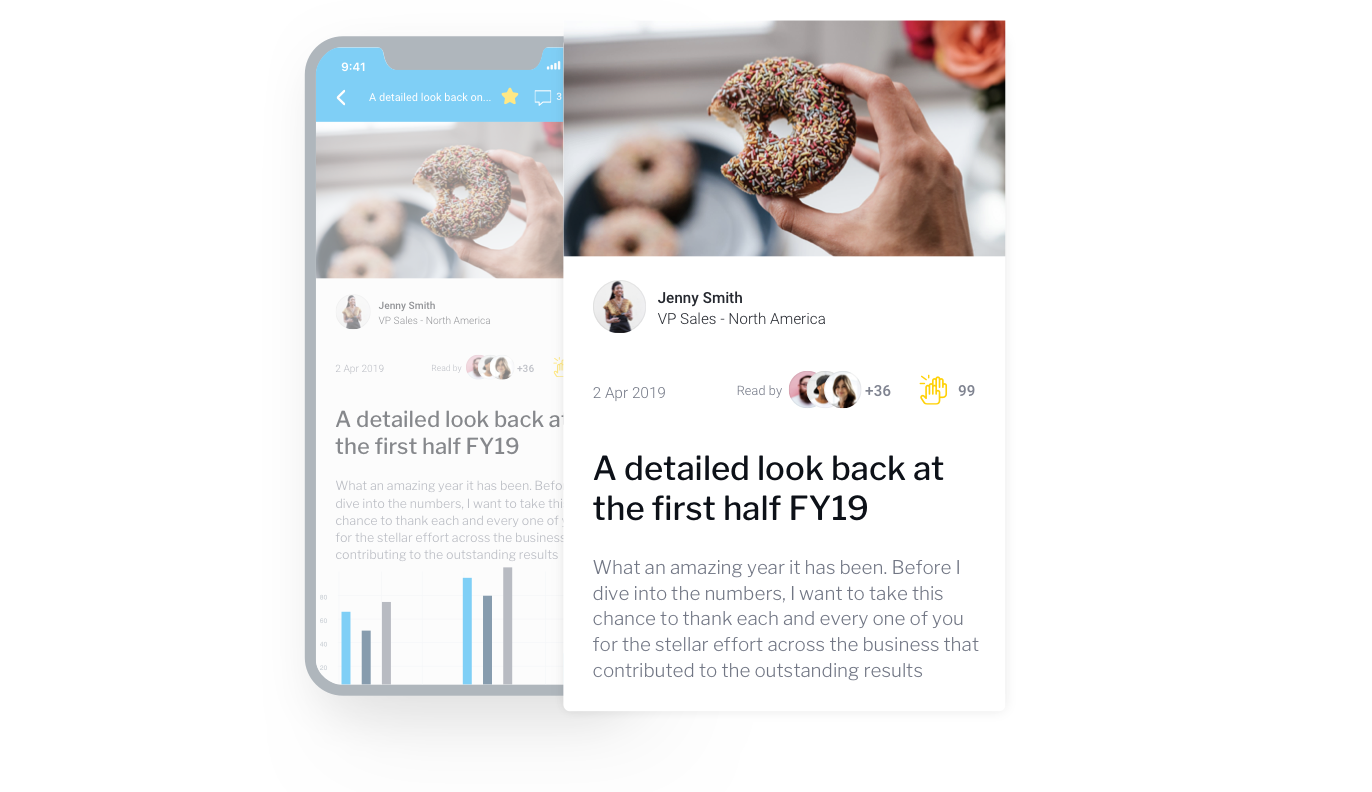
A familiar interface.
By then presenting this snackable style content in a format familiar to most mobile users through a timeline supported by social interactions, everyday business users instantly become able to interact with data without training and possibly never having previously built a report or looked at a dashboard. It’s a significant change in how analytics is delivered and how we believe more people can make data a part of how they work.
Where we’re going, you won’t need dashboards.
This is the first analytics app in the world that has been built with the data consumer in mind, not the data analyst. It’s the new paradigm in BI that we believe will finally enable organisations to be ‘data-led’ by ensuring a wider audience see, engage and act on their data. See for yourself by downloading the app and having a play with our sample data.