

Data Visualization Tools vs Data Analytics: What's the Difference?
Data visualization tools are dedicated software applications or components of a business intelligence (BI) solution that visually render data and present information through various formats, like graphs, charts, or heat maps - and an important parts of analytics today.
The best data visualization tools are those that provide a diverse range of visualization options that represent complex data across multiple use cases, and help end-users easily analyze it. Data analytics is the process of analyzing raw data, used to examine all sorts of data, including real-time, historical, unstructured, structured, and qualitative. It enables you to identify patterns and generate insights to make data driven business decisions.
A data visualization tool and data analytics solution are both incredibly important for your company. However, there are several differences. In this post, you will find all the details.
Data Visualization vs Data Analytics: Overview
There’s a common misconception about data visualization and data analytics that they are the same thing. However, both of them have some distinctions. Let’s find them out.
Why is data visualization used?
Data visualization presents all the information through graphs, charts and maps. It helps you to create interactive visualizations for complex data. Hence, you can quickly understand key insights. You can use data visualization to experiment with different scenarios by making slight adjustments to the inputs. As a result, you can easily visualize data and make effective business decisions.
Data analytics, meanwhile, is a dedicated solution that enables you to optimize company performance. It helps you to identify areas that lack efficiency, and significantly reduce cost or time spent. Hence, you can make your business process highly efficient. Data analytics also helps you analyze customer trends and satisfaction, leveraging reliable data sources to get accurate results. Overall, it can lead you to deliver better results.
Related: What is Data Visualization and its Importance in Business Intelligence?
What are the different techniques?
The best data visualization tools utilize interactive charts and graphs to visualize complex information. Here are some of the most popular techniques:
1. Histogram: Histogram organizes a set of data into a range of frequencies. It allows you to illustrate the distribution of data over a defined period.
2. Pie charts: The pie chart is a visual representation of data for understanding the relationships between the parts and the whole of a variable. For example, it helps you to understand the industry percentage of a country by areas or sectors.
3. Scatter plots: A scatter plot is another type of visualization technique. It shows you the relationship between different variables by using dots.
Analysts use different data sources and analytical methods to extract information. However, they fall on two main categories:
1. Qualitative Analysis: Qualitative analysis can perform in-depth analysis of small data sets. It can create patterns from insights and concepts. It deals with non-numeric data such as videos, images, and transcripts.
2. Quantitative Analysis: Quantitative analysis generally tells you what is happening in the market. It helps you to understand whether the trends are showing a rise or fall. It leans more toward the statistical nature of data.

What are some popular tools?
Some of the most popular data visualization tools on the market include Microsoft Power BI, Tableau, Looker, QlikView, Google Charts, FusionCharts, Grafana, Chartist.js, and D3.js. Data engineers utilize them to visualize and present complex information. Hence, data visualization software can help you to effectively convey critical message.
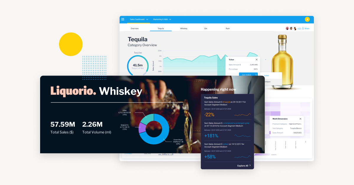
Yellowfin is a data visualization tool that supports a drag and drop builder to build reports and dashboards without worrying about SQL, and contains dozens of out-of-the-box visualizations that non-technical end-users and analysts alike can leverage quick and easy. Unlike Tableau, Yellowfin doesn't struggle to process and refresh data. It is fast and powerful. That's why it can be a great alternative to Tableau, especially on complex and real-time visualizations.
Read: Yellowfin BI – A great alternative to Tableau and Qlik
What are the communication methods?
Data visualization solutions visualize complex information in the form of graphs, charts and maps. Also, they utilize other visual aids, including 3-D displays. It helps them simplify the data results. Hence, you can easily understand all the insights. However, the data visualizations doesn't necessarily provide a conclusion or recommendation.
Data analytics involve in-depth analysis of their queries. It uses dashboards and reports to present complex information. The analytics reports include the question they set out to answer, the methodology of their analysis, and their findings. Unlike data visualization, data analytics provides recommendations through dashboards.
What benefits do they offer?
Data visualization offers several important advantages. It helps you to process complex information faster to easily grasp important data. Also, you no longer have to use traditional spreadsheets, which often had missing insights.
The best data visualization tools can lead you to better business decisions and actionable insights. Therefore, you can quickly identify the area that needs improvement to enhance productivity, increase sales, and grow your company.
Data analytics keeps you updated on the behavioral changes of your customers and performance of business operations. Hence, you can react faster to the shifts and gain a competitive advantage. For example, you can personalize your products and services based on customer behavioral shifts to boost sales.
Data analytics also allows you to identify and solve issues affecting the user experience. Hence, it can help you to improve your products with capabilities such as automated data cleansing, which can significantly improve the quality of data for future data driven decisions.
Data Visualization vs Data Analytics: Comparison Table
| Data Visualization Tools | Data Analytics | |
|---|---|---|
| Uses | Data visualization tools help you to easily understand complex information by representing data through graphs or charts | Data analytics simplifies the process of analysis to help you make more informed business decisions |
| Relation | Data visualization solutions enable data analytics to get more in-depth insights | Data analytics utilizes data visualization tools to draw conclusions or provide recommendations |
| Techniques | Graphs and charts, like bar charts, line graphs, histograms, etc. | Prescriptive analytics, predictive analytics, diagnostic analytics, and descriptive analytics. |
| Best Tools | Yellowfin, Google Charts, FusionCharts, Grafana, Chartist.js, and D3.js | Yellowfin BI, Power BI, Tableau, Looker, and QlikView |
| Used by | Data engineers | Data analysts |
| Platforms | Big data processing, service management dashboards, analysis, and design | Big data processing, data mining, analysis, and design |
| Benefits | Understand complex information faster, get actionable insights, enhance productivity, and increase sales | Identify and fix issues affecting customer experience, improve product quality, and make more informed business decisions |
Should I use Yellowfin data visualization for my business?
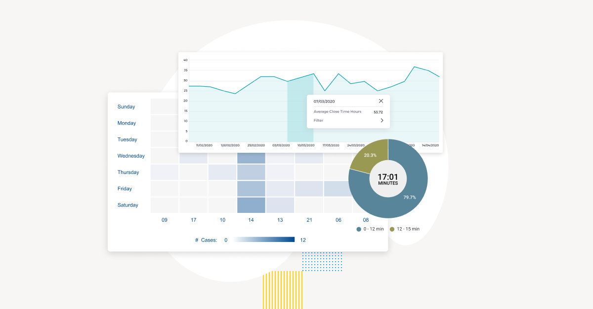
Yellowfin is a business intelligence solution that enables you to create stunning graphs, charts and plots with some of the best data visualization tools available in its suite.
Yellowfin is built to help you better understand your business data through visualization, with over 50 chart types, including bar charts, line graphs, and trellis charts out-of-the-box, all of which are very easy to create in its drag and drop report builder.
Yellowfin also allows you to build your own visualization by utilizing your favorite JavaScript charting libraries, like D3, Highcharts, and three.js, providing flexibility of extending its in-built visualization capabilities.
On top of that, Yellowfin provides a comprehensive analytics solution for both general data analysis and data visualization requirements. Therefore, you don’t have to use different tools for different purposes. You get everything in a single place.
Overall, Yellowfin is a complete business intelligence platform. It is powerful, versatile, and feature-rich. It can efficiently visualize complex and real-time data. Yellowfin supports self service BI and Natural Language Generation (NLG). See for yourself in the video below.