

Supercharge Yellowfin with 100+ Interactive Charts from FusionCharts
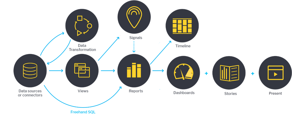
Yellowfin converts your data into visual Reports and then helps you to create Dashboards and Stories to present these reports to your customers. The Reports are usually a combination of data fields and charts.
Charts are a significant component of any report. They help customers understand the data quickly and give your report or presentation clarity and authority. Charts are used to compare different values, recognize data that veers away from what you’re used to, help you see relationships between groups, and much more.
A chart is only useful if it clearly and effectively communicates your point. That's why there are so many types of charts. If you select the wrong visual aid or default to the most common type of data visualization, your viewer may become confused or misinterpret your data.
There is a wide range of chart types available in Yellowfin. These include standard charts like Area Charts, Bar Charts, and Column Charts, as well as analytical charts like Scatter Charts, Histograms, Heat Grids, and Tree Maps.
To choose the right chart, think about what type of message needs to be conveyed, the audience that will be viewing the chart, and the type of data being presented.
The complexity of data has increased over the years. It may be necessary to implement a chart type that Yellowfin does not support, or you may want to make your chart more interactive. We've got you covered. Use the custom JavaScript chart option to create charts using FusionCharts, the leading JavaScript charting library.
In this post, we explain why you should use FusionCharts and how to integrate it with Yellowfin.
What is FusionCharts?
FusionCharts is a powerful JavaScript charting library that enables developers to produce visualizations of their source data, with over 100 different charts and 2,000 different maps to choose from.
FusionCharts is extremely useful for people who work with complex data a lot, as it's intuitive and easy to use. It allows you to create interactive and responsive charts in a few JavaScript lines of code. It can be used to create high-performance time-series charts for “big data” dashboards, meaning you will be able to render thousands or even a million data points in the browser fast and effectively.
Why FusionCharts?
Developers use FusionCharts with Yellowfin for many reasons. Here are some.
1. 100+ interactive charts and 2,000+ data-driven maps
As mentioned earlier, there is a possibility that you will need to use a chart that isn't provided out of the box by Yellowfin. You should consider FusionCharts in this case. FusionCharts has more than 100 interactive charts and 2,000 data-driven maps available, so there will always be the perfect chart to fit your needs.
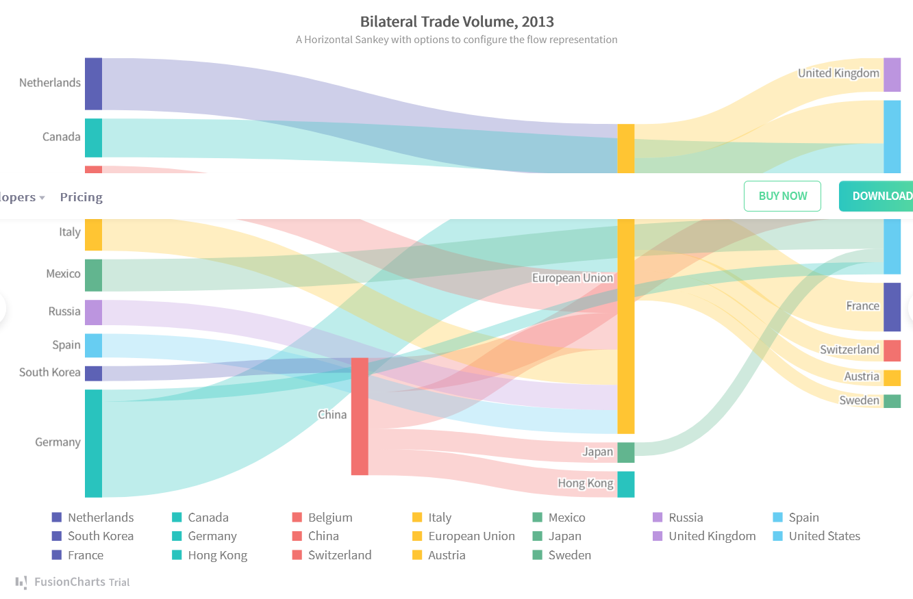
Imagine you are presenting the bilateral trade volume between ten countries. Hence, the Sankey diagram would be the best chart for representing these data because it will intuitively highlight the most important flow. It will be easy for your audience to see which countries export the most and which export the least. Use FusionCharts to create the chart, and it will be displayed in your Yellowfin reports.
FusionCharts Sankey diagram example:
2. More control over your chart
FusionCharts features give you control over every single element on your chart. While Yellowfin provides some of these features, the features provided by FusionCharts provide much more control. For instance, in FusionCharts, you can include line/text annotations within a chart to point at a specific data plot and display additional information about it. This works best when you want a few data plots to stand out among many.
In this example, you can see that, among the scores of all the footballers plotted on the chart, only the plots about L. Messi and F. Bernardeschi have annotations with them. This will instantly attract the attention of viewers toward them.
With FusionCharts events, you can write a custom function to perform a specific task or to execute certain actions when an event is triggered. One event that is triggered when a chart is loaded, when a data plot is clicked, or when any part of the chart is modified, among others.
Let us suppose you build a column chart to showcase countries across the globe with the largest stockpiles of oil (in terms of billions of barrels). You can configure a dataPlotClick event, which is triggered when a viewer clicks on a data plot, to display the number of barrels of oil in a country and the source of the information.
3. Improved user interface with FusionCharts themes
FusionCharts is equipped with multiple prebuilt themes. You can choose among them to give your chart a beautiful style without the need to go through many options or use CSS. All you need to do is to include the theme JavaScript file and set the theme option in the FusionCharts code. Then you can enjoy a stunning chart that fits with your dashboard.
Get familiar with FusionCharts themes by playing with the below example:
http://jsfiddle.net/fusioncharts/0dtjw8a5/
Why not use an open-source charting library instead?
Although open-source charting libraries are cheaper, there are many reasons to turn them down:
- They don’t have the large selection of charts, gauges, and maps that FusionCharts does. Most of these libraries have support for the types that Yellowfin already supports and fewer.
- They lack features and are not effective to handle a large amount of data.
- Most of them don’t provide comprehensive documentation or examples, which will lead to taking a long-time to learn.
- Unlike FusionCharts, these libraries don't provide professional support to their customers.
Last but not least, FusionCharts has reasonable price plans when it comes to the features it provides. The good news is that, if you are already a Yellowfin customer, you will enjoy a 25% discount on FusionCharts plans.
How to integrate FusionCharts into Yellowfin dashboards
The Yellowfin integration with FusionCharts is super easy. Follow the steps below:
- Extract the downloaded files and move them to {{yellowfin_installation_folder}}/js/chartingLibraries/.
- Open the reports window on the Yellowfin dashboard.
- Click on the "Add Chart" button.
- Click on the "JavaScript Charts" button from the left side menu. If you don't see it, you will need to enable it first. Learn more.
- Write your FusionChart code following this guide.
- Yellowfin requires the code to be wrapped inside a function with the name generateChart.
- The generateChart function takes parameter options, which is a JSON object containing all the required information about your data. For example,
- options.divSelector is the div that the chart will be attached to.
- options.dataset.chart_information.height contains the height value of the canvas.
- options.dataset.chart_information.width contains the width value of the canvas.
generateChart = function(options) { // This is the div you draw your chart into var $chartDrawDiv = $(options.divSelector); // To stop scrollbars in any portlets regardless of your JavaScript, use this CSS class $chartDrawDiv.addClass('jsChartNoOverflow'); // This gets the height and width from the data set. Use these when creating your chart so that // it will fit the dashboard, canvas and storyboard correctly var height = options.dataset.chart_information.height; var width = options.dataset.chart_information.width; // Convert the raw data JSON to the format required for the chart if required. var processedData = processData(options.dataset.data); // Do the actual drawing of the chart into $chartDiv. doDrawing(processedData, $chartDrawDiv[0].id, height, width, options.errorCallback); }, |
- options.dataset.data is a JSON object containing information about the chart datasets, labels, etc. To convert these raw data to the FusionCharts dataset format, we defined an internal function called processData
- After the processData function returns the data in the format required by FusionCharts, we are now ready to draw the chart.
processData = function(dataset) { var optimizedData = [], category; for( var key in dataset){ if(key == "year"){ category = dataset[key].map(d => { return {label: d.raw_data};}); }else{ optimizedData.push({ "seriesname": key, "data": dataset[key].map(d => { return {value: d.raw_data};}) }); } } return { categories: [ { category } ], dataset: optimizedData, }; // Data is in the dataset in a column based format, where each column has an array of data // eg. dataset.column_name[0].raw_data, dataset.column_name[0].formatted_data }, |
- To keep the code organized, we write the code to draw the chart inside an internal function we called doDrawing.
- To draw a FusionCharts chart, we should include the FusionCharts JavaScript files. Since we have downloaded the the files and moved them to the project folder in the first and second steps, we can include them in the code like this:
doDrawing = function(data, $chartDiv, height, width, errorFunction) { require(['js/fusionCharts/fusioncharts', 'js/fusionCharts/fusioncharts.charts', 'js/fusionCharts/themes/fusioncharts.theme.fusion' ], function(FusionCharts, fusionthemes, fusion) {
}); }; |
- Inside the function, write the FusionCharts code based on the chart type you want to display. For example, to display an area chart, your code could be like this:
| doDrawing = function(data, $chartDiv, height, width, errorFunction) { |
// Use require to load the JavaScript libraries you need
require(['js/fusionCharts/fusioncharts',
'js/fusionCharts/fusioncharts.charts',
'js/fusionCharts/themes/fusioncharts.theme.fusion'
], function(FusionCharts, fusionthemes, fusion) {
try {
// Your chart draw code here
const dataSource = {
chart: {
caption: "Yearly sales of iPhone",
yaxisname: "Number of units sold",
subcaption: "2007-2016",
legendposition: "Right",
drawanchors: "0",
showvalues: "0",
plottooltext: "<b>$dataValue</b> iPhones sold in $label",
theme: "fusion"
},
categories: data.categories,
dataset: data.dataset,
};
FusionCharts.ready(function() {
var myChart = new FusionCharts({
type: "msarea",
renderAt: $chartDiv,
width: width,
height: height,
dataFormat: "json",
dataSource
}).render();
});
} catch(err){
errorFunction(err);
}
});
};
- Click on the preview tab to see the chart output and edit the code until the chart looks exactly as you want.
- Save the chart, and it will be displayed on your dashboard and in your presentation.
Summary
Yellowfin helps you solve data complexity with automation, data storytelling, collaboration, and beautiful action-based dashboards that are simple to use. Take your dashboards and data visualizations to the next level with interactive and responsive charts from FusionCharts. FusionCharts integrates flawlessly with Yellowfin. It has a powerful API, a lot of features, and prebuilt themes that will help you create stunning charts that your audience will love.
Try FusionCharts Suite XT
Get a 14-day free trial of FusionCharts XT.