

How to Analyze Sales Performance by Moving Total Using Yellowfin Z Chart
In this blog, the team at Yellowfin Japan demonstrates how to take advantage of Yellowfin's data visualization capability in the form of Z Charts. So, what is a Z Chart, and what does it look like?
Z Chart Overview and Analysis Examples
What is a Z chart?
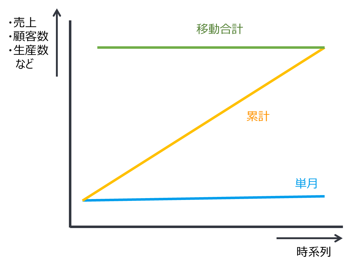
A Z chart is a chart that uses single month, Cumulative Total and Moving Total to show trends and transitions in metrics that are difficult to grasp only from single month data. It is used for understanding changes of numerical values such as sales, number of customers, number of productions, etc.
The horizontal axis is basically a time series axis. For a monthly sales analysis, month is set as the axis. On the vertical axis, numerical values such as sales, customer numbers, production numbers, etc. are placed. It is one of many line charts available in Yellowfin.
In our example below, the line in blue is the sales for a single month. The yellow line shows the cumulative sales since the beginning of the corresponding year. The green line is called Moving Total, meaning the total for a given period of time from the point in time. The shape drawn by these three lines resembles the letter Z, hence the name Z chart.
Moving Totals
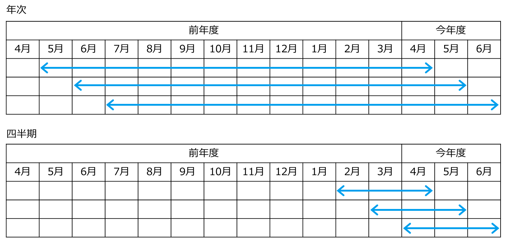
The following is a brief introduction to the concept of Moving Totals. As mentioned earlier, Moving Total is the total for a given period of time from that point in time. In the case of an annual period, it is the total of the previous 12 months, including the month in question. In this case, it is also called a Moving Annual Total. For a quarter, it is the sum of the last three months including the month in question. The use of Moving Totals allows us to identify major trends that cannot be captured only from single year figures.
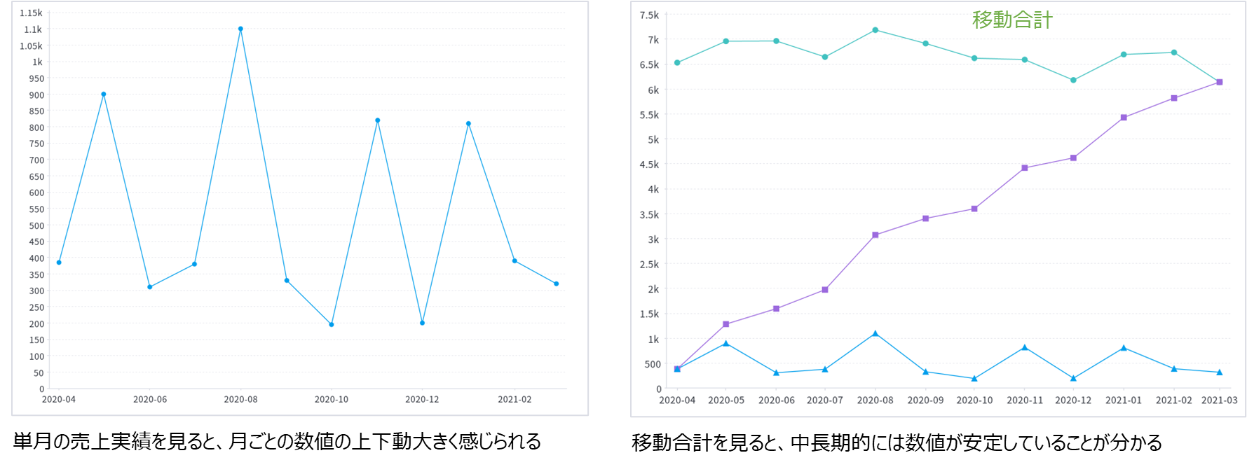
Let's check Moving Totals on an actual Z chart. The below left is a line chart showing sales performance in a single month. The monthly movement is widely fluctuated so it would be hard to grasp a major trend.
The right is a Z chart showing the same metrics. Although the single month sales still fluctuate up and down, when displayed together with the Moving Total, you can see that the major trend is flat and the sales transition is stable.
Types of Z charts
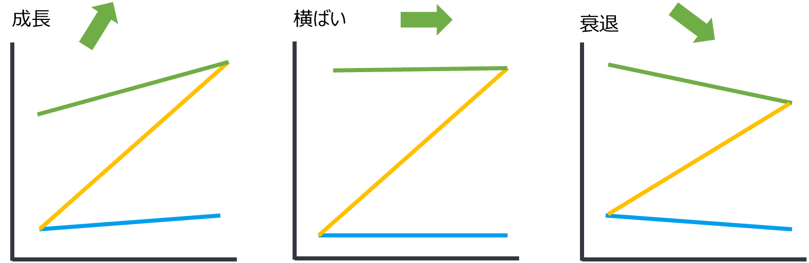
There are three main types for Z charts.
- Growth: The Moving Total shows a steadily increasing trend. This indicates that the business or company is in a growth phase.
- Flat: The Moving Total shows an almost flat trend. This indicates that the business has entered a stable period.
- Decline: The Moving Total shows a downward trend. It is a time the business needs to be reviewed and requires drastic improvements.
Creating and Analyzing a Z chart
To create a Z chart in Yellowfin, you need at least one axis and one aggregated value.
For example, if you have information consisting of two columns: year & month, and sales, you can create a Z chart showing monthly sales. In addition, having the necessary information to narrow down, such as fiscal year or business area, makes the chart more useful.
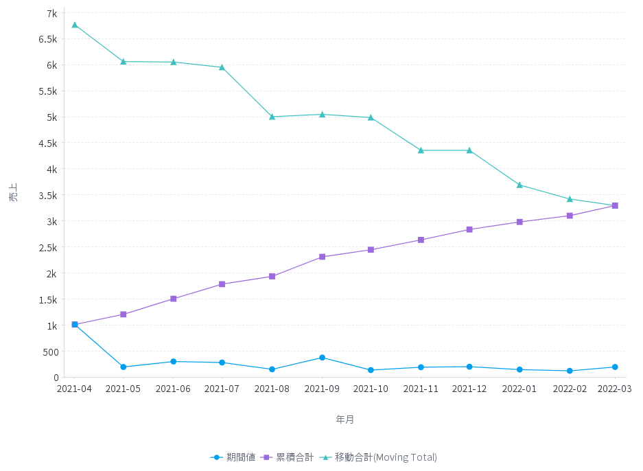
For example, the table below shows monthly sales results for the four fiscal years from FY 2018 to FY 2021. It would be hard to grasp the trends just by looking at this table, as the figures fluctuate up and down from month to month.
Based on this data, we will create a Z chart in Yellowfin and analyze it.
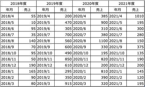
FY 2019 - Growth Phase
In FY 2019, the Moving Total (green) is growing steadily, due to the fact that this was the following year the establishment of the business. In a form commonly referred to as “growth’, we can see a trend of significant sales growth compared to the previous year.
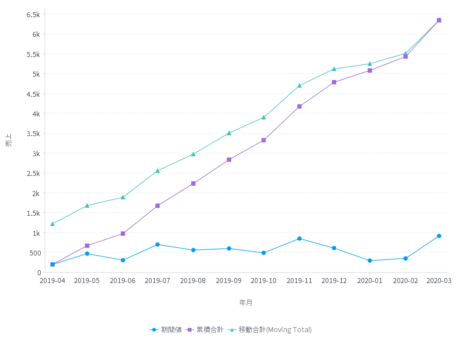
FY2020 - flat Phase
FY2020 is in the form of a ‘flat’ period, indicating that the business has entered a stable situation. Although monthly sales are swinging up and down significantly, the Moving Total shows that the trend has remained flat.
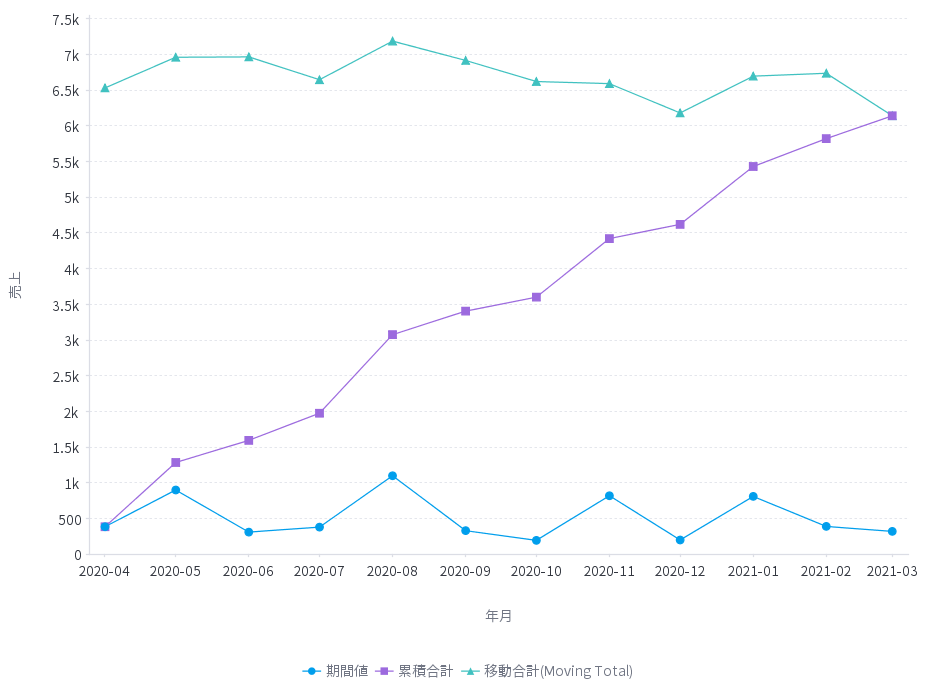
FY2021 - Decline Phase
FY2021 is a form of ‘decline’, in which the line for the Moving Total shows a downward trend, indicating that the business has entered a declining period.
The Power of Z Charts
These are just some examples of how to utilize the Z Chart using Yellowfin. In the case of a diversified company or a company that handles many products and brands, it might be a good idea to use a Z chart in conjunction with product portfolio management to explain the life cycle of each business and the positioning of products and brands.
It is also important to visualize data in an easy to understand manner for stakeholders when developing a business. To help you visualize the life cycle of your business, products, and more, we recommend trying out Yellowfin Z charts and our extensive data visualization library for yourself.