

How to Visualize Open Data with Yellowfin
In this blog, the team at Yellowfin Japan aimed to utilize various sets of open data and analyze them with Yellowfin, demonstrating its capabilities and the value of analyzing publicly available government data. So, what is open data, and what does it look like?
What is open data?
Open data is data that is openly accessible, exploitable, editable and shared by anyone for any purpose. Open data is licensed under an open license and typically the only requirement associated with using it is to attribute it to the source.
Recently, governments and local governments are actively trying to make data available to be used by a wide range of people for their analysis. The team at Yellowfin Japan wanted to demonstrate the many types of analysis and data visualization made possible using Yellowfin, so in this blog, we will analyze various open data that is publicly available.
For more information on the special conditions and licensing attached to the use of open data, we recommend visiting OpenDefinition.org.
Japan population data
Population trends in Japan
First, let’s analyze population trends in Japan using data published on e-stat, a comprehensive data provider for government statistics.
We created a population pyramid using population data (including estimates) by sex and age group for the period 2000 - 2045, which are available on e-stat, and Yellowfin's data visualization toolset. The original data is the results of the census conducted once every 5 years. The data are arranged in order of oldest to newest to see how the shape of the pyramid changes.
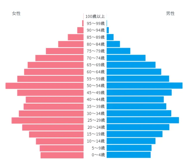
・2000
The shape of the pyramid is called a ‘jar’ shape, with projections around the early 50s and late 20s age groups. It has a large proportion of the working-age population and the elderly age groups are supported by society. However, the population declines in the age group below 10 years old, indicating that we are entering a society with a declining birthrate and an aging population.
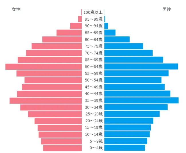
・2020
As in 2000, the population is still crucible-shaped, but the protrusion of the crucible is gradually moving to the upper part of the population. As for the younger age groups, it is clear that the population declines as the age group goes down. This confirms that the aging society is rapidly advancing.
・2045
Although based on estimates, we can see that the population volume will be concentrated at the top by 2045. A TV program ‘The Impact of a Shrinking Nippon’ from NHK described it as coffin-shaped. It appears that the working-age population will not be able to support the elderly population at that time.
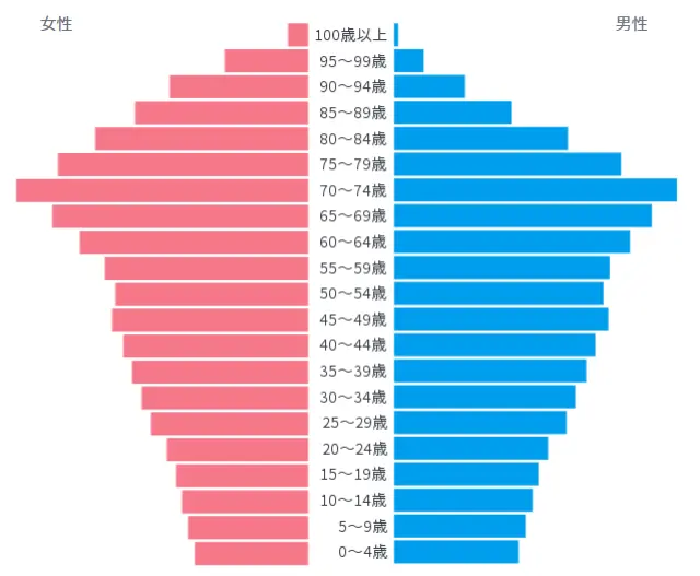
Incidentally, the population pyramid for any given year shows that women (pink) live longer than men (blue). In particular, when we look at the age groups over 80 years old, we see a large difference between male and female population.
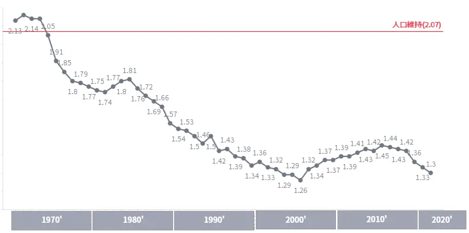
We refer to the total fertility rate as an important KPI to address the declining birthrate. The total fertility rate is a demographic indicator that is the sum of the age-specific fertility rates of all women, married or unmarried, aged 15 - 49, and means the ‘fertility rate for the year’ excluding differences in the age structure of the female population. The data, also available on e-stat, is used to visualize the trends in the total fertility rate.
Generally, a total fertility rate of 2.07 or higher is necessary to maintain the population. However, since the mid-1970s, Japan's total fertility rate has remained below the level required to maintain the population, and in the 2020s, the figure is headed for further decline, partly due to the COVID pandemic.
Visualizing data like this will give us a better sense of our rapidly aging society with a rapidly declining birthrate. If measures to address the declining birthrate are not taken urgently, Japanese society will become structurally in-viable. At the same time, measures related to increasing the working-age population, such as actively accepting foreign workers, must be expanded.
Travel History Data Analysis
Traveling history of official vehicles
We found that Aizu Wakamatsu City published the driving history of official vehicles as open data. The location information of official vehicles is managed using time, latitude, and longitude information, however, it is quite hard for people to be able to tell where a vehicle is running by looking at the numerical information of latitude and longitude.
Therefore, we will use a map data visualization within Yellowfin to visualize the driving history for easier analysis and data exploration at-a-glance.

Thanks to GPS technology, this kind of analysis is now possible, but in this case, if you take a side trip, you will be exposed immediately. In a way, we find the current environment horrified as it seems everything we do is being monitored.

Utilize Weather Information
Temperature Trends in Naha City (Okinawa)
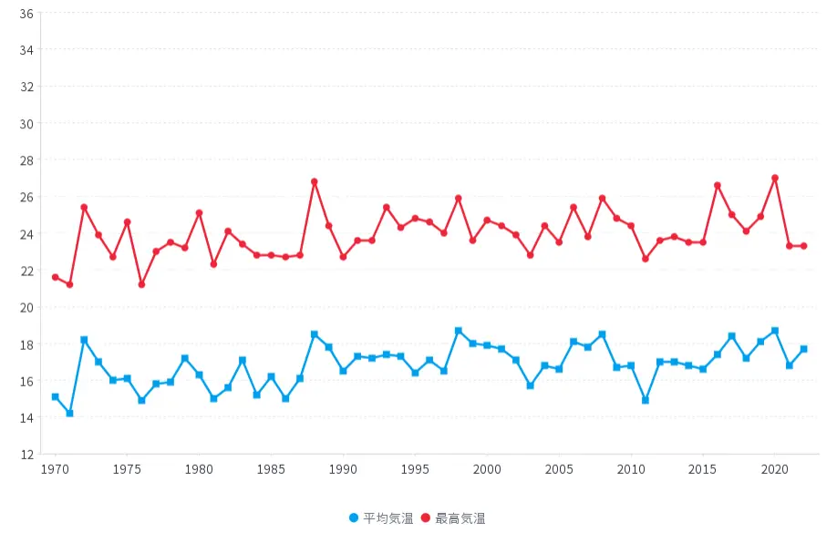
The Japan Meteorological Agency provides historical weather information for each city as open data. We downloaded the monthly average and maximum temperature data for Naha City and visualized the temperature trends.
The line graph below shows the average (blue) and maximum (red) temperatures in Naha City in August. Both average and maximum temperatures seem to be gradually increasing year by year. It can also be seen that since the late 1990s, the number of years in which the maximum temperature exceeds 34 degrees Celsius has been increasing.
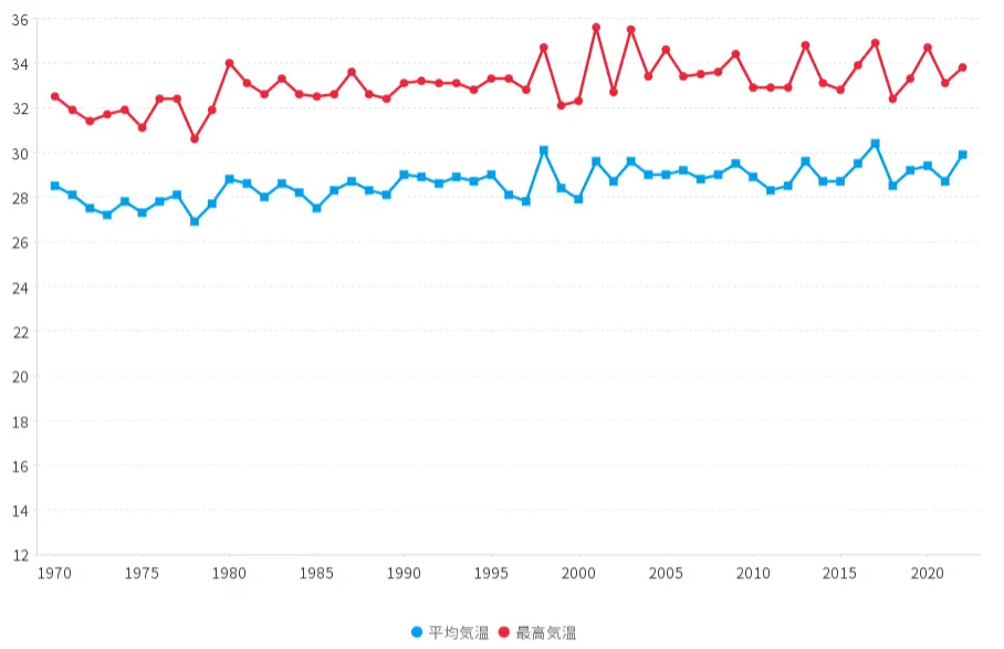
Similarly, the average and maximum temperatures in January in Naha City show a similar trend to those in August.
The temperature trends in other cities have actually shown a similar trend. Global warming is likely to be a major factor. For the sake of future generations, global warming countermeasures are an unavoidable issue. We should be aware of what we can do on a daily basis.
What Else Can be Done with Open Data?
These are just a few examples of the use of open data with Yellowfin. In addition to the data discussed in this blog, there is a wealth of other data available to the public, such as industry and consumption data. Utilizing these data for analysis will broaden the scope of our daily operation.
On the other hand, there are still many issues that need to be addressed related to the use of open data. One reason for this may be the fact that past accumulated data is being released altogether, but even with similar data, the granularity often differs. For example, the unit of data is different for each country, prefecture, municipality, etc., so we often encounter situations where it is difficult to combine multiple pieces of data. Data formats and delivery methods also vary.
For data to be collected in the future, it may be necessary to consider the assumption that the data will be used for analysis. In any case, governments around the world are increasingly promoting the use of open data, and we should consider how to utilize them in the future.
Explore Open Data using Yellowfin Data Visualization
Learn how Yellowfin can enhance your data-rich reporting with stunning, customizable dashboards and data visualization - try our demo today.