

Makeover Monday with Yellowfin: Winter Olympics Special
Makeover Monday is a social data project where each week the organisers post a link to a chart and its data, and then people rework the chart. Maybe they re-tell the story more effectively, or find a new story in the data.
For this week’s Makeover Monday, the data set was around medals won in the Winter Olympics and categorized by sport, gender, country, etc. The Yellowfin team had three submissions for this week (awesome effort!) and you can view them on our Twitter and Instagram. The time to do the makeover is typically short on this sort of exercise (it’s suggested to time-box to an hour) so this post is a little bit of a walkthrough on how we built our submissions, and what could have been improved.
The first submission was by Tom Linton (North America) and focussed on a rivalry in the Olympics (full interactive viz available here):
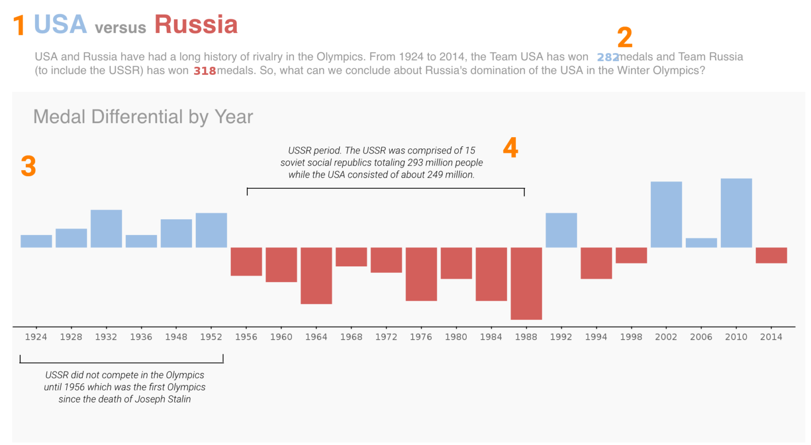
1. USA versus Russia
Nothing better than comparing the titans of the sporting world in their quest for world domination. This is a good way to pick a theme in what is otherwise a very large data scope.
2. Big Number in a Text widget
Rather than hard-coding the numbers, Tom creates a Big Number chart and inserts that into the Text widget. So if viewers were filtering the report data, this would have dynamically updated within the sentence as well - nice one!
3. Simple Big Bar Chart that tells a story
The main chart is super simple – but it packs a punch. Really good visual storytelling here.
4. Chart Commentary
Great idea in adding commentary/annotations on the chart to highlight key events – it was here I learned that the USSR did not compete prior to 1956!
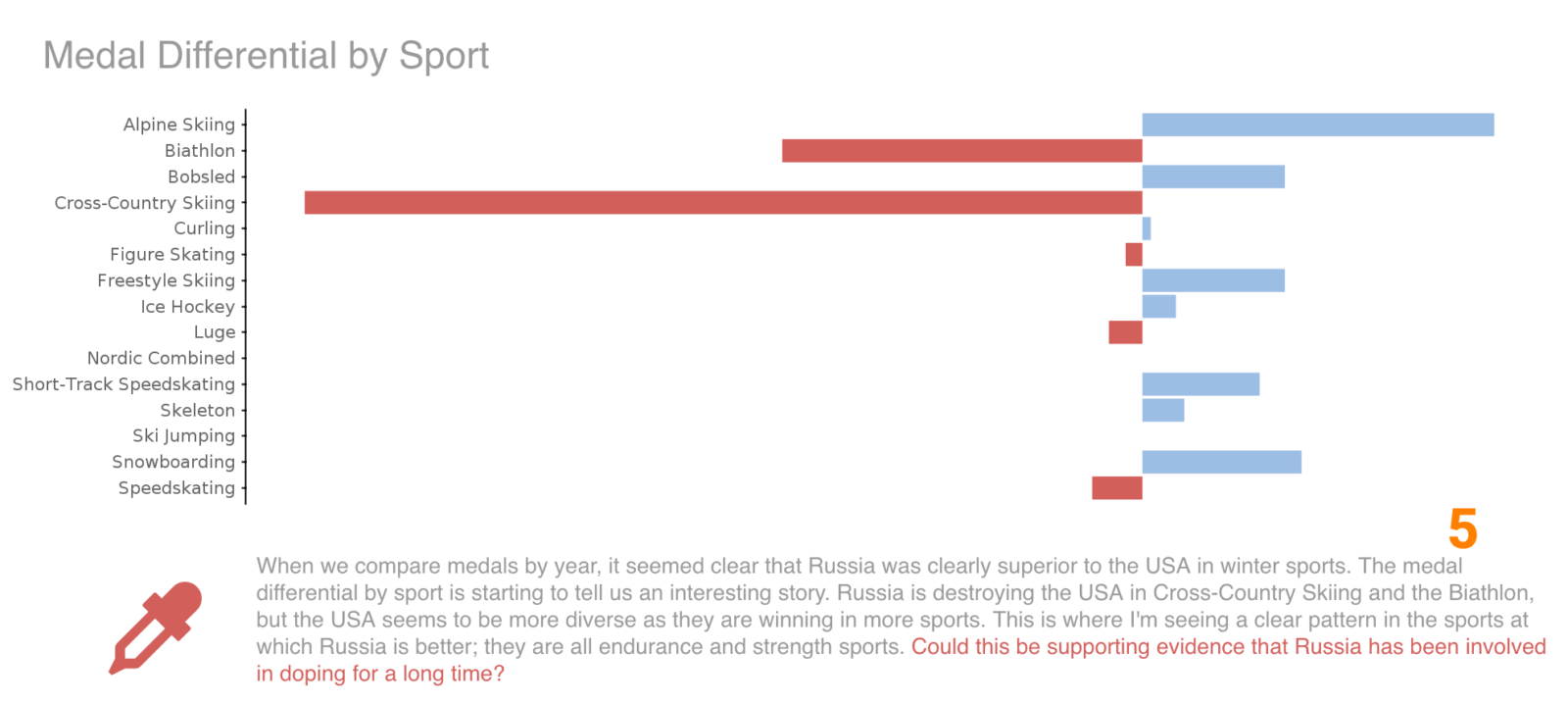
5. Doping by Sport Analysis
Bit of a long bow drawn here: Have Slavic and Nordic countries always done well in cross country skiing because their countries are flatter and alpine is expensive? The USA on the other hand is way wealthier and has steep mountains. Perhaps that’s the pattern here? We've got to be careful not to introduce bias - even if the massive difference in medals for biathlon proves the Russians are way better shooters that the Americans. 😉
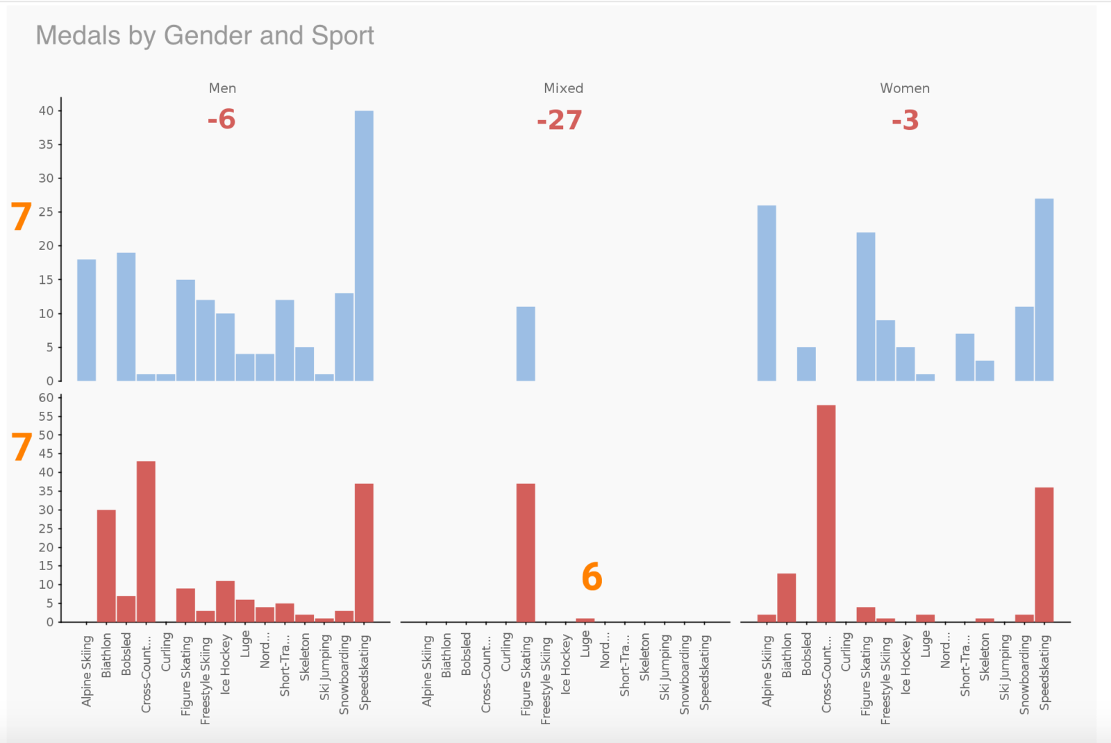
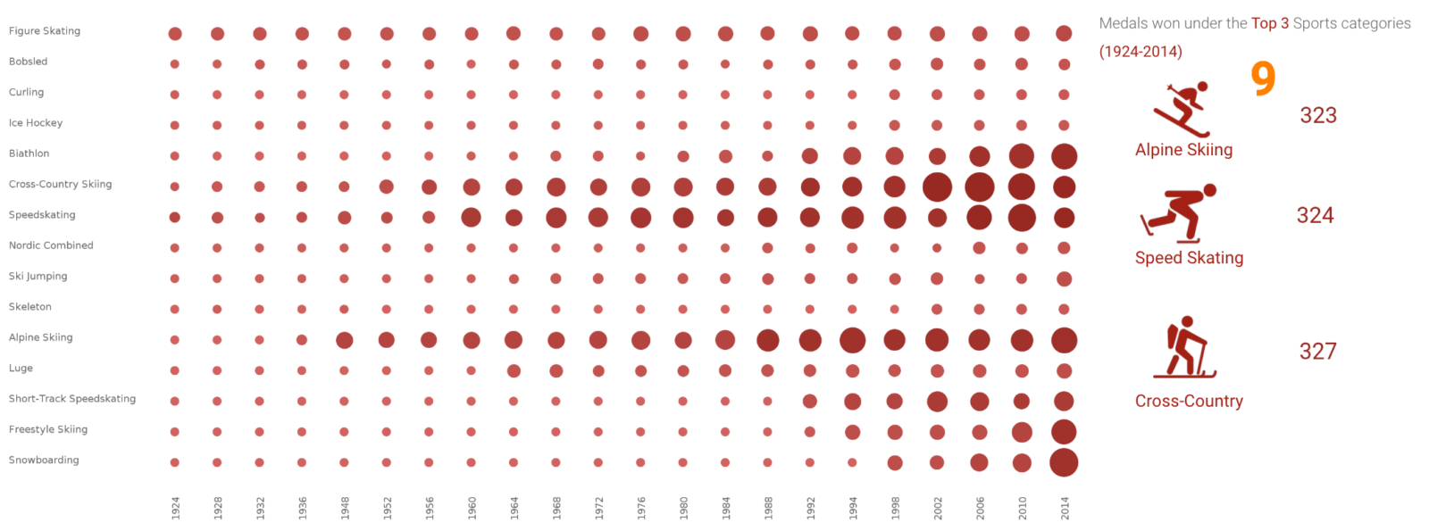
6. Medals by Sport and Gender
Thinking back, it might have been a simpler comparison if we removed the Mixed category.
7. Equal Axes for Charts
The different axis bounds makes it difficult for the reader to visually compare both charts - we should have made it uniform.
The second submission was by Chitresh Suresh (Melbourne) and focussed on the Soviet Disintegration, analyzing how their domination of sports may have changed after the end of the USSR (full interactive viz available here):
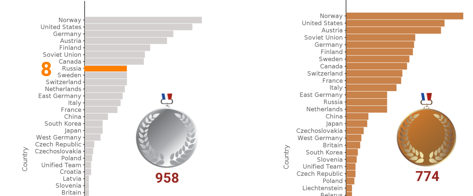
8. Highlighting Russia/USSR/other Eastern Bloc countries
We should have used a different colour to highlight the main countries and ensure they popped off the chart visually. Also, taking the average number of medals (or medal points) per game would have made for a more consistent analysis.
9. Heat Grid over time
Great use of a Heat Grid chart with size metric involved as well as the associated Big Numbers to highlight top categories. However, we should have probably filtered it down to Russia and the USSR, given the story arc.
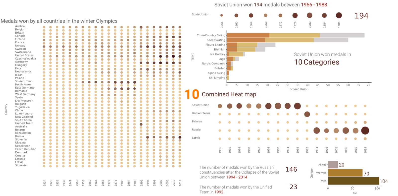
10. The Third Act
I think we had a great start to the story, but tried to include just a bit too much at the end. How did Russia fair after the USSR fell apart? The analysis that comes closest to answering this was from the combined Heat Grid chart. We probably should have zoned in a bit more on this and go deeper.
The third submission was by me (Melbourne) and I focussed on the 1500m speed skating event (full interactive viz available here). I also got our CEO, Glen Rabie, to have a look at my submission and this is his feedback:
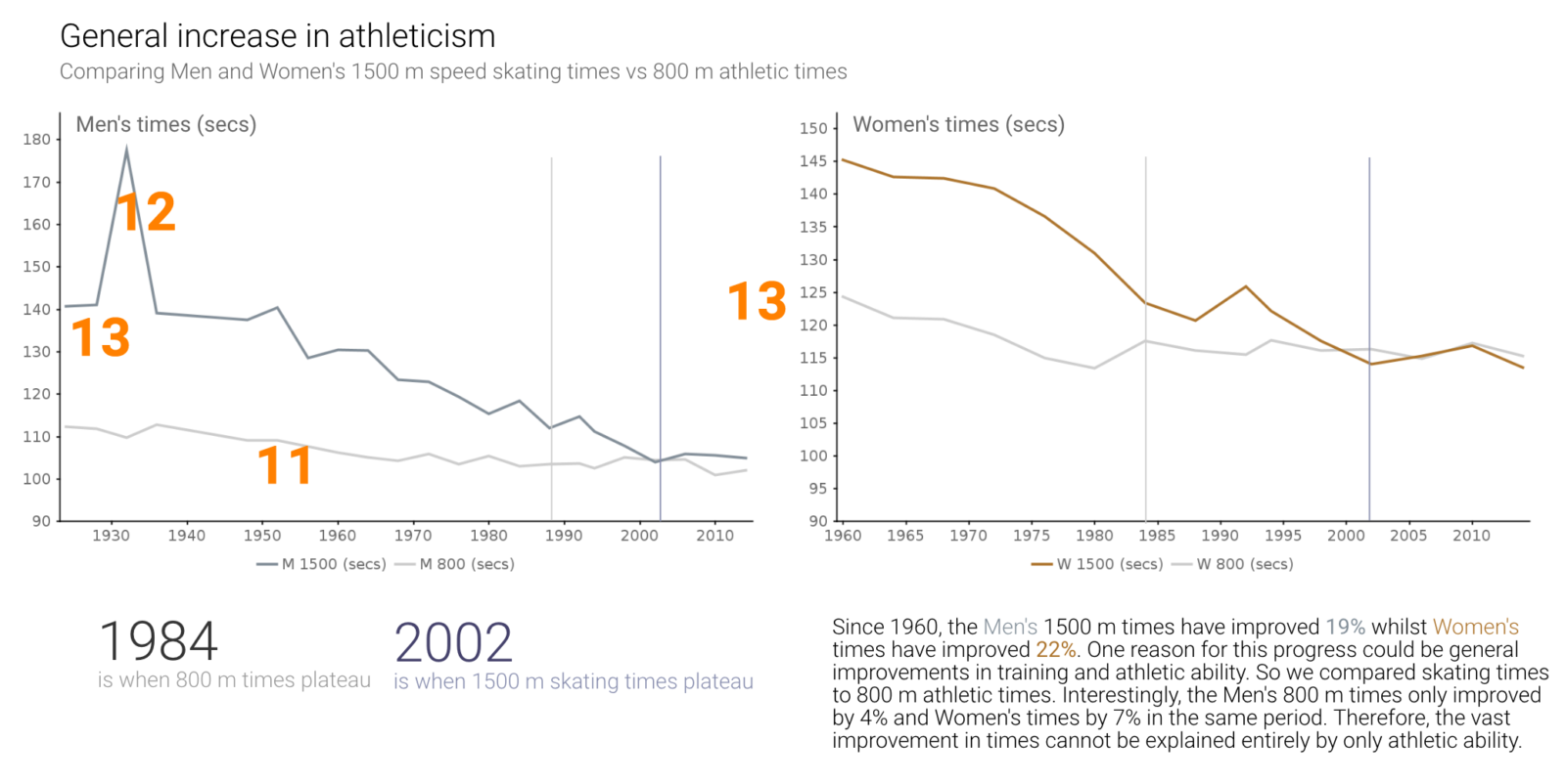
11. Clarity of Speed Skating vs Athletics
Although a powerful comparison, we could have used icons to further highlight the two series - similar to what Chitresh did with his submission.
12 1932 Men's 1500m Anomaly
We should have commented on this: basically, Europe was preparing for war and was not in attendance – so an American won. It’s an interesting fact that would have just added a little bit more to the story. This could also have been done with a chart annotation similar to the style that Tom did.
13 Men's and Women's Axis
We should have made the axes uniform to make visual comparison easier.
14 Data Entry Error
We actually made a mistake in data entry that created an outlier in 1988. Another good reason to never trust spreadsheets 😉
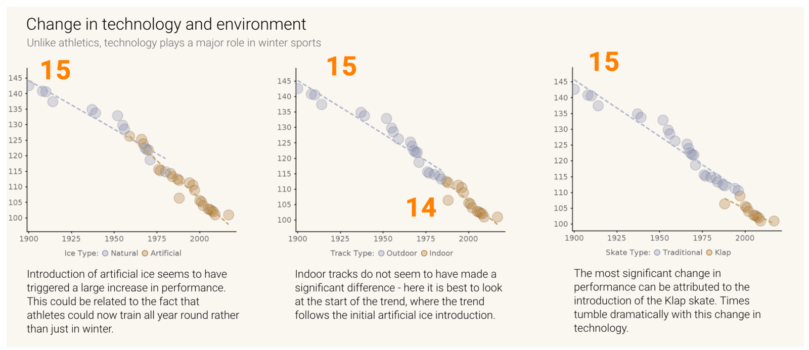
15 Chart Titles
We should have included chart titles at the top of these charts and make it a little bit more obvious to the reader as to what's being shown here.
16. Soviet Era
We didn't actually look up when the Soviets started taking part - it was in 1956, hence the sudden increase in medals. A rookie mistake but both Tom and Chitresh pointed this out in their submissions.
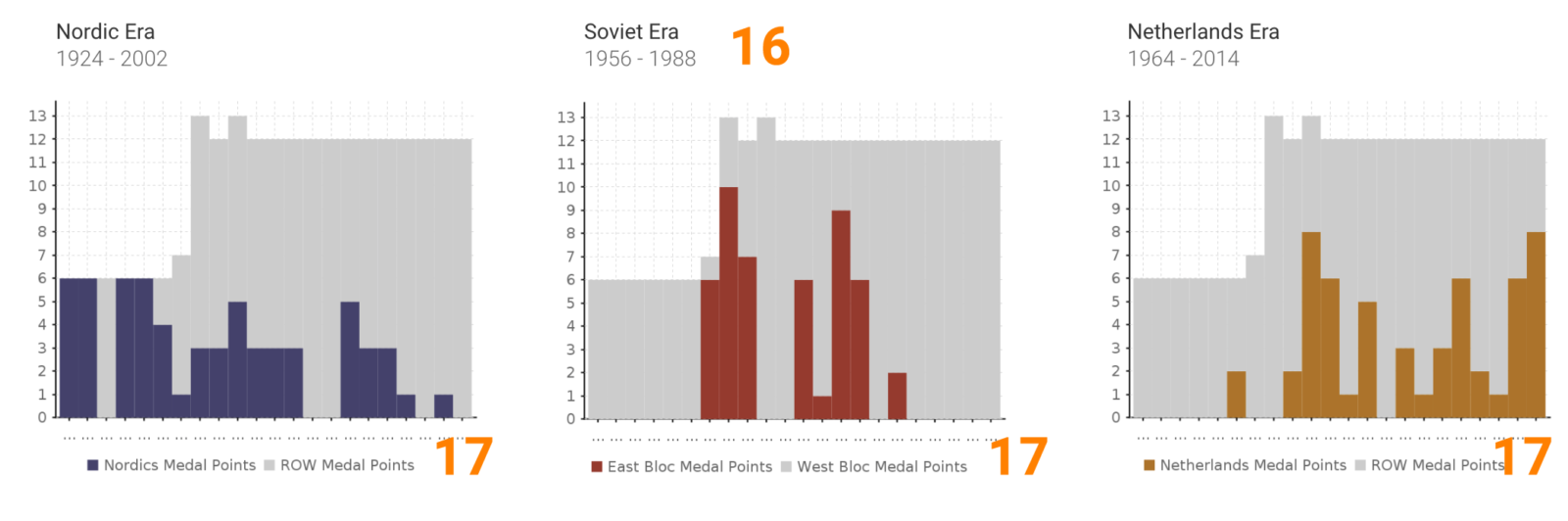
17. Date Axis
We should ave made this a time series axis to better highlight the years.
And that's it from us for this week!
If you’d like to participate in Makeover Monday, come join us at Data.World, otherwise you can follow our submissions and interact with us on Twitter and Instagram.