

7 Most Common Dashboard Design Mistakes to Avoid
Dashboards are an important data analytics tool for understanding business metrics and managing your business performance. However, if your dashboard is not designed well, it can be difficult to use for analysis, and ineffective for decision-making. Dashboard design should be simple and accessible, and reflect your company's branding and identity.
Ensuring your analytical dashboard is readable, usable and accurate is heavily reliant on following best practice dashboard design. This article discusses 7 common dashboard design mistakes to avoid, and provides tips on how to create a successful dashboard.
Why is Dashboard Design Important?
Well-designed dashboards can help your business make its key performance indicators (KPIs) far more transparent to drive goals and improvement in particular areas. A poorly designed dashboard can lead to confusion and wasted time. You and your team need a clear understanding of what’s going on in your business to make informed decisions.
Here are some reasons why good design for your dashboards is so important.
Better Organization: Well-designed dashboards can help you stay organized and on top of your business. By keeping track of your data in one place with consistent formatting, imagery, iconography, colors and fonts, you can ensure everyone who uses your dashboards can understand the data on display, and make better decisions that help your business run smoothly.
Easier Monitoring of Progress: Dashboards that follow proper design guidelines can help you monitor your business’s progress at-a-glance, without having to spend too much time trying to make sense of the data presented. By being able to see how your business is doing over time at-a-glance, you can make adjustments and ensure that your goals are met reliably.
Clearer Communication with Your Team: A well-designed dashboard can help you better communicate insights, wins and trends with your team. By seeing data that’s important to them presented clearly and succinctly, your team can be more effective and efficient in realizing their goals and objectives.
Recommended Reading: Why Design Matters in BI

What is a Dashboard Design Comprised of?
There are a few key components that make up a good dashboard design. These include:
Fonts and Typography
Fonts are an important part of any design, and it is especially important in a dashboard. Fonts serve as a focal point for users, and should be chosen wisely to make sure that the overall design is easy to read.
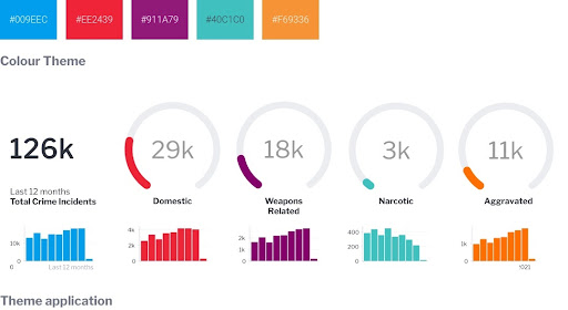
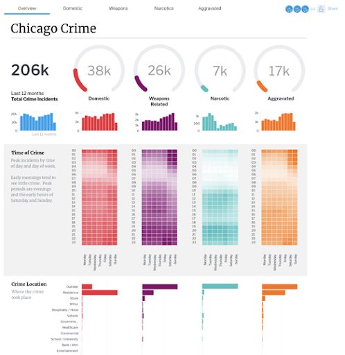
Colors
Colors also play an important role in a dashboard. They should be used to help users differentiate different sections of the design, and to make it easy for them to find what they are looking for.
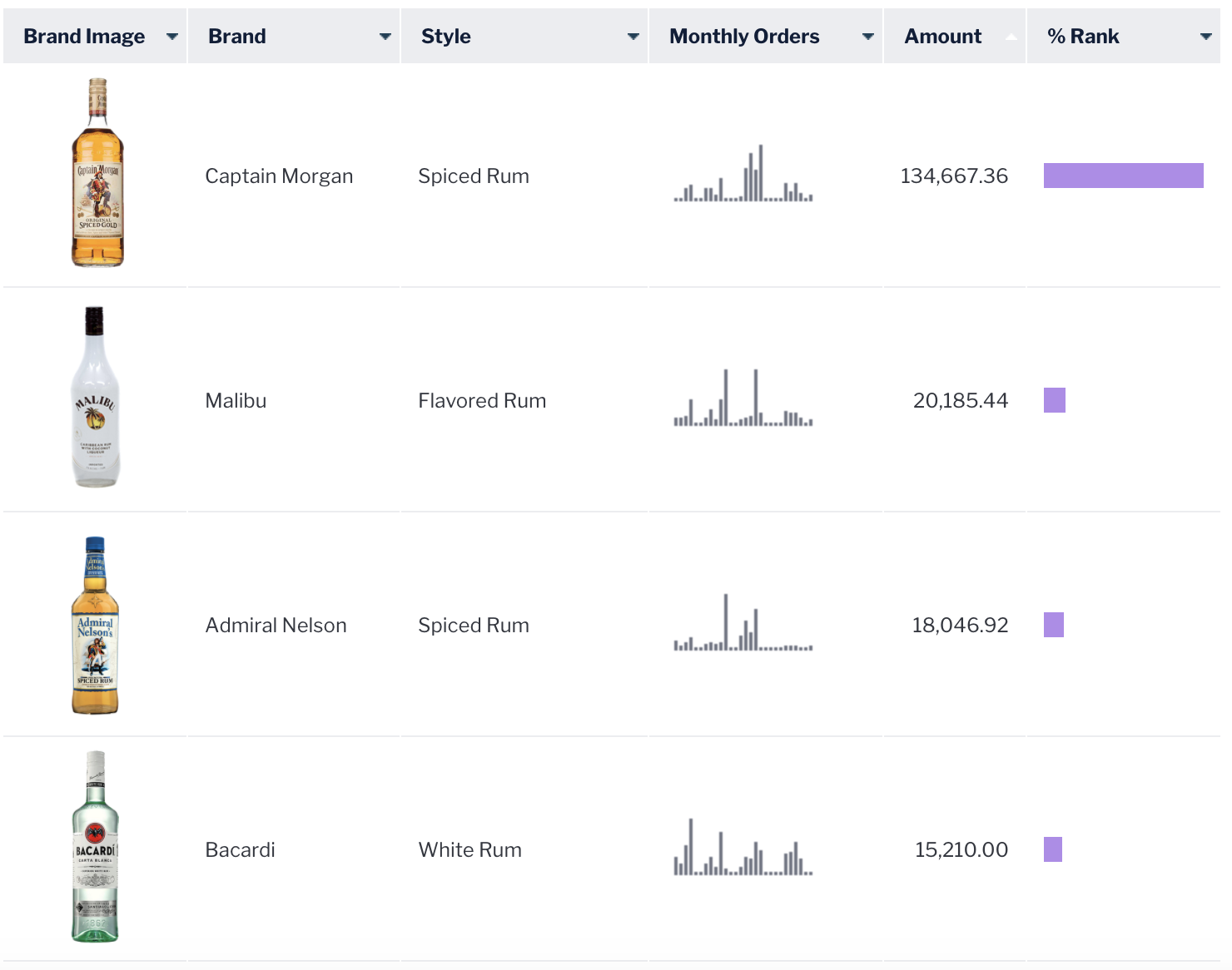
Graphics and Images
Graphics and images can be used to add a bit of 'pizzazz' to a dashboard. They can also be used to help users understand the data more easily.
Recommended Reading: 5 Essential Dashboard Design Tips and Considerations
What are 7 Common Dashboard Design Mistakes to Avoid?
With so many different types of dashboards available, it can be easy to make mistakes when creating your own. Here are seven of the most common dashboard design mistakes to avoid:
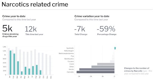
1. Wrong Visualization Choice
Charts and graphs can be a great way to communicate data, but they shouldn't be the only visual element on your dashboard. You can use images, icons, and other visuals to help users understand the data.
Some dashboard builders rely too heavily on one type of visual element, or pick the wrong type of chart or graph, which lessens the impact of the information on display, or makes it harder for the dashboard user to interpret the data presented.
The point of a dashboard is to provide a quick overview of important data, and picking the right visual elements will help users do that. This means using visuals that are easy to understand and remember, and that complement the data.
2. Unnecessary Complexity
Too many elements on a dashboard can make it difficult for users to understand and use. Keep your dashboard simple by removing any unnecessary elements (rich media, additional tables, etc), and focus on delivering the most important information to users.
Adding too many charts and graphs can also make your dashboard difficult to navigate. Try to stick to a few types of charts and graphs, and make sure they are used effectively to convey your data.
3. Illegible Font or Graphics
Make sure your font and graphics are easy to read. Use a simple, easy-to-read font, and make sure all graphics are scaled down to a size that is comfortable to view.
The use of colors can also make a dashboard more difficult to read. You can try to use a neutral color scheme, and make sure all text and graphics are easy to see.
4. Not Labeling KPIs, Pages, or Sections
It can be easy to forget to label important components on a dashboard. Make sure to label all KPIs, pages, and sections so that users can easily find the information they are looking for.
Adequately labeling your dashboard can also help users understand how the data is organized. This will help them better understand the data and make better decisions.
5. Lack of Context in Data Visualization
Data visualization is an important part of a good dashboard, but it should always be used in conjunction with the data it is displaying. Data visualization can help users understand the data more easily, but it should never be used to hide or obscure information.
Contextual data visualization can be especially helpful when it comes to understanding complex data sets. Irrelevant data should be removed or relegated to a separate section of the dashboard, so that users can focus on the data that is most important to them.
Your dashboard should be easy to navigate on both desktop and mobile devices. Make sure all of your charts and graphs are labeled clearly, and use large buttons and icons to make it easy for users to access the information they need.

7. No Summary or Tooltips
Include helpful information like this in the footer of your dashboard, so users can quickly get a sense of what is happening on the screen. Your employees will appreciate being able to find the information they need without having to search through long lists of data.
How Do You Create a Great Dashboard?
User experience (UX) is key when it comes to creating a great dashboard. The creator must consider the different types of users who will be using the dashboard, as well as the different ways they will be interacting with it. In order to create a great dashboard, there are some principles that should be followed.
Informative Presentation: You should make sure that all of the data is presented in a clear and concise way. This will help users to understand what is happening on the dashboard and how they can use it to improve their work.
Effective Navigation: You should also make sure that the navigation is easy to use. This will help users to find the information they are looking for quickly and easily.
Appropriate Use of Graphics: Finally, you should use appropriate graphics to help make the dashboard more visually appealing. This will help to improve the UX and make it easier for them to understand what is happening on the screen.

What are the Main Types of Dashboards?
There are three types of dashboards: operational, analytical, and strategic. These three types of dashboards are based on the purpose of the dashboard.
Operational Dashboard
Operational dashboards are used to keep track of important performance metrics and to communicate progress to stakeholders. Common performance metrics that are tracked on an operational dashboard include revenue, customer churn, and employee productivity.
This type of dashboard provides real time data that can be used to make informed decisions. By tracking key performance benchmarks, managers can identify trends and make adjustments as needed.
Analytical Dashboard
An analytical dashboard is a graphical representation of data that can be used to understand and make decisions about a company or organization. It can be used to track performance, identify trends, and provide situational awareness.
A good analytics dashboard should be easy to use and provide a clear overview of KPIs. It should also be customizable to reflect the specific needs of the organization. This customization can include the use of different data visualizations, chart types, and reports.
Strategic Dashboard
While an analytical dashboard is an important tool for measuring progress and understanding performance, a strategic dashboard is a visual representation of the company's strategy and how it is being executed. It can be used to identify areas of improvement, assess risks and opportunities, and make informed decisions.
Creating a strategic dashboard requires more than just compiling data. It must be designed to communicate key insights and drive action.
Read More: Operational, Strategic or Analytical Dashboard - Which Type Is Best for BI?
Ready to Make an Impactful Dashboard Design?
With the right tool and guidance, you can create an analytical dashboard that is both visually appealing and easy to use, but the best way to make an immediate impact on your business intelligence (BI) efforts is to adopt a proven analytics solution with a flexible, customizable dashboard builder that can improve the way that your team, customers, and clients consume their data. Yellowfin can help you to create a dashboard that is effective and user-friendly, and follow design practices easily. See for yourself in the video below.