Yellowfin 7.4 Little Things: Enhancing data visualizations
Get ready to improve your data visualization skills with increased customizations and settings in the revamped chart builder.
To wrap up this blog series, the final Yellowfin 7.4 ‘little’ enhancements that we reveal, involve one of the most creative aspects of our BI tool: the chart builder. We have already revealed some of the updates being made to this component in our previous posts, but this time we will dig deeper into all the little changes we’ve included.
Our revolutionary chart builder has been essential in helping content creators develop advanced visualizations. And now with the new features, their job will be made easier with additional usability, customizations, and control over their data’s graphical representations.
We will talk you through some of these changes and how they will affect your chart building skills for the better.
Increased customization
Yellowfin 7.4’s revamped chart builder will grant you increased customization. Now you can alter chart legends and axis details to add your own personal touches to the visualizations.
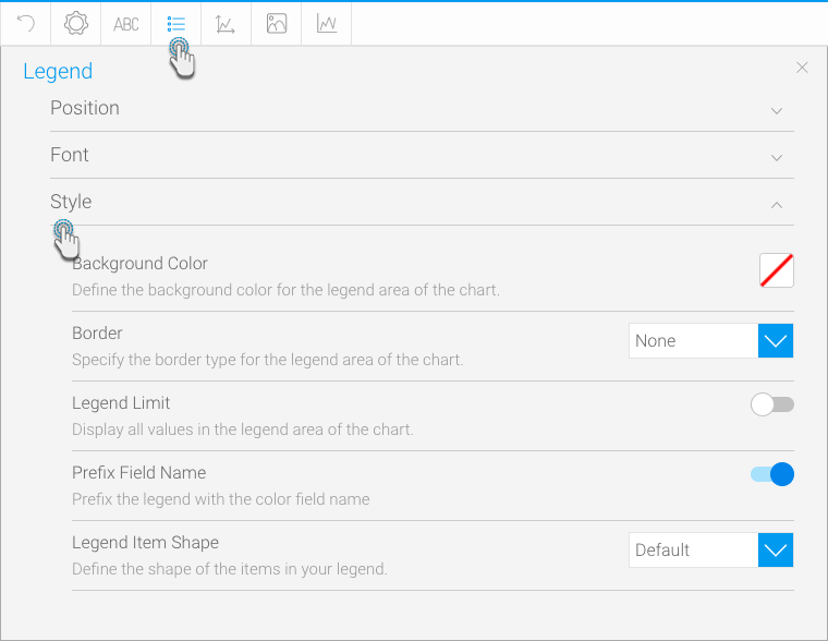
With the help of these enhancements, customizing the legend has never been more fun. Legends are a great way to understand the data being graphically displayed in the chart. They serve as the chart’s key, helping to identify the content represented in the chart with the help of colors and lines. We have included new style settings to their setup, to allow you to carry out some cosmetic changes. Access these by clicking on the legend settings button on top of the chart builder, and expanding the Style section.
With the newly included options, you can choose a different symbol for your legend items, such as a circle (shown in the image below), square or line, or hide the legend name, show or hide the trend lines from being mentioned in the legend, or even set a limit so that if your data contains too many items, the legend will not be displayed. This is a great way to stop hundreds of items from being displayed in a single legend, taking away from the importance of your graphs.
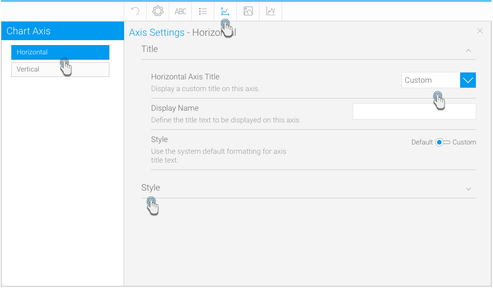
That isn’t all, though. Through the axis settings icon in the chart builder, you can make further adjustments to the chart’s axis’, that you couldn’t before.
You can now modify the title of either of the axes on auto-generated charts. Change the title to a custom one, or use the default one generated by the system, or simply just hide the title altogether. Furthermore, additional styling will allow you to show or hide the tick marks and tick labels of the chart axis.
These simple tweaks will provide you with more flexibility in how you present your data, giving you more control over what your audience will view. This way, no amount of unwanted information will be shared.
Double the functions
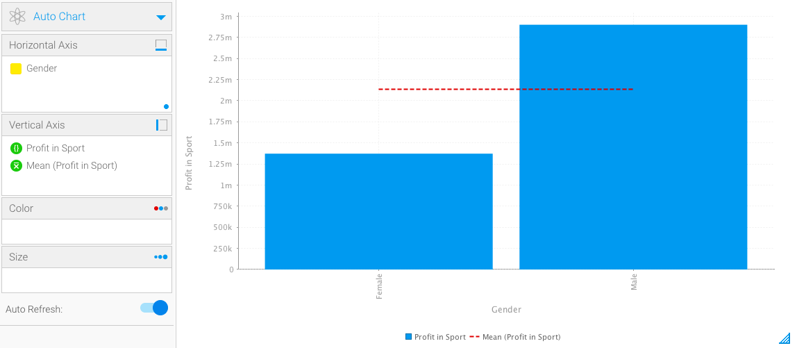
You may be aware of the chart field functions that allow you to perform tasks on your data, such as calculating the average value or variances, or generating trends, forecasts, accumulations, or set analysis. A modification we’ve made to the chart functions, is enabling a basic function, such as average or trend to be performed directly on one of the two advanced functions (variance or set analysis). This will save you precious time in carrying these out separately and combining their results. This is one of the ways we get you to the Why faster.
Simply drag an advanced function to an axis, filling out its details, and then haul a basic one into that same field. For example, we can create a set analysis to discover the profits made in sports, and then using the average function, find out the mean value of these profits.
Time series improvements
In a previous post, we compared the two types of time series: continuous and discrete. But that’s not all that we have to share with you. We’ve made a few more alterations to this useful feature.
Choose any type of date format for your time series charts for a more customized feel and better representation. You can choose to stick with the format as it is in the report, or change it to a different one. Show the dates in their full forms (e.g. Monday, Quarter 1, October) or their short variations (Mon, Q1, Oct). Just go to the series settings, select the date field that you’ve used in your chart, and simply apply the date format that you prefer.
You can now also color-code your time series charts. Simply drag a metric field in the color field, and the time-based chart will alter its colors according to the values of the selected metric field, along with a legend at the bottom.
Additional data sorting
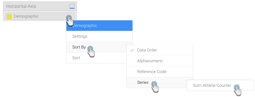
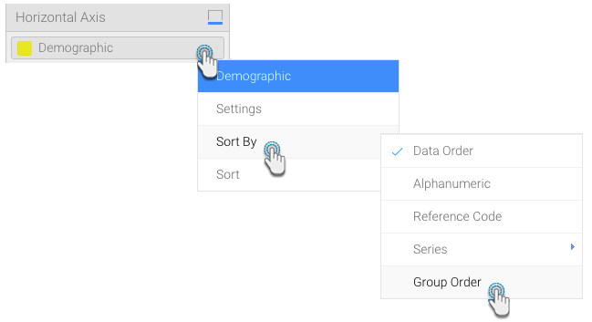
Data sorting has been essential in organizing and presenting your content the way you want. And Yellowfin has always provided multiple means of doing so. Newer additions made to how you can further sort your content include sorting by series on heat grids and sorting by group order in most charts.
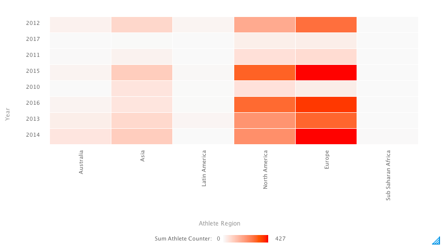
Content creators have been using series sort on most types of charts. This allows them to sort their chart content by the values in a chart metric series. Now however, this can also be applied to heat grid charts. You are now able to arrange a heat grid in a new way according to grid colors or size. Just create a heat grid with metric data in the color field and set the series sort according to it.
The next sorting option that we’ll explain is another important one. This involves group data, which is a Yellowfin functionality that lets users combine values of a field together. Previously, you were not able to sort your charts according to these group data values, but now you can. When you create group data, simply arrange the values in any order you prefer, and then set the sort order to group in your chart.
With the inclusion of these new sort orders, you will be able to make the appearance of your charts look better. If the maximum value is displayed right next to the minimum value, changing the sort order will eliminate any confusions in your data.
These new chart builder enhancements are proof that we’ve been listening to our user’s feedback and continuously improving an already progressive component. The additional settings will allow for an easier and more interesting content building experience.
This concludes our series on the little things that you can enjoy in Yellowfin 7.4.
