

How to Choose the Best Data Visualization for Your Reporting
Data visualization involves visually imparting information to communicate complex data. Graphics such as charts help simplify data so more people can understand the insights embedded within a dashboard or report. Businesses use data visualizations to find and highlight patterns and trends in big data sets, with many data visualization examples available today, including graphs, maps and plots to help others grasp data conveniently.
The best data visualization tools cater to a wide range of use cases. From teaching where teachers use data visualization to display results, to business, where executives use it to contextualize information with stakeholders, there are several applications of data visualizations today. This article helps you prepare for picking the best tool for you.
How to Pick the Best Data Visualization Tools
In this quickly growing world of big data, the ways of structuring and visualizing information are also evolving rapidly. Nowadays, every human activity on digital devices has something to do with data. Whether it's using smartphones or browsing social media, the use of data not just for business, in but in our everyday lives, is more frequent.
Now it is possible to draw correlations between related events, decipher patterns in data and project upcoming trends thanks to more interactive charts and graphs. Data visualization tools are essential to graphically represent our data using these types of visualizations to better communicate real-time information with end-users.
Data visualization becomes way important when it comes to executive communication and making decisions. In business intelligence, data visualization tools are the core that assists decision-makers in analyzing, sharing and acting on data to help improve business performance. We've included a link below to help you understand its full impact.
Related: What is Data Visualization and its Importance in Business Intelligence?
Types of Data Visualization: An Overview
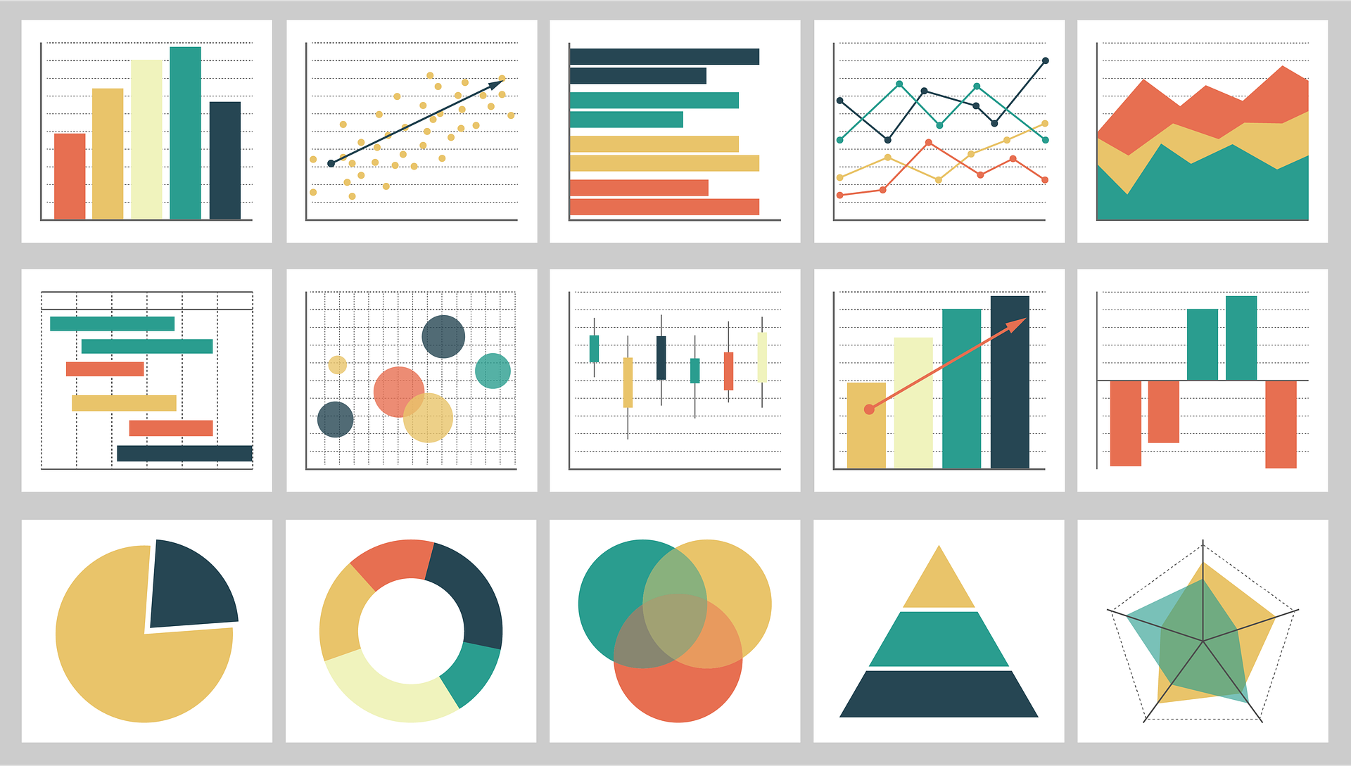
To choose the right interactive visualization solution for your business and dashboards, you must first understand the various types of data visualization examples currently available within business intelligence (BI) solutions, along with their use cases. We cover some of the most popular data visualization examples below.
Line Chart
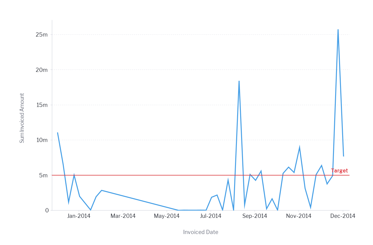
A line chart is a basic data visualization technique. We use line charts to demonstrate relationships within a continuous data set. It helps reveal trends or changes over time.
When is it useful in data visualization? When having too big data for a bar chart or a continuous dataset that tends to change over time, the line chart is a suitable choice. You can also use it when you want to show trends rather than exact values.
Pie Chart
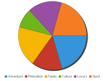
A pie chart is another basic visualization chart. We use pie charts to demonstrate parts of a whole, and a pie chart often shows numbers in percentages.
When is it useful in data visualization? It is an optimal choice with small datasets and when one wants to show relative proportions of a whole data-set. It is also a good choice when showing the comparative effect of one factor on various categories, up to six categories.
Bar Chart
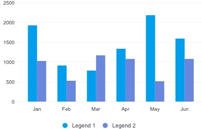
We use a bar chart to compare different items on hand. Note that bars are horizontal on a bar chart and vertical on a column chart.
Bar charts best help compare parts of a comparatively bigger dataset of different categories. Also, it is useful when demonstrating values in negative and positive in the dataset. It might be good to keep 10 bars maximum in the graph.
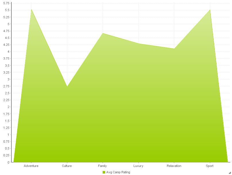
Area Chart
An area chart is similar to a line chart, with some subtle differences. It demonstrates changes over time and continuity across a data-set.
When is it useful in data visualization? It is an optimal choice when illustrating the volume of data over time. Similarly, it helps describe part-to-whole relations, though it is unsuitable with discrete data.
Scatter Chart
A scatter chart helps demonstrate the relationship between two variables by plotting several data points in the graph. We place several points on the x-y axis.
When is it useful in data visualization? It is useful when looking forward to determining the potential relationship between two variables of several data points.
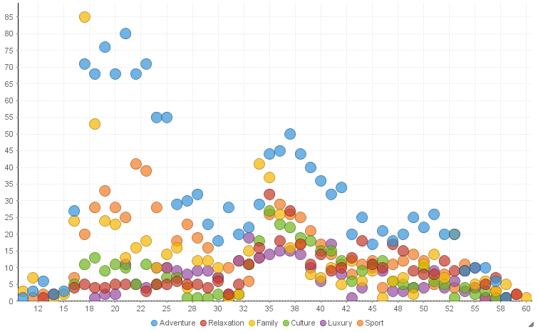
Bubble Chart
Bubble charts (or bubble plots) compare three numeric variables. Each dot in a bubble chart represents a data point, while horizontal, vertical, and dot sizes show variable values.
You can use a bubble chart to compare variables that are independent of one another, as well as to demonstrate distribution or relation. However, if you have a limited data-set, you should avoid using a bubble chart in your dashboards.
4 Key Considerations when Creating Data Visualizations
Here we discuss the four essential elements when building interactive data visualization for use by your customers, co-workers, product users, or C-suite.
1. Understand the task the user wishes to perform
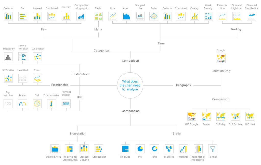
Firstly, you need to understand what story you wish to tell with data on hand. Indeed, the first question always is what was the point of collecting the data in the first place. It is no wonder that data is a story expressed in numbers. Thus, having a crystal clear idea for collecting such data is a must. It might be for identifying trends, comparing different options, demonstrating some distribution, or observing the correlation between several value sets. You can comfortably choose a chart type when you know the back-end story of data, and what you want to deliver. Yellowfin has a visual guide, which we include below.
2. Identify the size and complexity of the data
Few charts don't match huge datasets, which is obvious. Therefore, the size and complexity of your data will determine the chart type you choose. When representing big data, for instance, you have to select from a few charts capable of achieving it. Scatter plot works well with big datasets. In contrast, pie charts seem reasonable with a limited number of datasets. On balance, we can safely say that it is untrue that one-chart-fits-all datasets as far as data visualization is concerned.
3. Assess the type of data to be visualized
All data is not of the same type. The nature of data may be continuous, descriptive, categorical, or qualitative. So, It’s best to choose a chart type based on data type. For instance, a line chart instead of a bar chart is suitable for continuous data. On the other hand, a bar chart would work fine when you are dealing with categorical data. It is easy to guess you cannot pick a line chart with categorical data. Thus, you would choose a bar chart as it carries a discrete finite amount of categories.
4. Define the audience of your data visualization
It is time to figure out your audience that you’ll share your visualization dashboards with. Suppose you are examining trends in the stock market. Here, you will use a different type of chart for veterans and a different one for beginners just starting their stock market venture. After all, data visualization aims to communicate data on hand with people in an efficient manner. For this reason, you need to keep your audience in mind when you resort to representing your data with them.
Related: 9 Key Features of Enterprise Data Visualization Software
Which Data Visualization Tool is Best?
Unfortunately, many in-house or existing analytics in the market only offer limited graphs, charts and maps, and unattractive visualizations and designs. Furthermore, those solutions are hard to customize design, along with their incapacity of getting white-labeled in-app.
Yellowfin's data visualization product suite offers a diverse range of visualization customization, carrying over 50 types of charts. Moreover, it carries cutting-edge charts & supports JavaScript charting libraries that include D3 and three.js.
White-labeling and integration with native apps are also simple, with location intelligence, namely in-built mapping ability and Google Maps API for building interactive visualizations supported. On top of everything, it bears a flexible design canvas for beginners and designers.
Explore Yellowfin's interactive dashboard gallery to see how we can offer one of the best data visualization software solutions for your general data analysis requirements.